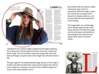
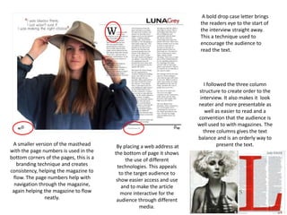
Q1 In what ways does your media product use, develop or challenge forms and ...briege simmonds
The document discusses how the media product uses and develops conventions of real media forms. It describes taking inspiration from Rolling Stone magazine for the masthead design, including a selling line like many magazines to attract readers, and using headlines similar to Q magazine. Conventionally, it includes the date, price, and barcode, but develops this by adding the email address. Photos are used conventionally to create eye contact. Splashes and a band index also follow conventions. The ransom note style quote is unconventional but aims to intrigue readers. Cover lines and placement of the title aim to inform and engage readers. Large pictures on their own page and credits for photos are also conventional. More photos were added to be visual and show aspects of the
The document summarizes the ways in which the author's magazine cover and contents pages both follow and challenge conventions of the popular magazine "Top of the Pops". The author's magazine uses a similar color scheme of pink, yellow, and blue as "Top of the Pops" but with some variation. It also uses direct address with models looking at the camera, but places the masthead in front of the cover image unlike "Top of the Pops". For the contents page, it follows conventions like using anchors but challenges the placement of text in the center instead of dead space. The double page spread similarly follows conventions like question and answer interviews and drop caps but challenges the lack of a grab quote.
This document summarizes how the author's media product uses and challenges conventions of real magazines. The author chose fonts, layouts, and design elements that conform to rock music magazine conventions like large capitalized mastheads and left-justified text. Color schemes and feature images also follow conventions. However, some elements challenge conventions, like an unconventional magazine title and continuous color scheme between pages. Overall, the author strives to balance conforming to reader expectations with unique and interesting design choices.
The document discusses techniques for magazine cover design and layout. It examines inspiration drawn from Vibe Magazine and how its style informed the design of an "Urban" music magazine. Key elements discussed include using bold mastheads, attention-grabbing headlines, coordinating article text colors with cover images, and exaggerated "puffs" to entice readers. The left third of the cover is analyzed as the critical visible area that needs an eye-catching main article to draw audiences in.
Holly Peacock discusses the conventions used in her music magazine. On the front cover, she uses elements like the artist's name in a bold headline, the main feature photo in the center, and flashes and plugs to promote other content. For the contents page, she includes a masthead, subscription box, band index list, editorial, and navigation panel to guide readers. On the double page feature spread, she combines conventions from other magazines, including a border, dropped capital letter, artist splash, and white space to focus attention on the article. Throughout the magazine, her goal is to use typical magazine layouts and design elements to make the publication look professional and appeal to readers.
The document discusses how the media product uses and develops conventions of real magazines. It examines conventions used in the front cover, contents page, advertisements, and website. For the front cover, conventions like the masthead, color scheme, sell lines, barcodes, and images are used. The contents page follows conventions such as images, page numbers, editors' info, layout, and color scheme. Advertisements use conventions like short text, product image placement, branding, and contact info. The website adheres to conventions with its masthead, homepage image, social media links, articles, and contact page. The document analyzes how the media product both develops and challenges some conventions of real magazines.
The document discusses the conventions used in magazine design that the author's music magazine follows, such as including a model on the cover looking at the reader, using text layers for depth, and promoting offers; it also explains some conventions the magazine breaks like having the model working instead of looking at the reader. The author believes following most conventions helps the magazine be recognizable while small breaks in convention add uniqueness.
The document provides guidelines for designing the front cover of a music magazine, comparing the conventions used in other magazines. It notes that most conventions are followed, such as using text layering, excluding text in front of the model, and using cover lines to show contents. However, it breaks from having the model look at the reader, instead showing them working, to fit the magazine's focus on music for film and TV. Sticking closely to conventions helps potential readers recognize it as a music magazine, but some breaks from convention can be justified to better represent the magazine's topic.
The document discusses conventions used in magazine design and how the author developed their own magazine cover and layout. Some key conventions followed include placing the masthead, issue number and price on the cover. However, the author added bullet points under the masthead listing what's inside. On the contents page, the author challenged conventions by using a long shot image instead of multiple smaller ones. The double page spread followed some conventions like splitting the pages but was developed by using a slanted split and different colors on each side.
The document discusses how the student's magazine product uses and develops conventions of real media products.
It summarizes how the student followed conventions like including a masthead, front cover with a model, features list, contents page with images and page numbers, columns of text, numbered articles, and an editorial page with the editor's photo and signature.
However, the student also challenged some conventions by using unique fonts, more casual language in the editorial, and layouts that featured larger images than text. The goal was to make the magazine stand out while still appealing to expectations of the target audience.
The document discusses how the media product follows conventions of real regional magazines. It summarizes the key design elements and conventions used for the front cover, advertisements, editorial pages, contents page, billboard, and website. Across all sections, common conventions that were followed include using high-quality images, a consistent font and layout, the magazine's logo/branding, and providing essential details to engage and inform readers. The goal was to create a magazine that would feel authentic and appeal to readers based on what is typically seen in other successful regional magazines.
The document provides initial ideas for various sections of a proposed pop music magazine titled "POPTASTIC!". The front cover would feature an attractive smiling female with the masthead in large text at the top left on a white background. The contents page would continue the pink, white and orange color scheme and include page numbers, artist images and the masthead. A double page spread would have a midshot image on one page and a question and answer style article on the other in smaller text and different colored questions and answers. Photographs would include solo artists and bands using different shots and some with props or locations to represent the pop genre.
The document discusses the design elements of a magazine cover and interior pages. Key points include:
- The masthead is bold and colorful to draw attention in the top left corner as is standard.
- The cover uses a celebrity image, quiz promotion, and colloquial language to attract readers.
- Interior pages continue the color scheme and include an exclusive celebrity interview in magazine style with direct engagement between images and text.
The document summarizes the key design choices made in developing a magazine cover and contents pages, comparing decisions to the magazine Q. Key points of comparison include using a banner on the cover to draw attention, choosing a black and white traditional design to convey music's importance, using transparent boxes for cover lines to imply urgency, and including an editor's letter and categorization on the contents page to feel more personalized and professional. Design choices are made considering conventions from similar magazines in the genre.
Evaluation Question 1: In what ways does your media product use, develop or c...ALarsen14
The document discusses how the student's magazine cover and contents pages use, develop, and change conventions of other rock music magazines.
The cover follows conventions such as including a masthead, skyline, main image using rule of thirds, main sell line near the image, and additional cover lines. It challenges conventions by only featuring the lead singer instead of the full band and placing the issue date in an unusual location.
The contents page includes standard elements like the masthead, page titles and numbers, subheadings, and previews of interior pages. It challenges conventions by placing the masthead in the center instead of the top. It develops conventions by including a large editor's letter to introduce the magazine and providing descriptions
The document summarizes the codes and conventions used in a magazine front cover, contents page, and double page spread. For the front cover, standard elements like the masthead, cover lines, and images are included to suit the alternative rock genre. The contents page layout is not challenged to keep it clear for readers. The double page spread challenges conventions with a unique layout not commonly seen in alternative rock magazines, to attract a young audience with new ideas. Elements like the masthead are also included to promote online posting of articles.
This document discusses how the media product uses and develops conventions of real magazines. It summarizes how various design elements on the magazine cover, contents page, articles, and advertisements develop conventions to appear professional and engage readers. These include using large text and logos to draw attention, celebrity names and photos to promote artists, consistent page numbering and a table of contents for navigation, and advertisements to promote related products. The document explains how these elements target audiences, represent themes, and develop a cohesive brand identity using standard magazine conventions.
The document discusses the production of a regional magazine media product and how it conforms to conventions of real magazines. It summarizes how each element of the magazine production, including the front cover, contents page, and billboard, follows conventions in terms of layout, design choices, and content. This includes using familiar fonts, logos and slogans on the cover, incorporating reader submissions on the contents page, and promoting the magazine's cross-platform availability on the billboard. The document provides examples from other magazines to demonstrate how the magazine production under evaluation aligns with standard magazine formats and codes.
1. The document describes the design choices made for a magazine targeted at young girls aged 8-13 who enjoy music, fashion, and celebrities. Market research was conducted to inform the design.
2. Care was taken to use colors, fonts, and layouts that would appeal to the target audience. Images of attractive celebrities were used throughout to represent aspirational figures for readers.
3. Digital editing tools like Photoshop were used to enhance photographs and give the magazine a polished, professional look in line with the audience's preferences.
This document discusses the target audience for a proposed alternative rock magazine. The target audience would be young adults aged 16-25 who are interested in alternative rock music. Specifically, the target audience would be middle-class working young adults as the magazine would be priced affordably at £2.20. Research also found that white males would be most likely to purchase the magazine due to an interest in the bands and content featured. The magazine aims to attract this target audience through design elements on the cover and content layout that follow conventions of alternative rock magazines.
1. The document describes the design choices made for a magazine targeted at young girls aged 8-13 who are interested in music, fashion, and celebrities. Key design elements include the title, cover image, layout, and use of color, images, and informal language.
2. Research was conducted through questionnaires to understand the target audience's preferences.
3. Digital photography and image editing techniques like Photoshop were used to enhance photos and make them more appealing to the target audience.
- The document evaluates the author's music magazine project, discussing how it uses conventions of real music magazines.
- Key aspects discussed include the use of eye-catching design elements like colors, fonts, and images on the cover and throughout the magazine. Pull quotes, interviews, and reviews of music are also included.
- Representation of the hip hop genre and culture is emphasized through aspects like clothing, hairstyles, and jewelry in photos as well as graffiti-style text and topics covered.
The document provides details on the design of a magazine cover and contents page for a teenage girl target audience. Key elements included a bold masthead in the top left, a celebrity cover image and teaser lines. The contents page uses sections and informal language to organize and preview magazine content appealing to teenage girls. Consistent colors, fonts and positioning are used throughout for brand recognition and readability.
1. The document discusses how the author's magazine product uses and develops conventions of real magazines.
2. Key conventions used include placing a barcode and issue number on the cover to look professional, using cover lines and selling points to attract buyers, and employing a grid system on the cover with important information at the top.
3. Internally, conventions like quotes, photos, and headers are used on the content page, while the feature article employs pull quotes, headlines, and a photo to match styles seen in example magazines like NME.
Creating a clear brand identity on my contents page and the flat plan on cont...Alfieweston
The document discusses creating a clear brand identity for a hip-hop magazine. Key elements include focusing all content on hip-hop to consistently remind readers of the magazine's focus. The layout organizes important new articles prominently to engage readers. Visual elements like a distinctive color scheme and logo help readers instantly recognize the magazine.
Voor zowel opdrachtgevers als zelfstandigen brengt de afschaffing van de VAR en de overstap naar modelovereenkomsten nogal wat veranderingen met zich mee. Na het volgen van dit webinar kent u de wijzigingen en risico’s en weet u welke acties u als ondernemer moet oppakken.
La amistad se da entre dos o más personas que encuentran inquietudes comunes y comparten alegrías y dolores a lo largo de la vida. Las amistades pueden formarse rápidamente o tardar años en desarrollarse, y son especialmente importantes durante la etapa escolar, donde los compañeros de clase se convierten en una familia. Los verdaderos amigos aceptan a las personas tal como son, las acompañan en sus logros y fracasos, y nunca las juzgan por sus errores.
The document discusses a new curriculum called "Tonnucci I El Nou Curriculum". It overhauls the existing curriculum to focus more on developing students' life skills, values, and well-rounded growth. The new curriculum aims to prepare students for their personal, academic, and professional lives after compulsory education.
The document announces GeekWeek events in Wroclaw and Krakow, Poland from April 18-24, 2016. It promotes GeekWeekFEST which will take place in Krakow, Wroclaw, and Luxembourg featuring programming and technology-related activities.
The document describes characterizing wafer geometry and overlay error on silicon wafers with nonuniform stress. It discusses measuring wafer geometry using an optical metrology tool to characterize nonuniform stress-induced wafer distortions. A metric called the predicted in-plane distortion residual (PIR), derived from wafer geometry measurements, is shown to strongly correlate with measured overlay error. The relationship between wafer geometry, in-plane distortion when the wafer is chucked, and resulting overlay error is explored through finite element models. Engineered stress monitor wafers with deliberate variations in nonuniform stress are used to further study this relationship and correlations between PIR and measured overlay error.
El documento habla sobre los recursos económicos y el proceso de producción. Explica que los recursos principales son la tierra, el trabajo y el capital, los cuales son escasos y tienen múltiples usos productivos. También describe que la combinación de estos recursos a través de una técnica productiva permite obtener bienes y servicios finales de consumo o de inversión, así como bienes intermedios.
Letterkenny Army Depot implemented Lean Six Sigma principles in 2002 to improve productivity and reduce costs in order to survive an upcoming BRAC review. This included identifying and eliminating wasteful processes. Over time, the implementation of Lean led to significant cost savings and productivity increases across various programs. It also fostered a cultural shift where employees became empowered to identify and implement improvements. As a result, Letterkenny received several Shingo awards for operational excellence, confirming its success with Lean and establishing it as a model for Army facilities.
Este documento describe diferentes métodos para evaluar el comportamiento de fumar, incluyendo entrevistas, evaluaciones de dependencia a la nicotina, autoinformes, escalas de motivación y abstinencia, y medidas fisiológicas. La evaluación es crucial para diagnosticar la adicción a la nicotina y desarrollar un tratamiento efectivo. Existen buenos instrumentos y técnicas de evaluación como escalas que miden constructos relacionados al fumar de manera confiable. Futuros desarrollos deben adaptar los instrumentos a criterios clínicos como los
This document provides information about caster wheels and floor locks from Caster Depot. It describes several series of caster wheels varying in size, load capacity, and material. Features of standard and specialty wheels are outlined. The document also lists Caster Depot locations and contact information.
Bridging the Distance: How distance and flexible learning is used to support ...NVL - DISTANS
Bridging the Distance: How distance and flexible learning is used to support rural development in Iceland. A presentation by Hróbjartur Árnason (University of Iceland) held on EDEN conference in Oslo 12-15 june 2013.
This presentation is part of the DISTANS networks project on "How Education can Support Rural Development": http://distans.wetpaint.com/page/Does+Education+support+rural+development%3F
Agile2015 Strategy Mapping: Clear path to a successful Agile strategyDave Neuman
Strategy mapping is a simple framework for visualizing a strategy and it works for Agile adoption as well. My session showed participants how to map cause-and-effect relationships between process, practices, and skills to customer and financial objectives using a strategy map.
This document analyzes the front cover, contents page, and double page spread of a mock rock music magazine. It discusses the conventions and design elements used on each page, such as the masthead across the top, bold fonts, multiple colors, cover lines, price and issue info on the front cover. On the contents page, it continues the branding and lists important page numbers and images. The double page spread features a large main image, interview columns, and pull quotes in the same colors as the front cover. It also notes some conventions that were not used, such as overlapping the title and masthead or including more pull quotes. Overall, the document examines how the magazine prototype both does and does not follow typical conventions for real
The document discusses how the author attracted their audience to their music magazine through various design elements. Some key ways included using eye contact in photographs to connect with readers, studio shots to look professional, and dark clothing/props to add mystery. Font choices were grungy and edgy to fit the rock genre. The color scheme of black, white, and red identified it as an alternative magazine. Layouts on the cover and content pages drew attention using multiple headlines and angled photos. Language balanced simplicity for the target audience of teenagers with more sophisticated words to maintain professionalism.
The document provides an evaluation of a magazine design. It discusses using images of people the same age as the target audience to relate to them. A sans serif font is used to make the design bold and eye-catching. The masthead follows magazine conventions by being in the top corner. Three colors are used throughout to represent brand identity without overcomplicating the design.
The document discusses the design and layout of a magazine. Key points include:
1) Images of bands were edited to enhance colors and lighting to look more professional and appealing. Various software were used to edit photos.
2) Font, layout, and design elements like pull quotes and box outs were used to follow magazine conventions and make information visually interesting and easy to understand.
3) Casual language and inclusion of various music genres aims to attract a target audience of 16-25 year olds.
The document is an evaluation of a magazine created by the author. It discusses various conventions used in real magazines and how the author employed or challenged these conventions in their own magazine. Specifically, it covers conventions around mastheads, fonts, color schemes, photography, date lines, pull quotes, and watermarks. The author analyzes how they applied each convention and why to best suit their target audience and make their magazine appealing and readable.
Tom Ibbott evaluated his magazine project. He analyzed how his magazine used and developed conventions from real magazines in its content, layouts, and formats. He represented various social groups like teenagers, EDM fans, and the middle class. He challenged some stereotypes about these groups. Finally, he discussed that Bauer Media, BBC/Immediate Media, or Time Inc. UK would be suitable media institutions to distribute his magazine because of their experience producing similar magazines.
This document analyzes various elements of a magazine created by the author for a school project. It examines how each element, including the masthead, images, costumes, models, title/font, written content, layout, and contents page, conforms to conventions of real pop genre magazines for a young female audience. Minor ways elements were developed include using the title "Inside this mag..." instead of "Contents" and including additional pictures on the contents page. Overall, the magazine closely follows conventions to appeal to its target readership.
This document describes the design elements used in the front cover, contents page, and double page spread of a student-created music magazine. For the front cover, dominant images and bright colors are used to attract different audiences. Consistent colors and layout maintain coherence. The contents page is clearly organized with images, columns, and page numbers for navigation. The double page spread features a large central image overlapping text to emphasize an exclusive article and convey an "indie" aesthetic through experimental formatting and banners denoting exclusivity. Consistent branding elements and design principles are applied across components to engage readers.
AS EVALUATION - In what ways does your media product use, develop and challen...khalfyard
The document summarizes how the media product uses, develops, and challenges conventions of real music magazines. It discusses research conducted on forms and conventions of pop magazines. It then explains how the layout, design elements, and language of the created music magazine both adhere to and develop conventions from real magazines. The cover, contents page, double page spread, images, and tone were all influenced by research but also include original and developed elements to create a unique product.
The document discusses how the media product uses and develops conventions of real magazines. It analyzes the front cover, contents page, billboard, and website elements. For each element, it identifies conventions used in other magazines that were followed in the media product. These include using a masthead on the front cover and website, images and page numbers on the contents page, contact information on the website, and promotion of social media links. It aims to follow reader expectations created by real magazine conventions while adding some unconventional elements like a colored line on the billboard for branding.
The document provides an evaluation of the forms and conventions used in the student's media magazine product. It discusses several key conventions used in the front cover, contents page, and article page. The front cover uses conventions like the masthead, cover lines, selling line, and cover image. The contents page includes page numbers, columns, editor's letter, and context. The article page features a large cover image, columns for text, drop caps, pull quotes, and adheres to the color scheme. The student also drew inspiration from existing magazines and discussed how some magazines challenge conventions by not including cover lines or positioning the masthead differently.
The document provides an evaluation of the forms and conventions used in the student's media magazine product. It discusses several key conventions used in the front cover, contents page, and article page that align with real music magazines. This includes the masthead, cover lines, cover image, color scheme, columns, and page numbers. The student also discusses how they drew inspiration from existing magazines and developed some elements while maintaining the overall conventions. Finally, it analyzes some magazines that challenge conventions in their designs.
1. The document describes the design choices made for a magazine targeted at young girls aged 8-13 who enjoy music, fashion, and celebrities. Market research informed the color scheme, layout, and types of articles included.
2. The target audience is described as clean cut and innocent. Consistency is maintained through a similar house style and font across pages.
3. Technologies used include photo editing software to enhance images of celebrities to attract readers and represent the magazine's ideals. Digital skills were developed in areas like positioning, lighting and skin editing.
The document discusses how the media product both follows and challenges conventions of real magazines. It follows conventions such as using different fonts and page numbers to guide readers. However, it also challenges conventions by using a simple three-color scheme rather than bright colors, and including reader submissions rather than just professional content. Overall, the document aims to create a magazine that feels sophisticated while still appealing to a younger audience.
The document provides details about a media evaluation for a music magazine. It discusses how the magazine uses conventions from other media products in its masthead, images, colors, layouts, and articles. It also challenges some conventions by using edgier fonts and informal tones. The target audience is identified as younger males interested in pop music. Feedback from the target audience on the magazine was generally positive.
The document discusses how the author designed a music magazine to attract and address their target teenage audience. Key elements considered included the masthead, color scheme, photographs, layout, and writing style. Red, black and white were used prominently to make the magazine stand out visually while appealing to both genders. Large images and minimal text were used to engage the teenage audience. Photographs and writing style aimed to connect with the audience and reflect their interests in music and fashion.
The document describes a media product (a magazine) and how it uses and challenges conventions of real magazines. It discusses the magazine's masthead, images, color scheme, text, and layouts. The magazine aims to represent a young, urban audience that listens to pop music. It follows conventions like masthead placement and font but challenges some with edgier fonts. The target audience would be teens to late 20s, primarily male students and music fans. Feedback from a focus group was positive overall.
The document discusses how the author addressed their audience in designing their magazine. They used informal language, bold vibrant fonts, large scale images of teenage subjects making eye contact, and advertisements related to things their target audience would enjoy. The front cover features a bright blue masthead in the top left corner and a simple layout with the image and text spaced equally. While some elements like the bright colors and feminine subjects may give a more feminine impression, the author tried to keep the magazine appealing to both female and male readers.
AS media evaluation question 7. Looking back at your preliminary task, what do you feel you have learnt in the progression from it to the full product?
Q1. In what ways does your media product use, develop or challenge forms and conventions of real media products?
AS media coursework evaluation question 1
Q4 How did you used media technologies in the construction and research, plan...hollygruncell
The document discusses the various media technologies used at different stages of a coursework project. These included Blogger to organize work, iMovie for video editing, WIX for a website creation, Microsoft Publisher for a poster, Photoshop for image editing, 1001 Fonts for fonts, Survey Monkey for gathering audience feedback, Windows Movie Maker and Prezi for presentations, and TinyTake for screen recording. Each technology was used because it allowed for clear presentation, easy use, and a professional appearance for the final products.
Q3. What have you learned from your audience feedback?hollygruncell
The document discusses feedback received from a target audience of 16-18 year olds for a horror film trailer. The feedback was used to refine the trailer to better appeal to this audience. Changes made based on the feedback included adding extra moments of horror, modifying sounds and music to build more tension and suspense, and leaving some elements ambiguous to encourage viewership. Additional feedback after the final trailer was positive overall but suggested further refinements to the music and audio quality.
The document discusses the benefits of exercise for mental health. Regular physical activity can help reduce anxiety and depression and improve mood and cognitive functioning. Exercise causes chemical changes in the brain that may help protect against mental illness and improve symptoms.
The document discusses the benefits of exercise for mental health. Regular physical activity can help reduce anxiety and depression and improve mood and cognitive functioning. Exercise causes chemical changes in the brain that may help boost feelings of calmness, happiness and focus.
3. What kind of media istitution might distribute your product and why?hollygruncell
The document discusses choosing Bauer Media as the distributor for a new music magazine. Bauer Media is a well-known institution that already distributes similar magazines targeting 15-25 year olds, including Mojo, Q, and Kerrang. While these focus on rock music, the new magazine will focus on indie/alternative music, appealing to a wider audience alongside the others. Bauer's experience distributing music magazines makes it well-suited to help a new magazine succeed.
This slide is special for master students (MIBS & MIFB) in UUM. Also useful for readers who are interested in the topic of contemporary Islamic banking.
How to Build a Module in Odoo 17 Using the Scaffold MethodCeline George
Odoo provides an option for creating a module by using a single line command. By using this command the user can make a whole structure of a module. It is very easy for a beginner to make a module. There is no need to make each file manually. This slide will show how to create a module using the scaffold method.
Main Java[All of the Base Concepts}.docxadhitya5119
This is part 1 of my Java Learning Journey. This Contains Custom methods, classes, constructors, packages, multithreading , try- catch block, finally block and more.
How to Fix the Import Error in the Odoo 17Celine George
An import error occurs when a program fails to import a module or library, disrupting its execution. In languages like Python, this issue arises when the specified module cannot be found or accessed, hindering the program's functionality. Resolving import errors is crucial for maintaining smooth software operation and uninterrupted development processes.
LAND USE LAND COVER AND NDVI OF MIRZAPUR DISTRICT, UPRAHUL
This Dissertation explores the particular circumstances of Mirzapur, a region located in the
core of India. Mirzapur, with its varied terrains and abundant biodiversity, offers an optimal
environment for investigating the changes in vegetation cover dynamics. Our study utilizes
advanced technologies such as GIS (Geographic Information Systems) and Remote sensing to
analyze the transformations that have taken place over the course of a decade.
The complex relationship between human activities and the environment has been the focus
of extensive research and worry. As the global community grapples with swift urbanization,
population expansion, and economic progress, the effects on natural ecosystems are becoming
more evident. A crucial element of this impact is the alteration of vegetation cover, which plays a
significant role in maintaining the ecological equilibrium of our planet.Land serves as the foundation for all human activities and provides the necessary materials for
these activities. As the most crucial natural resource, its utilization by humans results in different
'Land uses,' which are determined by both human activities and the physical characteristics of the
land.
The utilization of land is impacted by human needs and environmental factors. In countries
like India, rapid population growth and the emphasis on extensive resource exploitation can lead
to significant land degradation, adversely affecting the region's land cover.
Therefore, human intervention has significantly influenced land use patterns over many
centuries, evolving its structure over time and space. In the present era, these changes have
accelerated due to factors such as agriculture and urbanization. Information regarding land use and
cover is essential for various planning and management tasks related to the Earth's surface,
providing crucial environmental data for scientific, resource management, policy purposes, and
diverse human activities.
Accurate understanding of land use and cover is imperative for the development planning
of any area. Consequently, a wide range of professionals, including earth system scientists, land
and water managers, and urban planners, are interested in obtaining data on land use and cover
changes, conversion trends, and other related patterns. The spatial dimensions of land use and
cover support policymakers and scientists in making well-informed decisions, as alterations in
these patterns indicate shifts in economic and social conditions. Monitoring such changes with the
help of Advanced technologies like Remote Sensing and Geographic Information Systems is
crucial for coordinated efforts across different administrative levels. Advanced technologies like
Remote Sensing and Geographic Information Systems
9
Changes in vegetation cover refer to variations in the distribution, composition, and overall
structure of plant communities across different temporal and spatial scales. These changes can
occur natural.
The simplified electron and muon model, Oscillating Spacetime: The Foundation...RitikBhardwaj56
Discover the Simplified Electron and Muon Model: A New Wave-Based Approach to Understanding Particles delves into a groundbreaking theory that presents electrons and muons as rotating soliton waves within oscillating spacetime. Geared towards students, researchers, and science buffs, this book breaks down complex ideas into simple explanations. It covers topics such as electron waves, temporal dynamics, and the implications of this model on particle physics. With clear illustrations and easy-to-follow explanations, readers will gain a new outlook on the universe's fundamental nature.
Executive Directors Chat Leveraging AI for Diversity, Equity, and InclusionTechSoup
Let’s explore the intersection of technology and equity in the final session of our DEI series. Discover how AI tools, like ChatGPT, can be used to support and enhance your nonprofit's DEI initiatives. Participants will gain insights into practical AI applications and get tips for leveraging technology to advance their DEI goals.
This presentation includes basic of PCOS their pathology and treatment and also Ayurveda correlation of PCOS and Ayurvedic line of treatment mentioned in classics.
हिंदी वर्णमाला पीपीटी, hindi alphabet PPT presentation, hindi varnamala PPT, Hindi Varnamala pdf, हिंदी स्वर, हिंदी व्यंजन, sikhiye hindi varnmala, dr. mulla adam ali, hindi language and literature, hindi alphabet with drawing, hindi alphabet pdf, hindi varnamala for childrens, hindi language, hindi varnamala practice for kids, https://www.drmullaadamali.com
How to Add Chatter in the odoo 17 ERP ModuleCeline George
In Odoo, the chatter is like a chat tool that helps you work together on records. You can leave notes and track things, making it easier to talk with your team and partners. Inside chatter, all communication history, activity, and changes will be displayed.
Digital Artefact 1 - Tiny Home Environmental Design
Evaluation Question 1.
1.
2. The masthead is at the top
left of the front cover to
make sure it stands out to
the audience and is easily
recognised for branding. A
masthead is used to give a
magazine an identity. To help
with the branding of the
magazine the masthead is
continued throughout the
magazine., which helps the
magazine to flow and makes
it seem more consistent.
Typically a masthead is placed
at the top of the magazine front
cover to make it the most
important part of the front
cover. This makes it more easily
recognisable to the audience.
However the analysed front
cover places its masthead in the
top left corner, this is for the
same reasons as well as the
audience reading from left to
right so giving it more
importance. The masthead is
also layered over on this
magazine because the magazine
is well known so the masthead
requires less attention and the
layering makes the front cover
look more interesting.
3. Similarly to my analysed
front cover of a music
magazine I layered over
my main image on my
front cover, but kept the
face clear and uncovered.
I decided to use this
convention to make the
magazine look more
interesting and therefore
more appealing.
I left the face of my artist
uncovered to draw
attention towards the
face and to make the
image stand out more as
well as attracting the
potential audience.
The analysed front cover uses a
group photo as the main artist is
a band. They’re not all looking at
the camera which shows how
close they are and shows them as
a tight knit group. This shows
them to be a happy friendly
group.
I tried to reciprocate this vibe
with my solo artist by making her
seem more relaxed and
[presenting her with a happy
facial expression. I decided to use
a direct mode of address as she is
a solo artist and this makes it
more engaging for the audience.
4. A banner was used to plug
more content, helping to
show the magazine as being
full and busy, this would
attract the audience as the
magazine would look full
and interesting with lots for
the audience to view and
interact with.
By using a range of fonts the
magazine is made to look
more interesting and
appealing, as well as
highlighting more important
and more appealing content
with more attractive fonts.
The range in the font styles
and sizes is used as a
differentiation tool for the
target audience.
I decided to follow the
convention of layering my front
cover make it seem more
appealing and attractive to the
audience. I wanted to keep
attention to the important
content of the magazine,
persuading the target audience
to buy the magazine.
5. Most magazines follow a
colour scheme of three
main colours. On my
analysed magazine this is
black, red and white; this
creates a house style that
is consistent throughout
the magazine.
To help my magazine to
flow I decided to follow
this convention and
focused on the three main
colours, white, blue and
grey to help my magazine
to flow.
I decided to plug artists across
the top to help make it more
gender inclusive, and to help
persuade the audience to
purchase the magazine. My
analysed magazine didn’t do
this but I wanted to appeal
more to a wider audience and
to be more appealing with
more artists from the genre.
6. I decided to follow the
conventions of
subheadings for my
contents page, this is to
help with the organisation
of the contents page and
therefore the navigation
of the magazine.
They are in different fonts
and colours to create a
differentiation and to
stand out as being
subheadings.
I used the subheading
‘features’ like Q
magazines example to
display the content on the
front cover, as it is familiar
for the audience,
A short bio on each article
in the magazine is used,
which helps to navigate to
what the reader finds most
interesting. It helps
advertises parts of the
contents of the magazine,
making them seem
appealing to the target
audience.
I decided to write the bios
in a similar way to my
analysed contents pages so
that is familiar to the
audience and is therefore
attractive to them.
7. I used the left-hand third
convention, keeping the
main text on the left as well
as the title ‘CONTENTS’. This
is because people read from
left to right which makes the
text most important on a
contents page, this
convention is used by both
of my analysed texts.
Numbering the images
used on the contents
page helped with the
navigation of the
magazine because of the
direct links to the page if
the audience is
interested. This helps to
create consistency for the
magazine and also helps
to make it flow
throughout.
I followed the technique of
structuring the information
on the contents page in a
column format. This is to
keep it clear and easy to
navigate and read. The use
of the column structure
also gives the magazine a
more professional look. It
is not only a familiar
convention for the
audience but makes the
contents page
conventional as well.
8. The main image on the
contents page links to the
main article and focus of
this issue of the magazine.
The main image refers to
the main content of the
magazine to help with the
advertisement, it is aligned
to the right to follow the
left hand third rule. This is
because it is not the most
important part of the
contents page.
Smaller images are less
important but still help to
advertise the contents of
the magazine. I decided to
align my smaller image
with the text to give a
more professional feel as
well as following the
column structure.
A three colour consistency
was used to help create a
house style and to help the
magazine to flow smoothly,
this followed typical
conventions of music
magazine contents pages.
Bold but simple font choices
are used to keep it clear and
easy to read and therefore
navigate through the
magazine.
Different font sizes are used
to differentiate between the
importance of the contents.
9. Eye contact with the camera makes
it personal, gives a bit of a
connection with the reader, I used
this convention to appeal more
towards my target audience., and
to also make the interview/article
more inviting.
The image takes up a whole page
of the double page spread as this
draws attention to both the image
and the interview and therefore is
persuading to the audience and
makes them want to read the
article.
I decided to use a colour image to appeal to the target audience,
this is because it suits the genre of music more than a black and
white image. The use of colour makes the image look more laid
back and happy as it gives more of an insight into what the artist is
like.
This goes against my analysed double page spread, as the image is
in black and white to look more classy and to present the artist as
more mysterious. However my artist is from a different genre of
music so this view wouldn’t suit it.
10. A quote is used to get the attention of the audience and to make
them want to read the interview so that they can find out more and
to find out the context of the quote.
The quote is placed in the top left corner to follow the left-hand
third rule, which means that it will be one of the first things seen
and therefore can be used effectively to attract the audience.
This convention isn't used on my analysed text, but I decided to use
it to appeal more to the audience and make the double page spread
look more interesting.
Placing the artists name in the
top right corner of the double
page spread is a persuasive
device. By using different fonts,
it stands out more and therefore
is attractive to the target
audience. It also makes it clear
as to who is being interviewed to
the audience.
I decided to use this form for my
double page spread as it would
be familiar to my target
audience and is a good
persuasive device also.
11. I followed the three column
structure to create order to the
interview. It also makes it look
neater and more presentable as
well as easier to read and a
convention that the audience is
well used to with magazines. The
three columns gives the text
balance and is an orderly way to
present the text.
A bold drop case letter brings
the readers eye to the start of
the interview straight away.
This a technique used to
encourage the audience to
read the text.
By placing a web address at
the bottom of page it shows
the use of different
technologies. This appeals
to the target audience to
show easier access and use
and to make the article
more interactive for the
audience through different
media.
A smaller version of the masthead
with the page numbers is used in the
bottom corners of the pages, this is a
branding technique and creates
consistency, helping the magazine to
flow. The page numbers help with
navigation through the magazine,
again helping the magazine to flow
neatly.
12. The interview is relayed more like a past conversation than just a Q and
A, this makes it more interesting to read as well as more appealing to
the target audience. It reads more like a story and gives a more
professional look to the magazine.
I followed this convention from my analysed interview so that it was
more familiar to the audience as well as being more attractive and
therefore persuading the audience to want to read the interview.
13. It is important to adhere to the majority of the general conventions as they are
familiar to the target audience and familiarity appeals to an audience as it is more
trustworthy and appears more professional.
Most of the generic conventions the audience expects to see, e.g. a masthead,
main images, structure, subheadings
I decided to conform with most of the generic conventions so that it would suit
the target audience more and would be appealing because of the familiarity.
I challenged some conventions to make my magazine more interesting and to give
it more of an individual feel so that it has the attraction for the audience of being
a little different as well.
I decided to challenge the idea of putting another pull quote on my contents page
and placed it on the double page spread instead. Although pull quotes are used to
advertise the contents of the interview some more on the contents page, I
decided not to inlcude it there but instead on the double page spread so that
when the audience turns to the interview instead of flicking past they see the
quote and decide to read the article to find out more.