Download to read offline

![BACKGROUND
“The great art in writing advertisements, is the finding
out a proper method to catch the reader's eye, without
which a good thing may pass over unobserved, or be
lost among commissions of bankrupt. […] I must not
here omit the blind Italian character, which being scarce
legible, always fixes and detains the eye, and gives the
curious reader something like the satisfaction of prying
into a secret.”
Typeface @ emac2015 2](https://image.slidesharecdn.com/emac2015-160224215107/85/Emac2015-typeface-smits-etal-2-320.jpg)
![BACKGROUND
“The great art in writing advertisements, is the finding
out a proper method to catch the reader's eye, without
which a good thing may pass over unobserved, or be
lost among commissions of bankrupt. […] I must not
here omit the blind Italian character, which being scarce
legible, always fixes and detains the eye, and gives the
curious reader something like the satisfaction of prying
into a secret.”
Addison, 1710
Typeface @ emac2015 3](https://image.slidesharecdn.com/emac2015-160224215107/85/Emac2015-typeface-smits-etal-3-320.jpg)

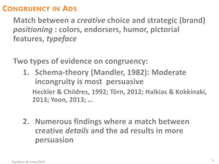


![PRETESTS; N = 20
• Fonts:
– Din = casual
– Counselor Script = luxurious
• Products/Advertisements
Water – low involvement product
– DasaniTM = casual
– IsklarTM = luxurious
Car tires – high involvement product
– KuhmoTM = luxurious
– PirelliTM = casual
[Changed Pirelli in Kuhmo to avoid prior associations]
10](https://image.slidesharecdn.com/emac2015-160224215107/85/Emac2015-typeface-smits-etal-10-320.jpg)
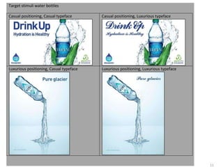


This document summarizes a study that investigated the effect of typeface congruency between advertisements and products on attitudes. The study presented advertisements for water bottles and car tires that used either a congruent or incongruent typeface based on if the product was portrayed as casual or luxurious. Results found that congruent typefaces led to more positive attitudes, higher brand credibility ratings, and higher expected prices compared to incongruent typefaces. The effect occurred for both low and high involvement products.


