Editing
•Download as PPTX, PDF•
0 likes•26 views
The document discusses design choices made to a magazine cover to make the title and text stand out more to readers. Effects were used to make the black title pop more and grab attention. A bubble effect was used around the main text to highlight it as the key point. Drop shadows on other text helped them stand out better against the background. A barcode was placed out of the way so it doesn't draw too much attention.
Report
Share
Report
Share

Recommended
Photoshop process
This document summarizes the Photoshop process used to design the front and contents pages of a magazine. Key steps included:
- Placing masthead, coverlines, barcode, and issue details on the front cover and editing using tools like color overlay and gradient.
- Creating a gradient background and adding graffiti-style textures to elements to give a 3D effect.
- Placing the main cover image and editing its hue and brightness to fit the color scheme and show detail.
- For the contents page, a brick wall texture was used as the background, page numbers and titles were given drop shadows, and images were edited and bordered.
Evaluation question how effective
The document discusses the effectiveness of combining a main product with ancillary texts. It notes that the poster, trailer, and magazine used consistent fonts, colors, and imagery to tie them together and represent the supernatural thriller genre. Blue and white were used throughout to symbolize evil. Both ancillary texts featured the two main characters to explore their journeys, as in the trailer. The combination of matching design elements across the products helps audiences connect them and promote the main product.
Kerrang
This document summarizes the design elements used on the front cover and contents pages of a Kerrang magazine. The front cover uses a black and white color scheme with artist photos in grayscale to fit the theme. Coverlines are in contrasting colors like yellow and red to draw attention. The contents pages continue the color blocking with quotes in vibrant colors to hook readers. Photos of popular artists are prominently featured throughout to appeal to readers and promote articles. Consistent branding elements like the logo and masthead maintain recognition across pages.
Editing My Cover Image For My Music Magazine
To edit a cover image for a music magazine, the author first opened the image file in an A4 layout. She then adjusted the brightness of the lighter model using hue and saturation tools. Next, she duplicated the background layer and applied a Gaussian blur filter of 1.2-3 pixels to the duplicate layer to blur the background and make the models stand out. Finally, she used the rubber tool to erase blurriness from the models while preserving the blurred background, and applied an overlay effect to merge background colors.
Image manip
The document provides steps for post-processing a photo to achieve a "golden hour" look. First, curves were used to balance tones and colors. Next, the gradient tool was used to reduce harsh lines. Then, airbrushing and the eye drop tool were used to touch up skin details. Areas with strong blemishes were covered using the patch tool. The puppet warp tool was used to enlarge key facial areas. A lens flare was added for drama. A black gradient on the bottom separated the models from the background. Finally, brightness was reduced and masked to bring back colors in the sky while keeping effects on the upper half.
Photoshop and InDesign skill
The document discusses various Photoshop and InDesign skills used to edit and design a magazine cover. These include using the magic wand and lasso tools to remove backgrounds, the channel mixer to manipulate color balance, spot healing brush to remove blemishes, burn tool to darken backgrounds, clone tool to cover up an unwanted necklace, and curves tool to edit colors. InDesign skills mentioned are adding drop shadows, bevel and emboss effects, directional feathering, adjusting opacity, and using clipping paths to remove backgrounds from images.
Photographs for magazine cover 4
The document discusses photographs for magazine cover 4. It appears to be related to a learning outcome labeled LO3, likely referring to a course or training program. Unfortunately there are no other details provided in the short document to include in the 3 sentence summary.
Photographs for magazine front cover 1 (lo3)
The magazine cover features a photograph of a smiling woman in a red dress standing in front of a white backdrop. She is holding a bouquet of flowers in one hand and her other hand is on her hip. In bold text above the woman it says "Spring Fashion: The Latest Trends for a New Season".
Editing
The document discusses design choices made for a magazine cover. Different effects, fonts, and placements were used to make elements like the title, cover lines, and barcode visually stand out. The main cover line was given a different font to indicate its higher importance, and effects like drop shadows were applied to the title to make it clearer for readers. Placement of the barcode away from other elements was meant to make the other content seem more prominent.
Photographs for magazine cover 1
The document discusses photographs for a magazine cover. It provides a brief label of "LO3" which may indicate the level of photographs or some other categorization. In 3 sentences or less, the summary captures the essential information that the document involves selecting photographs for a magazine cover.
Photographs for magazine cover 3
The document requests 3 photographs for a magazine cover. No other details are provided about the topic, theme, or style of photographs needed. The document is short and does not contain much contextual information to include in the summary.
Editing 2
The document discusses using various effects like outer shadow, stroke, and blending to make font and a masthead stand out against bright backgrounds on a cover page. Effects were applied at higher levels for the masthead compared to cover lines to ensure the text remained visible and the overall design looked more professional.
Editing
The document describes editing a magazine cover in Photoshop. The editor imported the image without distorting the pixels, then added text and effects to the title to blend it into the background. Cover lines were also given matching effects and fonts were varied to prevent everything looking the same, while ensuring the model's face remained visible.
Photographs for magazine cover 2
The document discusses photographs for the second magazine cover. It provides a code of LO3, which is likely related to the level of photographs or intended audience for the magazine. In a concise manner, the summary captures that the document involves selecting photos for a magazine cover and includes a relevant code.
Front cover creation
This 3 step process outlines how to create a front cover in Photoshop by first uploading an image, then using the text tool to add a masthead and main cover line along with any additional text to complete the front cover design.
Fashion spread outfit 1
The document discusses a fashion spread outfit. It appears to be a title or heading for an article or section about a specific outfit featured in a fashion spread or magazine. The outfit is the first one described or pictured in the spread.
Risk assessment lo2
This document contains risk assessments for potential hazards in various rooms and outdoor areas at Priestley College where photography may take place. In the photography room, the main hazards identified are the hot studio lights and the backdrop on the back wall. Controls in place include light switches located away from hot parts and the backdrop being taped to the floor. In the gym, fitness equipment and dumbbells pose trip/collision hazards, but controls such as spacing of equipment help mitigate risks. Wires on the floor of the music room and the piano pose trip hazards, but controls like wire placement and piano location in the corner help. Outside trees and slippery surfaces when raining are hazards, but ample walking space and ability to reschedule help control
Risk assessment (field)
A risk assessment was conducted for a photography shoot at Priestley College Field on December 22, 2016. Potential hazards identified included slippery grass if wet and spikey bushes that could cause cuts. Existing controls to reduce risk were concrete paths along the field and regularly maintained bushes. Further actions proposed were scheduling the shoot when the ground is dry and staying away from bush areas.
Photograph selection for magazine cover 3
This document discusses potential photographs for a magazine cover and analyzes each option. The photograph selected features a model with open and friendly body language making direct eye contact with the camera. Bright, even lighting allows all subjects to be clearly seen and creates a positive atmosphere. These qualities help viewers understand the magazine's genre and tone.
Photograph selection for magazine cover 2
The document discusses options for photographs to use on the cover of a magazine. It analyzes several photographs, noting that the best photos have good lighting that clearly shows all subjects, space for text on the cover, and directly engage the audience through eye contact or open body language to convey the magazine's genre and topic of music. The last photo is selected as it features all of these strong elements.
All gaming photographs
The document discusses the benefits of exercise for mental health. Regular physical activity can help reduce anxiety and depression and improve mood and cognitive functioning. Exercise causes chemical changes in the brain that may help protect against mental illness and improve symptoms.
Risk assessment radio room
This risk assessment form summarizes potential hazards in the radio room for a photoshoot. It identifies hazards such as movable chairs, loose cables, drinks near computers, bags, fires, doors, pipes, tables, and high objects. For each hazard, it lists who may be harmed, existing controls to reduce risk, and additional actions that can be taken to further reduce risk, such as enforcing rules and securing objects. The assessment was undertaken on December 22, 2016 by Ben Clarke to review safety in the radio room.
Model release form
Ben Clarke is given permission to use video recordings, sound recordings, and photographs of an individual between May 1, 2017 and September 1, 2017 for the media photography class or other college marketing, publicity, and electronic/printed publications. The material becomes the copyright of Priestley College and can be used alone or combined with other content. While future use can be stopped, recalling already published content is not possible.
Risk assessment p1.11
This risk assessment form evaluates potential hazards for a photoshoot at a location. It identifies hazards such as movable chairs, loose cables, drinks near computers, bags on the floor, potential fires, and the door. For each hazard, it lists who may be harmed, existing controls to reduce risk, and any additional actions that can be taken to further reduce risk, such as enforcing rules and making sure paths are clear. The form also provides a risk rating scale to evaluate the severity and likelihood of potential harms and determine what actions are required.
Chapter wise All Notes of First year Basic Civil Engineering.pptx
Chapter wise All Notes of First year Basic Civil Engineering
Syllabus
Chapter-1
Introduction to objective, scope and outcome the subject
Chapter 2
Introduction: Scope and Specialization of Civil Engineering, Role of civil Engineer in Society, Impact of infrastructural development on economy of country.
Chapter 3
Surveying: Object Principles & Types of Surveying; Site Plans, Plans & Maps; Scales & Unit of different Measurements.
Linear Measurements: Instruments used. Linear Measurement by Tape, Ranging out Survey Lines and overcoming Obstructions; Measurements on sloping ground; Tape corrections, conventional symbols. Angular Measurements: Instruments used; Introduction to Compass Surveying, Bearings and Longitude & Latitude of a Line, Introduction to total station.
Levelling: Instrument used Object of levelling, Methods of levelling in brief, and Contour maps.
Chapter 4
Buildings: Selection of site for Buildings, Layout of Building Plan, Types of buildings, Plinth area, carpet area, floor space index, Introduction to building byelaws, concept of sun light & ventilation. Components of Buildings & their functions, Basic concept of R.C.C., Introduction to types of foundation
Chapter 5
Transportation: Introduction to Transportation Engineering; Traffic and Road Safety: Types and Characteristics of Various Modes of Transportation; Various Road Traffic Signs, Causes of Accidents and Road Safety Measures.
Chapter 6
Environmental Engineering: Environmental Pollution, Environmental Acts and Regulations, Functional Concepts of Ecology, Basics of Species, Biodiversity, Ecosystem, Hydrological Cycle; Chemical Cycles: Carbon, Nitrogen & Phosphorus; Energy Flow in Ecosystems.
Water Pollution: Water Quality standards, Introduction to Treatment & Disposal of Waste Water. Reuse and Saving of Water, Rain Water Harvesting. Solid Waste Management: Classification of Solid Waste, Collection, Transportation and Disposal of Solid. Recycling of Solid Waste: Energy Recovery, Sanitary Landfill, On-Site Sanitation. Air & Noise Pollution: Primary and Secondary air pollutants, Harmful effects of Air Pollution, Control of Air Pollution. . Noise Pollution Harmful Effects of noise pollution, control of noise pollution, Global warming & Climate Change, Ozone depletion, Greenhouse effect
Text Books:
1. Palancharmy, Basic Civil Engineering, McGraw Hill publishers.
2. Satheesh Gopi, Basic Civil Engineering, Pearson Publishers.
3. Ketki Rangwala Dalal, Essentials of Civil Engineering, Charotar Publishing House.
4. BCP, Surveying volume 1
More Related Content
Viewers also liked
Editing
The document discusses design choices made for a magazine cover. Different effects, fonts, and placements were used to make elements like the title, cover lines, and barcode visually stand out. The main cover line was given a different font to indicate its higher importance, and effects like drop shadows were applied to the title to make it clearer for readers. Placement of the barcode away from other elements was meant to make the other content seem more prominent.
Photographs for magazine cover 1
The document discusses photographs for a magazine cover. It provides a brief label of "LO3" which may indicate the level of photographs or some other categorization. In 3 sentences or less, the summary captures the essential information that the document involves selecting photographs for a magazine cover.
Photographs for magazine cover 3
The document requests 3 photographs for a magazine cover. No other details are provided about the topic, theme, or style of photographs needed. The document is short and does not contain much contextual information to include in the summary.
Editing 2
The document discusses using various effects like outer shadow, stroke, and blending to make font and a masthead stand out against bright backgrounds on a cover page. Effects were applied at higher levels for the masthead compared to cover lines to ensure the text remained visible and the overall design looked more professional.
Editing
The document describes editing a magazine cover in Photoshop. The editor imported the image without distorting the pixels, then added text and effects to the title to blend it into the background. Cover lines were also given matching effects and fonts were varied to prevent everything looking the same, while ensuring the model's face remained visible.
Photographs for magazine cover 2
The document discusses photographs for the second magazine cover. It provides a code of LO3, which is likely related to the level of photographs or intended audience for the magazine. In a concise manner, the summary captures that the document involves selecting photos for a magazine cover and includes a relevant code.
Front cover creation
This 3 step process outlines how to create a front cover in Photoshop by first uploading an image, then using the text tool to add a masthead and main cover line along with any additional text to complete the front cover design.
Fashion spread outfit 1
The document discusses a fashion spread outfit. It appears to be a title or heading for an article or section about a specific outfit featured in a fashion spread or magazine. The outfit is the first one described or pictured in the spread.
Risk assessment lo2
This document contains risk assessments for potential hazards in various rooms and outdoor areas at Priestley College where photography may take place. In the photography room, the main hazards identified are the hot studio lights and the backdrop on the back wall. Controls in place include light switches located away from hot parts and the backdrop being taped to the floor. In the gym, fitness equipment and dumbbells pose trip/collision hazards, but controls such as spacing of equipment help mitigate risks. Wires on the floor of the music room and the piano pose trip hazards, but controls like wire placement and piano location in the corner help. Outside trees and slippery surfaces when raining are hazards, but ample walking space and ability to reschedule help control
Risk assessment (field)
A risk assessment was conducted for a photography shoot at Priestley College Field on December 22, 2016. Potential hazards identified included slippery grass if wet and spikey bushes that could cause cuts. Existing controls to reduce risk were concrete paths along the field and regularly maintained bushes. Further actions proposed were scheduling the shoot when the ground is dry and staying away from bush areas.
Photograph selection for magazine cover 3
This document discusses potential photographs for a magazine cover and analyzes each option. The photograph selected features a model with open and friendly body language making direct eye contact with the camera. Bright, even lighting allows all subjects to be clearly seen and creates a positive atmosphere. These qualities help viewers understand the magazine's genre and tone.
Photograph selection for magazine cover 2
The document discusses options for photographs to use on the cover of a magazine. It analyzes several photographs, noting that the best photos have good lighting that clearly shows all subjects, space for text on the cover, and directly engage the audience through eye contact or open body language to convey the magazine's genre and topic of music. The last photo is selected as it features all of these strong elements.
All gaming photographs
The document discusses the benefits of exercise for mental health. Regular physical activity can help reduce anxiety and depression and improve mood and cognitive functioning. Exercise causes chemical changes in the brain that may help protect against mental illness and improve symptoms.
Risk assessment radio room
This risk assessment form summarizes potential hazards in the radio room for a photoshoot. It identifies hazards such as movable chairs, loose cables, drinks near computers, bags, fires, doors, pipes, tables, and high objects. For each hazard, it lists who may be harmed, existing controls to reduce risk, and additional actions that can be taken to further reduce risk, such as enforcing rules and securing objects. The assessment was undertaken on December 22, 2016 by Ben Clarke to review safety in the radio room.
Model release form
Ben Clarke is given permission to use video recordings, sound recordings, and photographs of an individual between May 1, 2017 and September 1, 2017 for the media photography class or other college marketing, publicity, and electronic/printed publications. The material becomes the copyright of Priestley College and can be used alone or combined with other content. While future use can be stopped, recalling already published content is not possible.
Risk assessment p1.11
This risk assessment form evaluates potential hazards for a photoshoot at a location. It identifies hazards such as movable chairs, loose cables, drinks near computers, bags on the floor, potential fires, and the door. For each hazard, it lists who may be harmed, existing controls to reduce risk, and any additional actions that can be taken to further reduce risk, such as enforcing rules and making sure paths are clear. The form also provides a risk rating scale to evaluate the severity and likelihood of potential harms and determine what actions are required.
Viewers also liked (20)
Recently uploaded
Chapter wise All Notes of First year Basic Civil Engineering.pptx
Chapter wise All Notes of First year Basic Civil Engineering
Syllabus
Chapter-1
Introduction to objective, scope and outcome the subject
Chapter 2
Introduction: Scope and Specialization of Civil Engineering, Role of civil Engineer in Society, Impact of infrastructural development on economy of country.
Chapter 3
Surveying: Object Principles & Types of Surveying; Site Plans, Plans & Maps; Scales & Unit of different Measurements.
Linear Measurements: Instruments used. Linear Measurement by Tape, Ranging out Survey Lines and overcoming Obstructions; Measurements on sloping ground; Tape corrections, conventional symbols. Angular Measurements: Instruments used; Introduction to Compass Surveying, Bearings and Longitude & Latitude of a Line, Introduction to total station.
Levelling: Instrument used Object of levelling, Methods of levelling in brief, and Contour maps.
Chapter 4
Buildings: Selection of site for Buildings, Layout of Building Plan, Types of buildings, Plinth area, carpet area, floor space index, Introduction to building byelaws, concept of sun light & ventilation. Components of Buildings & their functions, Basic concept of R.C.C., Introduction to types of foundation
Chapter 5
Transportation: Introduction to Transportation Engineering; Traffic and Road Safety: Types and Characteristics of Various Modes of Transportation; Various Road Traffic Signs, Causes of Accidents and Road Safety Measures.
Chapter 6
Environmental Engineering: Environmental Pollution, Environmental Acts and Regulations, Functional Concepts of Ecology, Basics of Species, Biodiversity, Ecosystem, Hydrological Cycle; Chemical Cycles: Carbon, Nitrogen & Phosphorus; Energy Flow in Ecosystems.
Water Pollution: Water Quality standards, Introduction to Treatment & Disposal of Waste Water. Reuse and Saving of Water, Rain Water Harvesting. Solid Waste Management: Classification of Solid Waste, Collection, Transportation and Disposal of Solid. Recycling of Solid Waste: Energy Recovery, Sanitary Landfill, On-Site Sanitation. Air & Noise Pollution: Primary and Secondary air pollutants, Harmful effects of Air Pollution, Control of Air Pollution. . Noise Pollution Harmful Effects of noise pollution, control of noise pollution, Global warming & Climate Change, Ozone depletion, Greenhouse effect
Text Books:
1. Palancharmy, Basic Civil Engineering, McGraw Hill publishers.
2. Satheesh Gopi, Basic Civil Engineering, Pearson Publishers.
3. Ketki Rangwala Dalal, Essentials of Civil Engineering, Charotar Publishing House.
4. BCP, Surveying volume 1
RHEOLOGY Physical pharmaceutics-II notes for B.pharm 4th sem students
Physical pharmaceutics notes for B.pharm students
ANATOMY AND BIOMECHANICS OF HIP JOINT.pdf
it describes the bony anatomy including the femoral head , acetabulum, labrum . also discusses the capsule , ligaments . muscle that act on the hip joint and the range of motion are outlined. factors affecting hip joint stability and weight transmission through the joint are summarized.
The History of Stoke Newington Street Names
Presented at the Stoke Newington Literary Festival on 9th June 2024
www.StokeNewingtonHistory.com
How to Manage Your Lost Opportunities in Odoo 17 CRM
Odoo 17 CRM allows us to track why we lose sales opportunities with "Lost Reasons." This helps analyze our sales process and identify areas for improvement. Here's how to configure lost reasons in Odoo 17 CRM
Natural birth techniques - Mrs.Akanksha Trivedi Rama University
Natural birth techniques - Mrs.Akanksha Trivedi Rama UniversityAkanksha trivedi rama nursing college kanpur.
Natural birth techniques are various type such as/ water birth , alexender method, hypnosis, bradley method, lamaze method etcWalmart Business+ and Spark Good for Nonprofits.pdf
"Learn about all the ways Walmart supports nonprofit organizations.
You will hear from Liz Willett, the Head of Nonprofits, and hear about what Walmart is doing to help nonprofits, including Walmart Business and Spark Good. Walmart Business+ is a new offer for nonprofits that offers discounts and also streamlines nonprofits order and expense tracking, saving time and money.
The webinar may also give some examples on how nonprofits can best leverage Walmart Business+.
The event will cover the following::
Walmart Business + (https://business.walmart.com/plus) is a new shopping experience for nonprofits, schools, and local business customers that connects an exclusive online shopping experience to stores. Benefits include free delivery and shipping, a 'Spend Analytics” feature, special discounts, deals and tax-exempt shopping.
Special TechSoup offer for a free 180 days membership, and up to $150 in discounts on eligible orders.
Spark Good (walmart.com/sparkgood) is a charitable platform that enables nonprofits to receive donations directly from customers and associates.
Answers about how you can do more with Walmart!"
How to deliver Powerpoint Presentations.pptx
"How to make and deliver dynamic presentations by making it more interactive to captivate your audience attention"
BÀI TẬP BỔ TRỢ TIẾNG ANH LỚP 9 CẢ NĂM - GLOBAL SUCCESS - NĂM HỌC 2024-2025 - ...
BÀI TẬP BỔ TRỢ TIẾNG ANH LỚP 9 CẢ NĂM - GLOBAL SUCCESS - NĂM HỌC 2024-2025 - ...Nguyen Thanh Tu Collection
https://app.box.com/s/tacvl9ekroe9hqupdnjruiypvm9rdaneWound healing PPT
This document provides an overview of wound healing, its functions, stages, mechanisms, factors affecting it, and complications.
A wound is a break in the integrity of the skin or tissues, which may be associated with disruption of the structure and function.
Healing is the body’s response to injury in an attempt to restore normal structure and functions.
Healing can occur in two ways: Regeneration and Repair
There are 4 phases of wound healing: hemostasis, inflammation, proliferation, and remodeling. This document also describes the mechanism of wound healing. Factors that affect healing include infection, uncontrolled diabetes, poor nutrition, age, anemia, the presence of foreign bodies, etc.
Complications of wound healing like infection, hyperpigmentation of scar, contractures, and keloid formation.
How to Setup Warehouse & Location in Odoo 17 Inventory
In this slide, we'll explore how to set up warehouses and locations in Odoo 17 Inventory. This will help us manage our stock effectively, track inventory levels, and streamline warehouse operations.
What is Digital Literacy? A guest blog from Andy McLaughlin, University of Ab...
What is Digital Literacy? A guest blog from Andy McLaughlin, University of Aberdeen
Advanced Java[Extra Concepts, Not Difficult].docx
This is part 2 of my Java Learning Journey. This contains Hashing, ArrayList, LinkedList, Date and Time Classes, Calendar Class and more.
ISO/IEC 27001, ISO/IEC 42001, and GDPR: Best Practices for Implementation and...
Denis is a dynamic and results-driven Chief Information Officer (CIO) with a distinguished career spanning information systems analysis and technical project management. With a proven track record of spearheading the design and delivery of cutting-edge Information Management solutions, he has consistently elevated business operations, streamlined reporting functions, and maximized process efficiency.
Certified as an ISO/IEC 27001: Information Security Management Systems (ISMS) Lead Implementer, Data Protection Officer, and Cyber Risks Analyst, Denis brings a heightened focus on data security, privacy, and cyber resilience to every endeavor.
His expertise extends across a diverse spectrum of reporting, database, and web development applications, underpinned by an exceptional grasp of data storage and virtualization technologies. His proficiency in application testing, database administration, and data cleansing ensures seamless execution of complex projects.
What sets Denis apart is his comprehensive understanding of Business and Systems Analysis technologies, honed through involvement in all phases of the Software Development Lifecycle (SDLC). From meticulous requirements gathering to precise analysis, innovative design, rigorous development, thorough testing, and successful implementation, he has consistently delivered exceptional results.
Throughout his career, he has taken on multifaceted roles, from leading technical project management teams to owning solutions that drive operational excellence. His conscientious and proactive approach is unwavering, whether he is working independently or collaboratively within a team. His ability to connect with colleagues on a personal level underscores his commitment to fostering a harmonious and productive workplace environment.
Date: May 29, 2024
Tags: Information Security, ISO/IEC 27001, ISO/IEC 42001, Artificial Intelligence, GDPR
-------------------------------------------------------------------------------
Find out more about ISO training and certification services
Training: ISO/IEC 27001 Information Security Management System - EN | PECB
ISO/IEC 42001 Artificial Intelligence Management System - EN | PECB
General Data Protection Regulation (GDPR) - Training Courses - EN | PECB
Webinars: https://pecb.com/webinars
Article: https://pecb.com/article
-------------------------------------------------------------------------------
For more information about PECB:
Website: https://pecb.com/
LinkedIn: https://www.linkedin.com/company/pecb/
Facebook: https://www.facebook.com/PECBInternational/
Slideshare: http://www.slideshare.net/PECBCERTIFICATION
South African Journal of Science: Writing with integrity workshop (2024)
South African Journal of Science: Writing with integrity workshop (2024)Academy of Science of South Africa
A workshop hosted by the South African Journal of Science aimed at postgraduate students and early career researchers with little or no experience in writing and publishing journal articles.Recently uploaded (20)
Digital Artefact 1 - Tiny Home Environmental Design
Digital Artefact 1 - Tiny Home Environmental Design
Chapter wise All Notes of First year Basic Civil Engineering.pptx
Chapter wise All Notes of First year Basic Civil Engineering.pptx
RHEOLOGY Physical pharmaceutics-II notes for B.pharm 4th sem students
RHEOLOGY Physical pharmaceutics-II notes for B.pharm 4th sem students
How to Manage Your Lost Opportunities in Odoo 17 CRM
How to Manage Your Lost Opportunities in Odoo 17 CRM
Natural birth techniques - Mrs.Akanksha Trivedi Rama University
Natural birth techniques - Mrs.Akanksha Trivedi Rama University
Walmart Business+ and Spark Good for Nonprofits.pdf
Walmart Business+ and Spark Good for Nonprofits.pdf
BÀI TẬP BỔ TRỢ TIẾNG ANH LỚP 9 CẢ NĂM - GLOBAL SUCCESS - NĂM HỌC 2024-2025 - ...
BÀI TẬP BỔ TRỢ TIẾNG ANH LỚP 9 CẢ NĂM - GLOBAL SUCCESS - NĂM HỌC 2024-2025 - ...
How to Setup Warehouse & Location in Odoo 17 Inventory
How to Setup Warehouse & Location in Odoo 17 Inventory
What is Digital Literacy? A guest blog from Andy McLaughlin, University of Ab...
What is Digital Literacy? A guest blog from Andy McLaughlin, University of Ab...
ISO/IEC 27001, ISO/IEC 42001, and GDPR: Best Practices for Implementation and...
ISO/IEC 27001, ISO/IEC 42001, and GDPR: Best Practices for Implementation and...
South African Journal of Science: Writing with integrity workshop (2024)
South African Journal of Science: Writing with integrity workshop (2024)
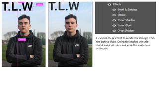
Editing
- 1. I used all these effect to create the change from the boring black. Doing this makes the title stand out a lot more and grab the audiences attention.
- 2. To make sure the main cover line is the main point I used the effect to create a bubble around. Doing this also makes sure you can see the text from the darkness of the models clothes. To make the other cover lines stand out more against the background I used a drop shadow as it made it blend out more. This is where I will add a barcode. Placing it here means that it is out of the way and means it isn’t drawing too much attention.