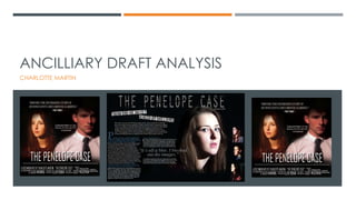
ANCILLIARY DRAFT ANALYSIS 
CHARLOTTE MARTIN
ADVERTISEMENT & DOUBLE PAGE SPREAD DRAFTS
PEER ANALYSIS / FEEDBACK 
Grade (A) 
I used different 
fonts and sizes 
which I aimed 
to achieve. I 
should make 
the ‘the real 
story’ bigger 
and more 
effective to add 
to the different 
font sizes and 
variations. 
I also need to 
finish the article 
and fill in the 
gaps at the 
Grade (B) 
I used different fonts 
and sizes, I should add 
the blue colour from 
my DPS into my article 
which I agree with. I 
used the blue to match 
Penelope’s eyes, this 
will be taken into 
consideration. 
Grade (B/A) 
I need to use different 
fonts to make the 
advert effective, 
instead of sticking with 
just one.
PEER ANALYSIS / FEEDBACK 
Grade (A) 
The image reflects 
the article and it 
looks professional! 
I need to fill the 
gap above the first 
image of the girl 
(Jess) on the right 
hand side. I will 
add a different 
section to the right 
hand side of the 
DPS. 
I need to pull the 
quote out a little 
more to be more 
effective and to 
Grade (B) 
My peer doesn’t like 
the font on the title 
and I agree. It’s 
taking me a long 
time to decide on a 
font that I think 
looks professional 
and effective, so I 
will take this on 
board and try to 
find a font that fits in 
with the theme and 
looks extremely 
effective.
PEER ANALYSIS / FEEDBACK 
Grade (A) 
Both these 
comments have 
no improvements, 
but they like the 
colour scheme, 
image and 
layout. I like my 
layout but I feel I 
need to make the 
colour scheme 
more evident and 
improve this 
slightly. 
Grade (A) 
Again, these 
comments say 
the advert looks 
professional, 
which of course I 
am aiming for. I 
feel as if to 
improve I need to 
add different 
fonts and add in 
the colour 
scheme more.
MY PERSONAL FEEDBACK 
 I feel as if my DPS and Advert need to be improved due to the colour scheme not 
being consistent throughout. Firstly, my DPS layout needs to be more structured and 
have the main parts standing out more (the image, enlarged quote and headline). 
 I want my advert to use a wider range of fonts and my colour scheme of blue to be 
adapted into this too. I am very happy with the image of the attacker on the right, 
but I want the image of Penelope to stand out a little more to balance out the 
tension in the advert itself. 
 This is my final draft and I will be making some more changes after the feedback I 
have received from my peers.

Draft

  • 1.
    ANCILLIARY DRAFT ANALYSIS CHARLOTTE MARTIN
  • 2.
    ADVERTISEMENT & DOUBLEPAGE SPREAD DRAFTS
  • 3.
    PEER ANALYSIS /FEEDBACK Grade (A) I used different fonts and sizes which I aimed to achieve. I should make the ‘the real story’ bigger and more effective to add to the different font sizes and variations. I also need to finish the article and fill in the gaps at the Grade (B) I used different fonts and sizes, I should add the blue colour from my DPS into my article which I agree with. I used the blue to match Penelope’s eyes, this will be taken into consideration. Grade (B/A) I need to use different fonts to make the advert effective, instead of sticking with just one.
  • 4.
    PEER ANALYSIS /FEEDBACK Grade (A) The image reflects the article and it looks professional! I need to fill the gap above the first image of the girl (Jess) on the right hand side. I will add a different section to the right hand side of the DPS. I need to pull the quote out a little more to be more effective and to Grade (B) My peer doesn’t like the font on the title and I agree. It’s taking me a long time to decide on a font that I think looks professional and effective, so I will take this on board and try to find a font that fits in with the theme and looks extremely effective.
  • 5.
    PEER ANALYSIS /FEEDBACK Grade (A) Both these comments have no improvements, but they like the colour scheme, image and layout. I like my layout but I feel I need to make the colour scheme more evident and improve this slightly. Grade (A) Again, these comments say the advert looks professional, which of course I am aiming for. I feel as if to improve I need to add different fonts and add in the colour scheme more.
  • 6.
    MY PERSONAL FEEDBACK  I feel as if my DPS and Advert need to be improved due to the colour scheme not being consistent throughout. Firstly, my DPS layout needs to be more structured and have the main parts standing out more (the image, enlarged quote and headline).  I want my advert to use a wider range of fonts and my colour scheme of blue to be adapted into this too. I am very happy with the image of the attacker on the right, but I want the image of Penelope to stand out a little more to balance out the tension in the advert itself.  This is my final draft and I will be making some more changes after the feedback I have received from my peers.