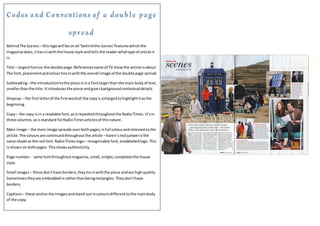
1. BehindThe Scenes – thislogowill be onall ‘behindthe scenes’featureswhichthe
magazine does,ittiesinwiththe house style andtellsthe readerwhattype of article it
is.
Title – largestfonton the double page.Referencesname of TV showthe article isabout.
The font,placementandcolourtiesinwiththe overall image of the double page spread.
Subheading–the introductiontothe piece isina fontlargerthan the main bodyof text,
smallerthanthe title.Itintroducesthe piece andgivesbackgroundcontextualdetails.
Dropcap – the firstletterof the firstwordof the copyis enlargedtohighlightitasthe
beginning.
Copy– the copy isin a readable font,asisrepeatedthroughoutthe RadioTimes. It’sin
three columns,asisstandard forRadioTimesarticlesof thisnature.
Main image – the main image spreadsoverbothpages,isfull colourandrelevanttothe
article.The coloursare continuedthroughoutthe article –Karen’sredjumperisthe
same shade as the red font.RadioTimes logo– recognisable font,establishedlogo.This
isshownon bothpages. Thisshowsauthenticity.
Page number- same fontthroughoutmagazine,small,simple,completesthe house
style.
Small images– these don’thave borders,theytie inwiththe piece andare highquality.
Sometimestheyare embeddedinratherthanbeingrectangles.Theydon’thave
borders.
Captions– these anchorthe imagesandstand out incoloursdifferenttothe mainbody
of the copy.