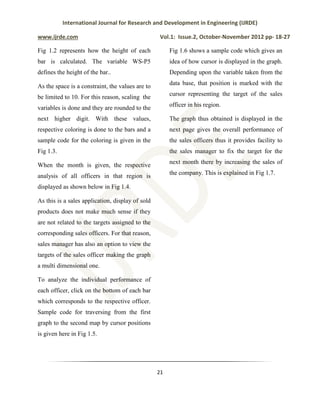
This document discusses implementing a dashboard in mainframes to analyze business data and sales performance. It describes creating a dashboard with two graphs - one showing sales performance of all officers in a region for a given month, and another showing individual performance of a selected officer. The graphs are dynamically updated from a database and use color coding and a cursor to indicate targets. Navigation between the graphs is enabled using drill-up and drill-down functions. The goal is to provide interactive data visualization to help managers track sales and improve business decisions.

![International Journal for Research and Development in Engineering (IJRDE)
www.ijrde.com Vol.1: Issue.2, October-November 2012 pp- 18-27
26
Fig 1.7: Individual performance of the sales officer
IV. CONCLUSION:
The application of this study is to help the
user perceive the nook and corner of his
transaction so that optimum usage of
resources can be done. In addition to this,
efficacious strategies can be implemented on
products which had resulted in loss to
enhance turn-over of the company. Hence a
better understanding of the company’s sales
and its revenue can be figured out.
REFERENCES :
[1] Alexis Leon, IBM Mainframe
Handbook.
[2] Murarch’s CICS for COBOL](https://image.slidesharecdn.com/644db3e5-e095-4ca4-9dea-e725946f0f5e-170226220153/85/docslide-us_ijrde-implementation-of-dashboard-in-mainframes-for-business-analysis-9-320.jpg)
![International Journal for Research and Development in Engineering (IJRDE)
www.ijrde.com Vol.1: Issue.2, October-November 2012 pp- 18-27
28
Programmer.
[3] Designing and programming CICS
application.
[4] Murarch’s CICS desk reference.
[5] Introduction to the new mainframe:
Z/OS Basics (An IBM red books
publication).
[6] David Lee , CICS Vs Online system
design and implementation techniques.
[7] Rownaque Nazneen, Shivani Jain,
Shashanko Aditya and Ravi Prakash
Sikariwal, Effective GUI implementation in
Mainframes – Windows based, International
Journal for Research and Development in
Engineering(IJRDE), 1(1), 2012, 4-11.
[8] Continuous guidance by our Technical
lead Mr. Robin Tommy, Tata Consultancy
Services.](https://image.slidesharecdn.com/644db3e5-e095-4ca4-9dea-e725946f0f5e-170226220153/85/docslide-us_ijrde-implementation-of-dashboard-in-mainframes-for-business-analysis-10-320.jpg)


![BB-_PPtt-1[1][1].pptx](https://cdn.slidesharecdn.com/ss_thumbnails/bb-pptt-111-230623135003-7e64c110-thumbnail.jpg?width=640&height=640&fit=bounds)


![Service_&_Commitment__Award[1]](https://cdn.slidesharecdn.com/ss_thumbnails/3dea2134-1a10-40d4-aa2d-e4ca214cd0b0-170226220748-thumbnail.jpg?width=640&height=640&fit=bounds)


