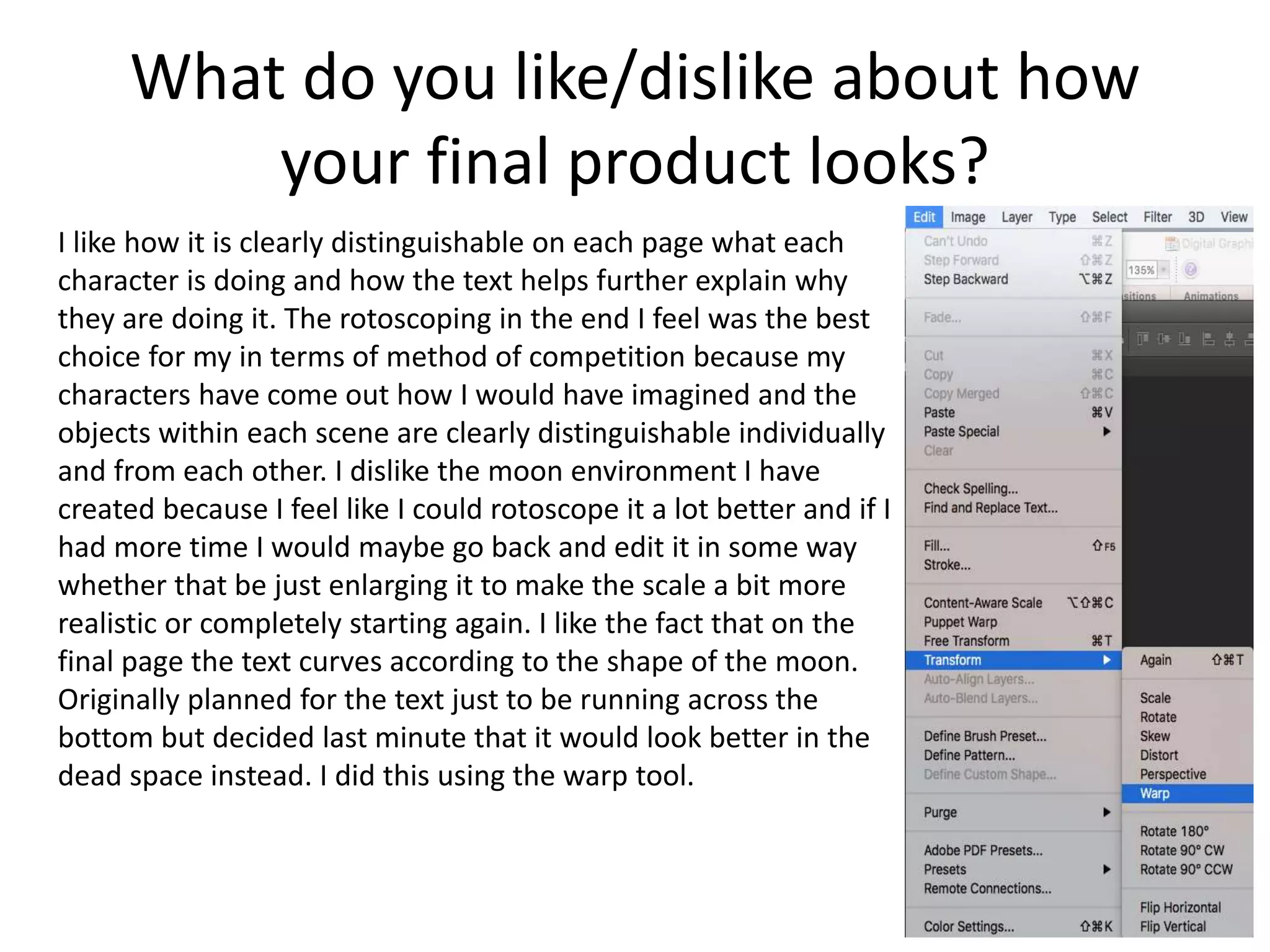
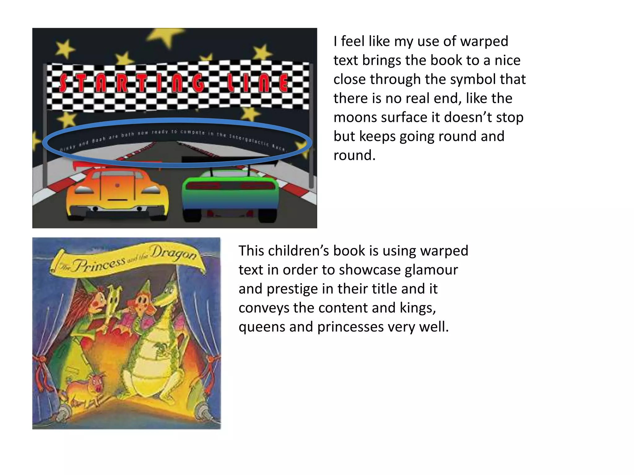
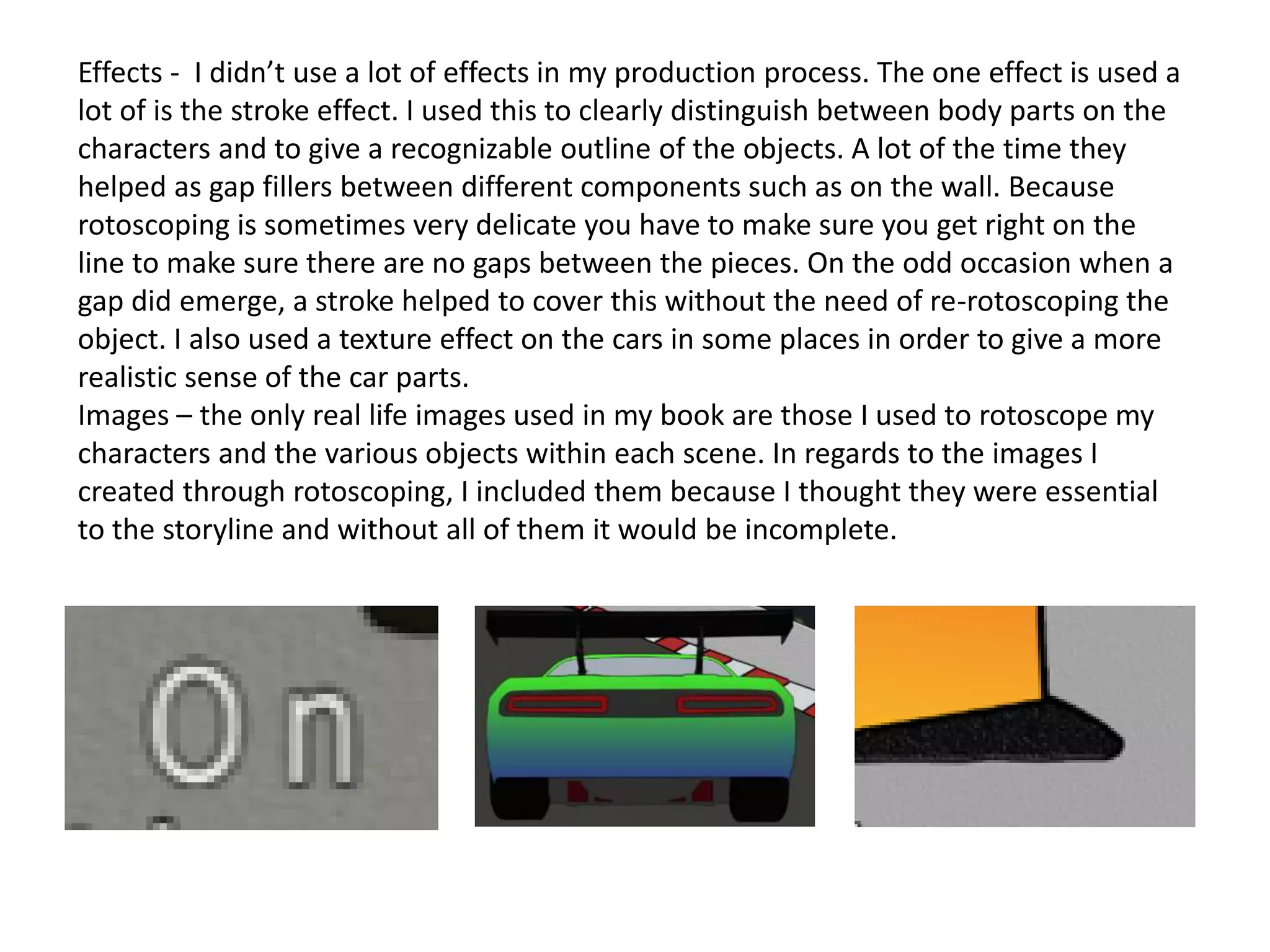
The student created a graphic narrative for children that tells a story about friendship and jealousy between animal characters. Their planning helped give direction to the project, but the final product differed from the plan in some ways, such as reducing the number of characters. The student used rotoscoping techniques to construct the images, which had strengths like characters looking as envisioned, but weaknesses like the repetitive nature of the process. Overall, the student feels the project is suitable for its intended early childhood audience and explores themes they can learn from.
A presentation which states questions for me to answer which lets me self evaluate my children's book. I have added multiple opinions to my answers including what i could improve and what i think is good about my work.
Read| The latest issue of The Challenger is here! We are thrilled to announce that our school paper has qualified for the NATIONAL SCHOOLS PRESS CONFERENCE (NSPC) 2024. Thank you for your unwavering support and trust. Dive into the stories that made us stand out!
Acetabularia Information For Class 9 .docxvaibhavrinwa19
Acetabularia acetabulum is a single-celled green alga that in its vegetative state is morphologically differentiated into a basal rhizoid and an axially elongated stalk, which bears whorls of branching hairs. The single diploid nucleus resides in the rhizoid.
Biological screening of herbal drugs: Introduction and Need for
Phyto-Pharmacological Screening, New Strategies for evaluating
Natural Products, In vitro evaluation techniques for Antioxidants, Antimicrobial and Anticancer drugs. In vivo evaluation techniques
for Anti-inflammatory, Antiulcer, Anticancer, Wound healing, Antidiabetic, Hepatoprotective, Cardio protective, Diuretics and
Antifertility, Toxicity studies as per OECD guidelines
2024.06.01 Introducing a competency framework for languag learning materials ...Sandy Millin
http://sandymillin.wordpress.com/iateflwebinar2024
Published classroom materials form the basis of syllabuses, drive teacher professional development, and have a potentially huge influence on learners, teachers and education systems. All teachers also create their own materials, whether a few sentences on a blackboard, a highly-structured fully-realised online course, or anything in between. Despite this, the knowledge and skills needed to create effective language learning materials are rarely part of teacher training, and are mostly learnt by trial and error.
Knowledge and skills frameworks, generally called competency frameworks, for ELT teachers, trainers and managers have existed for a few years now. However, until I created one for my MA dissertation, there wasn’t one drawing together what we need to know and do to be able to effectively produce language learning materials.
This webinar will introduce you to my framework, highlighting the key competencies I identified from my research. It will also show how anybody involved in language teaching (any language, not just English!), teacher training, managing schools or developing language learning materials can benefit from using the framework.
The Roman Empire A Historical Colossus.pdfkaushalkr1407
The Roman Empire, a vast and enduring power, stands as one of history's most remarkable civilizations, leaving an indelible imprint on the world. It emerged from the Roman Republic, transitioning into an imperial powerhouse under the leadership of Augustus Caesar in 27 BCE. This transformation marked the beginning of an era defined by unprecedented territorial expansion, architectural marvels, and profound cultural influence.
The empire's roots lie in the city of Rome, founded, according to legend, by Romulus in 753 BCE. Over centuries, Rome evolved from a small settlement to a formidable republic, characterized by a complex political system with elected officials and checks on power. However, internal strife, class conflicts, and military ambitions paved the way for the end of the Republic. Julius Caesar’s dictatorship and subsequent assassination in 44 BCE created a power vacuum, leading to a civil war. Octavian, later Augustus, emerged victorious, heralding the Roman Empire’s birth.
Under Augustus, the empire experienced the Pax Romana, a 200-year period of relative peace and stability. Augustus reformed the military, established efficient administrative systems, and initiated grand construction projects. The empire's borders expanded, encompassing territories from Britain to Egypt and from Spain to the Euphrates. Roman legions, renowned for their discipline and engineering prowess, secured and maintained these vast territories, building roads, fortifications, and cities that facilitated control and integration.
The Roman Empire’s society was hierarchical, with a rigid class system. At the top were the patricians, wealthy elites who held significant political power. Below them were the plebeians, free citizens with limited political influence, and the vast numbers of slaves who formed the backbone of the economy. The family unit was central, governed by the paterfamilias, the male head who held absolute authority.
Culturally, the Romans were eclectic, absorbing and adapting elements from the civilizations they encountered, particularly the Greeks. Roman art, literature, and philosophy reflected this synthesis, creating a rich cultural tapestry. Latin, the Roman language, became the lingua franca of the Western world, influencing numerous modern languages.
Roman architecture and engineering achievements were monumental. They perfected the arch, vault, and dome, constructing enduring structures like the Colosseum, Pantheon, and aqueducts. These engineering marvels not only showcased Roman ingenuity but also served practical purposes, from public entertainment to water supply.
Instructions for Submissions thorugh G- Classroom.pptxJheel Barad
This presentation provides a briefing on how to upload submissions and documents in Google Classroom. It was prepared as part of an orientation for new Sainik School in-service teacher trainees. As a training officer, my goal is to ensure that you are comfortable and proficient with this essential tool for managing assignments and fostering student engagement.
The French Revolution, which began in 1789, was a period of radical social and political upheaval in France. It marked the decline of absolute monarchies, the rise of secular and democratic republics, and the eventual rise of Napoleon Bonaparte. This revolutionary period is crucial in understanding the transition from feudalism to modernity in Europe.
For more information, visit-www.vavaclasses.com
Honest Reviews of Tim Han LMA Course Program.pptxtimhan337
Personal development courses are widely available today, with each one promising life-changing outcomes. Tim Han’s Life Mastery Achievers (LMA) Course has drawn a lot of interest. In addition to offering my frank assessment of Success Insider’s LMA Course, this piece examines the course’s effects via a variety of Tim Han LMA course reviews and Success Insider comments.
Welcome to TechSoup New Member Orientation and Q&A (May 2024).pdfTechSoup
In this webinar you will learn how your organization can access TechSoup's wide variety of product discount and donation programs. From hardware to software, we'll give you a tour of the tools available to help your nonprofit with productivity, collaboration, financial management, donor tracking, security, and more.
Introduction to AI for Nonprofits with Tapp NetworkTechSoup
Dive into the world of AI! Experts Jon Hill and Tareq Monaur will guide you through AI's role in enhancing nonprofit websites and basic marketing strategies, making it easy to understand and apply.
June 3, 2024 Anti-Semitism Letter Sent to MIT President Kornbluth and MIT Cor...Levi Shapiro
Letter from the Congress of the United States regarding Anti-Semitism sent June 3rd to MIT President Sally Kornbluth, MIT Corp Chair, Mark Gorenberg
Dear Dr. Kornbluth and Mr. Gorenberg,
The US House of Representatives is deeply concerned by ongoing and pervasive acts of antisemitic
harassment and intimidation at the Massachusetts Institute of Technology (MIT). Failing to act decisively to ensure a safe learning environment for all students would be a grave dereliction of your responsibilities as President of MIT and Chair of the MIT Corporation.
This Congress will not stand idly by and allow an environment hostile to Jewish students to persist. The House believes that your institution is in violation of Title VI of the Civil Rights Act, and the inability or
unwillingness to rectify this violation through action requires accountability.
Postsecondary education is a unique opportunity for students to learn and have their ideas and beliefs challenged. However, universities receiving hundreds of millions of federal funds annually have denied
students that opportunity and have been hijacked to become venues for the promotion of terrorism, antisemitic harassment and intimidation, unlawful encampments, and in some cases, assaults and riots.
The House of Representatives will not countenance the use of federal funds to indoctrinate students into hateful, antisemitic, anti-American supporters of terrorism. Investigations into campus antisemitism by the Committee on Education and the Workforce and the Committee on Ways and Means have been expanded into a Congress-wide probe across all relevant jurisdictions to address this national crisis. The undersigned Committees will conduct oversight into the use of federal funds at MIT and its learning environment under authorities granted to each Committee.
• The Committee on Education and the Workforce has been investigating your institution since December 7, 2023. The Committee has broad jurisdiction over postsecondary education, including its compliance with Title VI of the Civil Rights Act, campus safety concerns over disruptions to the learning environment, and the awarding of federal student aid under the Higher Education Act.
• The Committee on Oversight and Accountability is investigating the sources of funding and other support flowing to groups espousing pro-Hamas propaganda and engaged in antisemitic harassment and intimidation of students. The Committee on Oversight and Accountability is the principal oversight committee of the US House of Representatives and has broad authority to investigate “any matter” at “any time” under House Rule X.
• The Committee on Ways and Means has been investigating several universities since November 15, 2023, when the Committee held a hearing entitled From Ivory Towers to Dark Corners: Investigating the Nexus Between Antisemitism, Tax-Exempt Universities, and Terror Financing. The Committee followed the hearing with letters to those institutions on January 10, 202
Macroeconomics- Movie Location
This will be used as part of your Personal Professional Portfolio once graded.
Objective:
Prepare a presentation or a paper using research, basic comparative analysis, data organization and application of economic information. You will make an informed assessment of an economic climate outside of the United States to accomplish an entertainment industry objective.
2. Use this template to help you evaluate your project.
You should give specific details about your work.
You should provide both written and visual examples to explain your project.
You should find areas to praise in your work. Be specific about why you think they are
good or why you are proud of them.
You should also find areas that could be improved. Look for areas that you could make
better if you went back to them. Be specific about what you would improve.
Add additional slides as you need to. Don’t be restricted by what is here.
Any blank slides should be deleted before submission.
3. Does your final product reflect your
original intentions?
• Compare your planning/digital flat plans/
storyboards to your final product
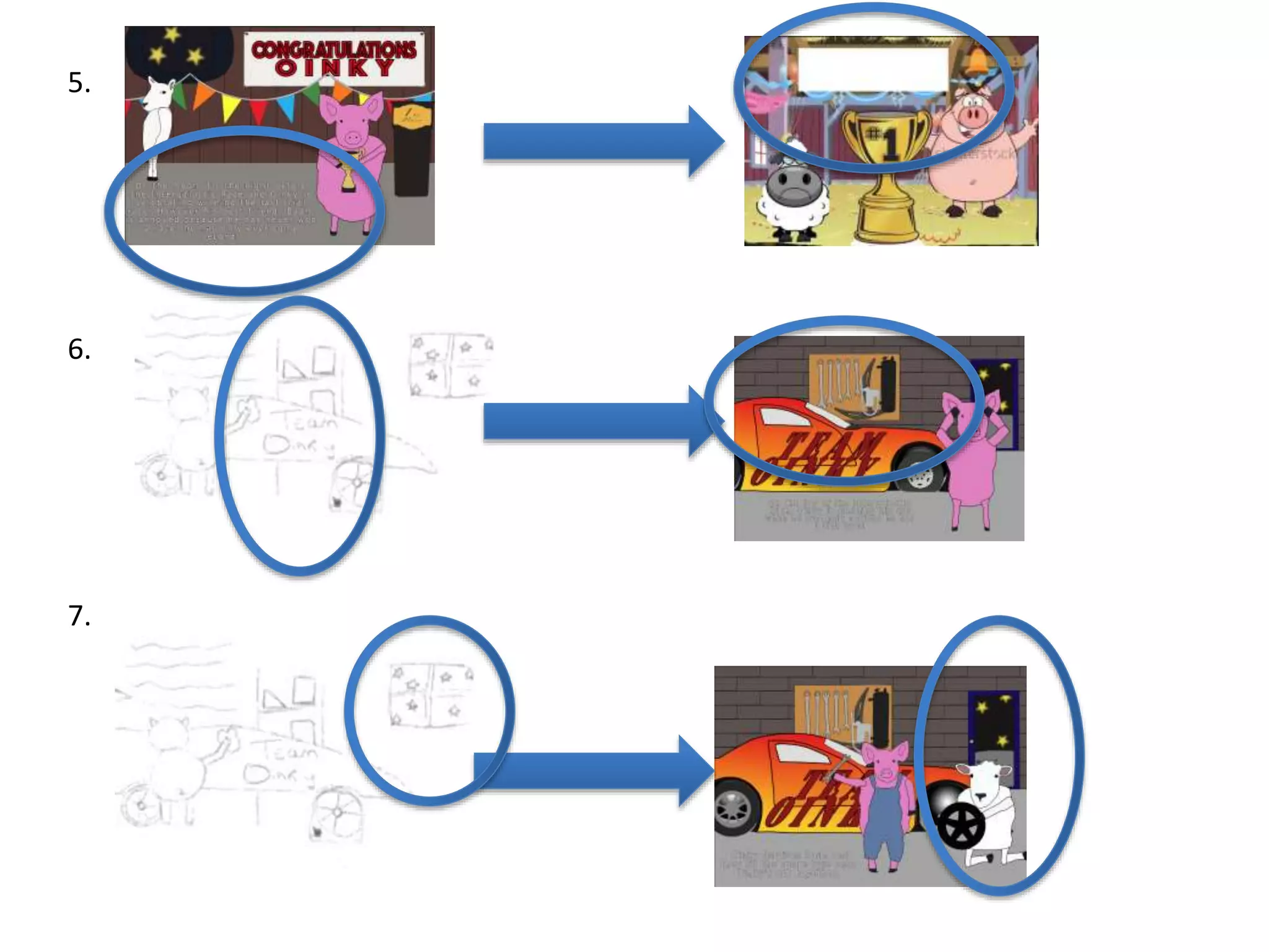
In many ways my final product does reflect my original intentions. This can be seen in the fact
that my final book’s main character was a pig which was seen in my illustration section of my
planning, my digital flat plans and my storyboards[1]. Another thing that has remained constant is
the setting, I always planned for the story to be set of the moon and this can be seen in my
narrative environment section and in the finished product [4].However, in many ways my final
product differs from my plan. One example of this is the reduction in the number of characters. I
originally planned for there to be 3 characters in my book but due to the unnecessary nature of
the 3rd character, he was was removed from the final product[2]. Another way my planning differs
from my finished product is in my illustration section, my character was seen as a superhero with
a layer, outfit etc. But in my final product my character was a racing driver [3]. Another thing that
has changed from my planning is the location of text on pages 1, 2, 3, 4, 6 and 8. This is seen in
both my hand-drawn and digital flat plans in comparison to my book [5]. However, considering
the additions of details on various scenes, the changes in location of text were necessary and
have worked out more visible and clearer to the reader. One more example of something that has
changed is in my hand-drawn flat plan, I have included a shelving unit in the back of pages 2 and
5. this was replaced by a tool rack on the wall as I felt that would represent a garage environment
better [6]. Another way in which my final product differs is the addition of the door into the
garage and the removal of the window [7]
6. How well have you constructed your
images?
• How well have you constructed your images? You could talk
about the overall visual appearance and well as the use of
texture and colour.
I feel I have constructed my images well for somebody who had previously no experience in the
subject of creating digital graphics. Improvements however could be made in regards to details to
characters such as details such as shadows and highlights to various orifices like ears. However, it
was difficult to sometimes create a character through my chosen method of rotoscoping because
it involves taking real life images and creating a character from that. Obviously pigs and sheep
don’t stand up in real life and so it made it harder to create the character standing up because
there wasn’t any original images to go off. In the creating process, I used colour overlays in order
to make a basic shade for the character to make it easily recognizable to the reader then used
strokes in order to define the different body parts e.g. arms, legs, face etc. For other objects such
as the cars I used gradient overlays between red and yellow and blue and green. For the moon I
used texture as well as a colour overlay in order to convey a rocky landscape and distinguish it
from the floor of the garage.
7. This was from a part of the car, the
gradient was set to radial in order to
try and convey the passage of light
through the car.
This was part of the main
character. The colour overlay was
constant throughout as was he
size of the stroke.
The left image is Oreo, a raccoon and the right image
is rocket who was a character in guardians of the
galaxy. Rocket was rotoscoped from Oreo. I feel like
this is obviously beyond my level of work but it shows
the extent of which rotoscoping can be used to create
animals.
This is Piggie from “We are in a Book”. It is a
children’s book from amazon. I believe the
pig to be illustrated but there are still
difference such as the lack of hooves and the
solid black eyes in this pig.
8. How well have you used text to anchor
your images
• You should talk about the combination of words, images and
text.
I feel that my images are well anchored, on pages 1 and 5 however there is considerably more
text than in others. I have done this for plot development only. If I were to change the amount of
text on these pages then the plot would not flow as well and it would not read as easily. All the
text is readable and in good positions according to what is happening in the specific image.
The comparison of amount of text between the first two images is very noticeable but at the
same time it does adequately describe what happens in the scene.
9. This is page 5 from “We are in
a Book” and you can see that
there is hardly any text on the
page and it is similar
throughout the book.
However, like my book, it does
describe what is going on in
the scene.
10. Is your product suitable for your
audience?
• Reference your proposal
• Give an audience profile and describe suitability in reference to content
In my proposal I stated that ideally my book would be targeted at 3-6 year olds with no specific
effort being made towards targeting a gender, class or race. I also stated that it would be targeted
in English speaking countries because it would be written in English and they would also
preferably having a early interest in space or racing to enhance their enjoyment of the story.
I feel like I have stuck to the specifications set out in my proposal with the content I have
produced. The book is written in English and in vocabulary I feel a 3-6 year old would understand.
The themes of friendship and jealousy are present but at that age it is important to learn of this
to better themselves in the future. The content in regards to racing and being set in space are
also present so anyone who is keen on those specific subjects not be disappointed.
11. It can clearly be seen that the story includes racing
cars set in space. My story also contains no material
that would be considered adult or likely to offend by
any culture, race, ethnic group or class.
This book is written for 4-8 years olds by Mark
Kelly. This is about a especially tiny mouse who
is chosen for a space mission over other
stronger mice. It contains similar warm-hearted
themes similar to the book that I have
produced. It shows how animals in space can
be a suitable theme for younger children.
12. What do you like/dislike about the
techniques you have used?
• Reference specific tools you used with images
I used the technique of rotoscoping to complete my book. This involved taking a real
life image from the internet, pasting it into a Photoshop document and then drawing
around it. To do this I used the polygonal lasso tool. I liked the fact that the technique
was quick and easy to learn and so I did not have to spend an extended amount of
time mastering the technique. For some parts of my book it was very easy to
rotoscope because there was no depth to the object e.g. the walls. However for things
that would take a lot of depth it was harder to rotoscope and such as the character. I
disliked how repetitive the technique because because in my book I had to spend a
considerable amount of time doing the same character in slightly different positions
and angles.
I wanted to make my characters anthropomorphic and so for the majority of my pages
I had my characters standing up. Since there were no pictures of animals standing on
the internet, I was forced to rotoscope a human body onto a pig head which turned
out alright for all intensive purposes but it meant that sometimes the body and the
13. rest didn't’t quite flow together in some places. This was partly my own fault as I could have
picked an easier storyline but I am happy overall with the finished product. I am also happy
about the ease of being able to drag and drop components between different Photoshop
windows as it saved me having to copy the same background again and again and
considering out of 8 pages, 6 have the same background it meant that it saved a lot of time
for my in the production process.
For the final page on the starting line banner I used a clipping mask because at that point I
was coming to the end of production and it would've taken too long to individually rotoscope
all the little rectangles and copy and paste them all.
14. What do you like/dislike about how
your final product looks?
I like how it is clearly distinguishable on each page what each
character is doing and how the text helps further explain why
they are doing it. The rotoscoping in the end I feel was the best
choice for my in terms of method of competition because my
characters have come out how I would have imagined and the
objects within each scene are clearly distinguishable individually
and from each other. I dislike the moon environment I have
created because I feel like I could rotoscope it a lot better and if I
had more time I would maybe go back and edit it in some way
whether that be just enlarging it to make the scale a bit more
realistic or completely starting again. I like the fact that on the
final page the text curves according to the shape of the moon.
Originally planned for the text just to be running across the
bottom but decided last minute that it would look better in the
dead space instead. I did this using the warp tool.
15. This children’s book is using warped
text in order to showcase glamour
and prestige in their title and it
conveys the content and kings,
queens and princesses very well.
I feel like my use of warped
text brings the book to a nice
close through the symbol that
there is no real end, like the
moons surface it doesn’t stop
but keeps going round and
round.
16. Why did you include the content you
used?
• Images, fonts, effects, colours
Font – I used the Verdana font in white because it was more readable against my
background. Black would not have been appropriate in the final scene with the text
appearing on a black background and it would have been inconsistent to have one
page with white text and the rest in black. It was for this reason I chose a white colour
and I also added on a slight black stroke of 3 to the font to make it stand out slightly
more and give the letters more structure.
Colours – I used a lot of basic recognizable colours in order to make them clear to my
audience. I used colour overlays the majority of the time for the characters and
backgrounds. The only places I used gradient overlays are for the cars. I used a yellow
to red and a green to blue gradient on the cars main body then a black to white
overlay on the lights and for the inside of the wheel arch. I did this to make the cars
look more attractive and cool to the audience.
17. Effects - I didn’t use a lot of effects in my production process. The one effect is used a
lot of is the stroke effect. I used this to clearly distinguish between body parts on the
characters and to give a recognizable outline of the objects. A lot of the time they
helped as gap fillers between different components such as on the wall. Because
rotoscoping is sometimes very delicate you have to make sure you get right on the
line to make sure there are no gaps between the pieces. On the odd occasion when a
gap did emerge, a stroke helped to cover this without the need of re-rotoscoping the
object. I also used a texture effect on the cars in some places in order to give a more
realistic sense of the car parts.
Images – the only real life images used in my book are those I used to rotoscope my
characters and the various objects within each scene. In regards to the images I
created through rotoscoping, I included them because I thought they were essential
to the storyline and without all of them it would be incomplete.
18. What signs, symbols or codes have
your used in your work?
• Choices of colour, style, locations, character design and
tone all give additional meaning to your work.
The colour of my characters has meaning. Baah, the villain, is coloured in
white not just because white is the natural colour of sheep but is a symbol
that he is used to getting what he wants and so is not gracious in defeat. It is
for this reason he resorts to stealing the tyre from Oinky. Oinky on the other
hand is pink, this conveys a soft character who is easily taken advantage of
and this eventually proves to be his downfall. These colours all form a basis
for racial prejudice and corresponding values.
The story is set on the moon, a place that you would think to be void of
prejudice but we still see that it is present. This shows that wherever you go
and whoever you’re with, prejudice still exists.
19. Another symbol that exists in my book is the spare tyre. This has
different meanings to different people e.g. characters in the book and
the reader. This is because to Oinky, the spare tyre represents a
destroyed friendship. To Baah, it represents an opportunity to finally
win a race and to the audience it symbolizes friendship between
characters.
20. Audience Responses
Cultural competence:
Media texts require us to have a certain level of cultural understanding to
be able to interpret them.
At a basic level, this could mean being able to read the language that a
magazine is written in.
At a deeper level, it means being able to interpret signs and symbols that
we use a visual shorthand to communicate ideas.
We recognise these signs in our own culture but find it harder to
understand when looking at others.
We create and attach meaning to signs and symbols in many different
forms.
20Creative Media Production 2012
21. Audience Responses
Cultural competence:
What is this?
This is a Norwegian Pine tree, covered in
snow and with a red ribbon on.
Our cultural understanding allows us to
interpret its meaning.
To us, in British society, it means
Christmas, presents and family.
This is because we share a cultural
knowledge.
21Creative Media Production 2012
22. Audience Responses
Cultural competence:
There are many other signs and symbols
that we attach meaning to.
A leather jacket can imply rebellion.
A sports car can imply wealth and power.
A cross can represent religion.
22Creative Media Production 2012
23. Audience Responses
Cultural competence:
Visual representations of everyday objects are often the same the world
over. A car appears as a car, no matter what country it appears in.
What that car means however, can be very different depending on your
cultural background.
23Creative Media Production 2012
24. What representations can be found in
your work?
• How are men, women or children shown in your work? Does
your work feature different ages, races, social groups or
religions? Does a lack of any variety of character types create
its own representation?
There are no genders, ages, races, social groups or religions in my book as my
characters are animals with no recognizable features that would point to a specific
gender. This I feel creates an unbiased representation as no clear li9nkscan be made
between my characters and specific groups within society.
25.
26. What style have you employed in your
products?
• Discuss influences/ existing products
• What visual style does your work have and
why did you choose it?
I used the story of the Tortoise and the Hare as a minor
influence because it involved a race, animals and a important
message and moral to be learned from it. This was important to
me when I was building a story because that age group (3 – 6),
sometimes have little concept of right and wrong and so it is
important to give that message early on in development.
I felt animals would be more playful in terms of in a child's mind
and would also assist slightly in education. The hungry caterpillar
assist in learning about the process of caterpillars turning into
butterfly’s and has proved to be exceptionally popular.
27.
28. What were the strengths and weaknesses
of the pre-production and planning
• How did the planning and research help
• How well did you manage your time
• Reference specific examples
Planning helped me construct an idea to which is could continuously edit throughout
the production process. It gave me direction and helped massively when serving as a
baseline from which I could then build upon. Research into other people’s work such
as the Tortoise and then Hare helped me gain an understanding as to the critical
points and a clear insight into what a children’s book need’s to include. If it wasn’t for
my research I might not have ended up with a story that had a clear message for
children of that age and the suitability may not have been where is should have been.
I feel like I managed my time very well.
29.
30. Historical and cultural context
• How does your work compare to what has
come before? What other similar products
have existed in the past? What current
products exist?
31.
32. Feedback 1
• What do you like about the graphics?
– I like your use of gradients in the cars and also how realistic they look. I especially like
the design of the cover and the layout of the heading and subheading, it looks really
professional.
• What would you do to develop the graphics?
– I think the white text on the light grey background could cause some readability issues
because there isn’t enough contrast.
33. Feedback 2
• What do you like about the graphics?
I feel you have shown good detail in your pages as well as a good use of the gradient
tool on the cars to give it a more realistic aspect. You have clearly thought through
what you wanted to create and have done it well, I also like how you’ve implemented
the text to go on the page as well as the graphics meaning there is no need for extra
pages just for text.
• What would you do to develop the graphics?
A point to improve could possibly be the font itself as it may be hard to read in grey on
top of a grey floor, also the background details like the car parts could possibly be in
more detail.
34. Feedback 3
• What do you like about the graphics?
I like the colours that you have used for your pages. I think they are bright and
eye catching for when people see them. I also think that the background of your
pages have a lot of detail so that you can tell where they are and get an idea of
where the text is coming from and understand what is happening in the story. I
think you’ve placed the font well on the page as well so that people can see and
read it.
• What would you do to develop the graphics?
But I would say that your font is a little hard to read but this could be due to
the font or the colour that you have chosen. I also think you could have added
a little but more detail in the cars. Overall I will admit the cars do look good
and the colours are nice and bright I just think you could have added just a
little bit of detail like shadows or things to make them really stand out on the
page due to how dark the backgrounds are. Also with your first one I think
your writing on the flag is a little hard to read this could be because the flag is
a little blurry or the colour you have used for it.
35. Peer Feedback
• Summarise peer feedback and discuss
– Responses you agree with
– Responses you disagree with
I agree with the responses that detailing on the car could be improved
and that in some instances that the text can be a little hard to read so I
will take those into consideration.
However, I disagree with the comment that said that there should be
more shadows because there are stars all around and so that amount of
light sources would cause multiple shadows meaning that it would be too
over the top and would distract from the main image.