Digipak feedback
•Download as PPTX, PDF•
0 likes•163 views
The document summarizes the design of a digipak for a music video. It notes that the bright colors catch the eye and are consistent with the corporate identity. The edited photos have an Instagram-like feel that links to the target audience. The cover photo and images from the video remind viewers and match the werewolf theme. Barcodes, QR codes and logos are positioned conventionally and maintain the consistent brand identity. The only noted improvement is making the front cover bolder.
Report
Share
Report
Share

Recommended
WeDesign_ Illustration Design
This slideshow is a collection of a few of the projects that we had done in the past. It was a collective effort of our team in creating and delivering the outputs as per the client brief.
We offer services in illustration designs for the graphic novels, comic illustrations, children's books and tales, illustrations for animation videos, infographics to name a few.
Get in touch:
Ipsha Barooah: ipsha@thewe-design.co.uk
Yash Garg: yash@thewe-design.co.uk
Billboard
This billboard advertisement promotes the television series premiere of "Beauty and the Beast" through careful typographic and design choices. The masthead is centered to draw the viewer's eye, and is layered to imply deeper meaning beyond the original Disney story. Multiple fonts are used to distinguish key information like the date and tagline "HOW BRAVE IS YOUR LOVE?". Gold text and the male character's eyes reference wealth and triumph central to the plot. Only three colors, two images, and minimal clutter allow the message to stand out clearly.
Website feedback
Kelsey Hyde provided feedback on a website. The background sunset image used on the website links to imagery in the band's music video and album packaging that depicts a nighttime werewolf theme. Comments noted that the repeated paper wolf images on each page tied into the band's overall branding. The website received praise for including a variety of content, good contact and social media links, merchandise sales, and integration of music tracks. However, some suggested replacing photos of the actual band with images from the music video and album to better align with the artistic vision.
Digipak vs Jewel pack
The document compares and contrasts the digipak and jewel pack packaging formats for CDs and DVDs. It discusses the aesthetics, target customers, ergonomics, environmental friendliness, size, function, materials used, and any social/moral issues for different albums/DVDs packaged in each format. The digipak is generally more environmentally friendly but less durable than the jewel pack, and its non-standard size can cause storage issues.
University of Minnesota Academic Health Center Web Theme Features
The document summarizes the features of the Harriet web theme used for Academic Health Center sites at the University of Minnesota. Key features include tabs for easy navigation between units, a customizable header, footer and navigation, a homepage slider, and over 30 layouts for different content types. Support resources and examples of live sites using the theme are available on the AHC Web Resource Hub.
Presentación1
The document discusses insights and hidden opportunities in retail stores. It notes that music is an important factor in making customers feel comfortable. The environment can influence buying decisions. One surprise was sellers intending to assist customers, making them feel confident and encouraging purchases. A hidden opportunity is that the cash register location is poor, wasting customers' time as they look for it.
Feedback for the website
Kelsey Hyde provided feedback on a website. The feedback discussed how the background sunset image used on the website linked to images used in the band's music video and album packaging, helping create cohesion. Comments noted how paper wolves featured throughout the website tied into the band's overall branding. The feedback concluded with some criticisms, including that images of the actual band should be replaced with images of them as depicted in the music video and album to maintain consistency.
2016-01 Lucene Solr spatial in 2015, NYC Meetup
This document discusses new features and approaches for Lucene/Solr spatial search in 2015. It summarizes new capabilities like heatmaps, GeoJSON support, and more accurate indexed geometries. It also covers new approaches like using dimensional values indexes for spatial data and a new GeoPointField. Some pending spatial TODOs are outlined, like JTS-free polygon support in Spatial4j and Geo3D point field adapters. The document concludes by providing contact information for the author to discuss Lucene/Solr guidance or custom development needs.
Populate your Search index, NEST 2016-01
This document discusses considerations for populating a search index. It covers topics like how to get data into the index, backups, scheduling and monitoring indexing, real-time search requirements, and common software used for crawlers and pipelines. Specific approaches are suggested for bulk indexing, incremental indexing, detecting deletes, and taking backups. The challenges of document transformations and mapping source data to search documents are also addressed. Open-source ETL software options like Clover ETL, Pentaho, and Talend are briefly summarized, with Talend and Apache NiFi receiving more detailed overviews.
Survey Results
Pop music is the most popular genre among respondents. The majority of respondents enjoy watching music videos and feel they influence the song, with over 90% wanting to see the artist featured in the video. Respondents also generally prefer videos that tell a story with multiple locations over a single location and enjoy humor but not excessive diegetic sound or videos longer than the song itself.
2014 11 lucene spatial temporal update
The document summarizes recent developments in spatial and temporal search capabilities in Apache Lucene and Solr. It describes new features like the FlexPrefixTree for more optimized spatial indexing, approaches for indexing and searching date ranges using numeric prefix trees, and upcoming work on spatial heatmaps and term auto-prefixing to improve search performance. The presentation was given by David Smiley, a Lucene/Solr committer and expert, to provide an overview of the latest improvements.
Afonso da maia
1) Afonso da Maia é descrito como um homem idoso, de estatura baixa e forte, com uma face larga e nariz aquilino. É visto como um símbolo do passado heróico de Portugal.
2) Na juventude, Afonso foi um liberal rebelde, mas na velhice tornou-se um homem sério, culto e caridoso, funcionando como sustento da família Maia.
3) A descoberta do incesto entre o neto e a sobrinha causa um grande desgosto em Afonso, que ac
Lucene/Solr spatial in 2015
An overview of spatial/geospatial developments on Lucene and Solr during 2015 (thru Oct). Presented at Lucene/Solr Revolution 2015 in Austin.
Solr: 4 big features
Four Big Features:
* Faceting
* Query auto-complete
* Geospatial
* Scaling
Presented at a Meetup in Boston, 11 March 2014.
Lucene 4 spatial
Covers the new Apache Lucene 4 spatial module. Includes Solr usage info. Applicable to ElasticSearch too.
Presented the 2012 Open Source Search in Government conference by Basis Technologies.
Surprise! Halloween is not a pagan festival after all
Halloween has Christian origins rather than pagan roots. It originated from the Catholic traditions of All Saints' Day on November 1st and All Souls' Day on November 2nd. Halloween's name comes from a contraction of "All Hallows' Eve," the evening before All Saints' Day. While the ancient Celts may have had festivals near this time, Halloween is actually a Christian holiday focused on remembering saints and praying for souls in purgatory. Modern Halloween traditions like wearing costumes and trick-or-treating have been adapted from pagan customs but now hold more innocent meanings within a Christian context.
Sermão de santo antónio aos peixes
O documento descreve o sermão "Sermão de Santo Antonio aos Peixes" pregado por Padre António Vieira. O sermão critica indiretamente os vícios dos colonos portugueses através de uma alegoria dirigida aos peixes. O Padre Vieira queixa-se que ninguém quer ouvir sua palavra, então decide pregar "aos peixes", tal como Santo António o fez, usando-o como exemplo de um pregador virtuoso e persistente.
Precursores del renacimiento, pintura renacimiento
Este documento presenta una lista cronológica de obras artísticas importantes del Renacimiento italiano y europeo, desde el siglo XIII hasta el siglo XVI. Incluye pinturas, esculturas y edificios de artistas como Cimabue, Giotto, Masaccio, Botticelli, Miguel Ángel, Rafael, Palladio y Cellini. Cubre movimientos como el proto-Renacimiento, el Renacimiento temprano y alto en Italia, y la expansión del Renacimiento por Europa.
The digipack product
The document discusses the design of a digipack album cover for a fictional indie band called Limerence. It analyzes how the design utilizes conventions from professional indie albums to appear professional. Key conventions included using muted colors associated with the indie folk genre, placing the band name prominently, featuring natural imagery, and selecting a simple yet stylish font. The document also compares the design to specific album covers and considers some minor improvements that could make the text more readable.
Evaluation Question 2
1. The document discusses maintaining consistency across promotional materials like album covers, music videos, and magazine ads through the use of similar fonts, colors, lighting, images, and environments.
2. It analyzes how bands like The Killers and Chase and Status achieve continuity recognition through signature fonts and consistent visual styles.
3. It describes how the student project incorporated these techniques to link a digipack, magazine cover, and music video by using the same fonts, desaturated colors, and imagery from the low-lit video scene.
Evaluation 2
1. The document discusses the importance of maintaining consistency across promotional materials like album covers, music videos, and magazine ads to create a unified brand identity.
2. It analyzes how several bands, like The Killers and Chase and Status, achieve consistency through similar fonts, colors, images, and lighting in their promotions.
3. It describes how the student incorporated these techniques seen in other bands' promotions into their own designs for a digipack and magazine ad to effectively promote a single and create continuity with the music video's theme and imagery.
Evaluation question 2
The document discusses how a band created cohesion across their main music product and ancillary texts like videos, packaging, and advertising. They established a clear "house style" using similar imagery of a playground, a black and white color filter, and themes of childhood innocence and death. Fonts, colors, and symbols of childhood destruction were carried over to link all parts together and make the brand identity easily recognizable to audiences. This cohesive strategy was intended to effectively market and promote the band's album.
Evaluation question 2
The document discusses how a band created coherence and brand identity across their various media products such as videos, packaging, and advertising. They established a house style using similar imagery of a playground, a black and white color filter, and linking themes of childhood and death. Typography and fonts were also kept consistent to reinforce the house style. Imagery from the music video was featured on both the album digipak and poster to create recognizability and draw audience attention.
Evaluation Activity 2
The document discusses how the continuity of branding across the main music video product and ancillary products like the digipak and poster strengthens their effectiveness. Key elements that link the products include consistent depictions of the band members' appearance, themes of feeling trapped in one's city that are portrayed in similar urban settings, and shot continuity between the ending shots of the music video and the front covers of the digipak and poster. The inside of the digipak also creates a sense of togetherness for the band members that is then juxtaposed with their loneliness in the music video. While some initial draft ideas for the ancillary products changed, the final versions complement the main video by summarizing its theme in an
Evaluation Question Two
The document discusses the effectiveness of combining a main product and ancillary texts in a promotional package. The main product is a music video for Queen's "Another One Bites the Dust" about rival gangsters. Images from the video are used on the digipak cover to visually link it. The digipak and magazine ad also share a color scheme and font to connect them. While each piece is differently designed, visual connections like recurring characters and styles ensure the package is cohesive rather than separate unrelated products.
Media evaluation – question 2
A brand image is developed over time through consistent advertising and themes to create an impression in consumers' minds. The document discusses how a band created a consistent brand image across their music products by keeping the same color theme, environment, and style in their album packaging, music video, and advertisements. This was done by shooting all materials in the same wilderness setting and keeping the color scheme, font, and visual style consistent throughout different elements to present a cohesive brand.
Evaluation question 2
The combination of the main music video product and ancillary texts like the Digipak and magazine advertisement is effective due to consistent visual elements. A graffiti image used at the beginning of the music video is also featured prominently in the Digipak and ad to connect the products. Font style and color are kept consistent between products to reinforce the band's logo and branding. Together these continuity elements create a recognizable style across all of the promotional materials.
More Related Content
Viewers also liked
Populate your Search index, NEST 2016-01
This document discusses considerations for populating a search index. It covers topics like how to get data into the index, backups, scheduling and monitoring indexing, real-time search requirements, and common software used for crawlers and pipelines. Specific approaches are suggested for bulk indexing, incremental indexing, detecting deletes, and taking backups. The challenges of document transformations and mapping source data to search documents are also addressed. Open-source ETL software options like Clover ETL, Pentaho, and Talend are briefly summarized, with Talend and Apache NiFi receiving more detailed overviews.
Survey Results
Pop music is the most popular genre among respondents. The majority of respondents enjoy watching music videos and feel they influence the song, with over 90% wanting to see the artist featured in the video. Respondents also generally prefer videos that tell a story with multiple locations over a single location and enjoy humor but not excessive diegetic sound or videos longer than the song itself.
2014 11 lucene spatial temporal update
The document summarizes recent developments in spatial and temporal search capabilities in Apache Lucene and Solr. It describes new features like the FlexPrefixTree for more optimized spatial indexing, approaches for indexing and searching date ranges using numeric prefix trees, and upcoming work on spatial heatmaps and term auto-prefixing to improve search performance. The presentation was given by David Smiley, a Lucene/Solr committer and expert, to provide an overview of the latest improvements.
Afonso da maia
1) Afonso da Maia é descrito como um homem idoso, de estatura baixa e forte, com uma face larga e nariz aquilino. É visto como um símbolo do passado heróico de Portugal.
2) Na juventude, Afonso foi um liberal rebelde, mas na velhice tornou-se um homem sério, culto e caridoso, funcionando como sustento da família Maia.
3) A descoberta do incesto entre o neto e a sobrinha causa um grande desgosto em Afonso, que ac
Lucene/Solr spatial in 2015
An overview of spatial/geospatial developments on Lucene and Solr during 2015 (thru Oct). Presented at Lucene/Solr Revolution 2015 in Austin.
Solr: 4 big features
Four Big Features:
* Faceting
* Query auto-complete
* Geospatial
* Scaling
Presented at a Meetup in Boston, 11 March 2014.
Lucene 4 spatial
Covers the new Apache Lucene 4 spatial module. Includes Solr usage info. Applicable to ElasticSearch too.
Presented the 2012 Open Source Search in Government conference by Basis Technologies.
Surprise! Halloween is not a pagan festival after all
Halloween has Christian origins rather than pagan roots. It originated from the Catholic traditions of All Saints' Day on November 1st and All Souls' Day on November 2nd. Halloween's name comes from a contraction of "All Hallows' Eve," the evening before All Saints' Day. While the ancient Celts may have had festivals near this time, Halloween is actually a Christian holiday focused on remembering saints and praying for souls in purgatory. Modern Halloween traditions like wearing costumes and trick-or-treating have been adapted from pagan customs but now hold more innocent meanings within a Christian context.
Sermão de santo antónio aos peixes
O documento descreve o sermão "Sermão de Santo Antonio aos Peixes" pregado por Padre António Vieira. O sermão critica indiretamente os vícios dos colonos portugueses através de uma alegoria dirigida aos peixes. O Padre Vieira queixa-se que ninguém quer ouvir sua palavra, então decide pregar "aos peixes", tal como Santo António o fez, usando-o como exemplo de um pregador virtuoso e persistente.
Precursores del renacimiento, pintura renacimiento
Este documento presenta una lista cronológica de obras artísticas importantes del Renacimiento italiano y europeo, desde el siglo XIII hasta el siglo XVI. Incluye pinturas, esculturas y edificios de artistas como Cimabue, Giotto, Masaccio, Botticelli, Miguel Ángel, Rafael, Palladio y Cellini. Cubre movimientos como el proto-Renacimiento, el Renacimiento temprano y alto en Italia, y la expansión del Renacimiento por Europa.
Viewers also liked (13)
Surprise! Halloween is not a pagan festival after all
Surprise! Halloween is not a pagan festival after all
Precursores del renacimiento, pintura renacimiento
Precursores del renacimiento, pintura renacimiento
Similar to Digipak feedback
The digipack product
The document discusses the design of a digipack album cover for a fictional indie band called Limerence. It analyzes how the design utilizes conventions from professional indie albums to appear professional. Key conventions included using muted colors associated with the indie folk genre, placing the band name prominently, featuring natural imagery, and selecting a simple yet stylish font. The document also compares the design to specific album covers and considers some minor improvements that could make the text more readable.
Evaluation Question 2
1. The document discusses maintaining consistency across promotional materials like album covers, music videos, and magazine ads through the use of similar fonts, colors, lighting, images, and environments.
2. It analyzes how bands like The Killers and Chase and Status achieve continuity recognition through signature fonts and consistent visual styles.
3. It describes how the student project incorporated these techniques to link a digipack, magazine cover, and music video by using the same fonts, desaturated colors, and imagery from the low-lit video scene.
Evaluation 2
1. The document discusses the importance of maintaining consistency across promotional materials like album covers, music videos, and magazine ads to create a unified brand identity.
2. It analyzes how several bands, like The Killers and Chase and Status, achieve consistency through similar fonts, colors, images, and lighting in their promotions.
3. It describes how the student incorporated these techniques seen in other bands' promotions into their own designs for a digipack and magazine ad to effectively promote a single and create continuity with the music video's theme and imagery.
Evaluation question 2
The document discusses how a band created cohesion across their main music product and ancillary texts like videos, packaging, and advertising. They established a clear "house style" using similar imagery of a playground, a black and white color filter, and themes of childhood innocence and death. Fonts, colors, and symbols of childhood destruction were carried over to link all parts together and make the brand identity easily recognizable to audiences. This cohesive strategy was intended to effectively market and promote the band's album.
Evaluation question 2
The document discusses how a band created coherence and brand identity across their various media products such as videos, packaging, and advertising. They established a house style using similar imagery of a playground, a black and white color filter, and linking themes of childhood and death. Typography and fonts were also kept consistent to reinforce the house style. Imagery from the music video was featured on both the album digipak and poster to create recognizability and draw audience attention.
Evaluation Activity 2
The document discusses how the continuity of branding across the main music video product and ancillary products like the digipak and poster strengthens their effectiveness. Key elements that link the products include consistent depictions of the band members' appearance, themes of feeling trapped in one's city that are portrayed in similar urban settings, and shot continuity between the ending shots of the music video and the front covers of the digipak and poster. The inside of the digipak also creates a sense of togetherness for the band members that is then juxtaposed with their loneliness in the music video. While some initial draft ideas for the ancillary products changed, the final versions complement the main video by summarizing its theme in an
Evaluation Question Two
The document discusses the effectiveness of combining a main product and ancillary texts in a promotional package. The main product is a music video for Queen's "Another One Bites the Dust" about rival gangsters. Images from the video are used on the digipak cover to visually link it. The digipak and magazine ad also share a color scheme and font to connect them. While each piece is differently designed, visual connections like recurring characters and styles ensure the package is cohesive rather than separate unrelated products.
Media evaluation – question 2
A brand image is developed over time through consistent advertising and themes to create an impression in consumers' minds. The document discusses how a band created a consistent brand image across their music products by keeping the same color theme, environment, and style in their album packaging, music video, and advertisements. This was done by shooting all materials in the same wilderness setting and keeping the color scheme, font, and visual style consistent throughout different elements to present a cohesive brand.
Evaluation question 2
The combination of the main music video product and ancillary texts like the Digipak and magazine advertisement is effective due to consistent visual elements. A graffiti image used at the beginning of the music video is also featured prominently in the Digipak and ad to connect the products. Font style and color are kept consistent between products to reinforce the band's logo and branding. Together these continuity elements create a recognizable style across all of the promotional materials.
Mag Ad designs
The combination of the main music video product and ancillary texts like the Digipak and magazine advertisement is effective due to consistent visual elements. A graffiti image used at the beginning of the music video is also featured prominently on both ancillary texts to connect all three products. Font style and color are kept consistent between products to reinforce the band's logo and branding. Together, the shared visuals and continuity of design across the different media create a recognizable style and strengthen the promotional campaign.
Question 2
Through using consistent fonts, colors, layouts, and imagery across its main product and ancillary texts, the band is able to create a recognizable uniform house style that helps establish its brand identity. Specifically, the band uses the same "Rage Italic" font for song/album titles and dark colors like black and white throughout to convey the dark, bleak atmosphere of the "Shadowplay" song and music video. Overlays are also used consistently as a motif to portray the torment of the main character. Settings and costumes are likewise kept consistent to maintain continuity across products.
Q2
The combination of the main product (music video) and ancillary texts (website and digipak) are highly effective in promoting the artist Barde. They use consistent visual elements like colors, fonts, and symbols to tie the products together and establish Barde's brand identity. The digipak and video showcase Barde's personality and style through fashion and creative visuals, while the simplified website provides information and links the products. Together, these multiple avenues allow audiences to explore and connect with Barde on different levels through music, visuals, and social media.
Media 2
The document discusses the design of a digipak created to promote a music video. Key elements were kept consistent between the digipak and video to create a recognizable brand, including using similar color schemes and imagery. Iconic images from the video, like a megaphone and dollar sign, were featured to connect the digipak content to themes in the video. Photos from the video were also included to introduce the artist in a personal way. The overall design was meant to effectively promote the music video and band through visual consistency that would appeal to the target audience.
Evaluation 2
The document discusses how the creator effectively combined their main video project with two ancillary texts, a digipack and poster. Key connections included using the same front cover image that reflected a scene in the video, identical red lipstick and style on all models, and matching fonts between pieces. The digipack interior was designed to represent the inner thoughts of the main model by using her face on the front and back covers. Scenes from the successful video were also replicated inside the digipack to strengthen the connection between the works.
A2 Media Evaluation Question 2
This is our A2 Media Evaluation for Question 2. "How effective is the combination of your Main Product and your Ancillary Task?"
Evaluation 2
The document discusses the connection between a main video product and two ancillary texts, a digipack and poster. It summarizes that the front cover image of the ancillary texts clearly connects to a scene in the video by showing three girls with identical looks. Throughout both the video and ancillary texts, the main model maintains a consistent rebellious style with provocative clothing and nudity. Red lipstick is used on all models in both pieces to unite them. The same font is used for all text to ensure consistency. The same striking front cover image is used on both the digipack and poster to make the product more memorable. Scenes from the video are featured inside the digipack to show a strong connection
A2 MEdia Evaluation Question 2
This is our A2 Media Evaluation for Question 2. "How effective is the combination of your Main Product and your Ancillary Task?"
Evaluation of Digipak Front Cover
The front cover of the digipak uses an iconic location from the music video to help promote the artist and portray his style. Using this rural forest location links the indie music genre to the product. Similarly, the front cover uses the same typography and fonts as the video to develop synergy between the products and give the artist a consistent "boy-next-door" image to appeal to their target audience. The front cover also features the artist holding a book prop that is significant in the video, helping people recognize the connection between the two works.
Media Evaluation Question 2
The document discusses how the main product (a music video) and ancillary task (a digipack) effectively combine symbolic elements and themes. A medallion symbol is used throughout both products to link characters and reinforce themes. Both products also share themes of war, isolation, and grief. Visual elements like costumes, color palette, shots, and typography are similarly executed to clearly connect the two pieces and ensure audiences understand they are meant to be experienced together. Maintaining codes and conventions from the main product allows the ancillary task to successfully promote and expand upon the core ideas.
Q2
The combination of a music video and three ancillary texts (magazine advert, digipak, record label) helped create a cohesive brand identity. The photo shoot for the advert and digipak took place in the same setting as the performance in the music video, linking the visual elements. Both were shot at night with construction lights to convey a message of overcoming challenges together. Identical settings and lighting made the texts instantly recognizable and reinforcing of each other. The band wore similar clothes and expressions in all pieces to further connect them.
Similar to Digipak feedback (20)
Recently uploaded
Introduction of Cybersecurity with OSS at Code Europe 2024
I develop the Ruby programming language, RubyGems, and Bundler, which are package managers for Ruby. Today, I will introduce how to enhance the security of your application using open-source software (OSS) examples from Ruby and RubyGems.
The first topic is CVE (Common Vulnerabilities and Exposures). I have published CVEs many times. But what exactly is a CVE? I'll provide a basic understanding of CVEs and explain how to detect and handle vulnerabilities in OSS.
Next, let's discuss package managers. Package managers play a critical role in the OSS ecosystem. I'll explain how to manage library dependencies in your application.
I'll share insights into how the Ruby and RubyGems core team works to keep our ecosystem safe. By the end of this talk, you'll have a better understanding of how to safeguard your code.
leewayhertz.com-AI in predictive maintenance Use cases technologies benefits ...
Predictive maintenance is a proactive approach that anticipates equipment failures before they happen. At the forefront of this innovative strategy is Artificial Intelligence (AI), which brings unprecedented precision and efficiency. AI in predictive maintenance is transforming industries by reducing downtime, minimizing costs, and enhancing productivity.
A Comprehensive Guide to DeFi Development Services in 2024
DeFi represents a paradigm shift in the financial industry. Instead of relying on traditional, centralized institutions like banks, DeFi leverages blockchain technology to create a decentralized network of financial services. This means that financial transactions can occur directly between parties, without intermediaries, using smart contracts on platforms like Ethereum.
In 2024, we are witnessing an explosion of new DeFi projects and protocols, each pushing the boundaries of what’s possible in finance.
In summary, DeFi in 2024 is not just a trend; it’s a revolution that democratizes finance, enhances security and transparency, and fosters continuous innovation. As we proceed through this presentation, we'll explore the various components and services of DeFi in detail, shedding light on how they are transforming the financial landscape.
At Intelisync, we specialize in providing comprehensive DeFi development services tailored to meet the unique needs of our clients. From smart contract development to dApp creation and security audits, we ensure that your DeFi project is built with innovation, security, and scalability in mind. Trust Intelisync to guide you through the intricate landscape of decentralized finance and unlock the full potential of blockchain technology.
Ready to take your DeFi project to the next level? Partner with Intelisync for expert DeFi development services today!
Fueling AI with Great Data with Airbyte Webinar
This talk will focus on how to collect data from a variety of sources, leveraging this data for RAG and other GenAI use cases, and finally charting your course to productionalization.
Programming Foundation Models with DSPy - Meetup Slides
Prompting language models is hard, while programming language models is easy. In this talk, I will discuss the state-of-the-art framework DSPy for programming foundation models with its powerful optimizers and runtime constraint system.
Nunit vs XUnit vs MSTest Differences Between These Unit Testing Frameworks.pdf
When it comes to unit testing in the .NET ecosystem, developers have a wide range of options available. Among the most popular choices are NUnit, XUnit, and MSTest. These unit testing frameworks provide essential tools and features to help ensure the quality and reliability of code. However, understanding the differences between these frameworks is crucial for selecting the most suitable one for your projects.
Skybuffer AI: Advanced Conversational and Generative AI Solution on SAP Busin...
Skybuffer AI, built on the robust SAP Business Technology Platform (SAP BTP), is the latest and most advanced version of our AI development, reaffirming our commitment to delivering top-tier AI solutions. Skybuffer AI harnesses all the innovative capabilities of the SAP BTP in the AI domain, from Conversational AI to cutting-edge Generative AI and Retrieval-Augmented Generation (RAG). It also helps SAP customers safeguard their investments into SAP Conversational AI and ensure a seamless, one-click transition to SAP Business AI.
With Skybuffer AI, various AI models can be integrated into a single communication channel such as Microsoft Teams. This integration empowers business users with insights drawn from SAP backend systems, enterprise documents, and the expansive knowledge of Generative AI. And the best part of it is that it is all managed through our intuitive no-code Action Server interface, requiring no extensive coding knowledge and making the advanced AI accessible to more users.
Best 20 SEO Techniques To Improve Website Visibility In SERP
Boost your website's visibility with proven SEO techniques! Our latest blog dives into essential strategies to enhance your online presence, increase traffic, and rank higher on search engines. From keyword optimization to quality content creation, learn how to make your site stand out in the crowded digital landscape. Discover actionable tips and expert insights to elevate your SEO game.
Skybuffer SAM4U tool for SAP license adoption
Manage and optimize your license adoption and consumption with SAM4U, an SAP free customer software asset management tool.
SAM4U, an SAP complimentary software asset management tool for customers, delivers a detailed and well-structured overview of license inventory and usage with a user-friendly interface. We offer a hosted, cost-effective, and performance-optimized SAM4U setup in the Skybuffer Cloud environment. You retain ownership of the system and data, while we manage the ABAP 7.58 infrastructure, ensuring fixed Total Cost of Ownership (TCO) and exceptional services through the SAP Fiori interface.
5th LF Energy Power Grid Model Meet-up Slides
5th Power Grid Model Meet-up
It is with great pleasure that we extend to you an invitation to the 5th Power Grid Model Meet-up, scheduled for 6th June 2024. This event will adopt a hybrid format, allowing participants to join us either through an online Mircosoft Teams session or in person at TU/e located at Den Dolech 2, Eindhoven, Netherlands. The meet-up will be hosted by Eindhoven University of Technology (TU/e), a research university specializing in engineering science & technology.
Power Grid Model
The global energy transition is placing new and unprecedented demands on Distribution System Operators (DSOs). Alongside upgrades to grid capacity, processes such as digitization, capacity optimization, and congestion management are becoming vital for delivering reliable services.
Power Grid Model is an open source project from Linux Foundation Energy and provides a calculation engine that is increasingly essential for DSOs. It offers a standards-based foundation enabling real-time power systems analysis, simulations of electrical power grids, and sophisticated what-if analysis. In addition, it enables in-depth studies and analysis of the electrical power grid’s behavior and performance. This comprehensive model incorporates essential factors such as power generation capacity, electrical losses, voltage levels, power flows, and system stability.
Power Grid Model is currently being applied in a wide variety of use cases, including grid planning, expansion, reliability, and congestion studies. It can also help in analyzing the impact of renewable energy integration, assessing the effects of disturbances or faults, and developing strategies for grid control and optimization.
What to expect
For the upcoming meetup we are organizing, we have an exciting lineup of activities planned:
-Insightful presentations covering two practical applications of the Power Grid Model.
-An update on the latest advancements in Power Grid -Model technology during the first and second quarters of 2024.
-An interactive brainstorming session to discuss and propose new feature requests.
-An opportunity to connect with fellow Power Grid Model enthusiasts and users.
Your One-Stop Shop for Python Success: Top 10 US Python Development Providers
Simplify your search for a reliable Python development partner! This list presents the top 10 trusted US providers offering comprehensive Python development services, ensuring your project's success from conception to completion.
HCL Notes and Domino License Cost Reduction in the World of DLAU
Webinar Recording: https://www.panagenda.com/webinars/hcl-notes-and-domino-license-cost-reduction-in-the-world-of-dlau/
The introduction of DLAU and the CCB & CCX licensing model caused quite a stir in the HCL community. As a Notes and Domino customer, you may have faced challenges with unexpected user counts and license costs. You probably have questions on how this new licensing approach works and how to benefit from it. Most importantly, you likely have budget constraints and want to save money where possible. Don’t worry, we can help with all of this!
We’ll show you how to fix common misconfigurations that cause higher-than-expected user counts, and how to identify accounts which you can deactivate to save money. There are also frequent patterns that can cause unnecessary cost, like using a person document instead of a mail-in for shared mailboxes. We’ll provide examples and solutions for those as well. And naturally we’ll explain the new licensing model.
Join HCL Ambassador Marc Thomas in this webinar with a special guest appearance from Franz Walder. It will give you the tools and know-how to stay on top of what is going on with Domino licensing. You will be able lower your cost through an optimized configuration and keep it low going forward.
These topics will be covered
- Reducing license cost by finding and fixing misconfigurations and superfluous accounts
- How do CCB and CCX licenses really work?
- Understanding the DLAU tool and how to best utilize it
- Tips for common problem areas, like team mailboxes, functional/test users, etc
- Practical examples and best practices to implement right away
Energy Efficient Video Encoding for Cloud and Edge Computing Instances
Energy Efficient Video Encoding for Cloud and Edge Computing Instances
dbms calicut university B. sc Cs 4th sem.pdf
Its a seminar ppt on database management system using sql
HCL Notes und Domino Lizenzkostenreduzierung in der Welt von DLAU
Webinar Recording: https://www.panagenda.com/webinars/hcl-notes-und-domino-lizenzkostenreduzierung-in-der-welt-von-dlau/
DLAU und die Lizenzen nach dem CCB- und CCX-Modell sind für viele in der HCL-Community seit letztem Jahr ein heißes Thema. Als Notes- oder Domino-Kunde haben Sie vielleicht mit unerwartet hohen Benutzerzahlen und Lizenzgebühren zu kämpfen. Sie fragen sich vielleicht, wie diese neue Art der Lizenzierung funktioniert und welchen Nutzen sie Ihnen bringt. Vor allem wollen Sie sicherlich Ihr Budget einhalten und Kosten sparen, wo immer möglich. Das verstehen wir und wir möchten Ihnen dabei helfen!
Wir erklären Ihnen, wie Sie häufige Konfigurationsprobleme lösen können, die dazu führen können, dass mehr Benutzer gezählt werden als nötig, und wie Sie überflüssige oder ungenutzte Konten identifizieren und entfernen können, um Geld zu sparen. Es gibt auch einige Ansätze, die zu unnötigen Ausgaben führen können, z. B. wenn ein Personendokument anstelle eines Mail-Ins für geteilte Mailboxen verwendet wird. Wir zeigen Ihnen solche Fälle und deren Lösungen. Und natürlich erklären wir Ihnen das neue Lizenzmodell.
Nehmen Sie an diesem Webinar teil, bei dem HCL-Ambassador Marc Thomas und Gastredner Franz Walder Ihnen diese neue Welt näherbringen. Es vermittelt Ihnen die Tools und das Know-how, um den Überblick zu bewahren. Sie werden in der Lage sein, Ihre Kosten durch eine optimierte Domino-Konfiguration zu reduzieren und auch in Zukunft gering zu halten.
Diese Themen werden behandelt
- Reduzierung der Lizenzkosten durch Auffinden und Beheben von Fehlkonfigurationen und überflüssigen Konten
- Wie funktionieren CCB- und CCX-Lizenzen wirklich?
- Verstehen des DLAU-Tools und wie man es am besten nutzt
- Tipps für häufige Problembereiche, wie z. B. Team-Postfächer, Funktions-/Testbenutzer usw.
- Praxisbeispiele und Best Practices zum sofortigen Umsetzen
Recently uploaded (20)
WeTestAthens: Postman's AI & Automation Techniques
WeTestAthens: Postman's AI & Automation Techniques
Introduction of Cybersecurity with OSS at Code Europe 2024
Introduction of Cybersecurity with OSS at Code Europe 2024
leewayhertz.com-AI in predictive maintenance Use cases technologies benefits ...
leewayhertz.com-AI in predictive maintenance Use cases technologies benefits ...
A Comprehensive Guide to DeFi Development Services in 2024
A Comprehensive Guide to DeFi Development Services in 2024
Deep Dive: Getting Funded with Jason Jason Lemkin Founder & CEO @ SaaStr
Deep Dive: Getting Funded with Jason Jason Lemkin Founder & CEO @ SaaStr
Programming Foundation Models with DSPy - Meetup Slides
Programming Foundation Models with DSPy - Meetup Slides
Nunit vs XUnit vs MSTest Differences Between These Unit Testing Frameworks.pdf
Nunit vs XUnit vs MSTest Differences Between These Unit Testing Frameworks.pdf
Skybuffer AI: Advanced Conversational and Generative AI Solution on SAP Busin...
Skybuffer AI: Advanced Conversational and Generative AI Solution on SAP Busin...
Best 20 SEO Techniques To Improve Website Visibility In SERP
Best 20 SEO Techniques To Improve Website Visibility In SERP
Overcoming the PLG Trap: Lessons from Canva's Head of Sales & Head of EMEA Da...
Overcoming the PLG Trap: Lessons from Canva's Head of Sales & Head of EMEA Da...
Deep Dive: AI-Powered Marketing to Get More Leads and Customers with HyperGro...
Deep Dive: AI-Powered Marketing to Get More Leads and Customers with HyperGro...
Your One-Stop Shop for Python Success: Top 10 US Python Development Providers
Your One-Stop Shop for Python Success: Top 10 US Python Development Providers
HCL Notes and Domino License Cost Reduction in the World of DLAU
HCL Notes and Domino License Cost Reduction in the World of DLAU
Energy Efficient Video Encoding for Cloud and Edge Computing Instances
Energy Efficient Video Encoding for Cloud and Edge Computing Instances
HCL Notes und Domino Lizenzkostenreduzierung in der Welt von DLAU
HCL Notes und Domino Lizenzkostenreduzierung in der Welt von DLAU
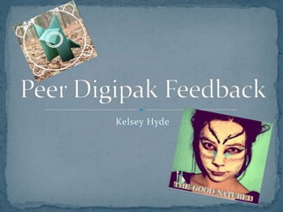
Digipak feedback
- 1. Kelsey Hyde
- 3. The bright and vibrant colours catch the eye. The different colours of the paper wolves fits with the corporate identity. Editing effect of the photos is all consistent, and almost has an “instagram” feel, which is modern and popular, and links us to our target audience. (Links to the smartphone app, “instagram”.) The cover photo is striking and enhanced by the coloured editing. Pastel colours
- 4. The images of the forest bring the audience back to the video and remind them of it. The sunset image links well to the website, and also matches the night-fall/ werewolf idea in the video. The actual images from were we actually shot the video is in instant reminder of it. The photographs look “very professional”, and “something that can actually be found in the market today.”
- 5. The bar code, QR scanner, record label details and logos on the back cover link well with the conventions of a digipak. In the right position that they are usually found (on the back cover at the bottom.) Logo is used clearly on every side, links to the brand identity. Fonts and colour schemes are consistent.
- 6. No spinal cover for the side of the digipak. The front cover “could have been brighter or bolder.”