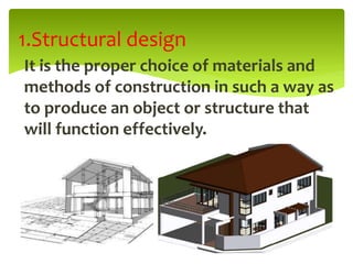
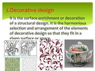
Designing is the process of planning and
creating a structure or ornament that will
serve its purpose and function.
Two types of design:
1.Structural design
2. Decorative design
DESIGNING
It is the proper choice of materials and
methods of construction in such a way as
to produce an object or structure that
will function effectively.
1.Structural design
It is the surface enrichment or decoration
of a structural design. It is the harmonious
selection and arrangement of the elements
of decorative design so that they fit in a
given surface or space.
2.Decorative design
1.Materials
2.Construction
3.Finish
4.Function
Elements of Structural design
1.Line
2.Form or Shape
3.Value
4.Texture
5.Color
Elements of decorative design
Line is imaginary but in design or in
the visual arts, a line is visible. It
maybe represented by a stroke of a
pencil or object that can trace the
latter.
LINE
Psychologists say that various lines have different effects on
human behavior.
1. Vertical lines- suggests strength, dignity or uprightness.
2.Horizontal lines- quietness and balance.
3.Inclined lines- instability, support, or action.
4.Regular curve lines- monotony and uniformity.
5.Irregular curve lines- feminity, grace or variety.
6.Heavy lines- boldness or nearness.
7.Light lines- distance, fineness, delicateness
8.Broken lines- disorder, power, as in the symbol of lightning.
LINE
Line joined end to end to produces a form.
Psychologists say that a square is not a good
structural shape but is a good decorative shape.
Most objects around us such as buildings, tables,
doors, and windows are rectangular in shape. A
circle suggests monotony, but unlike the square it
is a good structural shape.
FORM
Term sometimes called as shade, tone, notan, or
dark and light. It is the lightness and darkness of a
color of an object.
Black is the absence of light and white is its
presence.
The middle value of between black and white is
gray or neutrality.
The darkest value is low dark and the lightest
value is high light.
VALUE
Refers to the kind or quality of a surface. The
surface maybe fine or rough, hot or cold, hard or
soft rugged or smooth, shiny or dull.
In design texture can be represented by line-
shading technique.
Rough texture may suggests strength or poor
quality, while fine texture may suggests delicacy
or good quality.
TEXTURE
Among the elements of decorative design it is the most
interesting because of the quality of light.
Physicists tell us that color is seen when there is light. The
source of all light we have on earth except the dim light
from the stars and moon is the sun.
Light is composed of light waves of varying lenghts, each
length representing a color.
COLOR
Physiologists have found that we see color
when light waves entering the pupil of the
eye are focused by the eye lens on the retina.
In the retina cells called cones react when the
eye sees color, and the other cells called rods
react to dark and light or shades. From the
rods and cones the light image is then
transmitted to the brain through the optic
nerves and then the brain interprets what the
eye sees.
COLOR
Psychologists say that color affects our
emotions and feelings.
1.Blue- tiredness or melancholy
2.Red- courage, death, or fire
3. Yellow- cowardice, light or ripeness
4. Orange- ripeness and sweetness
5.green- jealousy, (green eyed monster) and
freshness
6. violet- royalty, reverence, or distance
COLOR
Primary colors
red, yellow and blue
Secondary colors
orange (red plus yellow)
green (blue plus yellow)
violet ( blue plus red)
Intermediate colors
yellow –green, yellow- orange, red- orange,
red violet, blue- green, and blue- violet.
COLOR
1.Hue- name of a color.
2.Intensity- the brightness or dullness of a
color.
3.Value- the darkness and or lightness of a
color.
Properties of color
1. Analogous or neighboring harmony- is the
combination of any colors neighboring or
adjacent on the color chart.
2.Complementary harmony- is the combination
of two opposite colors in the chart.
3.Double Complementary harmony- is the
combination of two adjacent colors and their
opposite colors on the color chart.
Color Combination or harmonies
ANALOGOUS HARMONY
COMPLEMENTARY HARMONY
DOUBLE COMPLEMENTARY HARMONY
4.Split Complementary- is the combination of
a primary or intermediate and the
colors adjacent to its opposite or
complement on the color chart.
5.Triadic harmony or simply triad- is the
combination of any three colors which
form an equilateral triangle on the
chart.
Color Combination or harmonies
SPLIT COMPLEMENTARY
TRIADIC HARMONY
1.Naturalistic design resembles an actual or
real object in shape and in color.
2.Conventional design has some resemblance
to the real object but some details are
omitted from it. The canal method is one
way to conventionalize a naturalistic
design.
Kinds of Decorative Design
NATURALISTIC DESIGN
CONVENTIONAL DESIGN
3.Geometrical design has a slight
resemblance to the real object, but
consists of geometrical shapes.
Another type of geometrical design is
that made like in cross- stitching on
course- woven cloth.
Kinds of Decorative Design
GEOMETRICAL DESIGN
4.Abstract design is not recognizable as
representing any known object. Such
design greatly differs in appearance from
any object. Easier to create than a
conventional or naturalistic design.
Kinds of Decorative Design
ABSTRACT DESIGN
 It focuses on the principles that regulate how
well a composition of lines and shapes
conveys the illusion of a three- dimensional
construction or spatial environment on a two
dimensional surface, be it a sheet of paper,
an illustration board or a computer monitor.
Rendering Tonal Values
While lines are essential to the task of
delineating contour and shape, there are also
quality of light, texture, mass, and space that
cannot be fully described by line alone. In
order to model the surfaces of forms an
convey a sense of light, we rely on the
rendering of tonal values.
Rendering Tonal Values
1.Hatching
Hatching consists of a series of more or less
parallel lines. The strokes maybe long or short,
mechanically ruled or drawn freehand and
executed with either a pen or a pencil on
smooth or rough paper. Another kind is cross-
hatching.
Basic Techniques for creating tonal
values
2. Scribbling
Scribbling is a shading technique that involves
drawing a network of random,
multidirectional lines. We can vary the shape,
density, and direction of the strokes to
achieve a wide range of tonal values, textures
and visual expressions.
Basic Techniques for creating tonal
values
3.Stippling
Stippling is a technique for shading by means
of a very fine dots. Applying stippling is a
slow and time- consuming procedure that
requires the utmost patience and care in
controlling the size and spacing of the dots.
The best results occur when using a fine-
tipped ink pen on a smooth drawing surface.
Basic Techniques for creating tonal
values
 Smudging means that you have to work less to
achieve shading. You simply put some graphite down
and then smear it to cover a larger area much more
quickly, thanks to the resulting blurred shadow.
Source. Browse our range of art pencils, pastels and
charcoals.
Smudging
 Another technique in shading is smudging or
smearing the graphite on the paper. You first
create your basic shading as talked about on
the previous page, then you take your finger
and smudge or smear the graphite of the
shading. The smudging of the shading will
blur the shading, make it less crisp.
4.Digital Tonal Value
2D drawing and 3D modeling programs usually
permit colors and tonal values to be selected
from a menu or palette and assigned to the
surfaces of forms. Image processing software
further allows the creation and application of
visual textures, some of which mimic the
traditional techniques.
Basic Techniques for creating tonal
values
DESIGNING.pptx

DESIGNING.pptx

  • 1.
    Designing is theprocess of planning and creating a structure or ornament that will serve its purpose and function. Two types of design: 1.Structural design 2. Decorative design DESIGNING
  • 2.
    It is theproper choice of materials and methods of construction in such a way as to produce an object or structure that will function effectively. 1.Structural design
  • 3.
    It is thesurface enrichment or decoration of a structural design. It is the harmonious selection and arrangement of the elements of decorative design so that they fit in a given surface or space. 2.Decorative design
  • 4.
  • 5.
  • 6.
    Line is imaginarybut in design or in the visual arts, a line is visible. It maybe represented by a stroke of a pencil or object that can trace the latter. LINE
  • 7.
    Psychologists say thatvarious lines have different effects on human behavior. 1. Vertical lines- suggests strength, dignity or uprightness. 2.Horizontal lines- quietness and balance. 3.Inclined lines- instability, support, or action. 4.Regular curve lines- monotony and uniformity. 5.Irregular curve lines- feminity, grace or variety. 6.Heavy lines- boldness or nearness. 7.Light lines- distance, fineness, delicateness 8.Broken lines- disorder, power, as in the symbol of lightning. LINE
  • 8.
    Line joined endto end to produces a form. Psychologists say that a square is not a good structural shape but is a good decorative shape. Most objects around us such as buildings, tables, doors, and windows are rectangular in shape. A circle suggests monotony, but unlike the square it is a good structural shape. FORM
  • 9.
    Term sometimes calledas shade, tone, notan, or dark and light. It is the lightness and darkness of a color of an object. Black is the absence of light and white is its presence. The middle value of between black and white is gray or neutrality. The darkest value is low dark and the lightest value is high light. VALUE
  • 11.
    Refers to thekind or quality of a surface. The surface maybe fine or rough, hot or cold, hard or soft rugged or smooth, shiny or dull. In design texture can be represented by line- shading technique. Rough texture may suggests strength or poor quality, while fine texture may suggests delicacy or good quality. TEXTURE
  • 13.
    Among the elementsof decorative design it is the most interesting because of the quality of light. Physicists tell us that color is seen when there is light. The source of all light we have on earth except the dim light from the stars and moon is the sun. Light is composed of light waves of varying lenghts, each length representing a color. COLOR
  • 15.
    Physiologists have foundthat we see color when light waves entering the pupil of the eye are focused by the eye lens on the retina. In the retina cells called cones react when the eye sees color, and the other cells called rods react to dark and light or shades. From the rods and cones the light image is then transmitted to the brain through the optic nerves and then the brain interprets what the eye sees. COLOR
  • 16.
    Psychologists say thatcolor affects our emotions and feelings. 1.Blue- tiredness or melancholy 2.Red- courage, death, or fire 3. Yellow- cowardice, light or ripeness 4. Orange- ripeness and sweetness 5.green- jealousy, (green eyed monster) and freshness 6. violet- royalty, reverence, or distance COLOR
  • 17.
    Primary colors red, yellowand blue Secondary colors orange (red plus yellow) green (blue plus yellow) violet ( blue plus red) Intermediate colors yellow –green, yellow- orange, red- orange, red violet, blue- green, and blue- violet. COLOR
  • 18.
    1.Hue- name ofa color. 2.Intensity- the brightness or dullness of a color. 3.Value- the darkness and or lightness of a color. Properties of color
  • 19.
    1. Analogous orneighboring harmony- is the combination of any colors neighboring or adjacent on the color chart. 2.Complementary harmony- is the combination of two opposite colors in the chart. 3.Double Complementary harmony- is the combination of two adjacent colors and their opposite colors on the color chart. Color Combination or harmonies
  • 21.
  • 22.
  • 23.
  • 24.
    4.Split Complementary- isthe combination of a primary or intermediate and the colors adjacent to its opposite or complement on the color chart. 5.Triadic harmony or simply triad- is the combination of any three colors which form an equilateral triangle on the chart. Color Combination or harmonies
  • 25.
  • 26.
  • 27.
    1.Naturalistic design resemblesan actual or real object in shape and in color. 2.Conventional design has some resemblance to the real object but some details are omitted from it. The canal method is one way to conventionalize a naturalistic design. Kinds of Decorative Design
  • 28.
  • 29.
  • 30.
    3.Geometrical design hasa slight resemblance to the real object, but consists of geometrical shapes. Another type of geometrical design is that made like in cross- stitching on course- woven cloth. Kinds of Decorative Design
  • 31.
  • 32.
    4.Abstract design isnot recognizable as representing any known object. Such design greatly differs in appearance from any object. Easier to create than a conventional or naturalistic design. Kinds of Decorative Design
  • 33.
  • 34.
     It focuseson the principles that regulate how well a composition of lines and shapes conveys the illusion of a three- dimensional construction or spatial environment on a two dimensional surface, be it a sheet of paper, an illustration board or a computer monitor. Rendering Tonal Values
  • 35.
    While lines areessential to the task of delineating contour and shape, there are also quality of light, texture, mass, and space that cannot be fully described by line alone. In order to model the surfaces of forms an convey a sense of light, we rely on the rendering of tonal values. Rendering Tonal Values
  • 36.
    1.Hatching Hatching consists ofa series of more or less parallel lines. The strokes maybe long or short, mechanically ruled or drawn freehand and executed with either a pen or a pencil on smooth or rough paper. Another kind is cross- hatching. Basic Techniques for creating tonal values
  • 38.
    2. Scribbling Scribbling isa shading technique that involves drawing a network of random, multidirectional lines. We can vary the shape, density, and direction of the strokes to achieve a wide range of tonal values, textures and visual expressions. Basic Techniques for creating tonal values
  • 40.
    3.Stippling Stippling is atechnique for shading by means of a very fine dots. Applying stippling is a slow and time- consuming procedure that requires the utmost patience and care in controlling the size and spacing of the dots. The best results occur when using a fine- tipped ink pen on a smooth drawing surface. Basic Techniques for creating tonal values
  • 42.
     Smudging meansthat you have to work less to achieve shading. You simply put some graphite down and then smear it to cover a larger area much more quickly, thanks to the resulting blurred shadow. Source. Browse our range of art pencils, pastels and charcoals. Smudging
  • 43.
     Another techniquein shading is smudging or smearing the graphite on the paper. You first create your basic shading as talked about on the previous page, then you take your finger and smudge or smear the graphite of the shading. The smudging of the shading will blur the shading, make it less crisp.
  • 45.
    4.Digital Tonal Value 2Ddrawing and 3D modeling programs usually permit colors and tonal values to be selected from a menu or palette and assigned to the surfaces of forms. Image processing software further allows the creation and application of visual textures, some of which mimic the traditional techniques. Basic Techniques for creating tonal values