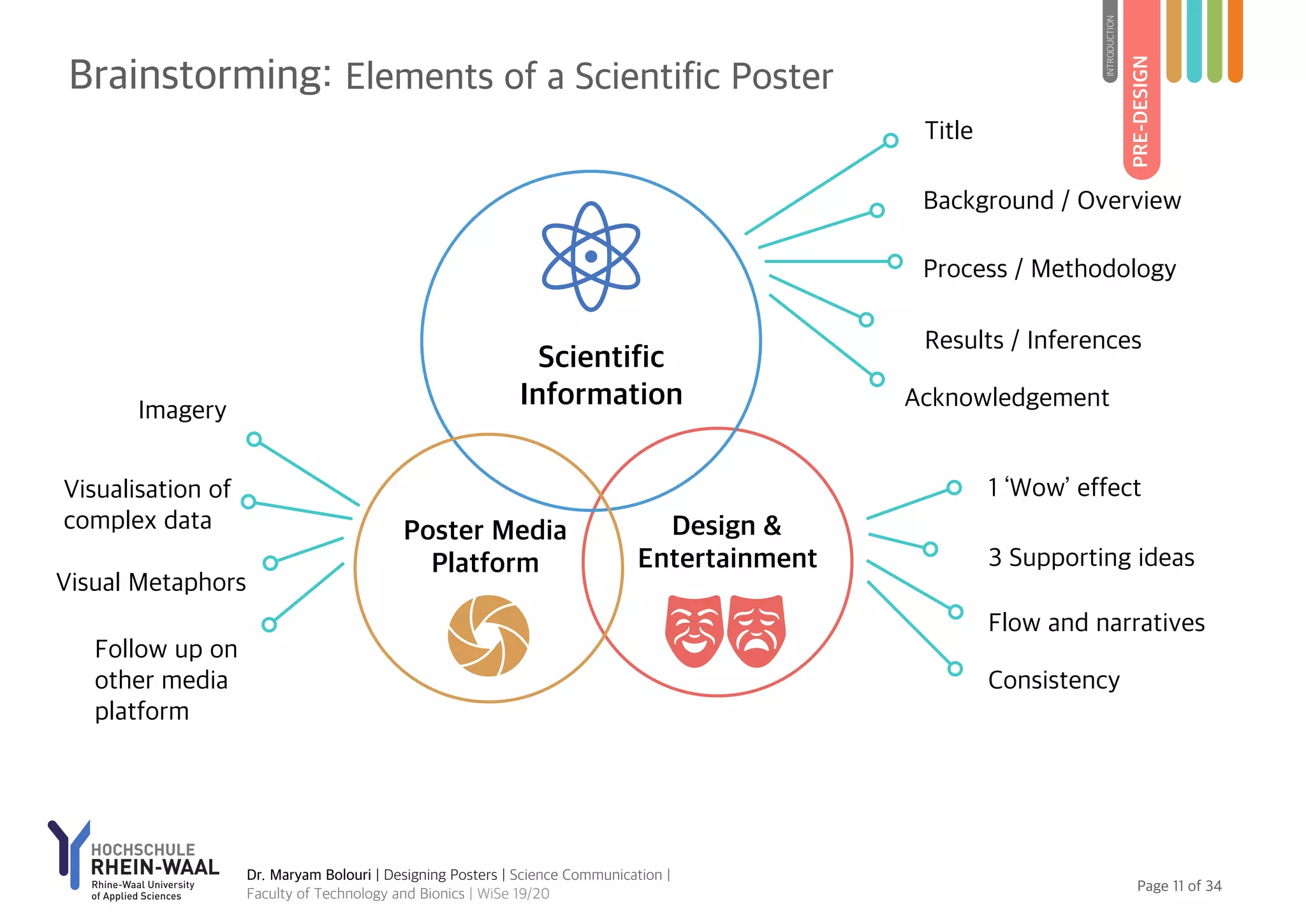
SlideShare a Scribd company logo
DESIGNING POSTERS
Strategies for Communicating
Scientific Projects
Dr. Maryam Bolouri
mbr@hsrw.eu (University)
maryam.bolouri@posteo.de (Private)
Faculty of Technology and Bionics
Page of1 34
1. Introduction
Definition of Concepts
Levels of Science Communication
2. Pre-Design: Planning the Poster
Learning from Paradigms in Design
Preparing Poster Concepts & Script
Elements of a Scientific Poster
3. Design Principles
Content and Context
Text and Typography
Composition and Layout
Visualisation and Imagery
Colour
4. Post-Design: Review & Print
Reviewing and Printing
Copyrights and Plagiarism
Media Platforms
5. Preparing a Scientific Poster: Basic Steps
6. Assessment Criteria
Contents
2019 Hochschule Rhein-Waal
Written, visualised, and designed by:
Maryam Bolouri
Lecture Date: 11.12.2019, 15:00 hrs, Cleve
Faculty of Technology and Bionics
Winter Semester 2019/20
For education purpose only. Please do not use slides,
contents and visualisations for commercial usage.
Poster Design
Strategies for Communicating Scientific Projects
INTRODUCTION
DESIGNING
POSTERS
Topic I
PhotoLicencebyPixabay
Page of3 34
Nexus of Science, Communication and Media Design
In the following text, we discuss the nexus of design,
science, media, communication and art and reexamine
their symbiosis for designing powerful scientific posters.
In ancient history, there are various evidences to
demonstrate the interconnections between art, culture
and science. The ancient wisdom are preserved in time
and are transmitted in spaces/places by using artistic and
human-centred communication systems. Some civilisation
used visuals while others used poetry. For instance, Omar
Khayyam, a Persian mathematician, astronomer and poet,
who lived during 11th century and is known for his
geometric algebra, wrote his mathematical teaching in
form of poetry.
During the modern history, specially after industrialisation,
a sharp conceptual distinction is made between the fields
of sciences, technology and engineering on the one hand,
and humanities, art, communication and cultural studies,
on the other hand. Today, we are witnessing a complex
interdisciplinary and intercultural network between these
fields. As rightly pointed out by Edward A. Shanken, the
sprout of these interrelationship has developed during
1960s. Considerably, the contemporary art influenced by
science and technology from ideas, methods, to tools and
images (see Shanken, 2002 & 2007).
Science Communication and Poster Design
We are witnessing a transformation in media culture and
communication systems globally. The media culture is
expanding towards visualisation of various spheres of life
and activities. And systems of visual communication and
media design platforms are changing rapidly. Poster
design, in general, is not a new communication practice in
history. With the sophistication and excessiveness of
information today, however, designing poster demands
thoughtful decisions and intelligible processes of design.
Designing a scientific poster is not only presentation and
visualisation of research results and data, but also is an
interactive installation to creatively, cognitively and
scientifically engage people.
The aim of this lecture e-notes is to compile strategies,
techniques and tools, which can be used in designing a
powerful visual posters for communicating scientific
projects. These strategies should be seen as a source of
inspiration rather than universal rules. The visual culture is
in course of metamorphosis.
INTRODUCTION
Introductory Remarks
Dr. Maryam Bolouri | Designing Posters | Science Communication |
Faculty of Technology and Bionics | WiSe 19/20
Colour in Science
Timeline of ‘all issues of
Popular Science magazine
from the beginning of
publication in 1872 to
1922’, without colour and
design. Source: Huber,
Zepel, & Manovich (2010)
Page of4 34
Dr. Maryam Bolouri | Designing Posters | Science Communication |
Faculty of Technology and Bionics | WiSe 19/20
Definition of Concepts
INTRODUCTION
*These definition are simplified for this presentation. For complex research usage please refer to your discipline
(e.g. information may be defined differently in science and informatics)
Page of5 34
What is Communication?
In the modern history, the concept of communication is
defined in different ways. The influential model is the
‘Mathematical Theory of Communication’ developed by
Claud E. Shanon during 1948 in the Bell Laboratory and
introduced to humanities by Warren Weaver. This theory
reduces the communication into a system of information
and it is essentially message-oriented model (see Bolouri,
2019).
During the expansion of the communication studies, many
theories from social science and anthropology, among
others, have been introduced to the field. These theories
highlighted communication as ‘a social function’, ’social
construction’, constituting social reality, or shaping
civilisation (see for example Raymond Williams, Harold
Innis, etc.).
The contemporary theories define communication not
merely as transmission of information, but as a process of
(re)constructing meaning. Accordingly, communication is a
dynamic and organic process of meaning-making. The
context, situations, settings, forms of mediation, inter alia,
can influence the constitution of reality and experience of
life (see Littlejohn & Foss, 2008).
From Intra-personal to Global communication
Communication may take place in various levels (see
McQuail, 2005).
✦ Intra-personal (e.g. cognition, ideation, creation,
expression of meaning at individual level)
✦ Inter-personal (e.g. the process of meaning-making
between two or more people)
✦ Intra-group (e.g. family)
✦ Intergroup or Association (e.g. community)
✦ Institutional or Organisational (e.g. business firm)
✦ Society-Wide or Public (e.g. national level)
✦ Global (e.g. intercultural and international level)
INTRODUCTION
Levels of Communication
Further Readings
Littlejohn, S. W. (2002).
Theories of Human
Communication. India:
Wadsworth.
‘We live in communication just
like fish live in water, wrapped
in but unconscious of
communication [processes] as
much as fish are unaware of
water’ (Hsia, 1988: p. 8).
Dr. Maryam Bolouri | Designing Posters | Science Communication |
Faculty of Technology and Bionics | WiSe 19/20
Intra-
Personal
Inter-Personal
Intra-Group
Inter-Group / Association
Institutional / Organisational
Society-Wide / Public
Global
Levels of Communication
Page of6 34
INTRODUCTION
Dr. Maryam Bolouri | Designing Posters | Science Communication |
Faculty of Technology and Bionics | WiSe 19/20
Levels of Communication
Page of7 34
INTRODUCTION
Dr. Maryam Bolouri | Designing Posters | Science Communication |
Faculty of Technology and Bionics | WiSe 19/20
Levels of Science Communication
PRE-DESIGN
PLANNINGTHE
POSTER
Topic II
Poster Design
Strategies for Communicating Scientific Projects
PhotoLicencebyPixabay
Page of9 34
PRE-DESIGN
INTRODUCTION
Design paradigms
There are two levels of design, which are involved here.
One is the actual design of your project (which is a
product design) and, the second, the poster design (which
is a media design). Here the major focus is on media
design.
There are various paradigms in design in general. What is a
paradigm? How can we learn from design paradigms? A
paradigm gives us a system of values and enables us to
make a judgment about particular design.
Form follows function
This designing principle is attributed to Lois Sullivan from
“Art and Crafts” movements during 1886 (Hammer, 2008:
p. 28). This paradigm gave value to functionality rather
than form. This is basically a functionalism approach in
design, which was glorified during the Bauhaus and the
Ulm School of design during 50s and 60s (p. 28).
In today’s context, can we rely on a functional poster? You
can design a functional poster, but not essentially an
efficient one.
Form follow emotion
The second paradigm is considered as a response to the
dominance of functionalism in design practices. The
emphasis was on emotional effects and aesthetics values
rather than the cause and effect relationship between
function and form.
Can we rely on aesthetically pleasant poster? A scientific
poster is not only a beautiful design but also
communicating meaning. A poster can simplify the
complex research projects.
Form follow form (cognition)
Bolz, In his book, Band-Design-Manifest des 21.
Jahrhunderts (2006) argued for a paradigm-shift in design
after “form follow function” and “form follow
emotions” (Hammer, 2008: p. 29). This idea was
influenced by the self-organisation of the nature (p. 29).
This paradigm-shift in design is cognitive-oriented. An
effective scientific poster uses the laws of perception in
design.
Learning From Paradigms in Design
Dr. Maryam Bolouri | Designing Posters | Science Communication |
Faculty of Technology and Bionics | WiSe 19/20
Page of10 34
PRE-DESIGN
INTRODUCTION
Dr. Maryam Bolouri | Designing Posters | Science Communication |
Faculty of Technology and Bionics | WiSe 19/20
The Language of Poster Vs. Research Article?
A poster is a space-based, non-linear medium, while the
research article is a linear and time-based medium. People
may decide how to get involved with your research results
presented on a poster. But, their gaze can be directed by
the information flow and visual narrative structure.
Central Narrative
Brainstorm the central narrative in your group. Decide
how to visualise your research story and results in a
meaningful way to other people. Visual narrative is the art
of building a bounding and comprehensive structure. It
would be discouraging for a viewer to search for data and
connecting meaningless information together. Designing a
poster is not merely a research report, but a cognitive and
comprehensive knowledge transfer. Decide on the
information flow and think of a clear structure which can
support it.
One “aha” moment!
It is important to communicate one central ‘wow’ effect /
‘aha’ moment to the viewer. Choose the major character
of your research and build the story around it. Use
another three supporting argument to back the central
discussion. Do not use too many details or wide-range of
concepts to communicate.
Time-based vs. Space-based Medium
Preparing a Poster: Concept and Script
Page of11 34
Scientific
Information
Design &
Entertainment
Poster Media
Platform
1 ‘Wow’ effect
Background / Overview
Process / Methodology
Results / Inferences
Follow up on
other media
platform
Imagery
Flow and narratives
Consistency
3 Supporting ideas
Visualisation of
complex data
Visual Metaphors
Title
PRE-DESIGN
INTRODUCTION
Dr. Maryam Bolouri | Designing Posters | Science Communication |
Faculty of Technology and Bionics | WiSe 19/20
Brainstorming: Elements of a Scientific Poster
Acknowledgement
Page of12 34
Topic III
Poster Design
Strategies for Communicating Scientific Projects
DESIGN
PRINCIPLES
PhotoLicencebyPixabay
Page of13 34
Dr. Maryam Bolouri | Designing Posters | Science Communication |
Faculty of Technology and Bionics | WiSe 19/20
DESIGNPRINCIPLES
INTRODUCTION
PRE-DESIGN
Major Elements in Design
Page of14 34
DESIGNPRINCIPLES
INTRODUCTION
PRE-DESIGN
Dr. Maryam Bolouri | Designing Posters | Science Communication |
Faculty of Technology and Bionics | WiSe 19/20
Poster Title
Choose a simple and creative title to attract people. Avoid
long sentence in the title.
Content Structure
Be aware of the visual nature of a poster. The content
serves as a part of the visual design. Avoid too many text
and write down only a gist of ideas. Summarise longer
sentences and build small paragraphs if required. Use
bullet points or subtitles to communicate important
information. Brainstorm in your group how to visualise
complex processes and complex data instead of writing.
Language
Know who your audience are. Choose simple and
uncluttered language to communicate sophisticated
research problems and results. Choose words and
sentences very consciously and be aware of word usage.
Mind your style and remain consistence if you choose
certain voices/tones. Remove unnecessary information.
• Simplicity: Think clearly and use simple language to
express your ideas. Avoid unnecessary words and
insignificant construction.
• Avoid Clutter: Avoid unnecessary structure in your
narration. Avoid redundant adverbs, adjectives or
prepositions (e.g. tall skyscraper, order up)
• Words and Usage: The usage of the word should be
appropriate and grammatically correct. Be attentive to
the interdisciplinary usage of the words.
• Continuity: Make sure to use appropriate connectors to
build logical relationships between sentences.
• Unity: The unity maintain the order subconsciously
demanded by the reader. Be aware of the unity of
tense, pronoun, tone, voice, British vs. American
English, goal, narrator, etc.
Context
Be aware of the context of your research. Identify the
nature of your research project and the potential readers
of your poster. The context can help you to set clear
design strategies. For instance, a poster for a scientific
project in the area of solar energy, which aims to target
particular group, may demand (semi-)realistic visualisation
with a naturalistic colour composition rather than visual
comics with a factious colour palette.
Content and Context
‘People will rarely spend
more than a minute or two
viewing a poster. Too much
text will communicate less
information, not more –
viewers will switch off if they
see excessive reading matter’
(Odling-Smee, 2013: p. 7).
Page of15 34
Dr. Maryam Bolouri | Designing Posters | Science Communication |
Faculty of Technology and Bionics | WiSe 19/20
DESIGNPRINCIPLES
INTRODUCTION
PRE-DESIGN
Summary: Content and Context
Page of16 34
DESIGNPRINCIPLES
INTRODUCTION
PRE-DESIGN
Dr. Maryam Bolouri | Designing Posters | Science Communication |
Faculty of Technology and Bionics | WiSe 19/20
Typography Matters
Typography functions as a mediator of information, which
influence attention, emotions, semantic reception and
optical perception (Hammer, 2008: p. 207). Typography is
a powerful expression tool in designing posters. The
aesthetic and effects of typography may vary based on
context, culture and the target group.
Typeface (fonts)
For scientific topics use San Serif fonts (Helvetica, arial,
calibri). They are simple and have less visual density*.
Complex Simple
Font Styles
Avoid too many font styles and colours. For instance
choose two fonts, one for titles/subtitles and one for the
body/text. Avoid CAPITALISATION of all words. It makes it
difficult to read. Our perception identify shapes of words
holistically rather than individual alphabet. Use italics for
names and bold for special labels or bullet points.
Font Size
Use a font size, which is readable from distance. The font
size categorises the information based on the importance.
Use readable typeface from distance. Use maximum three
to four size in the poster and remain consistence.
Remember that typefaces are different in print and digital
forms. Adjust the font size of the graphs to the scale of
the poster.
Text Size and Alignment
Use a readable size for the text. Avoid central alignments
for main text. Give a sense of order by aligning the
information consistently to the direction of reading (e.g.
left alignment or right alignment). Avoid justified option if
the reading flow is disrupted. Avoid long paragraphs in a
row. Build fewer words per line in a poster.
Line and Letter Spacing
The golden rule is, to give a space, space! The space
perceptually helps us to orient and follow the information.
Space design is influenced by culture.
Text and Typography
‘The technical terms for
letter spacing are ‘kerning’
and ‘tracking’. Kerning is
the adjustment of space
between pairs of letters.
Tracking is the uniform
adjustment of space
between all letters in a
range of text’ (Odling-
Smee, 2013: p. 7).
*Source of Imagery: Hammer (2008)
Page of17 34
DESIGNPRINCIPLES
INTRODUCTION
PRE-DESIGN
Font Size. Visual Credits:
Hammer (2008)
Dr. Maryam Bolouri | Designing Posters | Science Communication |
Faculty of Technology and Bionics | WiSe 19/20
Examples: Font Size
Choose minimum two or maximum three fonts:
one for titles/subtitles and one for the body/text.
Use maximum three to four font sizes in the
poster and remain consistence.
Typefaces is different in print and digital forms!
Example
Page of18 34
DESIGNPRINCIPLES
INTRODUCTION
PRE-DESIGN
Dr. Maryam Bolouri | Designing Posters | Science Communication |
Faculty of Technology and Bionics | WiSe 19/20
Examples: Alignment in Poster
Page of19 34
DESIGNPRINCIPLES
INTRODUCTION
PRE-DESIGN
Dr. Maryam Bolouri | Designing Posters | Science Communication |
Faculty of Technology and Bionics | WiSe 19/20
Examples: Typeface (Font Style)
Page of20 34
DESIGNPRINCIPLES
INTRODUCTION
PRE-DESIGN
Dr. Maryam Bolouri | Designing Posters | Science Communication |
Faculty of Technology and Bionics | WiSe 19/20
Examples: Spacing and Capitalisation
Page of21 34
Composition
Composing a poster is the art of directing the information
you wish to present. The composition of a poster is to
bring a cognitive and communicative harmony to your
text, visualisation and the space. The integration and
meaningful connection between these three elements are
significant in poster design. The poster appear as one
single photographic image in the mind of people.
Background
The recent studies in visual culture demonstrated that
there is a tendency towards adding layers of background
in design. Avoid, however, low quality pictures and
imagery with high colour contrast. The background should
not dominate, rather it should ease the flow of
information.
Layout
There are many ways to structure the layout. One way is
using the golden ratio in design. Golden ratio classically
refers to areas where more attention is focused. The eye-
tracking researches in recent years show that the visual
communication is influenced by culture and language.
DESIGNPRINCIPLES
INTRODUCTION
PRE-DESIGN
Dr. Maryam Bolouri | Designing Posters | Science Communication |
Faculty of Technology and Bionics | WiSe 19/20
Composition and Layout
The Golden Ratio. Visual Credits:
Hammer (2008)
Page of22 34
DESIGNPRINCIPLES
INTRODUCTION
PRE-DESIGN
Types of Imagery
There are various types of visualisations: photographs,
pictures, computer graphics, computer modelling,
sketches, graphs, figures, infographics, data visualisation,
symbols, cartoons, comics, tables, charts, and logos, inter
alia.
Qualities of the Imagery
There are important issues to consider in preparing
imagery for the poster.
• Label: Label pictures or graphs.
• Quality of image: Make sure of the print quality of
imageries.
• Description: Write a short description inside/near the
graphs if required.
• Clarity: Make sure the imagery is clear to perceive.
• Place: Be attentive to the context and content. Find an
appropriate place for the imagery. Do not use margins
or invisible areas for communicating important imagery.
• Size: The size of the imagery should be appropriate to
the proportion of the poster and should fit into the
context.
• Logo: Do not change any information in the logo, i.e.
the colour, the font, or the background.
Form and colours
The human perception is attentive to perceive forms
consciously and colours mostly subconsciously. Here are
few instruction to make a powerful imagery.
• Simplicity: Make sure to simplify the complex scientific
graphs. Avoid too much information and usage of
colour. Avoid detailed imagery in small size.
• Accuracy: Make sure the figures, models and graphs
presented are accurate. Consult expert for that matter.
• Clarity of form: Make sure to communicate a clear
form.
• Colour Harmony: Be aware of the colour contrast.
Make sure using the harmony between elements.
Techniques
Communicating complex scientific ideas are not easy.
There are various means to achieve an effective
communication. One powerful example is metaphor.
• Metaphors: Visual and verbal metaphors can be
effective tools. By comparing the known phenomenon,
you can reduce the complexity of a scientific problem.
Be cautious in choosing the metaphor, since an abstract
metaphor may confuse the viewer.
Visualisation and Imagery
Dr. Maryam Bolouri | Designing Posters | Science Communication |
Faculty of Technology and Bionics | WiSe 19/20
Form Consistency &
Unity of Perception
Hammer (2008)
Page of23 34
DESIGNPRINCIPLES
INTRODUCTION
PRE-DESIGN
Dr. Maryam Bolouri | Designing Posters | Science Communication |
Faculty of Technology and Bionics | WiSe 19/20
Types of Imagery
Page of24 34
DESIGNPRINCIPLES
INTRODUCTION
PRE-DESIGN
Dr. Maryam Bolouri | Designing Posters | Science Communication |
Faculty of Technology and Bionics | WiSe 19/20
Examples: Imagery
Page of25 34
DESIGNPRINCIPLES
INTRODUCTION
PRE-DESIGN
Colour Meaning and Association
We associate emotions, values and meanings to colours.
The colour preferences are influenced by culture,
environment, social milieus, individual and collective
experiences.
Colour Symbolism
Colour has had a multi-faced influence on human
behaviour, allowing the communication of information
about the environment, nature and nutritions. From
individual levels of colour preferences, perceptions,
emotions, affects, aesthetics, identity building, to
community symbolism, rituals, religious values, colour
discriminations (such as sexism, homophobia, racism,
nationalism), political parties, architecture, textile, media,
design, corporate and branding identities, colours
symbolism play key roles. Be aware of these difference in
design.
Colour Contrast
Be attentive to the colour composition and background –
e.g. saturated versus desaturated colours, colour contrast,
lightness of colours, etc.
Colour in Print
Colours production on screen and print are different.
There are basically two systems of colour production one
is additive (red, green, blue (RGB)), which emits white
light and two is subtractive (cyan, magenta, yellow, key
(CMYK)) which emits black used for printing.
Make sure to save the file in CMYK (printing) format.
Colour
Visual Credits: Hammer (2008)
Dr. Maryam Bolouri | Designing Posters | Science Communication |
Faculty of Technology and Bionics | WiSe 19/20
After Hammer (2008)
CMYK
RGB
Page of26 34
DESIGNPRINCIPLES
INTRODUCTION
PRE-DESIGN
Dr. Maryam Bolouri | Designing Posters | Science Communication |
Faculty of Technology and Bionics | WiSe 19/20
Examples: Colour Design
Source: Unknown
POST-DESIGN
Topic IV
Poster Design
Strategies for Communicating Scientific Projects
PhotoLicencebyPixabay
Page of28 34
Reviewing
It is advisable to review the poster in a printed version. In
this way, you can have a realistic view of the font sizes
and mistakes. You can alternatively do a test print of font
sizes in A3 or A4.
Printing
Consider the following issues before printing:
• Frame/Bleed: The printer may leave few millimetre
(approximately 3 mm) empty around your poster. Mind
this white frame in your design, specially if you use
colourful background. Avoid using graph and text too
close to the margins.
• Poster Size: Make sure to design the poster in
appropriate size you wish to print.
• Resolution: Make sure about the resolution of your
graphs and imagery. The printing standard is 300 dpi
(dots/pixel per inch) (e.g. for a 20 inches picture you
need at least 6000 pixel resolution)
• CMYK print colours: Make sure to save your digital
RGB colours into CMYK (or PMS) for print.
Ethics and Acknowledgement
Be aware of ethical issues and data protection in your
field. Acknowledge the research fundings and researchers
who contributed.
CopyRight and Plagiarism
Avoid plagiarism. Make sure to write the references in
case you use ideas (indirectly or directly), which are not
yours. Make sure of the copyrights of images, take
permission and give the full credit to the person created
the imagery.
Reviewing and Printing
POST-DESIGN
INTRODUCTION
PRE-DESIGN
DESIGNPRINCIPLES
Dr. Maryam Bolouri | Designing Posters | Science Communication |
Faculty of Technology and Bionics | WiSe 19/20
Written & Illustrated by
Seth Roberts & Brian Hawes
Page of29 34
Bias of Media
Media technologies can distort the process of
communication and create certain bias in human
perception. Consider dynamics of media and their
influence on our perception.
Types of Media
There are many ways to connect your poster to other
media platform. The following infographics demonstrates
various forms of media practice.
QR codes to Website
Social Networking sites (Twitter, Pinterest,
instagram, YouTube, etc.)
Augmented Reality
Designing Softwares
Adobe InDesign
Adobe Photoshop
Adobe Illustrator
QuarkXpress
Google Font (Open San Serif)
Microsoft PowerPoint
Media Platforms
Media Practices. Visual Credits:
Bolouri (2019)
Dr. Maryam Bolouri | Designing Posters | Science Communication |
Faculty of Technology and Bionics | WiSe 19/20
POST-DESIGN
INTRODUCTION
PRE-DESIGN
DESIGNPRINCIPLES
PREPARINGA
SCIENTIFIC
POSTERS:
BASICSTEPS
Poster Design
Strategies for Communicating Scientific Projects
Topic V
PhotoLicencebyPixabay
Page of31 34
Design Thinking: Process of Designing a Poster
BASICSTEPS
INTRODUCTION
PRE-DESIGN
DESIGNPRINCIPLES
POST-DESIGN
Dr. Maryam Bolouri | Designing Posters | Science Communication |
Faculty of Technology and Bionics | WiSe 19/20
Visualisation: Bolouri (2019)
ASSESSMENT
CRITERIA
PhotoLicencebyPixabay
Poster Design
Strategies for Communicating Scientific Projects
Topic VI
Page of33 34
Poster Design
Colour
Imagery & Visualisation
Composition & Layout
Text & Typography
Content & Context
1. Scientific Content
2. Content Structure
3. Title / Subtitles
4. Clear Narrative
5. Language
ASSESSMENT
INTRODUCTION
PRE-DESIGN
DESIGNPRINCIPLES
POST-DESIGN
BASICSTEPS
Assessment Criteria for
Science Communication Students
Dr. Maryam Bolouri | Designing Posters | Science Communication |
Faculty of Technology and Bionics | WiSe 19/20
1. Text Structure
2. Typeface (font)
3. Font style & size
4. Space design
5. Consistency
1. Composition Structure
2. Information Flow
3. Clear & Simple layout
4. Composition Appearance
1. Visual Communication
2. Simplicity & Accuracy
3. Clarity of Forms
4. Quality & Reception
1. Colour Composition
2. Colour Harmony
3. Colour in Print
40%
22 %
15 %
15 %
8 %
Bolouri, Maryam. 2019. Medial transformations:
Towards theorising the intelligent mediation sphere.
Tübingen: Universitätsbibliothek, TOBIAS-lib. DOI:
10.15496/publikation-30171. http://hdl.handle.net/
10900/88787
Hammer, Norbert. 2008. Mediendesign für Studium
und Beruf. Heidelberg: Springer.
Hsia, H. J. 1988. Mass communication research
methods: A step-by-step approach. New Jersey:
Lawrence Erlbaum Associates.
Odling-Smee, Anne. 2013. Poster design. British
Science Association.
Huber, William, Tara Zepel, Lev Manovich. 2010
Popular Science magazine, 1872-1922. https://
www.flickr.com/photos/culturevis/4670344452/in/
album-72157624959121129 last retrieved on
09.12.2019
Shanken, Edward A. (2007). Historicizing art and
technology: Forging a method and firing a canon. In
Oliver Grau (Ed.). 2007. Media Art Histories.
Cambridge: MIT Press. pp. 43-70.
Shanken, Edward A. 2002. Art in the Information Age:
Technology and conceptual art. ISAST. Leonardo. (Vol.
35), (No. 4), pp. 433-438.
Contact:
mbr@hsrw.eu
maryam.bolouri@posteo.de
@maryamboluri
Dr. Maryam Bolouri | Designing Posters | Science Communication |
Faculty of Technology and Bionics | WiSe 19/20
References
https://orcid.org/0000-0002-3201-703X

More Related Content

Similar to DESIGNING POSTERS: Strategies for Communicating Scientific Projects

Opening up education through digitization. Remarks on recent developments in ...
Opening up education through digitization. Remarks on recent developments in ...Opening up education through digitization. Remarks on recent developments in ...
Opening up education through digitization. Remarks on recent developments in ...
MOVING Project
 
Interface Design
Interface DesignInterface Design
Interface Design
Interface Design
 
Best Practices for Interdisciplinary Design.
Best Practices for Interdisciplinary Design.Best Practices for Interdisciplinary Design.
Best Practices for Interdisciplinary Design.
Arturo Pelayo
 
Comunicar-37-Steinbeck-27-35-english-1
Comunicar-37-Steinbeck-27-35-english-1Comunicar-37-Steinbeck-27-35-english-1
Comunicar-37-Steinbeck-27-35-english-1
Reinhold Steinbeck
 
Disciplining Media Education – Who cares?
Disciplining Media Education – Who cares?Disciplining Media Education – Who cares?
Disciplining Media Education – Who cares?
c60357
 
The Academic Book of the Future - Dr Samantha Rayner and Simon Tanner
The Academic Book of the Future - Dr Samantha Rayner and Simon TannerThe Academic Book of the Future - Dr Samantha Rayner and Simon Tanner
The Academic Book of the Future - Dr Samantha Rayner and Simon Tanner
Arts and Humanities Research Council (AHRC)
 
Lockton Tangible Thinking Workshop
Lockton Tangible Thinking WorkshopLockton Tangible Thinking Workshop
Lockton Tangible Thinking Workshop
Systemic Design Association (SDA)
 
Reflections On Social Media Use Along The Academic Research Life Cycle
Reflections On Social Media Use Along The 	Academic Research Life CycleReflections On Social Media Use Along The 	Academic Research Life Cycle
Reflections On Social Media Use Along The Academic Research Life Cycle
Anand Sheombar
 
OBC | After media industry: Media culture - the future dispositive of societ...
OBC | After media industry:  Media culture - the future dispositive of societ...OBC | After media industry:  Media culture - the future dispositive of societ...
OBC | After media industry: Media culture - the future dispositive of societ...
Out of The Box Seminar
 
Chapter 1 introduction
Chapter 1 introductionChapter 1 introduction
Chapter 1 introduction
grainne
 
Design thinking article
Design thinking articleDesign thinking article
Design thinking article
AnoukPaepen
 
Design thinking article
Design thinking articleDesign thinking article
Design thinking article
AnoukPaepen
 
Nciia 2009 Delcore Mehta Speer
Nciia 2009 Delcore Mehta SpeerNciia 2009 Delcore Mehta Speer
Nciia 2009 Delcore Mehta Speer
hdelcore
 
Knowledge Management Cultures: A Comparison of Engineering and Cultural Scien...
Knowledge Management Cultures: A Comparison of Engineering and Cultural Scien...Knowledge Management Cultures: A Comparison of Engineering and Cultural Scien...
Knowledge Management Cultures: A Comparison of Engineering and Cultural Scien...
Ralf Klamma
 
Science, Media and Public
Science, Media and PublicScience, Media and Public
Science, Media and Public
Sergio Ricardo Quiroga
 
Co design and societal influence - atm seminar 160316
Co design and societal influence - atm seminar 160316Co design and societal influence - atm seminar 160316
Co design and societal influence - atm seminar 160316
Tanja Suni
 
Negotiating Innovation - Slides for the American Library Association's Future...
Negotiating Innovation - Slides for the American Library Association's Future...Negotiating Innovation - Slides for the American Library Association's Future...
Negotiating Innovation - Slides for the American Library Association's Future...
Rolin Moe
 
Collaboration, Dialogue, and Creativity 68 architectural e
Collaboration, Dialogue, and Creativity 68 architectural eCollaboration, Dialogue, and Creativity 68 architectural e
Collaboration, Dialogue, and Creativity 68 architectural e
WilheminaRossi174
 
Design Advisory Service (Canada)
Design Advisory Service (Canada)Design Advisory Service (Canada)
Design Advisory Service (Canada)
DUCO
 
First Draft of Thesis (preliminary design)
First Draft of Thesis (preliminary design)First Draft of Thesis (preliminary design)
First Draft of Thesis (preliminary design)
JShep79
 

Similar to DESIGNING POSTERS: Strategies for Communicating Scientific Projects (20)

Opening up education through digitization. Remarks on recent developments in ...
Opening up education through digitization. Remarks on recent developments in ...Opening up education through digitization. Remarks on recent developments in ...
Opening up education through digitization. Remarks on recent developments in ...
 
Interface Design
Interface DesignInterface Design
Interface Design
 
Best Practices for Interdisciplinary Design.
Best Practices for Interdisciplinary Design.Best Practices for Interdisciplinary Design.
Best Practices for Interdisciplinary Design.
 
Comunicar-37-Steinbeck-27-35-english-1
Comunicar-37-Steinbeck-27-35-english-1Comunicar-37-Steinbeck-27-35-english-1
Comunicar-37-Steinbeck-27-35-english-1
 
Disciplining Media Education – Who cares?
Disciplining Media Education – Who cares?Disciplining Media Education – Who cares?
Disciplining Media Education – Who cares?
 
The Academic Book of the Future - Dr Samantha Rayner and Simon Tanner
The Academic Book of the Future - Dr Samantha Rayner and Simon TannerThe Academic Book of the Future - Dr Samantha Rayner and Simon Tanner
The Academic Book of the Future - Dr Samantha Rayner and Simon Tanner
 
Lockton Tangible Thinking Workshop
Lockton Tangible Thinking WorkshopLockton Tangible Thinking Workshop
Lockton Tangible Thinking Workshop
 
Reflections On Social Media Use Along The Academic Research Life Cycle
Reflections On Social Media Use Along The 	Academic Research Life CycleReflections On Social Media Use Along The 	Academic Research Life Cycle
Reflections On Social Media Use Along The Academic Research Life Cycle
 
OBC | After media industry: Media culture - the future dispositive of societ...
OBC | After media industry:  Media culture - the future dispositive of societ...OBC | After media industry:  Media culture - the future dispositive of societ...
OBC | After media industry: Media culture - the future dispositive of societ...
 
Chapter 1 introduction
Chapter 1 introductionChapter 1 introduction
Chapter 1 introduction
 
Design thinking article
Design thinking articleDesign thinking article
Design thinking article
 
Design thinking article
Design thinking articleDesign thinking article
Design thinking article
 
Nciia 2009 Delcore Mehta Speer
Nciia 2009 Delcore Mehta SpeerNciia 2009 Delcore Mehta Speer
Nciia 2009 Delcore Mehta Speer
 
Knowledge Management Cultures: A Comparison of Engineering and Cultural Scien...
Knowledge Management Cultures: A Comparison of Engineering and Cultural Scien...Knowledge Management Cultures: A Comparison of Engineering and Cultural Scien...
Knowledge Management Cultures: A Comparison of Engineering and Cultural Scien...
 
Science, Media and Public
Science, Media and PublicScience, Media and Public
Science, Media and Public
 
Co design and societal influence - atm seminar 160316
Co design and societal influence - atm seminar 160316Co design and societal influence - atm seminar 160316
Co design and societal influence - atm seminar 160316
 
Negotiating Innovation - Slides for the American Library Association's Future...
Negotiating Innovation - Slides for the American Library Association's Future...Negotiating Innovation - Slides for the American Library Association's Future...
Negotiating Innovation - Slides for the American Library Association's Future...
 
Collaboration, Dialogue, and Creativity 68 architectural e
Collaboration, Dialogue, and Creativity 68 architectural eCollaboration, Dialogue, and Creativity 68 architectural e
Collaboration, Dialogue, and Creativity 68 architectural e
 
Design Advisory Service (Canada)
Design Advisory Service (Canada)Design Advisory Service (Canada)
Design Advisory Service (Canada)
 
First Draft of Thesis (preliminary design)
First Draft of Thesis (preliminary design)First Draft of Thesis (preliminary design)
First Draft of Thesis (preliminary design)
 

Recently uploaded

NHR Engineers Portfolio 2023 2024 NISHANT RATHI
NHR Engineers Portfolio 2023 2024 NISHANT RATHINHR Engineers Portfolio 2023 2024 NISHANT RATHI
NHR Engineers Portfolio 2023 2024 NISHANT RATHI
NishantRathi18
 
ZAPATILLAS 2 X 110 ABRIL.pdf compra economico
ZAPATILLAS 2 X 110 ABRIL.pdf compra economicoZAPATILLAS 2 X 110 ABRIL.pdf compra economico
ZAPATILLAS 2 X 110 ABRIL.pdf compra economico
jhonguerrerobarturen
 
Timeless Principles of Good Design
Timeless Principles of Good DesignTimeless Principles of Good Design
Timeless Principles of Good Design
Carolina de Bartolo
 
哪里办理美国中央华盛顿大学毕业证双学位证书原版一模一样
哪里办理美国中央华盛顿大学毕业证双学位证书原版一模一样哪里办理美国中央华盛顿大学毕业证双学位证书原版一模一样
哪里办理美国中央华盛顿大学毕业证双学位证书原版一模一样
qo1as76n
 
UNIT V ACTIONS AND COMMANDS, FORMS AND CONTROLS.pptx
UNIT V ACTIONS AND COMMANDS, FORMS AND CONTROLS.pptxUNIT V ACTIONS AND COMMANDS, FORMS AND CONTROLS.pptx
UNIT V ACTIONS AND COMMANDS, FORMS AND CONTROLS.pptx
GOWSIKRAJA PALANISAMY
 
原版定做(penn毕业证书)美国宾夕法尼亚大学毕业证文凭学历证书原版一模一样
原版定做(penn毕业证书)美国宾夕法尼亚大学毕业证文凭学历证书原版一模一样原版定做(penn毕业证书)美国宾夕法尼亚大学毕业证文凭学历证书原版一模一样
原版定做(penn毕业证书)美国宾夕法尼亚大学毕业证文凭学历证书原版一模一样
gpffo76j
 
EASY TUTORIAL OF HOW TO USE CAPCUT BY: FEBLESS HERNANE
EASY TUTORIAL OF HOW TO USE CAPCUT BY: FEBLESS HERNANEEASY TUTORIAL OF HOW TO USE CAPCUT BY: FEBLESS HERNANE
EASY TUTORIAL OF HOW TO USE CAPCUT BY: FEBLESS HERNANE
Febless Hernane
 
Mohannad Abdullah portfolio _ V2 _22-24
Mohannad Abdullah  portfolio _ V2 _22-24Mohannad Abdullah  portfolio _ V2 _22-24
Mohannad Abdullah portfolio _ V2 _22-24
M. A. Architect
 
PDF SubmissionDigital Marketing Institute in Noida
PDF SubmissionDigital Marketing Institute in NoidaPDF SubmissionDigital Marketing Institute in Noida
PDF SubmissionDigital Marketing Institute in Noida
PoojaSaini954651
 
Branding de la empresa de Bolt- 2024.pdf
Branding de la empresa de Bolt- 2024.pdfBranding de la empresa de Bolt- 2024.pdf
Branding de la empresa de Bolt- 2024.pdf
PabloMartelLpez
 
Maximize Your Content with Beautiful Assets : Content & Asset for Landing Page
Maximize Your Content with Beautiful Assets : Content & Asset for Landing Page Maximize Your Content with Beautiful Assets : Content & Asset for Landing Page
Maximize Your Content with Beautiful Assets : Content & Asset for Landing Page
pmgdscunsri
 
Virtual Tour Application Powerpoint for museum of edinburgh
Virtual Tour Application Powerpoint for museum of edinburghVirtual Tour Application Powerpoint for museum of edinburgh
Virtual Tour Application Powerpoint for museum of edinburgh
millarj46
 
Game Concept Presentation for Ukrainian Mythology Based Game With Designs
Game Concept Presentation for Ukrainian Mythology Based Game With DesignsGame Concept Presentation for Ukrainian Mythology Based Game With Designs
Game Concept Presentation for Ukrainian Mythology Based Game With Designs
184804
 
Top Interior Designers in Bangalore.pdf1
Top Interior Designers in Bangalore.pdf1Top Interior Designers in Bangalore.pdf1
Top Interior Designers in Bangalore.pdf1
Decomart Studio
 
UNIT IV-VISUAL STYLE AND MOBILE INTERFACES.pptx
UNIT IV-VISUAL STYLE AND MOBILE INTERFACES.pptxUNIT IV-VISUAL STYLE AND MOBILE INTERFACES.pptx
UNIT IV-VISUAL STYLE AND MOBILE INTERFACES.pptx
GOWSIKRAJA PALANISAMY
 
一比一原版(BU毕业证)波士顿大学毕业证如何办理
一比一原版(BU毕业证)波士顿大学毕业证如何办理一比一原版(BU毕业证)波士顿大学毕业证如何办理
一比一原版(BU毕业证)波士顿大学毕业证如何办理
peuce
 
Graphic Design Tools and Software .pptx
Graphic Design Tools and Software   .pptxGraphic Design Tools and Software   .pptx
Graphic Design Tools and Software .pptx
Virtual Real Design
 
Technoblade The Legacy of a Minecraft Legend.
Technoblade The Legacy of a Minecraft Legend.Technoblade The Legacy of a Minecraft Legend.
Technoblade The Legacy of a Minecraft Legend.
Techno Merch
 
定制美国西雅图城市大学毕业证学历证书原版一模一样
定制美国西雅图城市大学毕业证学历证书原版一模一样定制美国西雅图城市大学毕业证学历证书原版一模一样
定制美国西雅图城市大学毕业证学历证书原版一模一样
qo1as76n
 
Heuristics Evaluation - How to Guide.pdf
Heuristics Evaluation - How to Guide.pdfHeuristics Evaluation - How to Guide.pdf
Heuristics Evaluation - How to Guide.pdf
Jaime Brown
 

Recently uploaded (20)

NHR Engineers Portfolio 2023 2024 NISHANT RATHI
NHR Engineers Portfolio 2023 2024 NISHANT RATHINHR Engineers Portfolio 2023 2024 NISHANT RATHI
NHR Engineers Portfolio 2023 2024 NISHANT RATHI
 
ZAPATILLAS 2 X 110 ABRIL.pdf compra economico
ZAPATILLAS 2 X 110 ABRIL.pdf compra economicoZAPATILLAS 2 X 110 ABRIL.pdf compra economico
ZAPATILLAS 2 X 110 ABRIL.pdf compra economico
 
Timeless Principles of Good Design
Timeless Principles of Good DesignTimeless Principles of Good Design
Timeless Principles of Good Design
 
哪里办理美国中央华盛顿大学毕业证双学位证书原版一模一样
哪里办理美国中央华盛顿大学毕业证双学位证书原版一模一样哪里办理美国中央华盛顿大学毕业证双学位证书原版一模一样
哪里办理美国中央华盛顿大学毕业证双学位证书原版一模一样
 
UNIT V ACTIONS AND COMMANDS, FORMS AND CONTROLS.pptx
UNIT V ACTIONS AND COMMANDS, FORMS AND CONTROLS.pptxUNIT V ACTIONS AND COMMANDS, FORMS AND CONTROLS.pptx
UNIT V ACTIONS AND COMMANDS, FORMS AND CONTROLS.pptx
 
原版定做(penn毕业证书)美国宾夕法尼亚大学毕业证文凭学历证书原版一模一样
原版定做(penn毕业证书)美国宾夕法尼亚大学毕业证文凭学历证书原版一模一样原版定做(penn毕业证书)美国宾夕法尼亚大学毕业证文凭学历证书原版一模一样
原版定做(penn毕业证书)美国宾夕法尼亚大学毕业证文凭学历证书原版一模一样
 
EASY TUTORIAL OF HOW TO USE CAPCUT BY: FEBLESS HERNANE
EASY TUTORIAL OF HOW TO USE CAPCUT BY: FEBLESS HERNANEEASY TUTORIAL OF HOW TO USE CAPCUT BY: FEBLESS HERNANE
EASY TUTORIAL OF HOW TO USE CAPCUT BY: FEBLESS HERNANE
 
Mohannad Abdullah portfolio _ V2 _22-24
Mohannad Abdullah  portfolio _ V2 _22-24Mohannad Abdullah  portfolio _ V2 _22-24
Mohannad Abdullah portfolio _ V2 _22-24
 
PDF SubmissionDigital Marketing Institute in Noida
PDF SubmissionDigital Marketing Institute in NoidaPDF SubmissionDigital Marketing Institute in Noida
PDF SubmissionDigital Marketing Institute in Noida
 
Branding de la empresa de Bolt- 2024.pdf
Branding de la empresa de Bolt- 2024.pdfBranding de la empresa de Bolt- 2024.pdf
Branding de la empresa de Bolt- 2024.pdf
 
Maximize Your Content with Beautiful Assets : Content & Asset for Landing Page
Maximize Your Content with Beautiful Assets : Content & Asset for Landing Page Maximize Your Content with Beautiful Assets : Content & Asset for Landing Page
Maximize Your Content with Beautiful Assets : Content & Asset for Landing Page
 
Virtual Tour Application Powerpoint for museum of edinburgh
Virtual Tour Application Powerpoint for museum of edinburghVirtual Tour Application Powerpoint for museum of edinburgh
Virtual Tour Application Powerpoint for museum of edinburgh
 
Game Concept Presentation for Ukrainian Mythology Based Game With Designs
Game Concept Presentation for Ukrainian Mythology Based Game With DesignsGame Concept Presentation for Ukrainian Mythology Based Game With Designs
Game Concept Presentation for Ukrainian Mythology Based Game With Designs
 
Top Interior Designers in Bangalore.pdf1
Top Interior Designers in Bangalore.pdf1Top Interior Designers in Bangalore.pdf1
Top Interior Designers in Bangalore.pdf1
 
UNIT IV-VISUAL STYLE AND MOBILE INTERFACES.pptx
UNIT IV-VISUAL STYLE AND MOBILE INTERFACES.pptxUNIT IV-VISUAL STYLE AND MOBILE INTERFACES.pptx
UNIT IV-VISUAL STYLE AND MOBILE INTERFACES.pptx
 
一比一原版(BU毕业证)波士顿大学毕业证如何办理
一比一原版(BU毕业证)波士顿大学毕业证如何办理一比一原版(BU毕业证)波士顿大学毕业证如何办理
一比一原版(BU毕业证)波士顿大学毕业证如何办理
 
Graphic Design Tools and Software .pptx
Graphic Design Tools and Software   .pptxGraphic Design Tools and Software   .pptx
Graphic Design Tools and Software .pptx
 
Technoblade The Legacy of a Minecraft Legend.
Technoblade The Legacy of a Minecraft Legend.Technoblade The Legacy of a Minecraft Legend.
Technoblade The Legacy of a Minecraft Legend.
 
定制美国西雅图城市大学毕业证学历证书原版一模一样
定制美国西雅图城市大学毕业证学历证书原版一模一样定制美国西雅图城市大学毕业证学历证书原版一模一样
定制美国西雅图城市大学毕业证学历证书原版一模一样
 
Heuristics Evaluation - How to Guide.pdf
Heuristics Evaluation - How to Guide.pdfHeuristics Evaluation - How to Guide.pdf
Heuristics Evaluation - How to Guide.pdf
 

DESIGNING POSTERS: Strategies for Communicating Scientific Projects

  • 1. DESIGNING POSTERS Strategies for Communicating Scientific Projects Dr. Maryam Bolouri mbr@hsrw.eu (University) maryam.bolouri@posteo.de (Private) Faculty of Technology and Bionics
  • 2. Page of1 34 1. Introduction Definition of Concepts Levels of Science Communication 2. Pre-Design: Planning the Poster Learning from Paradigms in Design Preparing Poster Concepts & Script Elements of a Scientific Poster 3. Design Principles Content and Context Text and Typography Composition and Layout Visualisation and Imagery Colour 4. Post-Design: Review & Print Reviewing and Printing Copyrights and Plagiarism Media Platforms 5. Preparing a Scientific Poster: Basic Steps 6. Assessment Criteria Contents 2019 Hochschule Rhein-Waal Written, visualised, and designed by: Maryam Bolouri Lecture Date: 11.12.2019, 15:00 hrs, Cleve Faculty of Technology and Bionics Winter Semester 2019/20 For education purpose only. Please do not use slides, contents and visualisations for commercial usage.
  • 3. Poster Design Strategies for Communicating Scientific Projects INTRODUCTION DESIGNING POSTERS Topic I PhotoLicencebyPixabay
  • 4. Page of3 34 Nexus of Science, Communication and Media Design In the following text, we discuss the nexus of design, science, media, communication and art and reexamine their symbiosis for designing powerful scientific posters. In ancient history, there are various evidences to demonstrate the interconnections between art, culture and science. The ancient wisdom are preserved in time and are transmitted in spaces/places by using artistic and human-centred communication systems. Some civilisation used visuals while others used poetry. For instance, Omar Khayyam, a Persian mathematician, astronomer and poet, who lived during 11th century and is known for his geometric algebra, wrote his mathematical teaching in form of poetry. During the modern history, specially after industrialisation, a sharp conceptual distinction is made between the fields of sciences, technology and engineering on the one hand, and humanities, art, communication and cultural studies, on the other hand. Today, we are witnessing a complex interdisciplinary and intercultural network between these fields. As rightly pointed out by Edward A. Shanken, the sprout of these interrelationship has developed during 1960s. Considerably, the contemporary art influenced by science and technology from ideas, methods, to tools and images (see Shanken, 2002 & 2007). Science Communication and Poster Design We are witnessing a transformation in media culture and communication systems globally. The media culture is expanding towards visualisation of various spheres of life and activities. And systems of visual communication and media design platforms are changing rapidly. Poster design, in general, is not a new communication practice in history. With the sophistication and excessiveness of information today, however, designing poster demands thoughtful decisions and intelligible processes of design. Designing a scientific poster is not only presentation and visualisation of research results and data, but also is an interactive installation to creatively, cognitively and scientifically engage people. The aim of this lecture e-notes is to compile strategies, techniques and tools, which can be used in designing a powerful visual posters for communicating scientific projects. These strategies should be seen as a source of inspiration rather than universal rules. The visual culture is in course of metamorphosis. INTRODUCTION Introductory Remarks Dr. Maryam Bolouri | Designing Posters | Science Communication | Faculty of Technology and Bionics | WiSe 19/20 Colour in Science Timeline of ‘all issues of Popular Science magazine from the beginning of publication in 1872 to 1922’, without colour and design. Source: Huber, Zepel, & Manovich (2010)
  • 5. Page of4 34 Dr. Maryam Bolouri | Designing Posters | Science Communication | Faculty of Technology and Bionics | WiSe 19/20 Definition of Concepts INTRODUCTION *These definition are simplified for this presentation. For complex research usage please refer to your discipline (e.g. information may be defined differently in science and informatics)
  • 6. Page of5 34 What is Communication? In the modern history, the concept of communication is defined in different ways. The influential model is the ‘Mathematical Theory of Communication’ developed by Claud E. Shanon during 1948 in the Bell Laboratory and introduced to humanities by Warren Weaver. This theory reduces the communication into a system of information and it is essentially message-oriented model (see Bolouri, 2019). During the expansion of the communication studies, many theories from social science and anthropology, among others, have been introduced to the field. These theories highlighted communication as ‘a social function’, ’social construction’, constituting social reality, or shaping civilisation (see for example Raymond Williams, Harold Innis, etc.). The contemporary theories define communication not merely as transmission of information, but as a process of (re)constructing meaning. Accordingly, communication is a dynamic and organic process of meaning-making. The context, situations, settings, forms of mediation, inter alia, can influence the constitution of reality and experience of life (see Littlejohn & Foss, 2008). From Intra-personal to Global communication Communication may take place in various levels (see McQuail, 2005). ✦ Intra-personal (e.g. cognition, ideation, creation, expression of meaning at individual level) ✦ Inter-personal (e.g. the process of meaning-making between two or more people) ✦ Intra-group (e.g. family) ✦ Intergroup or Association (e.g. community) ✦ Institutional or Organisational (e.g. business firm) ✦ Society-Wide or Public (e.g. national level) ✦ Global (e.g. intercultural and international level) INTRODUCTION Levels of Communication Further Readings Littlejohn, S. W. (2002). Theories of Human Communication. India: Wadsworth. ‘We live in communication just like fish live in water, wrapped in but unconscious of communication [processes] as much as fish are unaware of water’ (Hsia, 1988: p. 8). Dr. Maryam Bolouri | Designing Posters | Science Communication | Faculty of Technology and Bionics | WiSe 19/20 Intra- Personal Inter-Personal Intra-Group Inter-Group / Association Institutional / Organisational Society-Wide / Public Global Levels of Communication
  • 7. Page of6 34 INTRODUCTION Dr. Maryam Bolouri | Designing Posters | Science Communication | Faculty of Technology and Bionics | WiSe 19/20 Levels of Communication
  • 8. Page of7 34 INTRODUCTION Dr. Maryam Bolouri | Designing Posters | Science Communication | Faculty of Technology and Bionics | WiSe 19/20 Levels of Science Communication
  • 9. PRE-DESIGN PLANNINGTHE POSTER Topic II Poster Design Strategies for Communicating Scientific Projects PhotoLicencebyPixabay
  • 10. Page of9 34 PRE-DESIGN INTRODUCTION Design paradigms There are two levels of design, which are involved here. One is the actual design of your project (which is a product design) and, the second, the poster design (which is a media design). Here the major focus is on media design. There are various paradigms in design in general. What is a paradigm? How can we learn from design paradigms? A paradigm gives us a system of values and enables us to make a judgment about particular design. Form follows function This designing principle is attributed to Lois Sullivan from “Art and Crafts” movements during 1886 (Hammer, 2008: p. 28). This paradigm gave value to functionality rather than form. This is basically a functionalism approach in design, which was glorified during the Bauhaus and the Ulm School of design during 50s and 60s (p. 28). In today’s context, can we rely on a functional poster? You can design a functional poster, but not essentially an efficient one. Form follow emotion The second paradigm is considered as a response to the dominance of functionalism in design practices. The emphasis was on emotional effects and aesthetics values rather than the cause and effect relationship between function and form. Can we rely on aesthetically pleasant poster? A scientific poster is not only a beautiful design but also communicating meaning. A poster can simplify the complex research projects. Form follow form (cognition) Bolz, In his book, Band-Design-Manifest des 21. Jahrhunderts (2006) argued for a paradigm-shift in design after “form follow function” and “form follow emotions” (Hammer, 2008: p. 29). This idea was influenced by the self-organisation of the nature (p. 29). This paradigm-shift in design is cognitive-oriented. An effective scientific poster uses the laws of perception in design. Learning From Paradigms in Design Dr. Maryam Bolouri | Designing Posters | Science Communication | Faculty of Technology and Bionics | WiSe 19/20
  • 11. Page of10 34 PRE-DESIGN INTRODUCTION Dr. Maryam Bolouri | Designing Posters | Science Communication | Faculty of Technology and Bionics | WiSe 19/20 The Language of Poster Vs. Research Article? A poster is a space-based, non-linear medium, while the research article is a linear and time-based medium. People may decide how to get involved with your research results presented on a poster. But, their gaze can be directed by the information flow and visual narrative structure. Central Narrative Brainstorm the central narrative in your group. Decide how to visualise your research story and results in a meaningful way to other people. Visual narrative is the art of building a bounding and comprehensive structure. It would be discouraging for a viewer to search for data and connecting meaningless information together. Designing a poster is not merely a research report, but a cognitive and comprehensive knowledge transfer. Decide on the information flow and think of a clear structure which can support it. One “aha” moment! It is important to communicate one central ‘wow’ effect / ‘aha’ moment to the viewer. Choose the major character of your research and build the story around it. Use another three supporting argument to back the central discussion. Do not use too many details or wide-range of concepts to communicate. Time-based vs. Space-based Medium Preparing a Poster: Concept and Script
  • 12. Page of11 34 Scientific Information Design & Entertainment Poster Media Platform 1 ‘Wow’ effect Background / Overview Process / Methodology Results / Inferences Follow up on other media platform Imagery Flow and narratives Consistency 3 Supporting ideas Visualisation of complex data Visual Metaphors Title PRE-DESIGN INTRODUCTION Dr. Maryam Bolouri | Designing Posters | Science Communication | Faculty of Technology and Bionics | WiSe 19/20 Brainstorming: Elements of a Scientific Poster Acknowledgement
  • 13. Page of12 34 Topic III Poster Design Strategies for Communicating Scientific Projects DESIGN PRINCIPLES PhotoLicencebyPixabay
  • 14. Page of13 34 Dr. Maryam Bolouri | Designing Posters | Science Communication | Faculty of Technology and Bionics | WiSe 19/20 DESIGNPRINCIPLES INTRODUCTION PRE-DESIGN Major Elements in Design
  • 15. Page of14 34 DESIGNPRINCIPLES INTRODUCTION PRE-DESIGN Dr. Maryam Bolouri | Designing Posters | Science Communication | Faculty of Technology and Bionics | WiSe 19/20 Poster Title Choose a simple and creative title to attract people. Avoid long sentence in the title. Content Structure Be aware of the visual nature of a poster. The content serves as a part of the visual design. Avoid too many text and write down only a gist of ideas. Summarise longer sentences and build small paragraphs if required. Use bullet points or subtitles to communicate important information. Brainstorm in your group how to visualise complex processes and complex data instead of writing. Language Know who your audience are. Choose simple and uncluttered language to communicate sophisticated research problems and results. Choose words and sentences very consciously and be aware of word usage. Mind your style and remain consistence if you choose certain voices/tones. Remove unnecessary information. • Simplicity: Think clearly and use simple language to express your ideas. Avoid unnecessary words and insignificant construction. • Avoid Clutter: Avoid unnecessary structure in your narration. Avoid redundant adverbs, adjectives or prepositions (e.g. tall skyscraper, order up) • Words and Usage: The usage of the word should be appropriate and grammatically correct. Be attentive to the interdisciplinary usage of the words. • Continuity: Make sure to use appropriate connectors to build logical relationships between sentences. • Unity: The unity maintain the order subconsciously demanded by the reader. Be aware of the unity of tense, pronoun, tone, voice, British vs. American English, goal, narrator, etc. Context Be aware of the context of your research. Identify the nature of your research project and the potential readers of your poster. The context can help you to set clear design strategies. For instance, a poster for a scientific project in the area of solar energy, which aims to target particular group, may demand (semi-)realistic visualisation with a naturalistic colour composition rather than visual comics with a factious colour palette. Content and Context ‘People will rarely spend more than a minute or two viewing a poster. Too much text will communicate less information, not more – viewers will switch off if they see excessive reading matter’ (Odling-Smee, 2013: p. 7).
  • 16. Page of15 34 Dr. Maryam Bolouri | Designing Posters | Science Communication | Faculty of Technology and Bionics | WiSe 19/20 DESIGNPRINCIPLES INTRODUCTION PRE-DESIGN Summary: Content and Context
  • 17. Page of16 34 DESIGNPRINCIPLES INTRODUCTION PRE-DESIGN Dr. Maryam Bolouri | Designing Posters | Science Communication | Faculty of Technology and Bionics | WiSe 19/20 Typography Matters Typography functions as a mediator of information, which influence attention, emotions, semantic reception and optical perception (Hammer, 2008: p. 207). Typography is a powerful expression tool in designing posters. The aesthetic and effects of typography may vary based on context, culture and the target group. Typeface (fonts) For scientific topics use San Serif fonts (Helvetica, arial, calibri). They are simple and have less visual density*. Complex Simple Font Styles Avoid too many font styles and colours. For instance choose two fonts, one for titles/subtitles and one for the body/text. Avoid CAPITALISATION of all words. It makes it difficult to read. Our perception identify shapes of words holistically rather than individual alphabet. Use italics for names and bold for special labels or bullet points. Font Size Use a font size, which is readable from distance. The font size categorises the information based on the importance. Use readable typeface from distance. Use maximum three to four size in the poster and remain consistence. Remember that typefaces are different in print and digital forms. Adjust the font size of the graphs to the scale of the poster. Text Size and Alignment Use a readable size for the text. Avoid central alignments for main text. Give a sense of order by aligning the information consistently to the direction of reading (e.g. left alignment or right alignment). Avoid justified option if the reading flow is disrupted. Avoid long paragraphs in a row. Build fewer words per line in a poster. Line and Letter Spacing The golden rule is, to give a space, space! The space perceptually helps us to orient and follow the information. Space design is influenced by culture. Text and Typography ‘The technical terms for letter spacing are ‘kerning’ and ‘tracking’. Kerning is the adjustment of space between pairs of letters. Tracking is the uniform adjustment of space between all letters in a range of text’ (Odling- Smee, 2013: p. 7). *Source of Imagery: Hammer (2008)
  • 18. Page of17 34 DESIGNPRINCIPLES INTRODUCTION PRE-DESIGN Font Size. Visual Credits: Hammer (2008) Dr. Maryam Bolouri | Designing Posters | Science Communication | Faculty of Technology and Bionics | WiSe 19/20 Examples: Font Size Choose minimum two or maximum three fonts: one for titles/subtitles and one for the body/text. Use maximum three to four font sizes in the poster and remain consistence. Typefaces is different in print and digital forms! Example
  • 19. Page of18 34 DESIGNPRINCIPLES INTRODUCTION PRE-DESIGN Dr. Maryam Bolouri | Designing Posters | Science Communication | Faculty of Technology and Bionics | WiSe 19/20 Examples: Alignment in Poster
  • 20. Page of19 34 DESIGNPRINCIPLES INTRODUCTION PRE-DESIGN Dr. Maryam Bolouri | Designing Posters | Science Communication | Faculty of Technology and Bionics | WiSe 19/20 Examples: Typeface (Font Style)
  • 21. Page of20 34 DESIGNPRINCIPLES INTRODUCTION PRE-DESIGN Dr. Maryam Bolouri | Designing Posters | Science Communication | Faculty of Technology and Bionics | WiSe 19/20 Examples: Spacing and Capitalisation
  • 22. Page of21 34 Composition Composing a poster is the art of directing the information you wish to present. The composition of a poster is to bring a cognitive and communicative harmony to your text, visualisation and the space. The integration and meaningful connection between these three elements are significant in poster design. The poster appear as one single photographic image in the mind of people. Background The recent studies in visual culture demonstrated that there is a tendency towards adding layers of background in design. Avoid, however, low quality pictures and imagery with high colour contrast. The background should not dominate, rather it should ease the flow of information. Layout There are many ways to structure the layout. One way is using the golden ratio in design. Golden ratio classically refers to areas where more attention is focused. The eye- tracking researches in recent years show that the visual communication is influenced by culture and language. DESIGNPRINCIPLES INTRODUCTION PRE-DESIGN Dr. Maryam Bolouri | Designing Posters | Science Communication | Faculty of Technology and Bionics | WiSe 19/20 Composition and Layout The Golden Ratio. Visual Credits: Hammer (2008)
  • 23. Page of22 34 DESIGNPRINCIPLES INTRODUCTION PRE-DESIGN Types of Imagery There are various types of visualisations: photographs, pictures, computer graphics, computer modelling, sketches, graphs, figures, infographics, data visualisation, symbols, cartoons, comics, tables, charts, and logos, inter alia. Qualities of the Imagery There are important issues to consider in preparing imagery for the poster. • Label: Label pictures or graphs. • Quality of image: Make sure of the print quality of imageries. • Description: Write a short description inside/near the graphs if required. • Clarity: Make sure the imagery is clear to perceive. • Place: Be attentive to the context and content. Find an appropriate place for the imagery. Do not use margins or invisible areas for communicating important imagery. • Size: The size of the imagery should be appropriate to the proportion of the poster and should fit into the context. • Logo: Do not change any information in the logo, i.e. the colour, the font, or the background. Form and colours The human perception is attentive to perceive forms consciously and colours mostly subconsciously. Here are few instruction to make a powerful imagery. • Simplicity: Make sure to simplify the complex scientific graphs. Avoid too much information and usage of colour. Avoid detailed imagery in small size. • Accuracy: Make sure the figures, models and graphs presented are accurate. Consult expert for that matter. • Clarity of form: Make sure to communicate a clear form. • Colour Harmony: Be aware of the colour contrast. Make sure using the harmony between elements. Techniques Communicating complex scientific ideas are not easy. There are various means to achieve an effective communication. One powerful example is metaphor. • Metaphors: Visual and verbal metaphors can be effective tools. By comparing the known phenomenon, you can reduce the complexity of a scientific problem. Be cautious in choosing the metaphor, since an abstract metaphor may confuse the viewer. Visualisation and Imagery Dr. Maryam Bolouri | Designing Posters | Science Communication | Faculty of Technology and Bionics | WiSe 19/20 Form Consistency & Unity of Perception Hammer (2008)
  • 24. Page of23 34 DESIGNPRINCIPLES INTRODUCTION PRE-DESIGN Dr. Maryam Bolouri | Designing Posters | Science Communication | Faculty of Technology and Bionics | WiSe 19/20 Types of Imagery
  • 25. Page of24 34 DESIGNPRINCIPLES INTRODUCTION PRE-DESIGN Dr. Maryam Bolouri | Designing Posters | Science Communication | Faculty of Technology and Bionics | WiSe 19/20 Examples: Imagery
  • 26. Page of25 34 DESIGNPRINCIPLES INTRODUCTION PRE-DESIGN Colour Meaning and Association We associate emotions, values and meanings to colours. The colour preferences are influenced by culture, environment, social milieus, individual and collective experiences. Colour Symbolism Colour has had a multi-faced influence on human behaviour, allowing the communication of information about the environment, nature and nutritions. From individual levels of colour preferences, perceptions, emotions, affects, aesthetics, identity building, to community symbolism, rituals, religious values, colour discriminations (such as sexism, homophobia, racism, nationalism), political parties, architecture, textile, media, design, corporate and branding identities, colours symbolism play key roles. Be aware of these difference in design. Colour Contrast Be attentive to the colour composition and background – e.g. saturated versus desaturated colours, colour contrast, lightness of colours, etc. Colour in Print Colours production on screen and print are different. There are basically two systems of colour production one is additive (red, green, blue (RGB)), which emits white light and two is subtractive (cyan, magenta, yellow, key (CMYK)) which emits black used for printing. Make sure to save the file in CMYK (printing) format. Colour Visual Credits: Hammer (2008) Dr. Maryam Bolouri | Designing Posters | Science Communication | Faculty of Technology and Bionics | WiSe 19/20 After Hammer (2008) CMYK RGB
  • 27. Page of26 34 DESIGNPRINCIPLES INTRODUCTION PRE-DESIGN Dr. Maryam Bolouri | Designing Posters | Science Communication | Faculty of Technology and Bionics | WiSe 19/20 Examples: Colour Design Source: Unknown
  • 28. POST-DESIGN Topic IV Poster Design Strategies for Communicating Scientific Projects PhotoLicencebyPixabay
  • 29. Page of28 34 Reviewing It is advisable to review the poster in a printed version. In this way, you can have a realistic view of the font sizes and mistakes. You can alternatively do a test print of font sizes in A3 or A4. Printing Consider the following issues before printing: • Frame/Bleed: The printer may leave few millimetre (approximately 3 mm) empty around your poster. Mind this white frame in your design, specially if you use colourful background. Avoid using graph and text too close to the margins. • Poster Size: Make sure to design the poster in appropriate size you wish to print. • Resolution: Make sure about the resolution of your graphs and imagery. The printing standard is 300 dpi (dots/pixel per inch) (e.g. for a 20 inches picture you need at least 6000 pixel resolution) • CMYK print colours: Make sure to save your digital RGB colours into CMYK (or PMS) for print. Ethics and Acknowledgement Be aware of ethical issues and data protection in your field. Acknowledge the research fundings and researchers who contributed. CopyRight and Plagiarism Avoid plagiarism. Make sure to write the references in case you use ideas (indirectly or directly), which are not yours. Make sure of the copyrights of images, take permission and give the full credit to the person created the imagery. Reviewing and Printing POST-DESIGN INTRODUCTION PRE-DESIGN DESIGNPRINCIPLES Dr. Maryam Bolouri | Designing Posters | Science Communication | Faculty of Technology and Bionics | WiSe 19/20 Written & Illustrated by Seth Roberts & Brian Hawes
  • 30. Page of29 34 Bias of Media Media technologies can distort the process of communication and create certain bias in human perception. Consider dynamics of media and their influence on our perception. Types of Media There are many ways to connect your poster to other media platform. The following infographics demonstrates various forms of media practice. QR codes to Website Social Networking sites (Twitter, Pinterest, instagram, YouTube, etc.) Augmented Reality Designing Softwares Adobe InDesign Adobe Photoshop Adobe Illustrator QuarkXpress Google Font (Open San Serif) Microsoft PowerPoint Media Platforms Media Practices. Visual Credits: Bolouri (2019) Dr. Maryam Bolouri | Designing Posters | Science Communication | Faculty of Technology and Bionics | WiSe 19/20 POST-DESIGN INTRODUCTION PRE-DESIGN DESIGNPRINCIPLES
  • 31. PREPARINGA SCIENTIFIC POSTERS: BASICSTEPS Poster Design Strategies for Communicating Scientific Projects Topic V PhotoLicencebyPixabay
  • 32. Page of31 34 Design Thinking: Process of Designing a Poster BASICSTEPS INTRODUCTION PRE-DESIGN DESIGNPRINCIPLES POST-DESIGN Dr. Maryam Bolouri | Designing Posters | Science Communication | Faculty of Technology and Bionics | WiSe 19/20 Visualisation: Bolouri (2019)
  • 33. ASSESSMENT CRITERIA PhotoLicencebyPixabay Poster Design Strategies for Communicating Scientific Projects Topic VI
  • 34. Page of33 34 Poster Design Colour Imagery & Visualisation Composition & Layout Text & Typography Content & Context 1. Scientific Content 2. Content Structure 3. Title / Subtitles 4. Clear Narrative 5. Language ASSESSMENT INTRODUCTION PRE-DESIGN DESIGNPRINCIPLES POST-DESIGN BASICSTEPS Assessment Criteria for Science Communication Students Dr. Maryam Bolouri | Designing Posters | Science Communication | Faculty of Technology and Bionics | WiSe 19/20 1. Text Structure 2. Typeface (font) 3. Font style & size 4. Space design 5. Consistency 1. Composition Structure 2. Information Flow 3. Clear & Simple layout 4. Composition Appearance 1. Visual Communication 2. Simplicity & Accuracy 3. Clarity of Forms 4. Quality & Reception 1. Colour Composition 2. Colour Harmony 3. Colour in Print 40% 22 % 15 % 15 % 8 %
  • 35. Bolouri, Maryam. 2019. Medial transformations: Towards theorising the intelligent mediation sphere. Tübingen: Universitätsbibliothek, TOBIAS-lib. DOI: 10.15496/publikation-30171. http://hdl.handle.net/ 10900/88787 Hammer, Norbert. 2008. Mediendesign für Studium und Beruf. Heidelberg: Springer. Hsia, H. J. 1988. Mass communication research methods: A step-by-step approach. New Jersey: Lawrence Erlbaum Associates. Odling-Smee, Anne. 2013. Poster design. British Science Association. Huber, William, Tara Zepel, Lev Manovich. 2010 Popular Science magazine, 1872-1922. https:// www.flickr.com/photos/culturevis/4670344452/in/ album-72157624959121129 last retrieved on 09.12.2019 Shanken, Edward A. (2007). Historicizing art and technology: Forging a method and firing a canon. In Oliver Grau (Ed.). 2007. Media Art Histories. Cambridge: MIT Press. pp. 43-70. Shanken, Edward A. 2002. Art in the Information Age: Technology and conceptual art. ISAST. Leonardo. (Vol. 35), (No. 4), pp. 433-438. Contact: mbr@hsrw.eu maryam.bolouri@posteo.de @maryamboluri Dr. Maryam Bolouri | Designing Posters | Science Communication | Faculty of Technology and Bionics | WiSe 19/20 References https://orcid.org/0000-0002-3201-703X