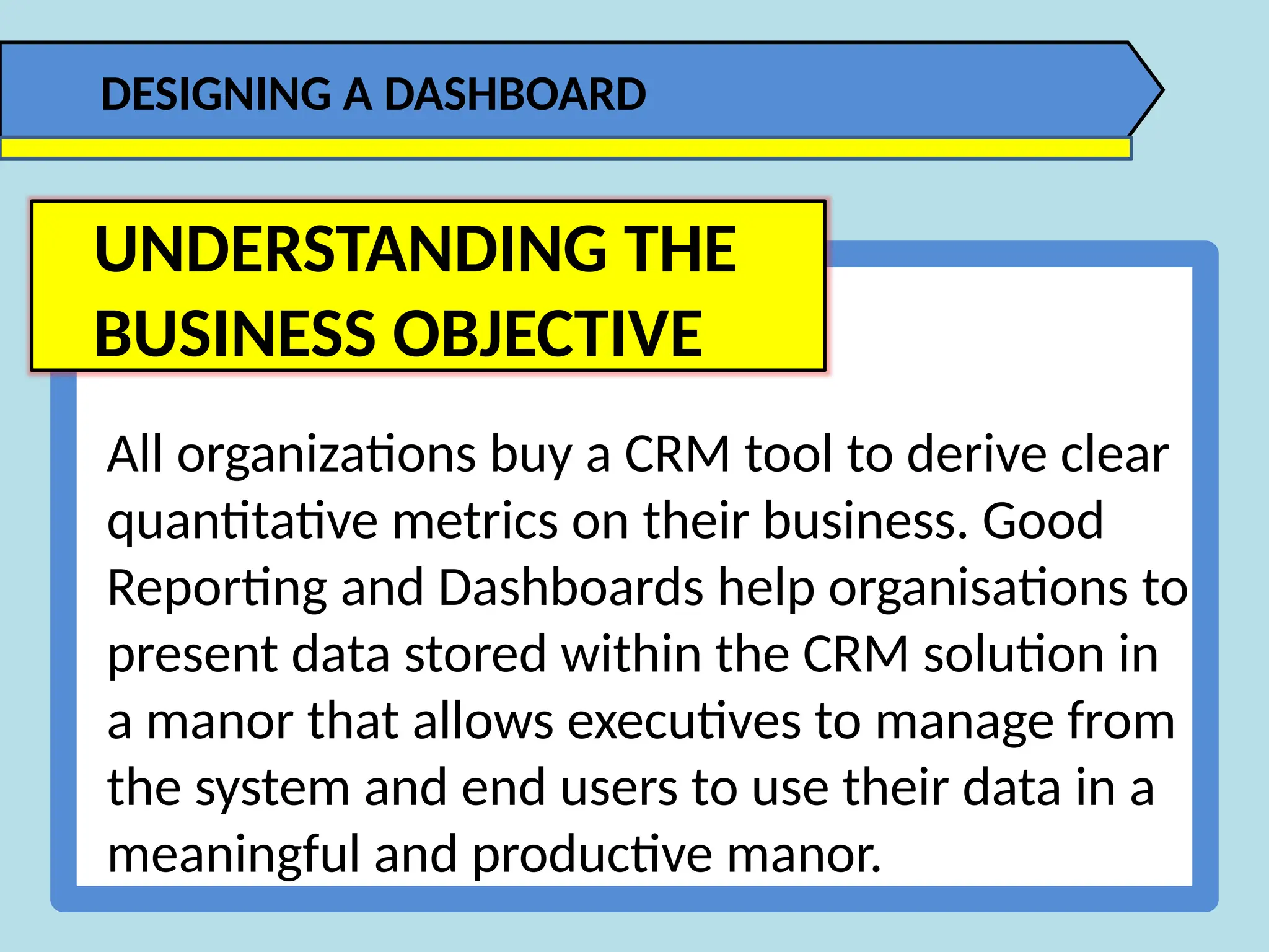
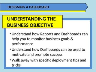
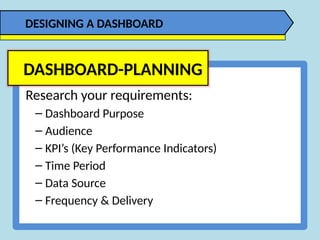
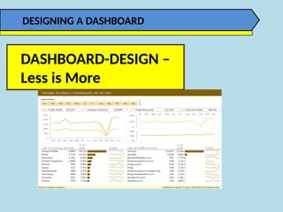
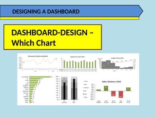
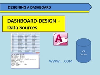
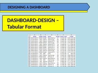
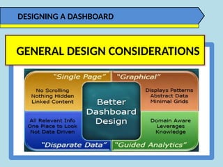
All organizations buy a CRM tool to derive clear
quantitative metrics on their business. Good
Reporting and Dashboards help organisations to
present data stored within the CRM solution in
a manor that allows executives to manage from
the system and end users to use their data in a
meaningful and productive manor.
DESIGNING A DASHBOARD
UNDERSTANDING THE
BUSINESS OBJECTIVE
• Understand how Reports and Dashboards can
help you to monitor business goals &
performance
• Understand how Dashboards can be used to
motivate and promote success
• Walk away with specific deployment tips and
tricks
DESIGNING A DASHBOARD
UNDERSTANDING THE
BUSINESS OBJECTIVE
Research your requirements:
– Dashboard Purpose
– Audience
– KPI’s (Key Performance Indicators)
– Time Period
– Data Source
– Frequency & Delivery
DASHBOARD-PLANNING
DESIGNING A DASHBOARD
DASHBOARD-MOCK-UP
DESIGNING A DASHBOARD
DASHBOARD-DESIGN
DESIGNING A DASHBOARD
DASHBOARD-DESIGN –
Less is More
DESIGNING A DASHBOARD
DASHBOARD-DESIGN –
Which Chart
DESIGNING A DASHBOARD
DASHBOARD-DESIGN –
Data Sources
DESIGNING A DASHBOARD
SQL
Server
WWW… .COM
DASHBOARD-DESIGN –
Tabular Format
DESIGNING A DASHBOARD
DASHBOARD-DESIGN –
Format as an Excel Table
DESIGNING A DASHBOARD
• Avoid using colors or background is to partition your
dashboards.
• De-emphasize borders, backgrounds, and other elements
that done dashboard areas.
• Avoid applying fancy effects such as gradients, pattern,
shadows, glows, soft edges, and other formatting.
• Don’t try to enhance your dashboards with clip art or
pictures.
DASHBOARD-DESIGN –
Formatting
DESIGNING A DASHBOARD
• Lightly colored labels give your users the information they
need without distracting them from the information
displayed.
• Ideal colors for labels are colors commonly found in nature:
soft grays, browns, blues, and greens.
DASHBOARD-DESIGN –
Formatting
DESIGNING A DASHBOARD
Number of Frames
• Up to 4 is good, no more than 6
Frame Proportions
• Size = implied importance
• Uniform otherwise
Location
• Top left = primary focus
• Bottom right = supporting detail
• Off page = irrelevant
Printing
• The dirty little secret
DASHBOARD-DESIGN –
Screen Layout
DESIGNING A DASHBOARD
Different frame on same page
▪ Must fit on the page
▪ Can drill from here to new page
New page in same browser
▪ Easy to get back
▪ Full page available
New browser tab/window
▪ Allows for comparisons
▪ Users must close windows/tabs
DASHBOARD-DESIGN –
Frame Options
DESIGNING A DASHBOARD
Identify the key dimensions for the metric
▪ Customer, product, department
▪ Drill into one or more of these
▪ Top 10 rankings
Identify the audience
▪ Marketing manager – Drill to product
▪ Sales Manager – Drill to customer
DASHBOARD-DESIGN –
Navigation
DESIGNING A DASHBOARD
Navigation –
What to Show
DASHBOARD-DESIGN –
Frame Options
DESIGNING A DASHBOARD
GENERAL DESIGN CONSIDERATIONS
DESIGNING A DASHBOARD
GENERAL DESIGN CONSIDERATIONS

DESIGNING A DASHBOARD - Excel Training PK

  • 1.
    All organizations buya CRM tool to derive clear quantitative metrics on their business. Good Reporting and Dashboards help organisations to present data stored within the CRM solution in a manor that allows executives to manage from the system and end users to use their data in a meaningful and productive manor. DESIGNING A DASHBOARD UNDERSTANDING THE BUSINESS OBJECTIVE
  • 2.
    • Understand howReports and Dashboards can help you to monitor business goals & performance • Understand how Dashboards can be used to motivate and promote success • Walk away with specific deployment tips and tricks DESIGNING A DASHBOARD UNDERSTANDING THE BUSINESS OBJECTIVE
  • 3.
    Research your requirements: –Dashboard Purpose – Audience – KPI’s (Key Performance Indicators) – Time Period – Data Source – Frequency & Delivery DASHBOARD-PLANNING DESIGNING A DASHBOARD
  • 4.
  • 5.
  • 6.
    DASHBOARD-DESIGN – Less isMore DESIGNING A DASHBOARD
  • 7.
  • 8.
    DASHBOARD-DESIGN – Data Sources DESIGNINGA DASHBOARD SQL Server WWW… .COM
  • 9.
  • 10.
    DASHBOARD-DESIGN – Format asan Excel Table DESIGNING A DASHBOARD
  • 11.
    • Avoid usingcolors or background is to partition your dashboards. • De-emphasize borders, backgrounds, and other elements that done dashboard areas. • Avoid applying fancy effects such as gradients, pattern, shadows, glows, soft edges, and other formatting. • Don’t try to enhance your dashboards with clip art or pictures. DASHBOARD-DESIGN – Formatting DESIGNING A DASHBOARD
  • 12.
    • Lightly coloredlabels give your users the information they need without distracting them from the information displayed. • Ideal colors for labels are colors commonly found in nature: soft grays, browns, blues, and greens. DASHBOARD-DESIGN – Formatting DESIGNING A DASHBOARD
  • 13.
    Number of Frames •Up to 4 is good, no more than 6 Frame Proportions • Size = implied importance • Uniform otherwise Location • Top left = primary focus • Bottom right = supporting detail • Off page = irrelevant Printing • The dirty little secret DASHBOARD-DESIGN – Screen Layout DESIGNING A DASHBOARD
  • 14.
    Different frame onsame page ▪ Must fit on the page ▪ Can drill from here to new page New page in same browser ▪ Easy to get back ▪ Full page available New browser tab/window ▪ Allows for comparisons ▪ Users must close windows/tabs DASHBOARD-DESIGN – Frame Options DESIGNING A DASHBOARD
  • 15.
    Identify the keydimensions for the metric ▪ Customer, product, department ▪ Drill into one or more of these ▪ Top 10 rankings Identify the audience ▪ Marketing manager – Drill to product ▪ Sales Manager – Drill to customer DASHBOARD-DESIGN – Navigation DESIGNING A DASHBOARD
  • 16.
    Navigation – What toShow DASHBOARD-DESIGN – Frame Options DESIGNING A DASHBOARD
  • 17.
    DESIGNING A DASHBOARD GENERALDESIGN CONSIDERATIONS
  • 18.
    DESIGNING A DASHBOARD GENERALDESIGN CONSIDERATIONS

Editor's Notes

  • #4 And lastly do a mock-up of the dashboard on paper before you dive into Excel. Time spent here will save you hours of redesign later.
  • #5 Design can make the difference between conveying your message quickly and easily, and hiding it in a sea of formatting and chart junk like these donut charts and gauges. This dashboard looks pretty but it’s cluttered with overuse of formatting and bad chart choices. Dashboards like this might give the reader an initial ‘wow’ because it looks pretty, but once they realise it’s taking them a long time to glean any information they’ll soon get bored with it.
  • #6 When it comes to dashboard design, Less is More. That is less colours, less fonts, and less formatting. Stay well away from 3D effects, gradient fills, shadows and any of the other unnecessary formatting. What we don’t want to do is hide the valuable information with too much formatting noise. Instead we want to use colour and formatting to draw attention to key points and show relationships between the data. For example, if you have two charts displaying the same metric but in a different context then you might colour them the same to show the reader that they are related. Just like I’ve done in this dashboard with the bar charts in the top 10 tables at the bottom, which both use the same colour because they both display visitor numbers, just grouped differently.
  • #7 Charts are a useful tool in communicating messages through a picture. That is the shape of the data contains a pattern, trend or exception. Knowing which chart to use for your data and message is essential.
  • #8 The data for your Dashboard can come from almost anywhere. It can be in Excel or an external data source, for example Access, it might be in a text file or a SQL Database, and even the Web etc. You can bring the data into Excel, or link directly to an external source.
  • #9 Tabular data is simply where your data is arranged in columns with a unique entry on each row and preferably without any blank rows or cells. The reason this is the ideal format is because all of the powerful tools and functions in Excel are designed to work with tabular data. If your data isn’t in this format then you’re going to run into problems; for example you won’t be able to use PivotTables or many of the built in functions the way they were intended, instead you’ll end up having to use overly complicated formulas, and this could mean a slow model that’s prone to errors. If you’re not sure what a tabular format is then you can (right) click the link in this presentation and read a tutorial on data formats.
  • #10 I also recommend formatting your tabular data in an Excel Table. The benefits of Excel tables are that your dashboards will be quick to build and very easy to update. If you’re not familiar with Excel Tables then you can (right) click on the link here and read my tutorial.