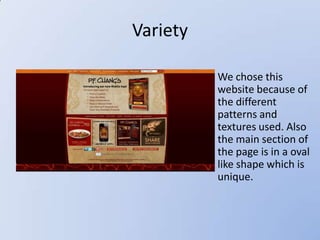
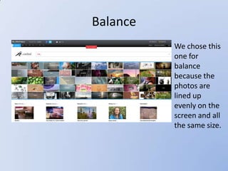
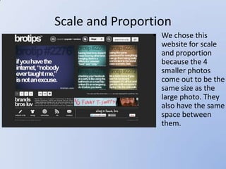
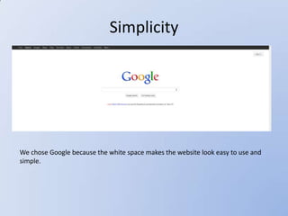
Design Principles

  Casey McCafferty
   Lucy Lotspeich
    Jesse Kinzer
Unity
   • We chose this because
     the links to the story’s
     are all the same size.
     They have similar type
     and are close together.
Variety

          We chose this
          website because of
          the different
          patterns and
          textures used. Also
          the main section of
          the page is in a oval
          like shape which is
          unique.
Balance
          • We chose this
            one for
            balance
            because the
            photos are
            lined up
            evenly on the
            screen and all
            the same size.
Scale and Proportion
                • We chose this
                  website for scale
                  and proportion
                  because the 4
                  smaller photos
                  come out to be the
                  same size as the
                  large photo. They
                  also have the same
                  space between
                  them.
Rhythm


We chose Pintrest for Rhythm because of the
repeating tiles of pictures and descriptions. The
repetition of pictures creates a scrolling or waterfall
effect.
Emphasis


We chose this website because the image really pops out at you as soon as you open
the website.
Simplicity


We chose Google because the white space makes the website look easy to use and
simple.

Design principles

  • 1.
    Design Principles Casey McCafferty Lucy Lotspeich Jesse Kinzer
  • 2.
    Unity • We chose this because the links to the story’s are all the same size. They have similar type and are close together.
  • 3.
    Variety We chose this website because of the different patterns and textures used. Also the main section of the page is in a oval like shape which is unique.
  • 4.
    Balance • We chose this one for balance because the photos are lined up evenly on the screen and all the same size.
  • 5.
    Scale and Proportion • We chose this website for scale and proportion because the 4 smaller photos come out to be the same size as the large photo. They also have the same space between them.
  • 6.
    Rhythm We chose Pintrestfor Rhythm because of the repeating tiles of pictures and descriptions. The repetition of pictures creates a scrolling or waterfall effect.
  • 7.
    Emphasis We chose thiswebsite because the image really pops out at you as soon as you open the website.
  • 8.
    Simplicity We chose Googlebecause the white space makes the website look easy to use and simple.