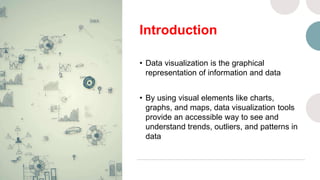
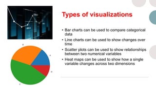
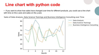
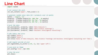
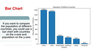
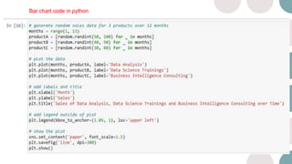
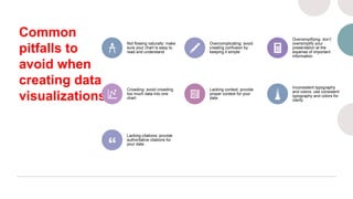
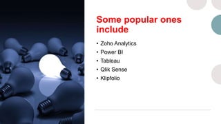
DATA VISUALISATION IN
DATA SCIENCE
Tingom Ferdinand & Ngong Charlotte
Info@ferdsilinks.com
Introduction
• Data visualization is the graphical
representation of information and data
• By using visual elements like charts,
graphs, and maps, data visualization tools
provide an accessible way to see and
understand trends, outliers, and patterns in
data
Types of visualizations
• Bar charts can be used to compare categorical
data
• Line charts can be used to show changes over
time
• Scatter plots can be used to show relationships
between two numerical variables
• Heat maps can be used to show how a single
variable changes across two dimensions
What to Consider
before Choosing a
Type of Visual
Line chart with python code
• If you want to show how sales have changed over time for different products, you could use a line chart
with time on the x-axis and sales on the y-axis​
Line Chart
Bar Chart
If you want to compare
the population of different
countries, you could use a
bar chart with countries
on the x-axis and
population on the y-axis
Bar chart code in python
Attributes of Good
visualizations or best
practices
• Choose an appropriate type of
visualization for your data
• Use color effectively to
highlight important information
• Label axes and provide a
legend if necessary
• Keep it simple – don’t clutter
your visualization with too
much information
Common
pitfalls to
avoid when
creating data
visualizations
Not flowing naturally: make
sure your chart is easy to
read and understand
Overcomplicating: avoid
creating confusion by
keeping it simple
Oversimplifying: don’t
oversimplify your
presentation at the
expense of important
information
Crowding: avoid crowding
too much data into one
chart
Lacking context: provide
proper context for your
data
Inconsistent typography
and colors: use consistent
typography and colors for
clarity
Lacking citations: provide
authoritative citations for
your data
Some popular ones
include
• Zoho Analytics
• Power BI
• Tableau
• Qlik Sense
• Klipfolio
Ferdsilinks Group
www.ferdsilinks.com
02, Adjacent Presbyterian Church Molyko-Buea
237 Buea, Cameroon
Whatsapp: +237 652002630

Data visualization in Data Science.pptx

  • 1.
    DATA VISUALISATION IN DATASCIENCE Tingom Ferdinand & Ngong Charlotte Info@ferdsilinks.com
  • 2.
    Introduction • Data visualizationis the graphical representation of information and data • By using visual elements like charts, graphs, and maps, data visualization tools provide an accessible way to see and understand trends, outliers, and patterns in data
  • 3.
    Types of visualizations •Bar charts can be used to compare categorical data • Line charts can be used to show changes over time • Scatter plots can be used to show relationships between two numerical variables • Heat maps can be used to show how a single variable changes across two dimensions
  • 4.
    What to Consider beforeChoosing a Type of Visual
  • 5.
    Line chart withpython code • If you want to show how sales have changed over time for different products, you could use a line chart with time on the x-axis and sales on the y-axis​
  • 6.
  • 7.
    Bar Chart If youwant to compare the population of different countries, you could use a bar chart with countries on the x-axis and population on the y-axis
  • 8.
    Bar chart codein python
  • 9.
    Attributes of Good visualizationsor best practices • Choose an appropriate type of visualization for your data • Use color effectively to highlight important information • Label axes and provide a legend if necessary • Keep it simple – don’t clutter your visualization with too much information
  • 10.
    Common pitfalls to avoid when creatingdata visualizations Not flowing naturally: make sure your chart is easy to read and understand Overcomplicating: avoid creating confusion by keeping it simple Oversimplifying: don’t oversimplify your presentation at the expense of important information Crowding: avoid crowding too much data into one chart Lacking context: provide proper context for your data Inconsistent typography and colors: use consistent typography and colors for clarity Lacking citations: provide authoritative citations for your data
  • 11.
    Some popular ones include •Zoho Analytics • Power BI • Tableau • Qlik Sense • Klipfolio
  • 12.
    Ferdsilinks Group www.ferdsilinks.com 02, AdjacentPresbyterian Church Molyko-Buea 237 Buea, Cameroon Whatsapp: +237 652002630