Download to read offline


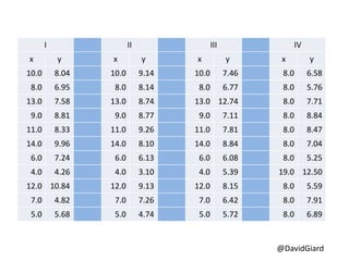
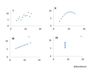
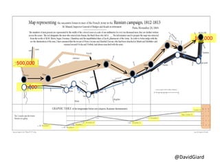
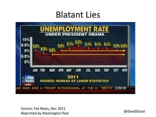
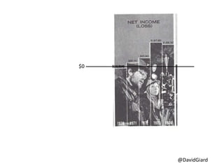
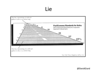
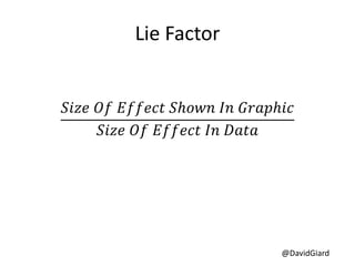
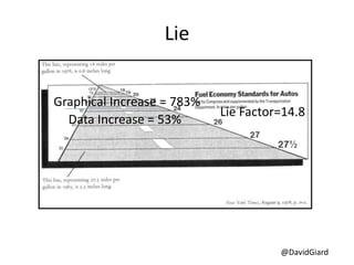
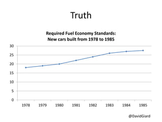
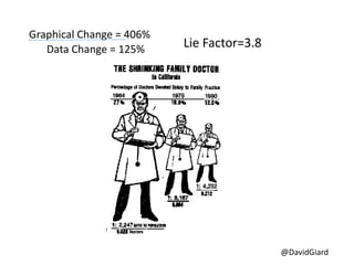
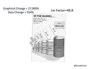

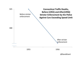
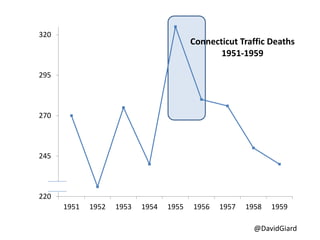
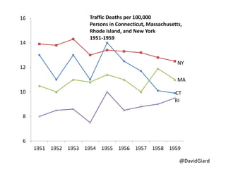
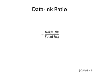
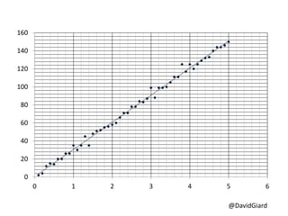
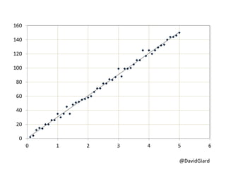
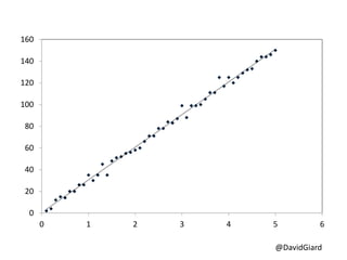
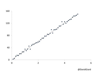
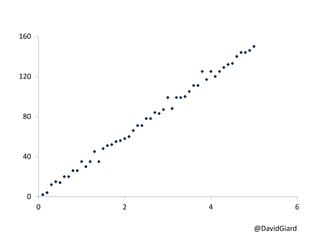

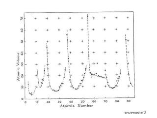
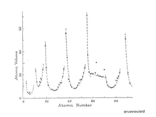
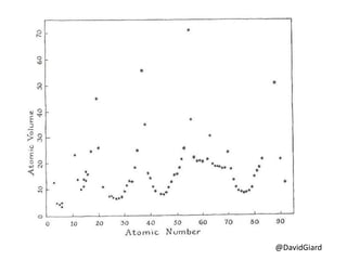
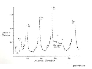
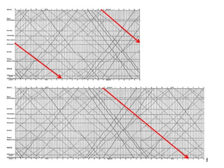

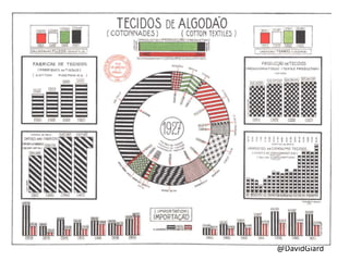
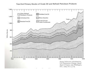
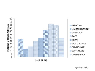
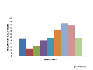
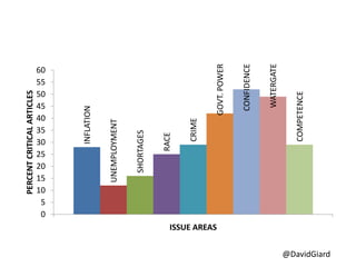
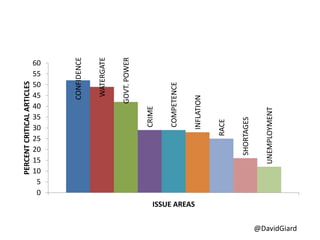
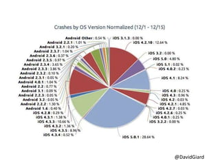

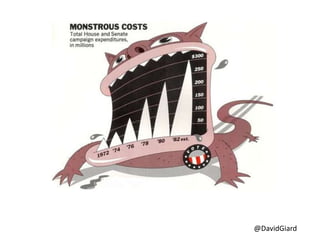
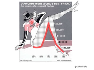

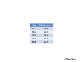
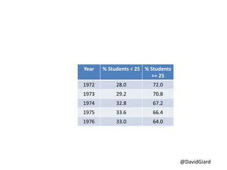
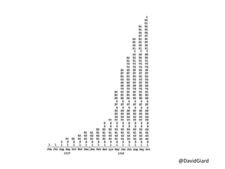
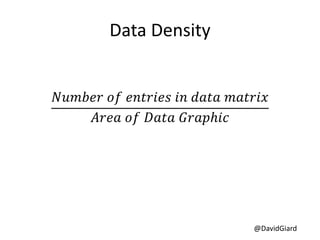
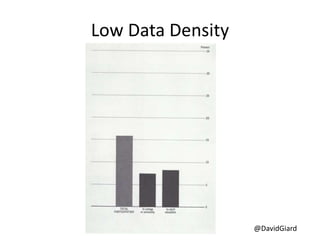
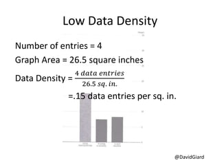
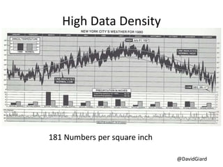
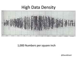
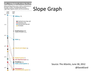
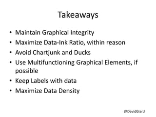

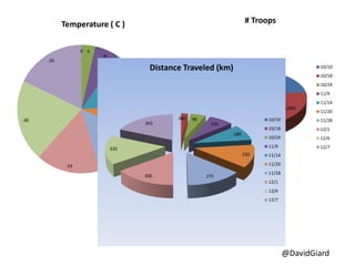
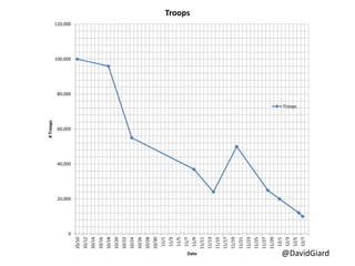
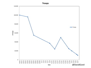
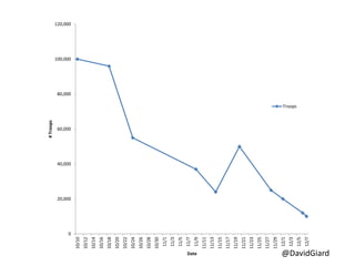
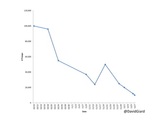
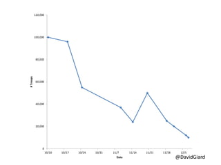
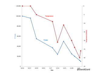


The document discusses the principles of data visualization and graphical integrity, emphasizing the need to accurately represent data while minimizing non-data ink. It references Edward Tufte's rules for effective graphical representation, including maintaining proportionality in data representation and maximizing data density. Various examples and graphics are provided to illustrate the impact of proper visualization techniques on understanding data.