Download as PDF, PPTX


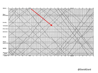


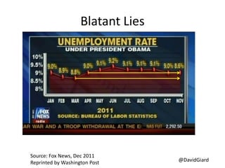


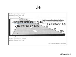


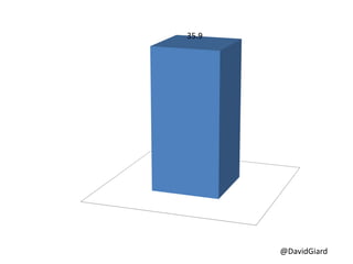


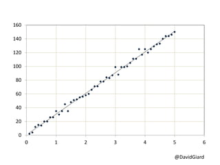

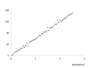


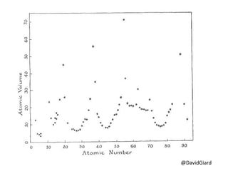

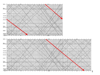


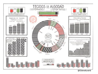
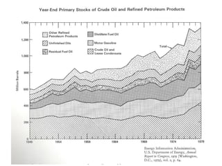

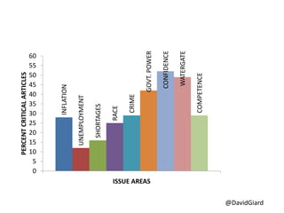


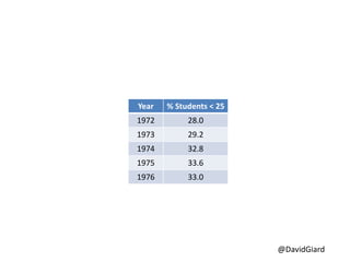


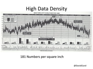


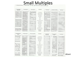


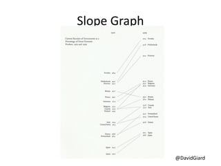


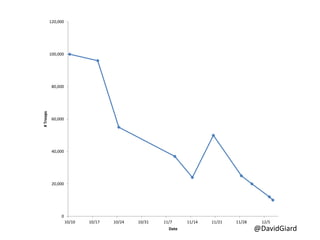
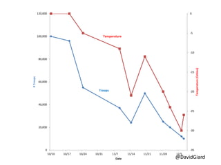


The document discusses principles of data visualization based on the ideas of Edward Tufte, emphasizing the importance of graphical integrity and maximizing the data-ink ratio while minimizing extraneous elements like 'chartjunk.' It presents various examples and graphs to illustrate these concepts, highlighting how misleading graphical representations can distort data interpretation. The key takeaways include maintaining clarity and context in data presentation.