Download free for 30 days
Sign in
Upload
Language (EN)
Support
Business
Mobile
Social Media
Marketing
Technology
Art & Photos
Career
Design
Education
Presentations & Public Speaking
Government & Nonprofit
Healthcare
Internet
Law
Leadership & Management
Automotive
Engineering
Software
Recruiting & HR
Retail
Sales
Services
Science
Small Business & Entrepreneurship
Food
Environment
Economy & Finance
Data & Analytics
Investor Relations
Sports
Spiritual
News & Politics
Travel
Self Improvement
Real Estate
Entertainment & Humor
Health & Medicine
Devices & Hardware
Lifestyle
Change Language
Language
English
Español
Português
Français
Deutsche
Cancel
Save
Submit search
EN
Uploaded by
Ritvvij Parrikh
273 views
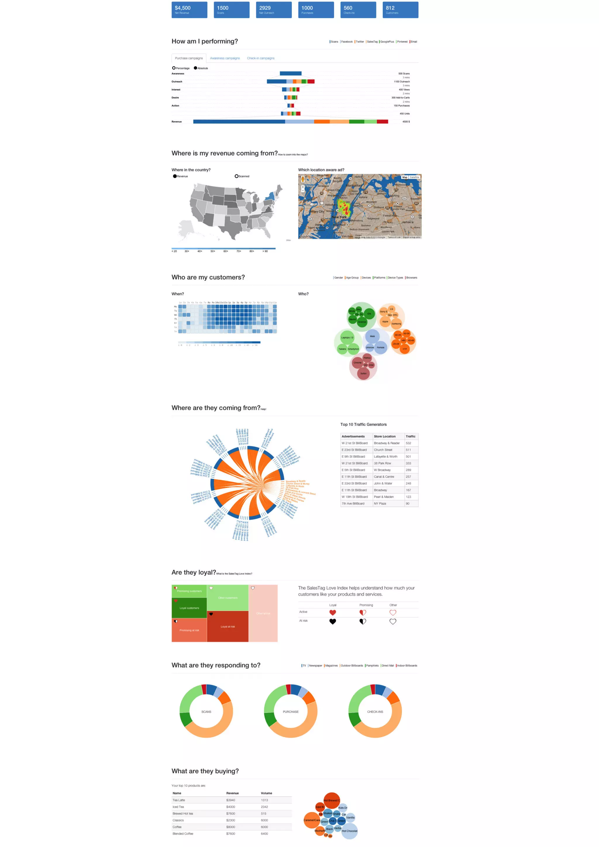
Offline Advertisements Analytics Dashboard
Related topics:
Business Intelligence
•
Read more
0
Save
Share
Embed
Embed presentation
Download
Download to read offline
1
/ 1
More Related Content
PDF
Taxonomy of charts
by
Ritvvij Parrikh
PDF
Talk at eChai, EDI, Ahmedabad
by
Ritvvij Parrikh
PDF
Visualizing Data Journalism (HasGeek Fifth Elephant)
by
Ritvvij Parrikh
PDF
Google Analytics Dashboard Design
by
Ritvvij Parrikh
PDF
Introduction to Pykih's Services
by
Ritvvij Parrikh
PDF
"A primer for custom data visualization" - An approach towards getting starte...
by
Ritvvij Parrikh
PDF
Getting comfortable with Data
by
Ritvvij Parrikh
PDF
PykQuery.js
by
Ritvvij Parrikh
Taxonomy of charts
by
Ritvvij Parrikh
Talk at eChai, EDI, Ahmedabad
by
Ritvvij Parrikh
Visualizing Data Journalism (HasGeek Fifth Elephant)
by
Ritvvij Parrikh
Google Analytics Dashboard Design
by
Ritvvij Parrikh
Introduction to Pykih's Services
by
Ritvvij Parrikh
"A primer for custom data visualization" - An approach towards getting starte...
by
Ritvvij Parrikh
Getting comfortable with Data
by
Ritvvij Parrikh
PykQuery.js
by
Ritvvij Parrikh
More from Ritvvij Parrikh
PPT
DataMeet 4: Data cleaning & census data
by
Ritvvij Parrikh
PDF
Dashboard fhub
by
Ritvvij Parrikh
PDF
Google Analytics Dashboard designed as an Infographic
by
Ritvvij Parrikh
PDF
Company presentation
by
Ritvvij Parrikh
PDF
JARVIS:BI for FMCG Sales Managers
by
Ritvvij Parrikh
PDF
Payroll Giving Management with TracksGiving
by
Ritvvij Parrikh
PPT
9 ways how cause marketing can help you achieve your marketing objectives.
by
Ritvvij Parrikh
PPT
How TracksGiving can help you implement your campaigning software up quicker ...
by
Ritvvij Parrikh
DataMeet 4: Data cleaning & census data
by
Ritvvij Parrikh
Dashboard fhub
by
Ritvvij Parrikh
Google Analytics Dashboard designed as an Infographic
by
Ritvvij Parrikh
Company presentation
by
Ritvvij Parrikh
JARVIS:BI for FMCG Sales Managers
by
Ritvvij Parrikh
Payroll Giving Management with TracksGiving
by
Ritvvij Parrikh
9 ways how cause marketing can help you achieve your marketing objectives.
by
Ritvvij Parrikh
How TracksGiving can help you implement your campaigning software up quicker ...
by
Ritvvij Parrikh
Download