The document describes the 5 step process for creating a band album cover in a photo editing software:
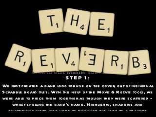
1) The first step was creating the band logo out of Scrabble tiles and enhancing it.
2) Second, the logo was pasted onto a wooden background that was recolored.
3) Next, the album title was cut out and added to look scratched into the wood.
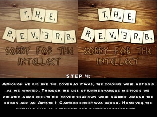
4) Various effects were added like blurring and cartoon filters to make the colors bolder.
5) Finally, a parental advisory sticker was included to complete the cover.