Download to read offline
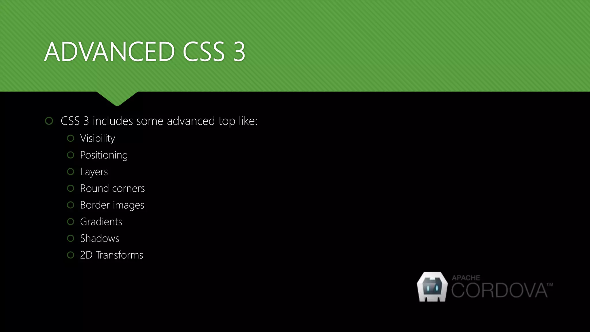
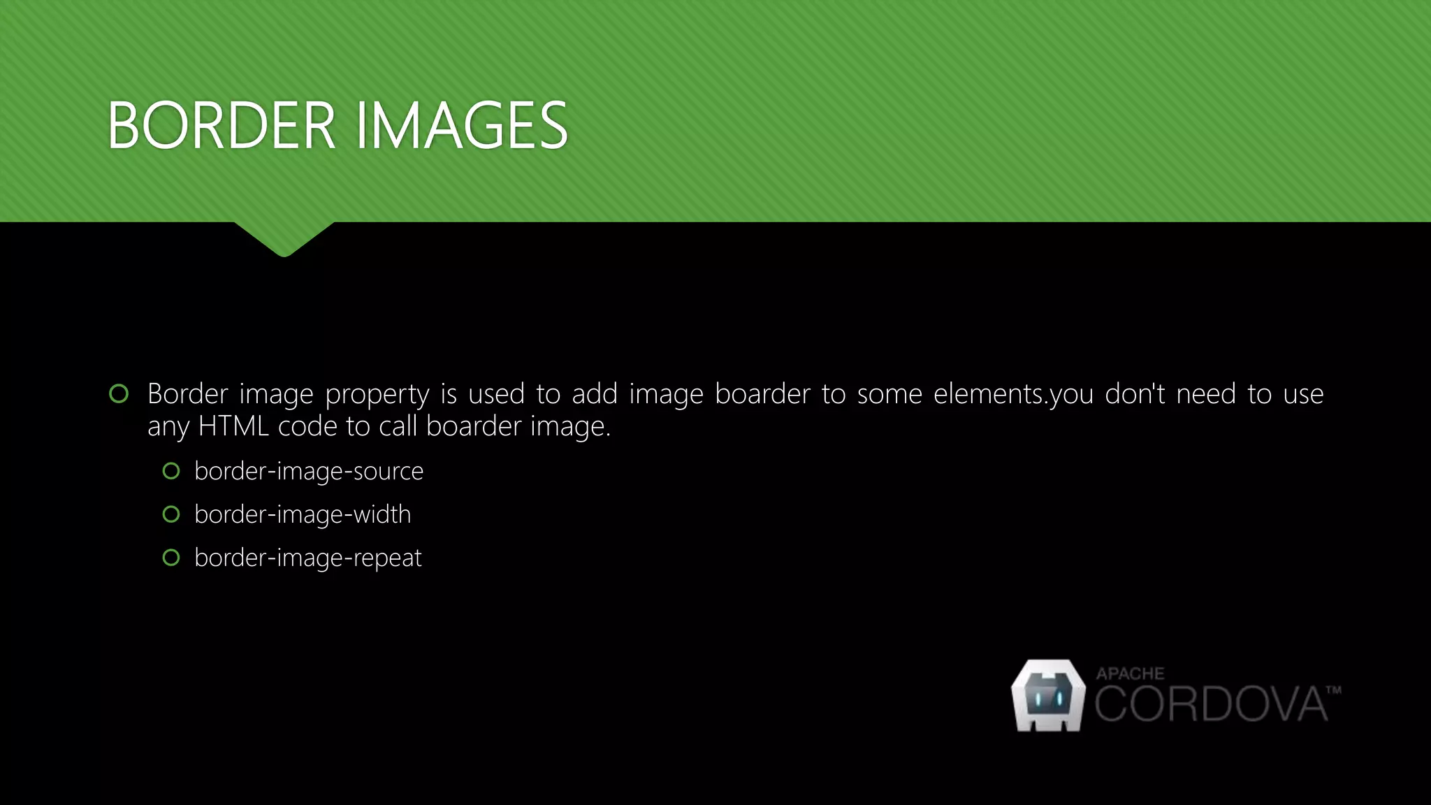
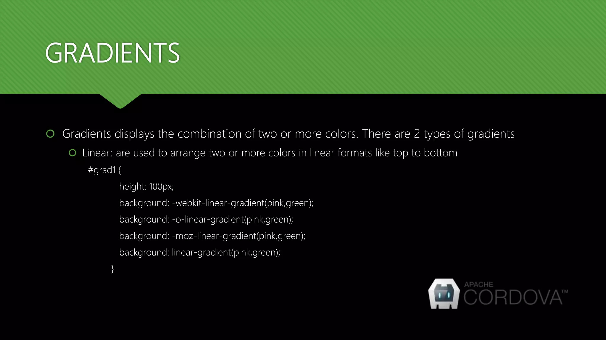
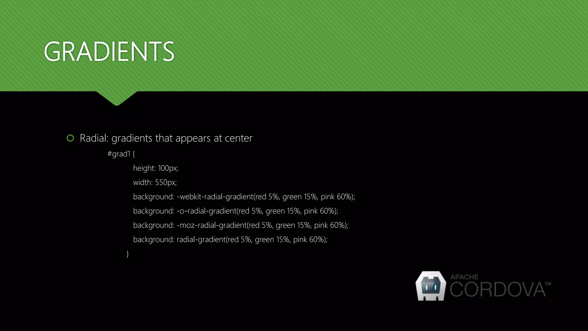
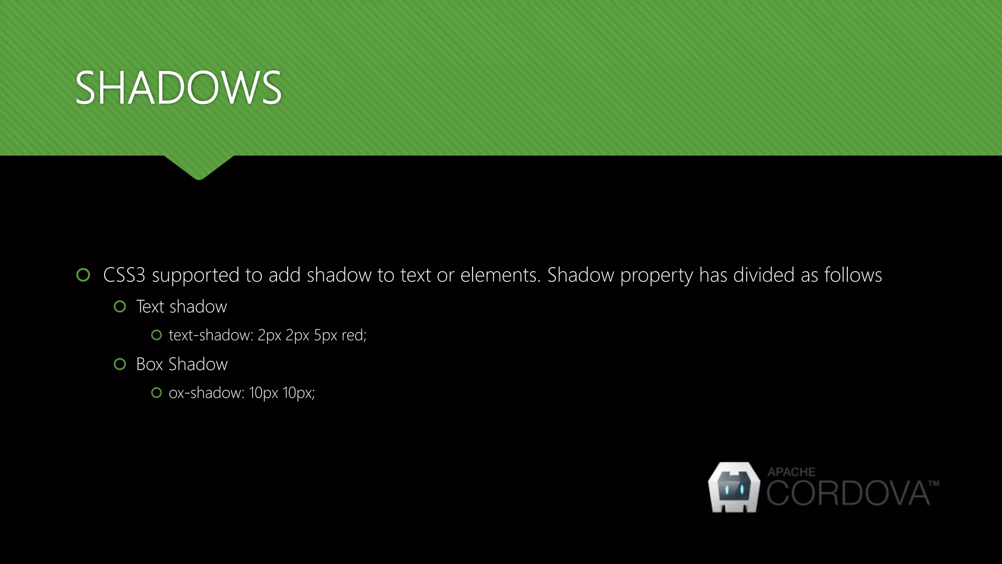
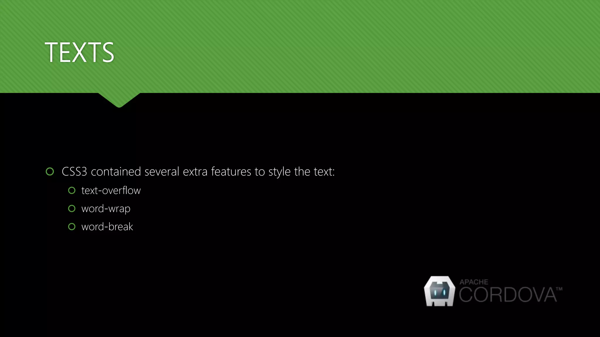
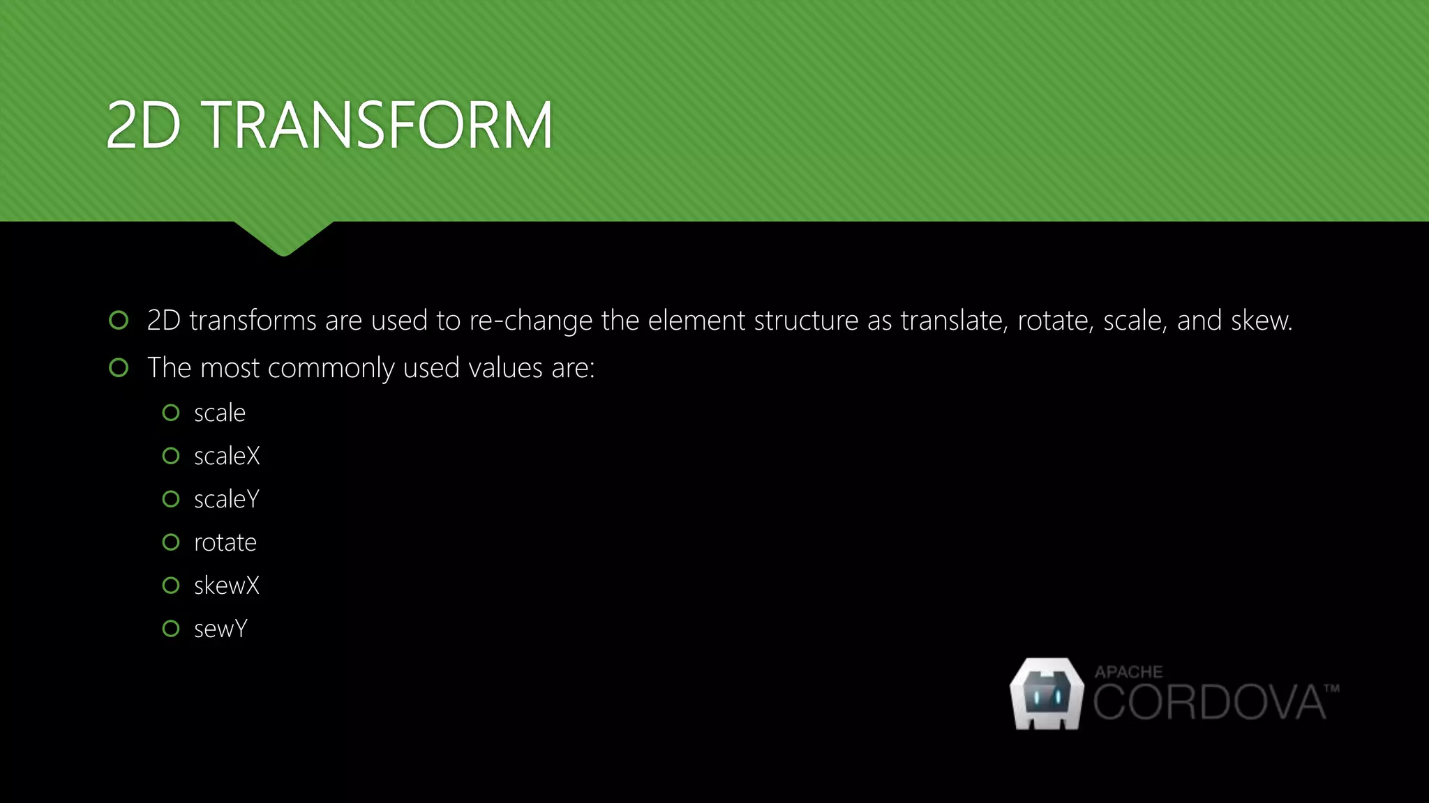
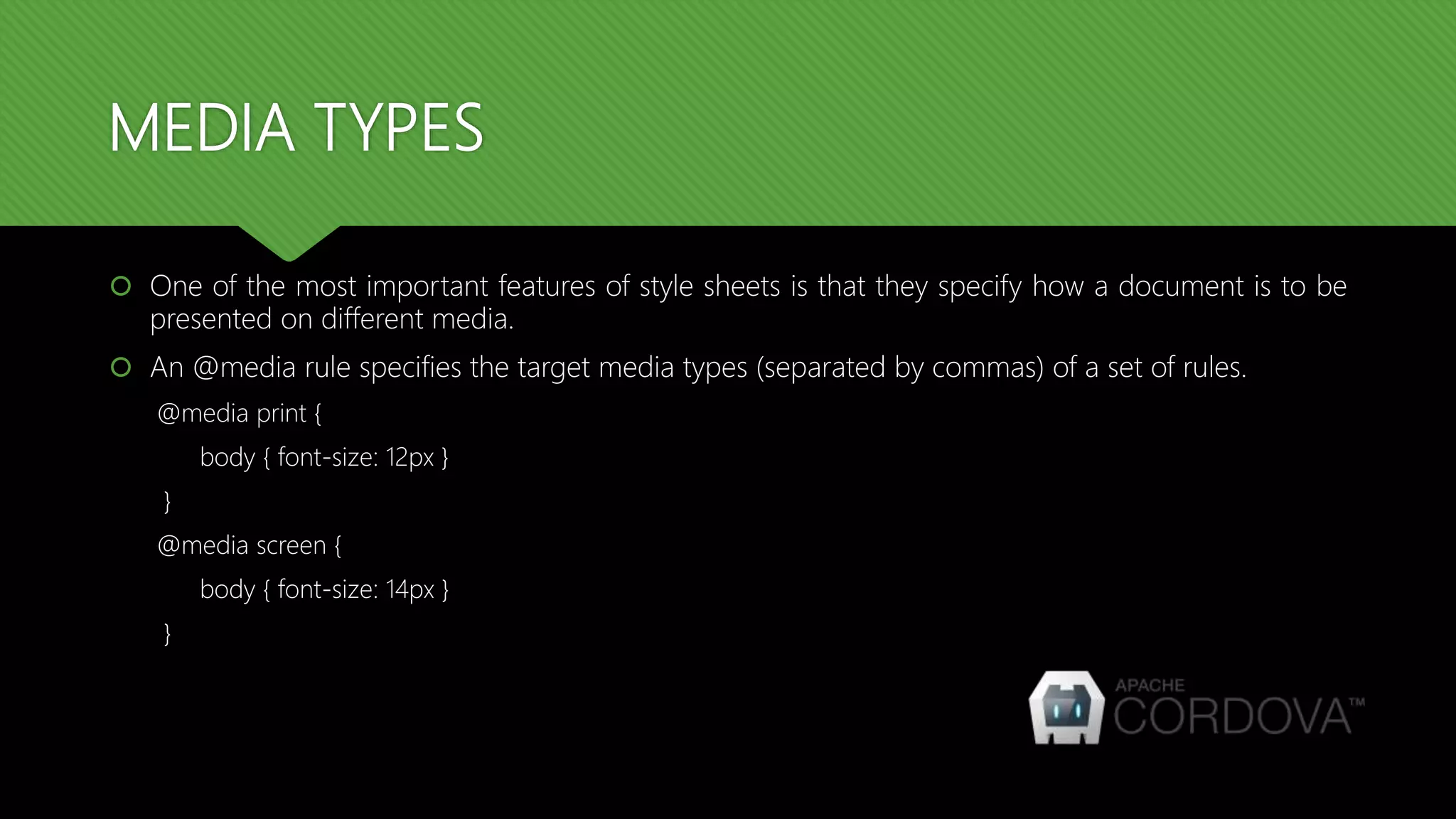
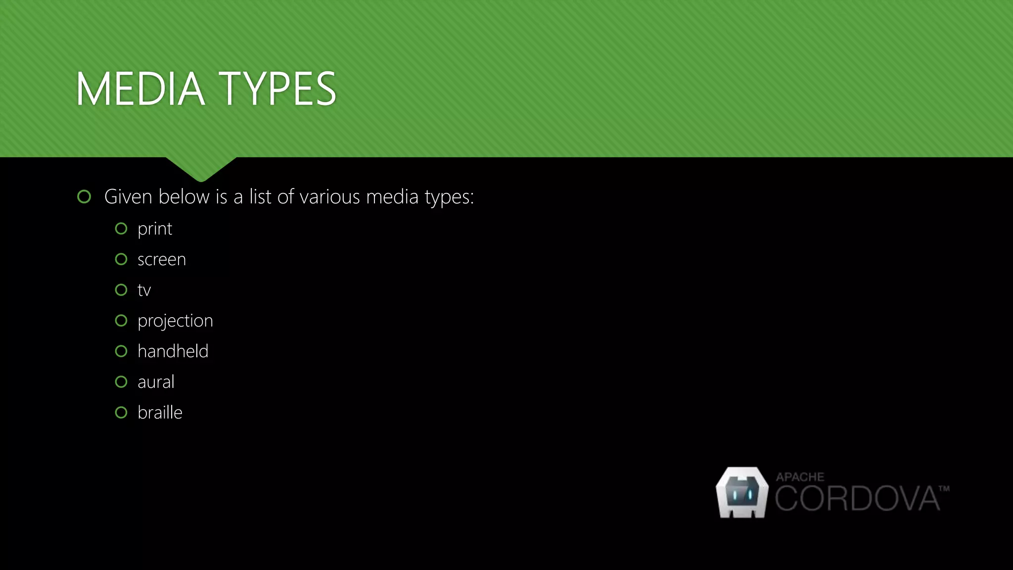

This document provides an overview of advanced CSS3 topics covered in Session 3 of a Cordova training, including visibility, positioning, layers, rounded corners, border images, gradients, shadows, 2D transforms, and media types. Key points covered are using the visibility property to hide elements, relative and absolute positioning, using z-index to create layers, border-radius for rounded corners, border-image to add image borders, linear and radial gradients, text and box shadows, text styling with text-overflow and word properties, 2D transforms like scale and rotate, and media types for different devices.