Downloaded 71 times

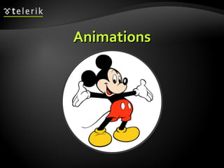
![Attribute Selectors E[foo^="bar"] An E element whose "foo" attribute value begins exactly with the string "bar" Example: a[src ^="https://"] E[foo$="bar"] An E element whose "foo" attribute value ends exactly with the string "bar" E[foo*="bar"] An E element whose "foo" attribute value contains the substring "bar"](https://image.slidesharecdn.com/7-css-3-120206055627-phpapp02/85/CSS3-6-320.jpg)


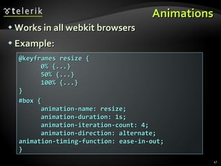
![Border radius Allows web developers to easily utilize rounder corners in their design elements Widespread browser support Syntax: Example: -moz-border-radius: 15px; border-radius: 15px; background-color: #FF00FF; border-*-*-radius: [ <length> | <%> ][ <length> | <%> ]?](https://image.slidesharecdn.com/7-css-3-120206055627-phpapp02/85/CSS3-36-320.jpg)


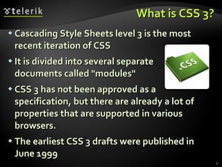
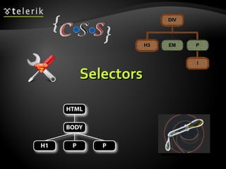
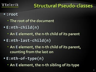
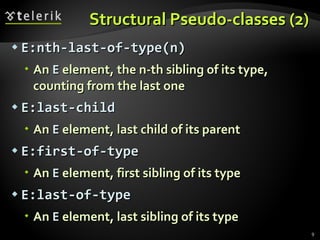
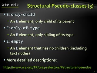
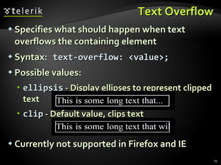
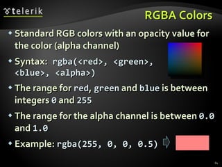
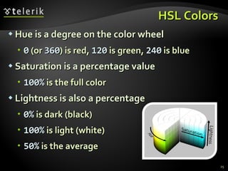
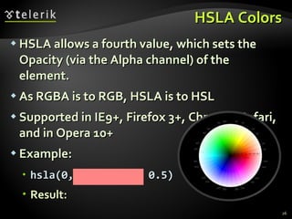
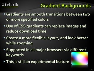
CSS 3 is the latest iteration of Cascading Style Sheets. It is divided into modules that add new selectors, properties, and values for styling elements. Some key additions in CSS 3 include new selectors like attribute and structural selectors, font features like @font-face, color properties like rgba and hsla, background properties like gradients and multiple backgrounds, border properties, box model properties, and animation features. The specification is still in development and support varies across browsers.