VIP Call Girls Service Banjara Hills Hyderabad Call +91-8250192130
Contents
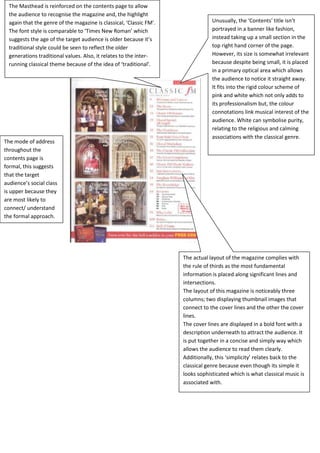
1. The Masthead is reinforced on the contents page to allow
the audience to recognise the magazine and, the highlight
again that the genre of the magazine is classical, ‘Classic FM’. Unusually, the ‘Contents’ title isn’t
The font style is comparable to ‘Times New Roman’ which portrayed in a banner like fashion,
suggests the age of the target audience is older because it’s instead taking up a small section in the
traditional style could be seen to reflect the older top right hand corner of the page.
generations traditional values. Also, it relates to the inter- However, its size is somewhat irrelevant
running classical theme because of the idea of ‘traditional’. because despite being small, it is placed
in a primary optical area which allows
the audience to notice it straight away.
It fits into the rigid colour scheme of
pink and white which not only adds to
its professionalism but, the colour
connotations link musical interest of the
audience. White can symbolise purity,
relating to the religious and calming
associations with the classical genre.
The mode of address
throughout the
contents page is
formal, this suggests
that the target
audience’s social class
is upper because they
are most likely to
connect/ understand
the formal approach.
The actual layout of the magazine complies with
the rule of thirds as the most fundamental
information is placed along significant lines and
intersections.
The layout of this magazine is noticeably three
columns; two displaying thumbnail images that
connect to the cover lines and the other the cover
lines.
The cover lines are displayed in a bold font with a
description underneath to attract the audience. It
is put together in a concise and simply way which
allows the audience to read them clearly.
Additionally, this ‘simplicity’ relates back to the
classical genre because even though its simple it
looks sophisticated which is what classical music is
associated with.
2. The magazines mast head ‘smash hits’ is displayed on the
contents page. This reinforces the magazine itself and acts as
a constant reminder that the genre is pop because it’s all
about ‘hits’
The mode of address of
the cover lines ‘news,
gossip, whatever!’
indicates the social class
of the audience. It is
colloquial, informal and
The main image on the
the use of exclamation
contents page is a picture
heightens the idea of a
of pop band West life. This
‘laid back approach’ which
reinforces the target
more links to the working
audience’s music genre
class out of all three
style and is perhaps used
classes.
as young girls look up to
them and see them as
icons.
The ‘Contents’ title is atypically situated
towards the bottom end of the page. It
is in bold block letters though to draw
the target audience’s eye to it and, to
make it stand out further is underlined
with a long, bold line.
From this we can tell that the target
audience are female because the colour
The page itself complies with the rule of
pink has stereotypical connotations of
thirds.
femininity and, its connotations of love,
romance and friendship links into the
target audience’s musical preference,
pop.
Additionally, the more modern intake of
the ‘Contents’ title being at the bottom
rather than the top, gives an indication
that the age of the target audience is
young people; its not a traditional layout
which could be a reflection of the less
traditional values of youth today.
3. The ‘Contents’ title is displayed in a
banner like fashion in the top right hand
corner of the page. It is placed in this
primary optical area in order to gain the
target audiences attention almost
instantaneously.
In terms of font style, the ‘Contents’ title
bold and in capital letters in order to
grab and maintain the attention of the
magazine readers. In addition, the fact
that the style itself isn’t traditional
highlights the target audience’s musical
preference of rock; this is because its
‘dismantled’ appearance has
connotations of rebellion relates to the
concept of rock.
The actual layout of the magazine
The main colour scheme complies with the rule of thirds as the
of the contents page is most fundamental information is placed
dark red, white and along significant lines and intersections.
black. This can also be The layout of this magazine is noticeably
seen to relate to the three parts; one strip at the top which
magazines rock genre displays thumbnail images of rock artists
because dark red and such as ‘Specs Appeal’ that link to the
black have connotations cover lines, one section containing the
such as ‘rage’, ‘anger’, main image of Chester from Linkin Park
‘wrath’, ‘strength’ and and the other the cover lines
‘grieve’; these are themselves.
typical concepts within The cover lines are displayed in a bold
rock music. font with a description underneath to
attract the audience. It is put together in
a concise and simply way which allows
the audience to read them clearly.
Additionally, it keeps into the colour
scheme of white, black and dark red to
reinforce the rock genre.
The denotation of the main image is a
picture of Chester Bennington, lead The cover lines portrayed in the contents page gives an
singer from band ‘Linkin Park’. He is indication of the social class and age of the target
shown performing and it looks as if he is audience. It can be inferred that by the magazines mast
screaming into the microphone; this head being abbreviated to ‘K’ in more than one cover
links to the magazines genre because line that the target audience is young people 15-19
rock is thought to have a much heavier because, this age group are stereotypically portrayed to
sound compared to other musical styles. abbreviate words. As well as this, the fact that a cover
This also shows indicates that target line introduces the idea of bargains, ‘Get K! Delivered to
audience’s favourite artists include rock your door for just £6 per month!’ shows that the
acts such as Linkin Park. primary social class of the target audience is working
class as this is the social class that aims to save the most
money.