Download to read offline


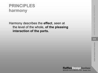


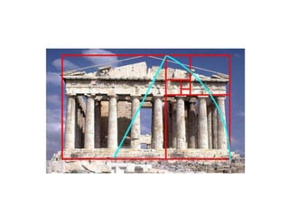

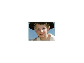

This document covers principles of user interaction design, focusing on scale, contrast, and proportion in communication-oriented interfaces. It emphasizes the importance of these visual elements in creating harmonious and effective designs that enhance the user experience. The document discusses how manipulating these elements can lead to clarity, emphasis, and visual interest in compositions.