Download to read offline


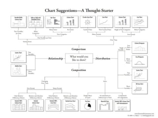
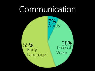
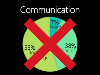


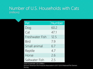
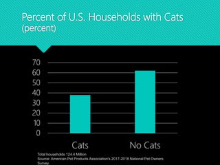
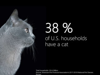
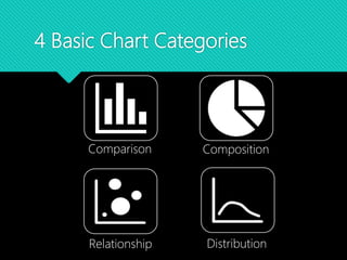
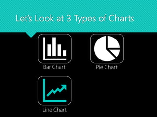
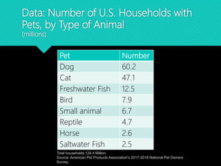
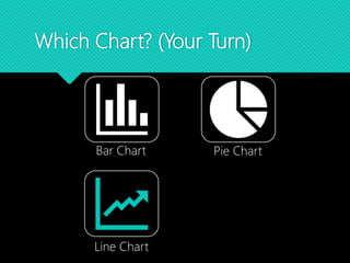
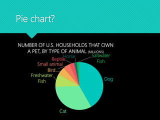
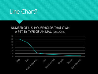
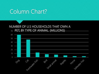
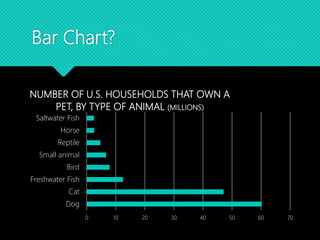
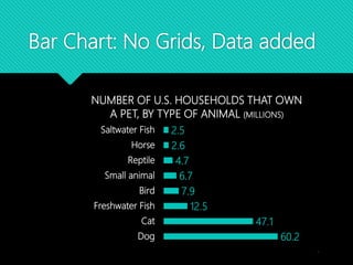
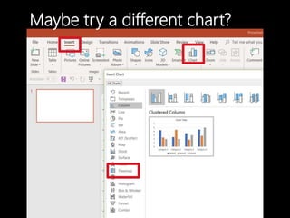
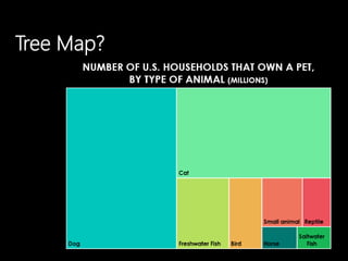
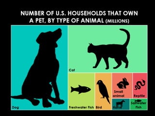
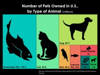

This document discusses best practices for communicating data visually. It covers assumptions like the importance of storytelling over style and perceptions that data is dull. Benefits of including evidence like increased credibility and informed decisions are outlined. Common problems in presenting data are acknowledged. The document then examines chart selection, providing examples of bar, pie and distribution charts. It emphasizes asking what you want to say, what the data says, and what the audience needs to hear to determine the best visual. Color considerations and resources for infographics and training are also suggested.


![제 23회 보아즈(BOAZ) 빅데이터 컨퍼런스 - [MBOAX] : ABSA를 활용한 소비자 반응 분석 기반 운영 효율화 대시보드 설계](https://cdn.slidesharecdn.com/ss_thumbnails/3-1boaz23rdconferencemboax-260203102709-9d519923-thumbnail.jpg?width=640&height=640&fit=bounds)


![Hacking-Uncovered-How-People-Get-Hacked-and-How-to-Stay-Safe[1].pptx](https://cdn.slidesharecdn.com/ss_thumbnails/hacking-uncovered-how-people-get-hacked-and-how-to-stay-safe1-260130170011-4883a9c7-thumbnail.jpg?width=640&height=640&fit=bounds)


