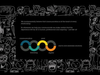
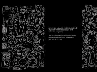
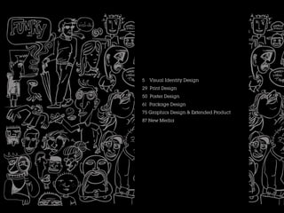
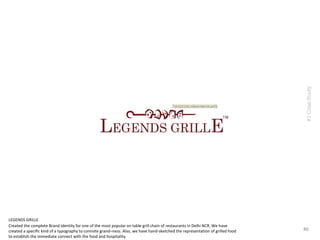
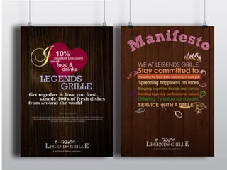
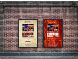
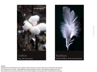
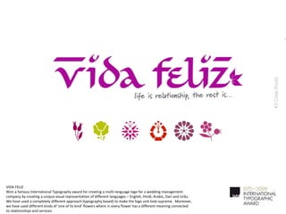
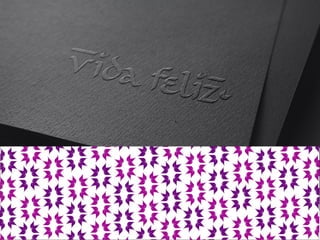
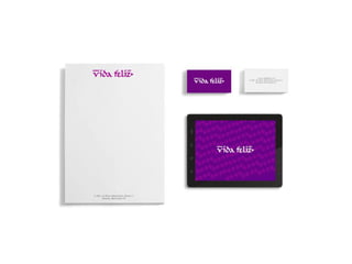
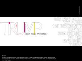
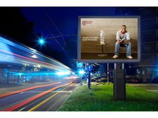
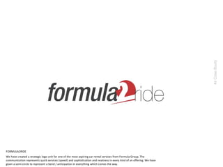
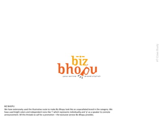
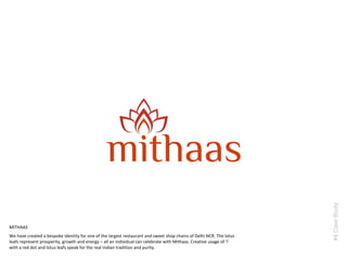
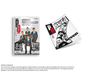
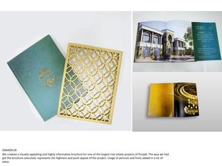
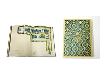
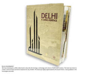
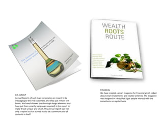
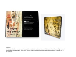
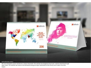
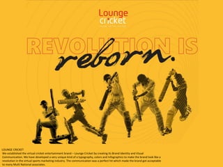
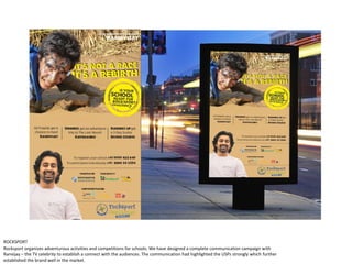
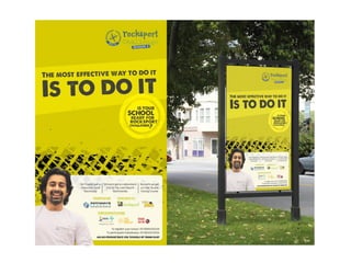
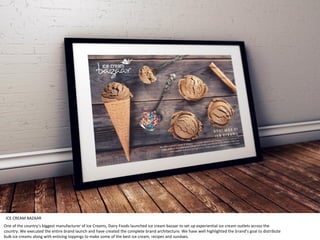
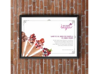
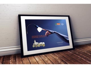
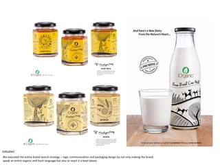
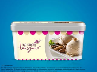
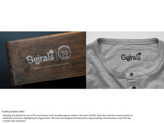
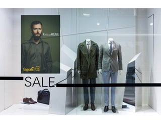
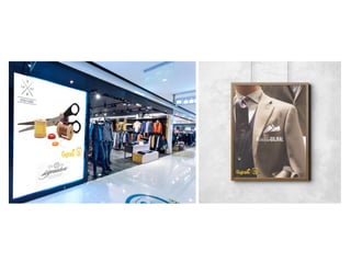
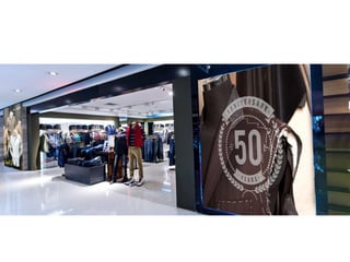
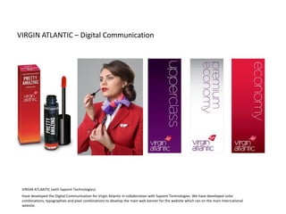
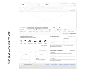
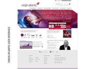
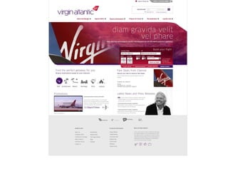
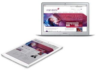
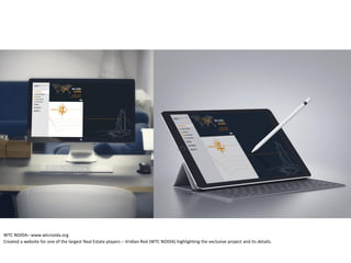
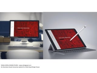
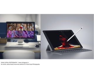
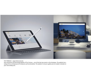
communication print
branding digital
end to end seamless solutions
We fundamentally believe that communication is at the heart of every
relationship.
So whenever we help you communicate we make certain that the
experience felt by all is human, professional and inspiring – just like us!
An award winning, multi-disciplined
digital & traditional design and
marketing agency.
We go beyond conception to deliver
experiences that work on people,
not just on paper.
5 Visual Identity Design
29 Print Design
50 Poster Design
61 Package Design
75 Graphics Design & Extended Product
87 New Media
5 Visual Identity Design
29 Print Design
43 Poster Design
61 Package Design
68 Graphics Design & Extended Product
74 New Media
Created the complete Brand Identity for one of the most popular on table grill chain of restaurants in Delhi NCR. We have
created a specific kind of a typography to connote grand–ness. Also, we have hand-sketched the representation of grilled food
to establish the immediate connect with the food and hospitality.
#6
#1CaseStudy
LEGENDS GRILLE
Developed the brand identity and conceptual communication for a plush cotton fabric manufacturer by showing
the characteristics of cotton – light-weighted, simple yet elegant and airy, still keeping the appeal classy. We
have made the communication look pure, soft and free flowing, the same way cotton made products represents.
#2CaseStudy
RENZER
Won a famous International Typography award for creating a multi-language logo for a wedding management
company by creating a unique visual representation of different languages – English, Hindi, Arabic, Dari and Urdu.
We have used a completely different approach (typography based) to make the logo unit look supreme. Moreover,
we have used different kinds of ‘one of its kind’ flowers where in every flower has a different meaning connected
to relationships and services
#3CaseStudy
VIDA FELIZ
TRUMP
#4CaseStudy
Perfectly crafted the complete Brand Communication for a model management company by using fashion oriented
classy typography and colors. Instead of making it monotonous, we have used multiple colors and straight line to get
right to the action.
We have taken an intellectual step by first creating different icons related to education and opting for International studies.
Inspium as a brand name has a meaning and essence to it, we have leveraged that to make the cohesive logo unit. We have
used the color red to make it look like a passionate action-oriented study abroad consultant.
#5CaseStudy
INSPIUM
We have created a strategic logo unit for one of the most aspiring car rental services from Formula Group. The
communication represents quick services (speed) and sophistication and neatness in every kind of an offering. We have
given a semi-circle to represent a bend / anticipation in everything which comes the way.
#6CaseStudy
FORMULA2RIDE
We have extensively used the illustrative route to make Biz Bhopu look like an unparalleled brand in the category. We
have used bright colors and independent icons like ‘i’ which represents individuality and ‘p’ as a speaker to connote
announcement. All this threads to call for a promotion – the exclusive service Biz Bhopu provides.
#7CaseStudy
BIZ BHOPU
#8CaseStudy
We have created a bespoke identity for one of the largest restaurant and sweet shop chains of Delhi NCR. The lotus
leafs represent prosperity, growth and energy – all an individual can celebrate with Mithaas. Creative usage of ‘i’
with a red dot and lotus leafs speak for the real Indian tradition and purity.
MITHAAS
#9CaseStudy
THE TERRACES
With one of the most fascinating and fun-loving typography, we have created this logo unit to monogram a holiday
destination. Also, the huts, one above the other represent the cottages at the terrace uphills and eco-friendly tourism.
This is one of the oldest logos we have done which gradually made us step up to make another logo celebrating 11
years of ultimate hospitality.
#10CaseStudy
For an ultra-luxurious, upmarket and sophisticated technology centric brand. We have managed to create a world class
identity. As the product demands, we have used visual representations of mirror image and switch to make it look really
out of the box.
MIROIR
5 Visual Identity Design
29 Print Design
43 Poster Design
61 Package Design
68 Graphics Design & Extended Product
74 New Media
UNESCO MGIEP
We have thoroughly visualized and created a concept from the Carl Haigen’s theory of Blue Dot. We have designed this
magazine with the intelligent use of Infographics representing strong facts and figures. The magazine was designed within the
given timeline and was launched in Paris to promote Global Citizenship.
PROPERTY OBSERVER
One of the finest Property consulting magazine, Property Observer hit strongly on physical and digital news stands over a period of 3
years. In the said period, we have strategize the magazine in terms of its size, content and advertisements. The magazine gradually
grabbed in a lot of traffic and therefore prospective advertisers over a period of time.
GRANDEUR
We created a visually appealing and highly informative brochure for one of the largest real estate projects of Punjab. The way we had
got the brochure executed, represents the highness and posh appeal of the project. Usage of pictures and fonts added in a lot of
value.
DELHI GOVERNMENT
We have developed a coffee table book to describe the heritage, archeology and culture of Delhi and its places. The book was done to
create a sense of love and honor towards the city of Delhi. The book was highly appreciated by the Government. It also grabbed in the
humungous eye balls.
After a thorough research, we have developed a world class coffee table book highlighting many dreams of the citizens of India and Africa to
unite for prosperity and happiness. It was an inter- government initiative which resulted in several readings, researches and content serving for
the well-ness of both nations wherein this book and its communication played the most crucial role.
AFRICAN EMBASSY
MINISTRY OF WATER RESOURCES
We developed the annual Water Review magazine for Ministry of Water
Resources wherein we used specific colors and fonts – as the magazine
demanded. We have made the magazine looked interactive and very reader
friendly. We have made the content looked breath-able and added
Infographics wherever required.
INNOX
We developed the brochure for Innox Wind Energy wherein we used specific
colors and fonts – as the magazine demanded. We have done the photoshoot
required for the magazine to make it look interactive and very reader friendly.
We have made the content looked breath-able by segregating it into desired
sections.
BIZ BHOPU
We have extensively used the illustrative route to
make Biz Bhopu look like an unparalleled brand in the
category. We have used bright colors and independent
icons like ‘i’ which represents individuality and ‘p’ as a
speaker to connote announcement. All this threads to
call for a promotion – the exclusive service Biz Bhopu
provides.
D.S. GROUP
Annual Reports of such huge corporates are meant to be
messaging to the end customers, else they just remain text
books. We have followed the thorough design elements and
have put them smartly (wherever required) in the report to
make it look unique and smart. This annual report was not
only a report but has turned out to be a communicator of
contents in itself.
FINANCIAL
We have created a smart magazine for Financial which talked
about smart investments and related schemes. The magazine
was designed in a way that it got people interact with the
consultants on regular basis.
KINBUCK 2
We have done the Menu communication for one of the most creative authentic restaurants in the heart of Delhi. We have kept the visual
communication retro and elegant, totally on the lines the restaurant has been decorated. Today, Menu has become an admired USP of
the restaurant.
KATHURIA ROLL MILLS
We have developed a yearly calendar for a robust industrialist. The calendar was designed using visuals made by sketching through
water colors. The calendar was meant to be distributed among the major industrialists of the country and it made a first level
impact.
5 Visual Identity Design
29 Print Design
43 Campaigns
61 Package Design
68 Graphics Design & Extended Product
74 New Media
We established the virtual cricket entertainment brand – Lounge Cricket by creating its Brand Identity and Visual
Communication. We have developed a very unique kind of a typography, colors and Infographics to make the brand look like a
revolution in the virtual sports marketing industry. The communication was a perfect hit which made the brand got acceptable
to many Multi National associates.
LOUNGE CRICKET
EURO ARCHITECT
FROM M.I. BUILDERS LTD.
The brief was to welcome the most
ultimate European design and
architect to the city of Lucknow.
We have designed a complete
communication strategy and
campaign to synergize the architect
of Europe to the Indian savvy
architecture. It was a successful
campaign which touch based a large
group of audiences.
ROCKSPORT
Rocksport organizes adventurous activities and competitions for schools. We have designed a complete communication campaign with
Ranvijay – the TV celebrity to establish a connect with the audiences. The communication had highlighted the USPs strongly which further
established the brand well in the market.
AISHPRA
Created a fashion communication for the brand with the use of multiple colors and fonts. Also, have made the product look like a hero,
highlighting it primarily to showcase it’s eternal beauty.
UNITED MOTORS INDIA
With a strong International
identity, the brand launched in
India at an International event.
It was a success but the
audiences confused the
product being Chinese made
and not the true American. We
developed a concept and
strategized the communication
to make the product look a real
American Renegade and up-
class than its competitors.
One of the country’s biggest manufacturer of Ice Creams, Dairy Foods launched ice cream bazaar to set up experiential ice cream outlets across the
country. We executed the entire brand launch and have created the complete brand architecture. We have well highlighted the brand’s goal to distribute
bulk ice creams along with enticing toppings to make some of the best ice cream, recipes and sundaes.
ICE CREAM BAZAAR
5 Visual Identity Design
29 Print Design
43 Poster Design
61 Package Design
68 Graphics Design & Extended Product
74 New Media
One of the market leaders around a decade ago, Leh Berry decided to actively establish itself in the market yet another time, getting back
with not just the plain flavored juices but with the goodness of the miraculous berry called Seabuckthorn. We helped the brand to launch
by making its unparalleled, out of the box packaging, making it look like an energy drink / beverage than just a juice.
LEH BERRY (SEABUCKTHORN BEVERAGES)
We executed the
packaging and carry-
forward communication
for he famous Italian ice
cream.
MOMO GELATO
We executed the entire brand launch strategy – logo, communication and packaging design by not only making the brand
speak an entire organic and fresh language but also to reach it a level above.
iORGANIC
ICE CREAM BAZAAR
One of the country’s biggest manufacturer of Ice Creams, Dairy Foods launched ice cream bazaar to set up experiential ice cream outlets across the
country. We executed the entire brand launch and have created the complete brand architecture. We have well highlighted the brand’s goal to distribute
bulk ice creams along with enticing toppings to make some of the best ice cream, recipes and sundaes.
5 Visual Identity Design
29 Print Design
53 Poster Design
61 Package Design
68 Graphics Design & Extended Product
74 New Media
GUJRALS (GUJRAL SONS)
Branding and identity for one of the most famous multi-branded apparel outlets in the heart of Delhi. Have also made the communication to
celebrate its 50 years, highlighting the legacy factor. We have also designed and executed in shop branding, show windows, retail POS and
multiple logo executions.
Strategic logo and
branding for one of the
finest gyms / body
boutiques in the city. Have
alos developed in shop
branding, show windows
and boutique POS.
FLEX BODY BOUTIQUE
5 Visual Identity Design
29 Print Design
43 Poster Design
61 Package Design
68 Graphics Design & Extended Product
74 New Media
VIRGIN ATLANTIC – Digital Communication
VIRGIN ATLANTIC (with Sapient Technologies)
Have developed the Digital Communication for Virgin Atlantic in collaboration with Sapient Technologies. We have developed color
combinations, typographies and pixel combinations to develop the main web banner for the website which ran on the main International
website.
VIRGINATLANTICWIREFRAME
VIRGINATLANTICUSERINTERFACE
UNESCO MGIEP – mgiep.unesco.org/bluedot/
We have thoroughly visualized and created a concept from the Carl Haigen’s theory of Blue Dot. We have designed the whole
Digital Communication – website and other channels along with the magazine. We have used some profilers and the
intelligent Infographics representing strong facts and figures. The website was designed within the given timeline and was
launched in Paris to promote Global Citizenship.
TREND TALK (Application)
Developed an e-commerce platform for an apparel brand/ Mobile App user interface
VRIDIAN RED – www.viridian.red
Created a main / master website along with the bouquet of micro-websites for one of the largest Real Estate players – Vridian Red
(premium WTC member) highlighting different projects and details.
RIVERSIDE RESIDENCES – www.riversideresidences.in
Created a beautiful website for one of the largest Real Estate players – Vridian Red (Riverside Residencies) highlighting the project
and its details.
WTC NOIDA– www.wtcnoida.org
Created a website for one of the largest Real Estate players – Vridian Red (WTC NOIDA) highlighting the exclusive project and its details.
VISHAL GOYAL DESIGN STUDIO – www.vishalgoyal.co.in
An illustration based interactive website for Vishal Goyal Design House.
VISHAL GOYAL PHOTOGRAPHY – www.vishalgoyal.in
An artistic, photo based interactive website for Vishal Goyal Photography.
THE TERRACES – www.theterraces.biz
Very interactive and fascinating website of The Terraces – one of the best spa resorts in the Himalayas. The website has a
rating of 9.5 on 10 because of its features and functionalities. The website is not just a gallery but an enabler to decide on
your next holiday visit.
hello@comdez.com
www.comdez.com
www.fb.com/ComDez

ComDez portfolio

  • 2.
    communication print branding digital endto end seamless solutions We fundamentally believe that communication is at the heart of every relationship. So whenever we help you communicate we make certain that the experience felt by all is human, professional and inspiring – just like us!
  • 3.
    An award winning,multi-disciplined digital & traditional design and marketing agency. We go beyond conception to deliver experiences that work on people, not just on paper.
  • 4.
    5 Visual IdentityDesign 29 Print Design 50 Poster Design 61 Package Design 75 Graphics Design & Extended Product 87 New Media
  • 5.
    5 Visual IdentityDesign 29 Print Design 43 Poster Design 61 Package Design 68 Graphics Design & Extended Product 74 New Media
  • 6.
    Created the completeBrand Identity for one of the most popular on table grill chain of restaurants in Delhi NCR. We have created a specific kind of a typography to connote grand–ness. Also, we have hand-sketched the representation of grilled food to establish the immediate connect with the food and hospitality. #6 #1CaseStudy LEGENDS GRILLE
  • 9.
    Developed the brandidentity and conceptual communication for a plush cotton fabric manufacturer by showing the characteristics of cotton – light-weighted, simple yet elegant and airy, still keeping the appeal classy. We have made the communication look pure, soft and free flowing, the same way cotton made products represents. #2CaseStudy RENZER
  • 14.
    Won a famousInternational Typography award for creating a multi-language logo for a wedding management company by creating a unique visual representation of different languages – English, Hindi, Arabic, Dari and Urdu. We have used a completely different approach (typography based) to make the logo unit look supreme. Moreover, we have used different kinds of ‘one of its kind’ flowers where in every flower has a different meaning connected to relationships and services #3CaseStudy VIDA FELIZ
  • 18.
    TRUMP #4CaseStudy Perfectly crafted thecomplete Brand Communication for a model management company by using fashion oriented classy typography and colors. Instead of making it monotonous, we have used multiple colors and straight line to get right to the action.
  • 22.
    We have takenan intellectual step by first creating different icons related to education and opting for International studies. Inspium as a brand name has a meaning and essence to it, we have leveraged that to make the cohesive logo unit. We have used the color red to make it look like a passionate action-oriented study abroad consultant. #5CaseStudy INSPIUM
  • 24.
    We have createda strategic logo unit for one of the most aspiring car rental services from Formula Group. The communication represents quick services (speed) and sophistication and neatness in every kind of an offering. We have given a semi-circle to represent a bend / anticipation in everything which comes the way. #6CaseStudy FORMULA2RIDE
  • 25.
    We have extensivelyused the illustrative route to make Biz Bhopu look like an unparalleled brand in the category. We have used bright colors and independent icons like ‘i’ which represents individuality and ‘p’ as a speaker to connote announcement. All this threads to call for a promotion – the exclusive service Biz Bhopu provides. #7CaseStudy BIZ BHOPU
  • 26.
    #8CaseStudy We have createda bespoke identity for one of the largest restaurant and sweet shop chains of Delhi NCR. The lotus leafs represent prosperity, growth and energy – all an individual can celebrate with Mithaas. Creative usage of ‘i’ with a red dot and lotus leafs speak for the real Indian tradition and purity. MITHAAS
  • 27.
    #9CaseStudy THE TERRACES With oneof the most fascinating and fun-loving typography, we have created this logo unit to monogram a holiday destination. Also, the huts, one above the other represent the cottages at the terrace uphills and eco-friendly tourism. This is one of the oldest logos we have done which gradually made us step up to make another logo celebrating 11 years of ultimate hospitality.
  • 28.
    #10CaseStudy For an ultra-luxurious,upmarket and sophisticated technology centric brand. We have managed to create a world class identity. As the product demands, we have used visual representations of mirror image and switch to make it look really out of the box. MIROIR
  • 29.
    5 Visual IdentityDesign 29 Print Design 43 Poster Design 61 Package Design 68 Graphics Design & Extended Product 74 New Media
  • 30.
    UNESCO MGIEP We havethoroughly visualized and created a concept from the Carl Haigen’s theory of Blue Dot. We have designed this magazine with the intelligent use of Infographics representing strong facts and figures. The magazine was designed within the given timeline and was launched in Paris to promote Global Citizenship.
  • 32.
    PROPERTY OBSERVER One ofthe finest Property consulting magazine, Property Observer hit strongly on physical and digital news stands over a period of 3 years. In the said period, we have strategize the magazine in terms of its size, content and advertisements. The magazine gradually grabbed in a lot of traffic and therefore prospective advertisers over a period of time.
  • 33.
    GRANDEUR We created avisually appealing and highly informative brochure for one of the largest real estate projects of Punjab. The way we had got the brochure executed, represents the highness and posh appeal of the project. Usage of pictures and fonts added in a lot of value.
  • 35.
    DELHI GOVERNMENT We havedeveloped a coffee table book to describe the heritage, archeology and culture of Delhi and its places. The book was done to create a sense of love and honor towards the city of Delhi. The book was highly appreciated by the Government. It also grabbed in the humungous eye balls.
  • 36.
    After a thoroughresearch, we have developed a world class coffee table book highlighting many dreams of the citizens of India and Africa to unite for prosperity and happiness. It was an inter- government initiative which resulted in several readings, researches and content serving for the well-ness of both nations wherein this book and its communication played the most crucial role. AFRICAN EMBASSY
  • 38.
    MINISTRY OF WATERRESOURCES We developed the annual Water Review magazine for Ministry of Water Resources wherein we used specific colors and fonts – as the magazine demanded. We have made the magazine looked interactive and very reader friendly. We have made the content looked breath-able and added Infographics wherever required. INNOX We developed the brochure for Innox Wind Energy wherein we used specific colors and fonts – as the magazine demanded. We have done the photoshoot required for the magazine to make it look interactive and very reader friendly. We have made the content looked breath-able by segregating it into desired sections.
  • 39.
    BIZ BHOPU We haveextensively used the illustrative route to make Biz Bhopu look like an unparalleled brand in the category. We have used bright colors and independent icons like ‘i’ which represents individuality and ‘p’ as a speaker to connote announcement. All this threads to call for a promotion – the exclusive service Biz Bhopu provides.
  • 40.
    D.S. GROUP Annual Reportsof such huge corporates are meant to be messaging to the end customers, else they just remain text books. We have followed the thorough design elements and have put them smartly (wherever required) in the report to make it look unique and smart. This annual report was not only a report but has turned out to be a communicator of contents in itself. FINANCIAL We have created a smart magazine for Financial which talked about smart investments and related schemes. The magazine was designed in a way that it got people interact with the consultants on regular basis.
  • 41.
    KINBUCK 2 We havedone the Menu communication for one of the most creative authentic restaurants in the heart of Delhi. We have kept the visual communication retro and elegant, totally on the lines the restaurant has been decorated. Today, Menu has become an admired USP of the restaurant.
  • 42.
    KATHURIA ROLL MILLS Wehave developed a yearly calendar for a robust industrialist. The calendar was designed using visuals made by sketching through water colors. The calendar was meant to be distributed among the major industrialists of the country and it made a first level impact.
  • 43.
    5 Visual IdentityDesign 29 Print Design 43 Campaigns 61 Package Design 68 Graphics Design & Extended Product 74 New Media
  • 44.
    We established thevirtual cricket entertainment brand – Lounge Cricket by creating its Brand Identity and Visual Communication. We have developed a very unique kind of a typography, colors and Infographics to make the brand look like a revolution in the virtual sports marketing industry. The communication was a perfect hit which made the brand got acceptable to many Multi National associates. LOUNGE CRICKET
  • 48.
    EURO ARCHITECT FROM M.I.BUILDERS LTD. The brief was to welcome the most ultimate European design and architect to the city of Lucknow. We have designed a complete communication strategy and campaign to synergize the architect of Europe to the Indian savvy architecture. It was a successful campaign which touch based a large group of audiences.
  • 51.
    ROCKSPORT Rocksport organizes adventurousactivities and competitions for schools. We have designed a complete communication campaign with Ranvijay – the TV celebrity to establish a connect with the audiences. The communication had highlighted the USPs strongly which further established the brand well in the market.
  • 54.
    AISHPRA Created a fashioncommunication for the brand with the use of multiple colors and fonts. Also, have made the product look like a hero, highlighting it primarily to showcase it’s eternal beauty.
  • 56.
    UNITED MOTORS INDIA Witha strong International identity, the brand launched in India at an International event. It was a success but the audiences confused the product being Chinese made and not the true American. We developed a concept and strategized the communication to make the product look a real American Renegade and up- class than its competitors.
  • 58.
    One of thecountry’s biggest manufacturer of Ice Creams, Dairy Foods launched ice cream bazaar to set up experiential ice cream outlets across the country. We executed the entire brand launch and have created the complete brand architecture. We have well highlighted the brand’s goal to distribute bulk ice creams along with enticing toppings to make some of the best ice cream, recipes and sundaes. ICE CREAM BAZAAR
  • 61.
    5 Visual IdentityDesign 29 Print Design 43 Poster Design 61 Package Design 68 Graphics Design & Extended Product 74 New Media
  • 62.
    One of themarket leaders around a decade ago, Leh Berry decided to actively establish itself in the market yet another time, getting back with not just the plain flavored juices but with the goodness of the miraculous berry called Seabuckthorn. We helped the brand to launch by making its unparalleled, out of the box packaging, making it look like an energy drink / beverage than just a juice. LEH BERRY (SEABUCKTHORN BEVERAGES)
  • 64.
    We executed the packagingand carry- forward communication for he famous Italian ice cream. MOMO GELATO
  • 66.
    We executed theentire brand launch strategy – logo, communication and packaging design by not only making the brand speak an entire organic and fresh language but also to reach it a level above. iORGANIC
  • 67.
    ICE CREAM BAZAAR Oneof the country’s biggest manufacturer of Ice Creams, Dairy Foods launched ice cream bazaar to set up experiential ice cream outlets across the country. We executed the entire brand launch and have created the complete brand architecture. We have well highlighted the brand’s goal to distribute bulk ice creams along with enticing toppings to make some of the best ice cream, recipes and sundaes.
  • 68.
    5 Visual IdentityDesign 29 Print Design 53 Poster Design 61 Package Design 68 Graphics Design & Extended Product 74 New Media
  • 69.
    GUJRALS (GUJRAL SONS) Brandingand identity for one of the most famous multi-branded apparel outlets in the heart of Delhi. Have also made the communication to celebrate its 50 years, highlighting the legacy factor. We have also designed and executed in shop branding, show windows, retail POS and multiple logo executions.
  • 73.
    Strategic logo and brandingfor one of the finest gyms / body boutiques in the city. Have alos developed in shop branding, show windows and boutique POS. FLEX BODY BOUTIQUE
  • 74.
    5 Visual IdentityDesign 29 Print Design 43 Poster Design 61 Package Design 68 Graphics Design & Extended Product 74 New Media
  • 75.
    VIRGIN ATLANTIC –Digital Communication VIRGIN ATLANTIC (with Sapient Technologies) Have developed the Digital Communication for Virgin Atlantic in collaboration with Sapient Technologies. We have developed color combinations, typographies and pixel combinations to develop the main web banner for the website which ran on the main International website.
  • 76.
  • 77.
  • 81.
    UNESCO MGIEP –mgiep.unesco.org/bluedot/ We have thoroughly visualized and created a concept from the Carl Haigen’s theory of Blue Dot. We have designed the whole Digital Communication – website and other channels along with the magazine. We have used some profilers and the intelligent Infographics representing strong facts and figures. The website was designed within the given timeline and was launched in Paris to promote Global Citizenship.
  • 85.
    TREND TALK (Application) Developedan e-commerce platform for an apparel brand/ Mobile App user interface
  • 86.
    VRIDIAN RED –www.viridian.red Created a main / master website along with the bouquet of micro-websites for one of the largest Real Estate players – Vridian Red (premium WTC member) highlighting different projects and details.
  • 87.
    RIVERSIDE RESIDENCES –www.riversideresidences.in Created a beautiful website for one of the largest Real Estate players – Vridian Red (Riverside Residencies) highlighting the project and its details.
  • 88.
    WTC NOIDA– www.wtcnoida.org Createda website for one of the largest Real Estate players – Vridian Red (WTC NOIDA) highlighting the exclusive project and its details.
  • 89.
    VISHAL GOYAL DESIGNSTUDIO – www.vishalgoyal.co.in An illustration based interactive website for Vishal Goyal Design House.
  • 90.
    VISHAL GOYAL PHOTOGRAPHY– www.vishalgoyal.in An artistic, photo based interactive website for Vishal Goyal Photography.
  • 91.
    THE TERRACES –www.theterraces.biz Very interactive and fascinating website of The Terraces – one of the best spa resorts in the Himalayas. The website has a rating of 9.5 on 10 because of its features and functionalities. The website is not just a gallery but an enabler to decide on your next holiday visit.
  • 93.