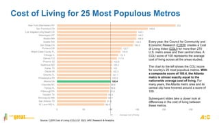
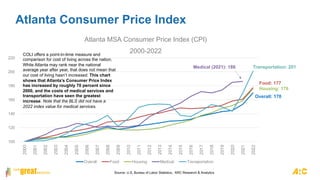
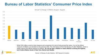
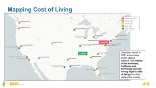
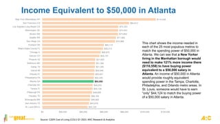
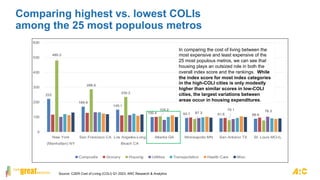
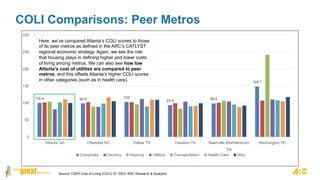
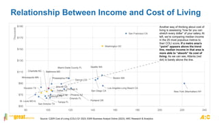
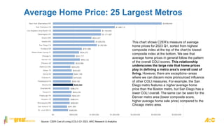
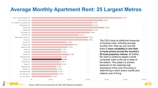
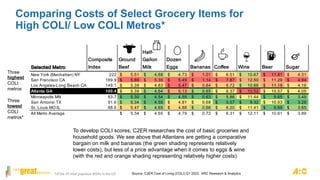
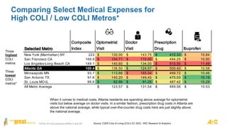
REGIONAL SNAPSHOT:
Metro Atlanta Cost of Living
October 2023
Will Wright
Sr. Data Analyst
wwright@atlantaregional.org
In summary…
According to the C2ER Cost of Living Index (COLI), Metro Atlanta’s overall cost of living is
almost exactly that of the national average. Manhattan (NYC), not surprisingly, has the
highest cost of living of any urban area on the list.
A metro Atlanta resident with a $50,000 salary moving to Manhattan would need to make
$110,558 to have equivalent spending power there. A move to San Francisco requires $84,612,
while a move to Dallas requires (a slightly higher) $51,295.
Atlanta’s cost of health care is slightly higher than some of its peer metros, but this is offset by
Atlanta’s comparatively cheaper utility costs.
Compared to the national index average of 100, metro Atlanta health care is 11.4 percent
more expensive than in the average metro area, but utilities are 18.9 percent less
expensive.
While the C2ER Cost of Living Index uses a similar methodology as the Consumer Price Index
(CPI), the COLI is not in itself a measure of inflation. We include data from the CPI in this
snapshot as a reference.
88.6
91.6
93.7
93.9
97.6
98.6
98.8
100.4
100.9
101.7
102.3
103
103.2
103.8
111.9
114.4
118.9
120.7
142.5
144.5
148.4
148.7
149.1
169.9
222
0 50 100 150 200 250
St. Louis MO-IL
San Antonio TX
Minneapolis MN
Houston TX
Pittsburgh PA
Tampa FL
Charlotte NC
Atlanta GA
Philadelphia PA
Orlando FL
Detroit MI
Dallas TX
Baltimore MD
Phoenix AZ
Denver CO
Chicago IL
Miami-Dade County FL
Portland OR
San Diego CA
Seattle WA
Boston MA
Washington DC
Los Angeles-Long Beach CA
San Francisco CA
New York (Manhattan) NY
Cost of Living for 25 Most Populous Metros
Average cost of living
Every year, the Council for Community and
Economic Research (C2ER) creates a Cost
of Living Index (COLI) for more than 270
U.S. metro areas and their central cities. A
COLI score of 100 represents the average
cost of living across all the areas studied.
The chart to the left shows the COLI score
for country’s 25 most populous metros. With
a composite score of 100.4, the Atlanta
metro is almost exactly equal to the
nationwide average cost of living. For
many years, the Atlanta metro area and its
central city have hovered around a score of
100.
Subsequent slides take a closer look at
differences in the cost of living between
these metros.
Source: C2ER Cost of Living (COLI) Q1 2023, ARC Research & Analytics
100
120
140
160
180
200
220
2000
2001
2002
2003
2004
2005
2006
2007
2008
2009
2010
2011
2012
2013
2014
2015
2016
2017
2018
2019
2020
2021
2022
Atlanta MSA Consumer Price Index (CPI)
2000-2022
Overall Food Housing Medical Transportation
Atlanta Consumer Price Index
Transportation: 201
Housing: 176
Food: 177
Overall: 170
COLI offers a point-in-time measure and
comparison for cost of living across the nation.
While Atlanta may rank near the national
average year after year, that does not mean that
our cost of living hasn’t increased. This chart
shows that Atlanta’s Consumer Price Index
has increased by roughly 70 percent since
2000, and the costs of medical services and
transportation have seen the greatest
increase. Note that the BLS did not have a
2022 index value for medical services.
Medical (2021): 186
Source: U.S, Bureau of Labor Statistics, ARC Research & Analytics
Atlanta Consumer Price Index
Similar to the previous chart, this shows only the overall levels of inflation over the past 20 years, or so. As can be seen, inflation soared immediately following the
pandemic. This happened in all metros, but it was a particularly steep rise in metro Atlanta. But, as of the latest reading, inflation has dropped to 4.4%, which
puts it on par with levels last see prior to the Great Recession. From this point forward, we will only look at C2ER’s Cost of Living Index.
Source: U.S Bureau of Labor Statistics, ARC Research & Analytics
-6.00%
-4.00%
-2.00%
0.00%
2.00%
4.00%
6.00%
8.00%
10.00%
12.00%
14.00%
Dec-02
Apr-03
Aug-03
Dec-03
Apr-04
Aug-04
Dec-04
Apr-05
Aug-05
Dec-05
Apr-06
Aug-06
Dec-06
Apr-07
Aug-07
Dec-07
Apr-08
Aug-08
Dec-08
Apr-09
Aug-09
Dec-09
Apr-10
Aug-10
Dec-10
Apr-11
Aug-11
Dec-11
Apr-12
Aug-12
Dec-12
Apr-13
Aug-13
Dec-13
Apr-14
Aug-14
Dec-14
Apr-15
Aug-15
Dec-15
Apr-16
Aug-16
Dec-16
Apr-17
Aug-17
Dec-17
Apr-18
Aug-18
Dec-18
Apr-19
Aug-19
Dec-19
Apr-20
Aug-20
Dec-20
Apr-21
Aug-21
Dec-21
Apr-22
Aug-22
Dec-22
Apr-23
Aug-23
Inflation in Metro Atlanta
Bureau of Labor Statistics’ Consumer Price Index
0.0%
1.0%
2.0%
3.0%
4.0%
5.0%
6.0%
7.0%
8.0%
9.0%
Atlanta Baltimore Chicago Detroit Houston Los Angeles New York Miami Philadelphia Phoenix San
Francisco
Seattle St Louis
Annual % Change in Inflation (August - August)
While COLI offers a point-in-time measure and comparison for cost of living across the nation, it is not the official
measure of inflation, as indicated on the previous slide. The chart above is from the Bureau of Labor Statistics, which is
widely cited as the official measure of inflation. As can be seen, inflation in metro Atlanta is among the highest,
but it trails inflation levels in New York, Detroit and Seattle.
Source: U.S Bureau of Labor Statistics, ARC Research & Analytics
Mapping Cost of Living
Over time, trends in
COLI scores have
shown distinct
patterns, with metros
in the Northeast,
California and
Northwest typically
having higher costs
of living than other
parts of the country.
Lowest
Highest
$44,124
$45,618
$46,663
$46,763
$48,606
$49,104
$49,203
$50,000
$50,249
$50,647
$50,946
$51,295
$51,394
$51,693
$55,727
$56,972
$59,213
$60,110
$70,966
$71,962
$73,904
$74,054
$74,253
$84,612
$110,558
$0 $20,000 $40,000 $60,000 $80,000 $100,000 $120,000
St. Louis MO-IL
San Antonio TX
Minneapolis MN
Houston TX
Pittsburgh PA
Tampa FL
Charlotte NC
Atlanta GA
Philadelphia PA
Orlando FL
Detroit MI
Dallas TX
Baltimore MD
Phoenix AZ
Denver CO
Chicago IL
Miami-Dade County FL
Portland OR
San Diego CA
Seattle WA
Boston MA
Washington DC
Los Angeles-Long Beach CA
San Francisco CA
New York (Manhattan) NY
Income Equivalent to $50,000 in Atlanta
This chart shows the income needed in
each of the 25 most populous metros to
match the spending power of $50,000 in
Atlanta. We can see that a New Yorker
living in the Manhattan borough would
need to make 121% more income there
($110,558) to have buying power
equivalent to a $50,000 salary in
Atlanta. An income of $50,000 in Atlanta
would provide roughly equivalent
spending power in the Tampa, Charlotte,
Philadelphia, and Orlando metro areas. In
St. Louis, someone would have to earn
“only” $44,124 to match the buying power
of a $50,000 salary in Atlanta.
Source: C2ER Cost of Living (COLI) Q1 2023, ARC Research & Analytics
222
169.9
149.1
100.4 93.7 91.6 88.6
480.2
286.6
235.2
104.2
87.3
79.1 76.3
0
100
200
300
400
500
600
New York
(Manhattan) NY
San Francisco CA Los Angeles-Long
Beach CA
Atlanta GA Minneapolis MN San Antonio TX St. Louis MO-IL
Composite Grocery Housing Utilities Transportation Health Care Misc.
Comparing highest vs. lowest COLIs
among the 25 most populous metros
In comparing the cost of living between the
most expensive and least expensive of the
25 most populous metros, we can see that
housing plays an outsized role in both the
overall index score and the rankings. While
the index score for most index categories
in the high-COLI cities is only modestly
higher than similar scores in low-COLI
cities, the largest variations between
areas occur in housing expenditures.
Source: C2ER Cost of Living (COLI) Q1 2023, ARC Research & Analytics
COLI Comparisons: Peer Metros
100.4 98.8 103
93.9 98.9
148.7
0
50
100
150
200
250
300
Atlanta GA Charlotte NC Dallas TX Houston TX Nashville-Murfreesboro
TN
Washington DC
Composite Grocery Housing Utilities Transportation Health Care Misc.
Here, we’ve compared Atlanta’s COLI scores to those
of its peer metros as defined in the ARC’s CATLYST
regional economic strategy. Again, we see the role
that housing plays in defining higher and lower costs
of living among metros. We can also see how low
Atlanta’s cost of utilities are compared to peer
metros, and this offsets Atlanta’s higher COLI scores
in other categories (such as in health care).
Source: C2ER Cost of Living (COLI) Q1 2023, ARC Research & Analytics
Relationship Between Income and Cost of Living
Atlanta GA
Baltimore MD
Boston MA
Charlotte NC
Chicago IL
Dallas TX
Denver CO
Detroit MI
Houston TX Los Angeles-Long Beach CA
Miami-Dade County FL
Minneapolis MN
New York (Manhattan) NY
Orlando FL
Philadelphia PA
Phoenix AZ
Pittsburgh PA
Portland OR
San Antonio TX
San Diego CA
San Francisco CA
Seattle WA
St. Louis MO-IL Tampa FL
Washington DC
$50
$70
$90
$110
$130
$150
$170
$190
80 100 120 140 160 180 200 220 240
Thousands
Another way of thinking about cost of
living is assessing “how far you can
stretch every dollar” of your salary. At
left, we’re comparing median income
in the 25 most populous metros to
their COLI score. If a metro area’s
“point” appears above the trend
line, median income in that area is
more able to “absorb” its cost of
living. As we can see, Atlanta (red
dot) is barely above the line.
Source: C2ER Cost of Living (COLI) Q1 2023, ESRI Business Analyst Online (2023), ARC Research & Analytics
$368,084
$341,693
$405,601
$399,014
$442,321
$453,276
$399,213
$488,560
$435,182
$475,000
$491,199
$454,857
$425,250
$523,996
$653,122
$531,717
$634,375
$701,098
$1,062,881
$1,009,333
$933,427
$1,171,487
$1,164,849
$1,498,712
$2,639,444
$0 $500,000 $1,000,000 $1,500,000 $2,000,000 $2,500,000 $3,000,000
St. Louis MO-IL
San Antonio TX
Minneapolis MN
Houston TX
Pittsburgh PA
Tampa FL
Charlotte NC
Atlanta GA
Philadelphia PA
Orlando FL
Detroit MI
Dallas TX
Baltimore MD
Phoenix AZ
Denver CO
Chicago IL
Miami-Dade County FL
Portland OR
San Diego CA
Seattle WA
Boston MA
Washington DC
Los Angeles-Long Beach CA
San Francisco CA
New York (Manhattan) NY
Average Home Price: 25 Largest Metros
This chart shows C2ER’s measure of average
home prices for 2023 Q1, sorted from highest
composite index at the top of the chart to lowest
composite index at the bottom. We see that
average home prices in general follow the pattern
of the overall COLI scores. This relationship
underscores the large role that home prices
play in defining a metro area’s overall cost of
living. However, there are exceptions--areas
where we can discern more pronounced influence
of other COLI measures. For example, the San
Diego metro features a higher average home
price than the Boston metro, but San Diego has a
lower COLI overall. The same can be seen for the
Denver metro area (lower composite score,
higher average home sale price) compared to the
Chicago metro area.
Source: C2ER Cost of Living (COLI) Q1 2023, ARC Research & Analytics
$1,083
$1,423
$1,376
$1,340
$1,308
$1,591
$1,505
$1,596
$1,599
$1,989
$1,595
$1,570
$1,916
$2,221
$1,868
$2,994
$3,003
$2,545
$3,099
$3,256
$3,883
$3,256
$3,248
$3,814
$4,814
$0 $1,000 $2,000 $3,000 $4,000 $5,000 $6,000
St. Louis MO-IL
San Antonio TX
Minneapolis MN
Houston TX
Pittsburgh PA
Tampa FL
Charlotte NC
Atlanta GA
Philadelphia PA
Orlando FL
Detroit MI
Dallas TX
Baltimore MD
Phoenix AZ
Denver CO
Chicago IL
Miami-Dade County FL
Portland OR
San Diego CA
Seattle WA
Boston MA
Washington DC
Los Angeles-Long Beach CA
San Francisco CA
New York (Manhattan) NY
Average Monthly Apartment Rent: 25 Largest Metros
The COLI looks at additional measures
of housing costs, including average
monthly rent. Here we can see that
there is more variability in rent than
in home prices across the country’s
25 most populous metros. As before,
the chart is sorted by largest overall
composite index at the top to least at
the bottom. This pattern is another
testament to the relatively high
importance of the cost of housing in
determining a metro area’s overall (and
relative) cost of living.
Source: C2ER Cost of Living (COLI) Q1 2023, ARC Research & Analytics
Selected Metro
Composite
Index
Ground
Beef
Half-
Gallon
Milk
Dozen
Eggs Bananas Coffee Wine Beer Sugar
New York (Manhattan) NY 222 5.51
$ 4.68
$ 4.73
$ 1.01
$ 6.51
$ 10.67
$ 11.81
$ 4.31
$
San Francisco CA 169.9 5.89
$ 5.35
$ 5.49
$ 1.14
$ 7.87
$ 12.50
$ 11.29
$ 4.94
$
Los Angeles-Long Beach CA 149.1 5.39
$ 4.83
$ 5.47
$ 0.84
$ 6.72
$ 10.66
$ 11.18
$ 4.16
$
Atlanta GA 100.4 5.39
$ 4.64
$ 5.13
$ 0.65
$ 6.37
$ 13.52
$ 10.57
$ 4.05
$
Minneapolis MN 93.7 5.30
$ 4.54
$ 4.55
$ 0.63
$ 5.86
$ 11.44
$ 9.65
$ 3.49
$
San Antonio TX 91.6 5.34
$ 4.55
$ 4.81
$ 0.68
$ 5.57
$ 9.32
$ 10.53
$ 3.28
$
St. Louis MO-IL 88.6 5.47
$ 4.65
$ 4.88
$ 0.66
$ 6.20
$ 11.41
$ 9.69
$ 3.65
$
All Metro Average 5.34
$ 4.65
$ 4.79
$ 0.72
$ 6.31
$ 12.11
$ 10.61
$ 3.89
$
Comparing Costs of Select Grocery Items for
High COLI/ Low COLI Metros*
*Of the 25 most populous MSAs in the US
Three
highest
COLI
metros
Three
lowest
COLI
metros*
To develop COLI scores, C2ER researches the cost of basic groceries and
household goods. We see above that Atlantans are getting a comparative
bargain on milk and bananas (the green shading represents relatively
lower costs), but less of a price advantage when it comes to eggs & wine
(with the red and orange shading representing relatively higher costs).
Source: C2ER Cost of Living (COLI) Q1 2023, ARC Research & Analytics
Comparing Select Medical Expenses for
High COLI / Low COLI Metros*
*Of the 25 most populous MSAs in the US
Three
highest
COLI
metros
Three
lowest
COLI
metros*
Selected Metro
Composite
Index
Optometrist
Visit
Doctor
Visit
Prescription
Drug Ibuprofen
New York (Manhattan) NY 222 130.00
$ 143.75
$ 412.33
$ 10.84
$
San Francisco CA 169.9 154.71
$ 170.00
$ 494.25
$ 10.90
$
Los Angeles-Long Beach CA 149.1 140.60
$ 134.00
$ 515.50
$ 11.49
$
Atlanta GA 100.4 136.50
$ 124.57
$ 500.40
$ 10.58
$
Minneapolis MN 93.7 113.66
$ 165.04
$ 499.72
$ 10.46
$
San Antonio TX 91.6 140.20
$ 149.45
$ 475.03
$ 10.19
$
St. Louis MO-IL 88.6 82.86
$ 91.25
$ 487.42
$ 10.29
$
All Metro Average 123.57
$ 131.54
$ 469.56
$ 10.53
$
When it comes to medical costs, Atlanta residents are spending above average for optometrist
visits but below average on doctor visits. In a similar fashion, prescription drug costs in Atlanta are
above the national average, while typical over-the-counter drug costs here are just slightly above
the national average.
Source: C2ER Cost of Living (COLI) Q1 2023, ARC Research & Analytics
Selected Metro
Composite
Index Haircut Boy Jeans
Women
Slacks Newspaper Energy Cost
New York (Manhattan) NY 222 31.00
$ 29.99
$ 36.64
$ 6.50
$ 189.79
$
San Francisco CA 169.9 27.13
$ 29.70
$ 52.71
$ 16.80
$ 291.07
$
Los Angeles-Long Beach CA 149.1 26.25
$ 35.33
$ 44.10
$ 10.42
$ 233.08
$
Atlanta GA 100.4 26.63
$ 30.66
$ 36.48
$ 12.29
$ 132.78
$
Minneapolis MN 93.7 25.41
$ 31.67
$ 40.46
$ 14.08
$ 173.99
$
San Antonio TX 91.6 27.20
$ 26.24
$ 41.80
$ 10.89
$ 137.32
$
St. Louis MO-IL 88.6 20.33
$ 25.69
$ 20.47
$ 7.66
$ 194.23
$
All Metro Average 23.46
$ 28.03
$ 35.22
$ 11.41
$ 192.98
$
Cost of Select Other Items for
High COLI/ Low COLI Metros*
*Of the 25 most populous MSAs in the US
Three
highest
COLI
metros
Three
lowest
COLI
metros*
Finally, as anyone who’s talked to friends who don’t live in the Atlanta area
probably knows, Atlantans are spending a lot less on our power bills than
are residents of most other large metros around the country. In fact, the
national metro average for energy costs is 45% higher than the average
energy cost in the metro Atlanta area.
Source: C2ER Cost of Living (COLI) Q1 2023, ARC Research & Analytics
Southern Region Consumer Expenditure by Income
12.1%
17.2%
13.1% 14.3% 12.7% 12.4% 12.0% 11.4% 11.8% 9.2%
33.8%
42.0%
40.1% 36.3% 35.9% 35.1% 33.1% 31.4% 31.2%
29.6%
8.8%
8.3%
11.5%
10.5%
9.3% 9.4%
9.0%
8.2% 8.7%
6.5%
18.0%
15.6% 18.3%
19.2%
21.1% 19.6%
20.4%
18.5% 14.4%
15.5%
27.4%
16.9% 17.0% 19.7% 21.0% 23.5% 25.3%
30.5% 33.9%
39.2%
0%
10%
20%
30%
40%
50%
60%
70%
80%
90%
100%
Total South Less than
$15,000
$15,000 to
$29,999
$30,000 to
$39,999
$40,000 to
$49,999
$50,000 to
$69,999
$70,000 to
$99,999
$100,000 to
$149,999
$150,000 to
$199,999
$200,000 and
more
Percent Share of Average Expenditures by Income Before Taxes,
Southern Region Consumer Expenditure Survey, 2020-2021
Food Housing Healthcare Transportation Other
It’s important to remember that
even though living in Atlanta isn’t
expensive compared to other
metros, “affordability” is a relative
term. This chart shows the
percentage of income that
people of different income
brackets devote to different
expense categories.
It’s easy to see that the spending in
“other” categories increases as
disposable income increases. This
may seem intuitive since all
remaining categories could be
classified as “needs” rather than
“wants”. However, the largest
expenditure category for the
$200,000+ set is life/personal
insurance and pensions/social
security, which many would argue
shouldn’t be classified as a “want.”
Source: U.S, Bureau of Labor Statistics, ARC Research & Analytics

COLI snapshot

  • 1.
    REGIONAL SNAPSHOT: Metro AtlantaCost of Living October 2023 Will Wright Sr. Data Analyst wwright@atlantaregional.org
  • 2.
    In summary… According tothe C2ER Cost of Living Index (COLI), Metro Atlanta’s overall cost of living is almost exactly that of the national average. Manhattan (NYC), not surprisingly, has the highest cost of living of any urban area on the list. A metro Atlanta resident with a $50,000 salary moving to Manhattan would need to make $110,558 to have equivalent spending power there. A move to San Francisco requires $84,612, while a move to Dallas requires (a slightly higher) $51,295. Atlanta’s cost of health care is slightly higher than some of its peer metros, but this is offset by Atlanta’s comparatively cheaper utility costs. Compared to the national index average of 100, metro Atlanta health care is 11.4 percent more expensive than in the average metro area, but utilities are 18.9 percent less expensive. While the C2ER Cost of Living Index uses a similar methodology as the Consumer Price Index (CPI), the COLI is not in itself a measure of inflation. We include data from the CPI in this snapshot as a reference.
  • 3.
    88.6 91.6 93.7 93.9 97.6 98.6 98.8 100.4 100.9 101.7 102.3 103 103.2 103.8 111.9 114.4 118.9 120.7 142.5 144.5 148.4 148.7 149.1 169.9 222 0 50 100150 200 250 St. Louis MO-IL San Antonio TX Minneapolis MN Houston TX Pittsburgh PA Tampa FL Charlotte NC Atlanta GA Philadelphia PA Orlando FL Detroit MI Dallas TX Baltimore MD Phoenix AZ Denver CO Chicago IL Miami-Dade County FL Portland OR San Diego CA Seattle WA Boston MA Washington DC Los Angeles-Long Beach CA San Francisco CA New York (Manhattan) NY Cost of Living for 25 Most Populous Metros Average cost of living Every year, the Council for Community and Economic Research (C2ER) creates a Cost of Living Index (COLI) for more than 270 U.S. metro areas and their central cities. A COLI score of 100 represents the average cost of living across all the areas studied. The chart to the left shows the COLI score for country’s 25 most populous metros. With a composite score of 100.4, the Atlanta metro is almost exactly equal to the nationwide average cost of living. For many years, the Atlanta metro area and its central city have hovered around a score of 100. Subsequent slides take a closer look at differences in the cost of living between these metros. Source: C2ER Cost of Living (COLI) Q1 2023, ARC Research & Analytics
  • 4.
    100 120 140 160 180 200 220 2000 2001 2002 2003 2004 2005 2006 2007 2008 2009 2010 2011 2012 2013 2014 2015 2016 2017 2018 2019 2020 2021 2022 Atlanta MSA ConsumerPrice Index (CPI) 2000-2022 Overall Food Housing Medical Transportation Atlanta Consumer Price Index Transportation: 201 Housing: 176 Food: 177 Overall: 170 COLI offers a point-in-time measure and comparison for cost of living across the nation. While Atlanta may rank near the national average year after year, that does not mean that our cost of living hasn’t increased. This chart shows that Atlanta’s Consumer Price Index has increased by roughly 70 percent since 2000, and the costs of medical services and transportation have seen the greatest increase. Note that the BLS did not have a 2022 index value for medical services. Medical (2021): 186 Source: U.S, Bureau of Labor Statistics, ARC Research & Analytics
  • 5.
    Atlanta Consumer PriceIndex Similar to the previous chart, this shows only the overall levels of inflation over the past 20 years, or so. As can be seen, inflation soared immediately following the pandemic. This happened in all metros, but it was a particularly steep rise in metro Atlanta. But, as of the latest reading, inflation has dropped to 4.4%, which puts it on par with levels last see prior to the Great Recession. From this point forward, we will only look at C2ER’s Cost of Living Index. Source: U.S Bureau of Labor Statistics, ARC Research & Analytics -6.00% -4.00% -2.00% 0.00% 2.00% 4.00% 6.00% 8.00% 10.00% 12.00% 14.00% Dec-02 Apr-03 Aug-03 Dec-03 Apr-04 Aug-04 Dec-04 Apr-05 Aug-05 Dec-05 Apr-06 Aug-06 Dec-06 Apr-07 Aug-07 Dec-07 Apr-08 Aug-08 Dec-08 Apr-09 Aug-09 Dec-09 Apr-10 Aug-10 Dec-10 Apr-11 Aug-11 Dec-11 Apr-12 Aug-12 Dec-12 Apr-13 Aug-13 Dec-13 Apr-14 Aug-14 Dec-14 Apr-15 Aug-15 Dec-15 Apr-16 Aug-16 Dec-16 Apr-17 Aug-17 Dec-17 Apr-18 Aug-18 Dec-18 Apr-19 Aug-19 Dec-19 Apr-20 Aug-20 Dec-20 Apr-21 Aug-21 Dec-21 Apr-22 Aug-22 Dec-22 Apr-23 Aug-23 Inflation in Metro Atlanta
  • 6.
    Bureau of LaborStatistics’ Consumer Price Index 0.0% 1.0% 2.0% 3.0% 4.0% 5.0% 6.0% 7.0% 8.0% 9.0% Atlanta Baltimore Chicago Detroit Houston Los Angeles New York Miami Philadelphia Phoenix San Francisco Seattle St Louis Annual % Change in Inflation (August - August) While COLI offers a point-in-time measure and comparison for cost of living across the nation, it is not the official measure of inflation, as indicated on the previous slide. The chart above is from the Bureau of Labor Statistics, which is widely cited as the official measure of inflation. As can be seen, inflation in metro Atlanta is among the highest, but it trails inflation levels in New York, Detroit and Seattle. Source: U.S Bureau of Labor Statistics, ARC Research & Analytics
  • 7.
    Mapping Cost ofLiving Over time, trends in COLI scores have shown distinct patterns, with metros in the Northeast, California and Northwest typically having higher costs of living than other parts of the country. Lowest Highest
  • 8.
    $44,124 $45,618 $46,663 $46,763 $48,606 $49,104 $49,203 $50,000 $50,249 $50,647 $50,946 $51,295 $51,394 $51,693 $55,727 $56,972 $59,213 $60,110 $70,966 $71,962 $73,904 $74,054 $74,253 $84,612 $110,558 $0 $20,000 $40,000$60,000 $80,000 $100,000 $120,000 St. Louis MO-IL San Antonio TX Minneapolis MN Houston TX Pittsburgh PA Tampa FL Charlotte NC Atlanta GA Philadelphia PA Orlando FL Detroit MI Dallas TX Baltimore MD Phoenix AZ Denver CO Chicago IL Miami-Dade County FL Portland OR San Diego CA Seattle WA Boston MA Washington DC Los Angeles-Long Beach CA San Francisco CA New York (Manhattan) NY Income Equivalent to $50,000 in Atlanta This chart shows the income needed in each of the 25 most populous metros to match the spending power of $50,000 in Atlanta. We can see that a New Yorker living in the Manhattan borough would need to make 121% more income there ($110,558) to have buying power equivalent to a $50,000 salary in Atlanta. An income of $50,000 in Atlanta would provide roughly equivalent spending power in the Tampa, Charlotte, Philadelphia, and Orlando metro areas. In St. Louis, someone would have to earn “only” $44,124 to match the buying power of a $50,000 salary in Atlanta. Source: C2ER Cost of Living (COLI) Q1 2023, ARC Research & Analytics
  • 9.
    222 169.9 149.1 100.4 93.7 91.688.6 480.2 286.6 235.2 104.2 87.3 79.1 76.3 0 100 200 300 400 500 600 New York (Manhattan) NY San Francisco CA Los Angeles-Long Beach CA Atlanta GA Minneapolis MN San Antonio TX St. Louis MO-IL Composite Grocery Housing Utilities Transportation Health Care Misc. Comparing highest vs. lowest COLIs among the 25 most populous metros In comparing the cost of living between the most expensive and least expensive of the 25 most populous metros, we can see that housing plays an outsized role in both the overall index score and the rankings. While the index score for most index categories in the high-COLI cities is only modestly higher than similar scores in low-COLI cities, the largest variations between areas occur in housing expenditures. Source: C2ER Cost of Living (COLI) Q1 2023, ARC Research & Analytics
  • 10.
    COLI Comparisons: PeerMetros 100.4 98.8 103 93.9 98.9 148.7 0 50 100 150 200 250 300 Atlanta GA Charlotte NC Dallas TX Houston TX Nashville-Murfreesboro TN Washington DC Composite Grocery Housing Utilities Transportation Health Care Misc. Here, we’ve compared Atlanta’s COLI scores to those of its peer metros as defined in the ARC’s CATLYST regional economic strategy. Again, we see the role that housing plays in defining higher and lower costs of living among metros. We can also see how low Atlanta’s cost of utilities are compared to peer metros, and this offsets Atlanta’s higher COLI scores in other categories (such as in health care). Source: C2ER Cost of Living (COLI) Q1 2023, ARC Research & Analytics
  • 11.
    Relationship Between Incomeand Cost of Living Atlanta GA Baltimore MD Boston MA Charlotte NC Chicago IL Dallas TX Denver CO Detroit MI Houston TX Los Angeles-Long Beach CA Miami-Dade County FL Minneapolis MN New York (Manhattan) NY Orlando FL Philadelphia PA Phoenix AZ Pittsburgh PA Portland OR San Antonio TX San Diego CA San Francisco CA Seattle WA St. Louis MO-IL Tampa FL Washington DC $50 $70 $90 $110 $130 $150 $170 $190 80 100 120 140 160 180 200 220 240 Thousands Another way of thinking about cost of living is assessing “how far you can stretch every dollar” of your salary. At left, we’re comparing median income in the 25 most populous metros to their COLI score. If a metro area’s “point” appears above the trend line, median income in that area is more able to “absorb” its cost of living. As we can see, Atlanta (red dot) is barely above the line. Source: C2ER Cost of Living (COLI) Q1 2023, ESRI Business Analyst Online (2023), ARC Research & Analytics
  • 12.
    $368,084 $341,693 $405,601 $399,014 $442,321 $453,276 $399,213 $488,560 $435,182 $475,000 $491,199 $454,857 $425,250 $523,996 $653,122 $531,717 $634,375 $701,098 $1,062,881 $1,009,333 $933,427 $1,171,487 $1,164,849 $1,498,712 $2,639,444 $0 $500,000 $1,000,000$1,500,000 $2,000,000 $2,500,000 $3,000,000 St. Louis MO-IL San Antonio TX Minneapolis MN Houston TX Pittsburgh PA Tampa FL Charlotte NC Atlanta GA Philadelphia PA Orlando FL Detroit MI Dallas TX Baltimore MD Phoenix AZ Denver CO Chicago IL Miami-Dade County FL Portland OR San Diego CA Seattle WA Boston MA Washington DC Los Angeles-Long Beach CA San Francisco CA New York (Manhattan) NY Average Home Price: 25 Largest Metros This chart shows C2ER’s measure of average home prices for 2023 Q1, sorted from highest composite index at the top of the chart to lowest composite index at the bottom. We see that average home prices in general follow the pattern of the overall COLI scores. This relationship underscores the large role that home prices play in defining a metro area’s overall cost of living. However, there are exceptions--areas where we can discern more pronounced influence of other COLI measures. For example, the San Diego metro features a higher average home price than the Boston metro, but San Diego has a lower COLI overall. The same can be seen for the Denver metro area (lower composite score, higher average home sale price) compared to the Chicago metro area. Source: C2ER Cost of Living (COLI) Q1 2023, ARC Research & Analytics
  • 13.
    $1,083 $1,423 $1,376 $1,340 $1,308 $1,591 $1,505 $1,596 $1,599 $1,989 $1,595 $1,570 $1,916 $2,221 $1,868 $2,994 $3,003 $2,545 $3,099 $3,256 $3,883 $3,256 $3,248 $3,814 $4,814 $0 $1,000 $2,000$3,000 $4,000 $5,000 $6,000 St. Louis MO-IL San Antonio TX Minneapolis MN Houston TX Pittsburgh PA Tampa FL Charlotte NC Atlanta GA Philadelphia PA Orlando FL Detroit MI Dallas TX Baltimore MD Phoenix AZ Denver CO Chicago IL Miami-Dade County FL Portland OR San Diego CA Seattle WA Boston MA Washington DC Los Angeles-Long Beach CA San Francisco CA New York (Manhattan) NY Average Monthly Apartment Rent: 25 Largest Metros The COLI looks at additional measures of housing costs, including average monthly rent. Here we can see that there is more variability in rent than in home prices across the country’s 25 most populous metros. As before, the chart is sorted by largest overall composite index at the top to least at the bottom. This pattern is another testament to the relatively high importance of the cost of housing in determining a metro area’s overall (and relative) cost of living. Source: C2ER Cost of Living (COLI) Q1 2023, ARC Research & Analytics
  • 14.
    Selected Metro Composite Index Ground Beef Half- Gallon Milk Dozen Eggs BananasCoffee Wine Beer Sugar New York (Manhattan) NY 222 5.51 $ 4.68 $ 4.73 $ 1.01 $ 6.51 $ 10.67 $ 11.81 $ 4.31 $ San Francisco CA 169.9 5.89 $ 5.35 $ 5.49 $ 1.14 $ 7.87 $ 12.50 $ 11.29 $ 4.94 $ Los Angeles-Long Beach CA 149.1 5.39 $ 4.83 $ 5.47 $ 0.84 $ 6.72 $ 10.66 $ 11.18 $ 4.16 $ Atlanta GA 100.4 5.39 $ 4.64 $ 5.13 $ 0.65 $ 6.37 $ 13.52 $ 10.57 $ 4.05 $ Minneapolis MN 93.7 5.30 $ 4.54 $ 4.55 $ 0.63 $ 5.86 $ 11.44 $ 9.65 $ 3.49 $ San Antonio TX 91.6 5.34 $ 4.55 $ 4.81 $ 0.68 $ 5.57 $ 9.32 $ 10.53 $ 3.28 $ St. Louis MO-IL 88.6 5.47 $ 4.65 $ 4.88 $ 0.66 $ 6.20 $ 11.41 $ 9.69 $ 3.65 $ All Metro Average 5.34 $ 4.65 $ 4.79 $ 0.72 $ 6.31 $ 12.11 $ 10.61 $ 3.89 $ Comparing Costs of Select Grocery Items for High COLI/ Low COLI Metros* *Of the 25 most populous MSAs in the US Three highest COLI metros Three lowest COLI metros* To develop COLI scores, C2ER researches the cost of basic groceries and household goods. We see above that Atlantans are getting a comparative bargain on milk and bananas (the green shading represents relatively lower costs), but less of a price advantage when it comes to eggs & wine (with the red and orange shading representing relatively higher costs). Source: C2ER Cost of Living (COLI) Q1 2023, ARC Research & Analytics
  • 15.
    Comparing Select MedicalExpenses for High COLI / Low COLI Metros* *Of the 25 most populous MSAs in the US Three highest COLI metros Three lowest COLI metros* Selected Metro Composite Index Optometrist Visit Doctor Visit Prescription Drug Ibuprofen New York (Manhattan) NY 222 130.00 $ 143.75 $ 412.33 $ 10.84 $ San Francisco CA 169.9 154.71 $ 170.00 $ 494.25 $ 10.90 $ Los Angeles-Long Beach CA 149.1 140.60 $ 134.00 $ 515.50 $ 11.49 $ Atlanta GA 100.4 136.50 $ 124.57 $ 500.40 $ 10.58 $ Minneapolis MN 93.7 113.66 $ 165.04 $ 499.72 $ 10.46 $ San Antonio TX 91.6 140.20 $ 149.45 $ 475.03 $ 10.19 $ St. Louis MO-IL 88.6 82.86 $ 91.25 $ 487.42 $ 10.29 $ All Metro Average 123.57 $ 131.54 $ 469.56 $ 10.53 $ When it comes to medical costs, Atlanta residents are spending above average for optometrist visits but below average on doctor visits. In a similar fashion, prescription drug costs in Atlanta are above the national average, while typical over-the-counter drug costs here are just slightly above the national average. Source: C2ER Cost of Living (COLI) Q1 2023, ARC Research & Analytics
  • 16.
    Selected Metro Composite Index HaircutBoy Jeans Women Slacks Newspaper Energy Cost New York (Manhattan) NY 222 31.00 $ 29.99 $ 36.64 $ 6.50 $ 189.79 $ San Francisco CA 169.9 27.13 $ 29.70 $ 52.71 $ 16.80 $ 291.07 $ Los Angeles-Long Beach CA 149.1 26.25 $ 35.33 $ 44.10 $ 10.42 $ 233.08 $ Atlanta GA 100.4 26.63 $ 30.66 $ 36.48 $ 12.29 $ 132.78 $ Minneapolis MN 93.7 25.41 $ 31.67 $ 40.46 $ 14.08 $ 173.99 $ San Antonio TX 91.6 27.20 $ 26.24 $ 41.80 $ 10.89 $ 137.32 $ St. Louis MO-IL 88.6 20.33 $ 25.69 $ 20.47 $ 7.66 $ 194.23 $ All Metro Average 23.46 $ 28.03 $ 35.22 $ 11.41 $ 192.98 $ Cost of Select Other Items for High COLI/ Low COLI Metros* *Of the 25 most populous MSAs in the US Three highest COLI metros Three lowest COLI metros* Finally, as anyone who’s talked to friends who don’t live in the Atlanta area probably knows, Atlantans are spending a lot less on our power bills than are residents of most other large metros around the country. In fact, the national metro average for energy costs is 45% higher than the average energy cost in the metro Atlanta area. Source: C2ER Cost of Living (COLI) Q1 2023, ARC Research & Analytics
  • 17.
    Southern Region ConsumerExpenditure by Income 12.1% 17.2% 13.1% 14.3% 12.7% 12.4% 12.0% 11.4% 11.8% 9.2% 33.8% 42.0% 40.1% 36.3% 35.9% 35.1% 33.1% 31.4% 31.2% 29.6% 8.8% 8.3% 11.5% 10.5% 9.3% 9.4% 9.0% 8.2% 8.7% 6.5% 18.0% 15.6% 18.3% 19.2% 21.1% 19.6% 20.4% 18.5% 14.4% 15.5% 27.4% 16.9% 17.0% 19.7% 21.0% 23.5% 25.3% 30.5% 33.9% 39.2% 0% 10% 20% 30% 40% 50% 60% 70% 80% 90% 100% Total South Less than $15,000 $15,000 to $29,999 $30,000 to $39,999 $40,000 to $49,999 $50,000 to $69,999 $70,000 to $99,999 $100,000 to $149,999 $150,000 to $199,999 $200,000 and more Percent Share of Average Expenditures by Income Before Taxes, Southern Region Consumer Expenditure Survey, 2020-2021 Food Housing Healthcare Transportation Other It’s important to remember that even though living in Atlanta isn’t expensive compared to other metros, “affordability” is a relative term. This chart shows the percentage of income that people of different income brackets devote to different expense categories. It’s easy to see that the spending in “other” categories increases as disposable income increases. This may seem intuitive since all remaining categories could be classified as “needs” rather than “wants”. However, the largest expenditure category for the $200,000+ set is life/personal insurance and pensions/social security, which many would argue shouldn’t be classified as a “want.” Source: U.S, Bureau of Labor Statistics, ARC Research & Analytics