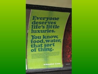
Oxfam Advert The advert has no picture to accompany the writing. This means that that writing is straight away the main focal point of the advert. The first sentence is casual, as if it is having a conversation with the reader. The statement, “Everyone deserves life’s little luxuries” could have purposely been chosen to appeal to everyone's more self-indulgent side, the side that believes they deserve to relax and take a break from their ‘stressful’ lifestyle. However the advert goes on to say things that are common place and normal to most readers. Food and water probably were not the ‘luxuries’ that the reader had in mind and it may make the reader feel guilty that their idea of luxury is selfish and greedy compared to the idea of luxury poor people have. This could make people give money to Oxfam because this moment of guilt will help people sympathise with those in need. The colours are also positive colours, colours that connote freshness and new beginnings. This puts a positive edge on the message; if you donate you are also being positive and making a worth while step forward in your life.  The advert can be seen around London underground, therefore it is for any type of person of any age. This shows that Oxfam understands that this is an issue that can be understood by everyone and therefore everyone has the understanding to want to try and help and donate.
 
Child Abuse Ad The use of imagery and writing is very effective in this advert. The striking photo of a man holding his middle finger up is shocking alone, the viewer’s attention will immediately be grabbed. The colours of black and white also make the image stand out more in a very gloomy and oppressive way and so the tone of the message is set. The viewer will then also look at the label, a label which everyone is familiar with and see it as something to keep children away from harm. Using this ‘safety label’ in this context creates a worrying juxtaposition as it is clear that the hand gesture is not concordant with the safety guideline of the label. This will make the viewer perhaps feel uneasy and therefore feel like they should donate so that this feeling is a little elevated and that they have helped to stop the issue in some way.  This advert is most definitely aimed at adults for it is inappropriate for younger people or children. This shows that the advert is perhaps relying on the paternal and maternal instincts of adults with children and therefore they will donate more money.

Charity adverts

  • 1.
  • 2.
    Oxfam Advert Theadvert has no picture to accompany the writing. This means that that writing is straight away the main focal point of the advert. The first sentence is casual, as if it is having a conversation with the reader. The statement, “Everyone deserves life’s little luxuries” could have purposely been chosen to appeal to everyone's more self-indulgent side, the side that believes they deserve to relax and take a break from their ‘stressful’ lifestyle. However the advert goes on to say things that are common place and normal to most readers. Food and water probably were not the ‘luxuries’ that the reader had in mind and it may make the reader feel guilty that their idea of luxury is selfish and greedy compared to the idea of luxury poor people have. This could make people give money to Oxfam because this moment of guilt will help people sympathise with those in need. The colours are also positive colours, colours that connote freshness and new beginnings. This puts a positive edge on the message; if you donate you are also being positive and making a worth while step forward in your life. The advert can be seen around London underground, therefore it is for any type of person of any age. This shows that Oxfam understands that this is an issue that can be understood by everyone and therefore everyone has the understanding to want to try and help and donate.
  • 3.
  • 4.
    Child Abuse AdThe use of imagery and writing is very effective in this advert. The striking photo of a man holding his middle finger up is shocking alone, the viewer’s attention will immediately be grabbed. The colours of black and white also make the image stand out more in a very gloomy and oppressive way and so the tone of the message is set. The viewer will then also look at the label, a label which everyone is familiar with and see it as something to keep children away from harm. Using this ‘safety label’ in this context creates a worrying juxtaposition as it is clear that the hand gesture is not concordant with the safety guideline of the label. This will make the viewer perhaps feel uneasy and therefore feel like they should donate so that this feeling is a little elevated and that they have helped to stop the issue in some way. This advert is most definitely aimed at adults for it is inappropriate for younger people or children. This shows that the advert is perhaps relying on the paternal and maternal instincts of adults with children and therefore they will donate more money.