- jQuery Mobile has UI components that can be used to build web apps, including toolbars, formatting elements, buttons, lists, and forms.
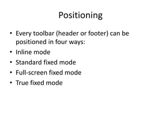
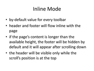
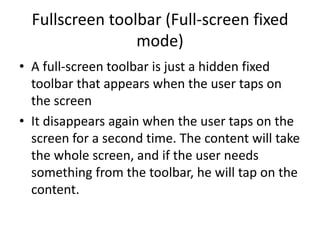
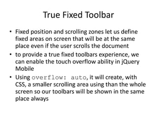
- Toolbars can define headers and footers and be positioned in inline, standard fixed, full-screen fixed, or true fixed modes. True fixed mode uses CSS overflow to create a scrolling area within the screen.
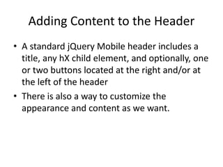
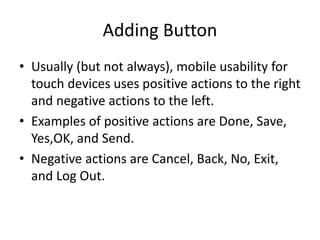
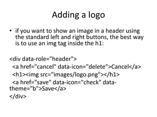
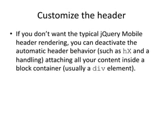
- Content can be added to headers including titles, buttons, images, and more. Buttons are typically placed on the right or left for positive and negative actions respectively.