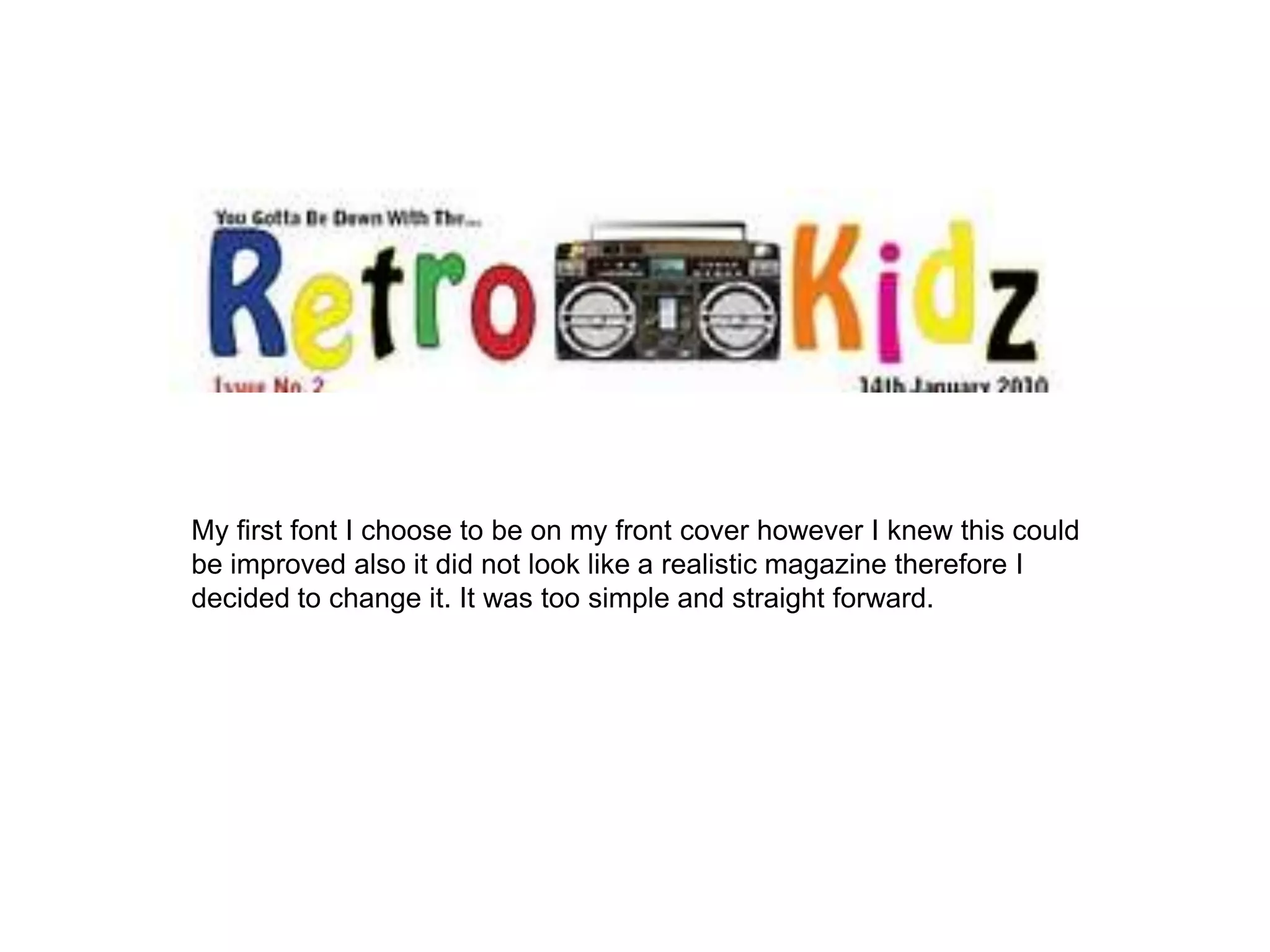
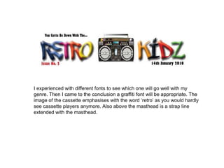
The author initially chose a simple font for their magazine cover but decided it did not look realistic so experimented with different fonts, ultimately concluding a graffiti font would be most appropriate. An image of a cassette tape on the cover emphasizes the word "retro" as cassette players are rarely seen anymore. Above the masthead is a strap line extending the title.