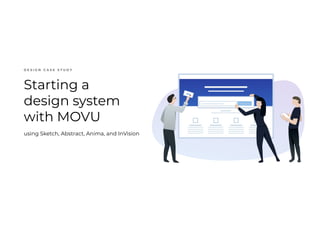
Using Sketch, Abstract version control, Anima toolkit (flexbox), and InVision. This talk was held at the SHARE NOW offices in Hamburg, as part of the Moinworld design meetup.
There is certain topic discussed in every company: communication between departments.
As FE developers, we sit in between UX designers and BE developers.
Our apps must follow the guidelines from the UX, be compatible with the BE APIs while meeting the business requirements from our POs.
In this presentation I am addressing the relationship between UX and FE devs.
One way to collaborate better with our UX colleagues is to… learn a bit of UX and maybe share some Front End knowledge with them too.
First users: Heuristics for designer/developer collaborationJonathan Abbett
From the University of Illinois Web Conference 2013.
Ask a web designer who his “first users” are, and he’ll probably name early adopters, stakeholders, or usability testers. Designers rarely consider their actual first users: the web developers they work with to build their designs. Over the last year, I’ve performed an informal user research project where the “users” were software development teams of all shapes and sizes. Drawing on these discussions and my background as a former web developer, I’ve created a set of friendly heuristics (in the tradition of Jakob Nielsen and Louis Rosenfeld) that designers can use to make their design materials far more useful for developers. I’ll show how these heuristics will encourage holistic solutions rather than piecemeal design work, surface critical implementation issues sooner, and establish a stronger basis for designer/developer collaboration.
EXPLORING VARIOUS UI INTERACTION PATTERNSROHISIVAM
AIM:
To explore various UI interaction patterns
Theory:
Understanding different UI interaction patterns is essential for creating engaging and user-friendly digital interfaces. This document provides a brief overview of ten UI interaction patterns commonly used in design.
List of Explained UI Interaction Patterns:
1.Hover Effects
2.Sliders and Carousels
3.Pop-up Modals
4.Expandable Menus
5.Drag-and-Drop Interactions
6.Parallax Scrolling
7.Toggle Switches
8.Progress Bars
9.Swipe Gestures
10.Tooltips
Common UI Interaction Patterns:
1.Hover Effects
Hover effects are dynamic changes that occur when a user hovers their mouse pointer over an element. Common examples include color shifts, button animations, and image enlargements.
2.Sliders and Carousels
Sliders and carousels allow multiple pieces of content to occupy a single screen space, which users can navigate through by swiping or clicking arrows. They are useful for showcasing multiple images or content pieces without cluttering the interface.
3.Pop-up Modals
Pop-up modals are overlay windows that display additional content or actions. They often appear when triggered by a button or link, providing focused user interactions without leaving the current context.
4.Expandable Menus
Expandable menus, such as accordions or collapsible panels, reveal hidden content or options when clicked. They are effective for organizing and presenting information in a compact format.
5.Drag-and-Drop Interactions
Drag-and-drop interactions enable users to move elements within a digital interface. These interactions are often used for reordering items, organizing content, or customizing layouts.
6.Parallax Scrolling
Parallax scrolling creates a 3D effect by moving background elements at different speeds as users scroll. It's often used for storytelling or adding depth to web pages.
7.Toggle Switches
Toggle switches allow users to turn features on or off with a simple toggle. They are common in settings, preferences, and filtering options.
8.Progress Bars
Progress bars display the completion status of a task, providing visual feedback to users. They are commonly used in forms, file uploads, and loading screens.
9.Swipe Gestures
Swipe gestures involve horizontal or vertical finger movements on touch screens. They are used for navigation, image galleries, and content browsing.
10.Tooltips
Tooltips provide supplementary information when users hover or tap on an element. They are useful for explaining functions, features, or abbreviations in a concise manner.
Conclusion:
This theoretical overview highlights the key characteristics and use cases of ten common UI interaction patterns. Understanding these patterns is crucial for designing user-centric and effective digital interfaces.
Developing an interface with proper UI Style Guides
AIM:
To develop an interface with proper UI style guides
PROCEDURE:
Step1: Open Figma Launch the Figma application on your computer.
Step2: Create a New Project In Figma,
A design system is a framework of practices that bring designers and products together. It is a platform to identify, and document what to share, whether a visual style, design patterns, front-end UI components, and practices like accessibility, research, content strategy.
The role of design with enterprise organizations is expanding, spreading across product teams and influencing decision-making at higher and higher levels. This scale, paired with the array of devices, browsers, screen sizes, locales, and environments, makes it increasingly challenging to align designers and developers to deliver cohesive user experiences.
In this talk, I’ll discuss the lessons learned, the challenges faced, and best practices for creating and maintaining an effective interface design system.
Presented at 3|SHARE's EVOLVE'15 - The Adobe Experience Manager Community Summit on Monday August 19th, 2015 at the Hard Rock Hotel in San Diego, CA. http://evolve.3sharecorp.com
At the UXCamp.ch barcamp on May 11, 2019 in Zurich, Marcel Kessler talked about what he thinks is the future of prototyping: Using coded react components in tools like UXPin (Merge), FramerX (Bridge), Alva and Modulz.
Implementing a Design System in a Small Team by SnapTravelProduct School
This session will provide a blueprint for how a team of 2 Designers and 3 Frontend engineers can work together, in a lean way, to build and implement a design system within 6 months while still working on other important company initiatives/features.
A talk given to the AOP Product Group, discussing the challenges with producing digital magazines that work across all devices. The problem is not delivery, but workflow. I talk about some of the design thinking and techniques that we have used to address this problem with Padify.
The road to faster mock-ups: How we built and shared our design systemandrewdenty
Design systems help us design consistent, joined up experiences across different products and platforms. With many designers working across a company, how do you easily share your design system so they’re each working with the latest version and not duplicating work?
This session is a case study aiming to give an overview of how we have used our design system, Honeycomb. Most talks on design systems focus on building a web toolkit, or library, with a bunch of developer ready components. But I want to show how we have created a number of resources for designers to speed up how they create designs before they hand over to developers.
We have used tools such as Sketch and Brand AI to build a library of components, which makes it really easy to create and change mockups. We typically use these mockups to test designs with end users before building.
Design system presentation - How to sell it internallyEugene Kardash
Design System is a systematic approach to creating and maintaining consistent user interfaces, which coherently communicate the brand values and empower user experience.
This presentation's goal is to give an overview of the current state of design maturity at the company (here, at Herbalife Nutrition), to justify the necessity of having it, and to get buy-ins from decision makers.
Lecture 2 from the MHIT 603 course on Human Interface Technology. This lecture provides an introduction to Prototyping. Taught by Mark Billinghurst at the University of Canterbury, July 17th, 2014.
How to Use Engineers in a UX DepartmentStephen James
Barbarians at the Gates How to Bring Engineers into Your UX Department in order to Lower Coordination and Transaction Costs and Accelerate Product Development
This is a modified version of a presentation given at an internal UX department offsite meeting for a large technology company back in 2014
Design Systems: Designing out Waste, Designing in ConsistencyEqual Experts
Design Systems help modern innovative companies build new software quickly without waste and with a consistent look and feel.
They are the single source of truth to allow the teams to design, realise and develop a product.
From our work with Design Systems for Equal Experts' clients we have many learnings to share about benefits and risks and what needs to be overcome to get a system live and adopted.
SPEAKER: David Hawdale. Product and UX person at Equal Experts.
Contact www.equalexperts.com
Contact David: david.hawdale@hawdale-associates.co.uk
Between Filth and Fortune- Urban Cattle Foraging Realities by Devi S Nair, An...Mansi Shah
This study examines cattle rearing in urban and rural settings, focusing on milk production and consumption. By exploring a case in Ahmedabad, it highlights the challenges and processes in dairy farming across different environments, emphasising the need for sustainable practices and the essential role of milk in daily consumption.
Expert Accessory Dwelling Unit (ADU) Drafting ServicesResDraft
Whether you’re looking to create a guest house, a rental unit, or a private retreat, our experienced team will design a space that complements your existing home and maximizes your investment. We provide personalized, comprehensive expert accessory dwelling unit (ADU)drafting solutions tailored to your needs, ensuring a seamless process from concept to completion.
You could be a professional graphic designer and still make mistakes. There is always the possibility of human error. On the other hand if you’re not a designer, the chances of making some common graphic design mistakes are even higher. Because you don’t know what you don’t know. That’s where this blog comes in. To make your job easier and help you create better designs, we have put together a list of common graphic design mistakes that you need to avoid.
Dive into the innovative world of smart garages with our insightful presentation, "Exploring the Future of Smart Garages." This comprehensive guide covers the latest advancements in garage technology, including automated systems, smart security features, energy efficiency solutions, and seamless integration with smart home ecosystems. Learn how these technologies are transforming traditional garages into high-tech, efficient spaces that enhance convenience, safety, and sustainability.
Ideal for homeowners, tech enthusiasts, and industry professionals, this presentation provides valuable insights into the trends, benefits, and future developments in smart garage technology. Stay ahead of the curve with our expert analysis and practical tips on implementing smart garage solutions.
White wonder, Work developed by Eva TschoppMansi Shah
White Wonder by Eva Tschopp
A tale about our culture around the use of fertilizers and pesticides visiting small farms around Ahmedabad in Matar and Shilaj.
7 Alternatives to Bullet Points in PowerPointAlvis Oh
So you tried all the ways to beautify your bullet points on your pitch deck but it just got way uglier. These points are supposed to be memorable and leave a lasting impression on your audience. With these tips, you'll no longer have to spend so much time thinking how you should present your pointers.
4. Switzerland’s largest
relocation platform.
Providing quality-tested
relocation and cleaning
service quotes from trusted
providers.
The platform is in English,
German, and French.
MOVU’s mission is to reduce
the stress of moving. Mine
was to create a stress-free
user interface experience
for its customers.
4
10. • Rapid growth + high designer turnover = inconsistencies.
• Increased friction for:
• Users
• MOVU’s team
10
The challenge
What is clickable? Only “Weiterlesen”. Interactive elements and
non-interactive elements were sometimes styled in the same way, giving
an unclear signal of how a user might be able to use the product.
13. 13
The solution: a design system
“A design system is a set of interconnected patterns and
shared practices coherently organized to serve
the purpose of a digital product.”
– Alla Kholmatova, Design Systems
14. 14
Design systems are
• A strategy for complex digital products, or products that will
rapidly scale.
• Specific solutions for simple features, freeing the team to focus
on solving complex challenges.
• Decision-making knowledge so individual team members make
consistent informed decisions.
• Less, higher quality, reusable design.
• DS are different from team to team. My experience mainly centers
around 1-2 designer teams and 3-10 frontend developers.
15. 15
Our goals
• Categorize and normalize the UI.
• Create a pattern library that serves as the single-source of truth.
• Use common design patterns.
• Improve the design/development handover.
• Reuse components as often as possible.
• Implement improvements across the entire platform rather
than in each feature separately.
22. 22
Divide and conquer
Map components to main user journey.
Subdivide main user journey into smaller flows e.g. inquiry flow,
booking flow.
23. 23
Atomic Design
“A mental model to help us think of our user interfaces as both a
cohesive whole and a collection of parts at the same time.”
– Brad Frost, Atomic design
24. 24
MOVU’s model
FOUNDATION ELEMENTS COMPONENTS TEMPLATES PAGES
Design
tokens/variables
Typography,
color, and space
Smallest
functional units
e.g. Atoms
Don’t make
sense in isolation
Complex interface
modules e.g.
Molecules +
Organisms
Make sense in
isolation
Layouts with
responsive
behavior
Templates with
real content
29. North star ⭐
• Clarity and simplicity over style
• Only one prio 1. No needless parts.
• Design with a perpetual beginner user in mind–simplify tasks
and present meaningful information when it’s most useful
• Unbreakable in every language (localization)
• Know when it’s time to move on. Pragmatic quality at 90%
• Create with reusability in mind, aiming for crafting as well as
possible given existing restrictions.
• Test internally for quality in a timebox.
29
MOVU’s Design Principles
30. 30
Naming
Mix of Atomic Design + CSS BEM ( Block Element Modifier) naming
methodologies. “/” = 📁 e.g. “element / button / primary / active”
Words to use:
• Semantic HTML or Material Design
• Purpose-based naming & real-world inspired naming
A good name is memorable, describes the use and purpose of an
interface module, and explains its visual hierarchy (how loud it is
compared to similar components).
34. 34
9 states of design
The Nine States of Design by Vince Speelman
Nothing Loading None One
Some Too many Incorrect
Correct
Done
35. 35
Step 4: Sync to InVision
Sync the Sketch page to InVision and make sure nothing breaks
(e.g. Anima can be buggy on InVision sync).
36. 36
Another designer opens the branch on Abstract and inspects
changes.
They check that everything was designed as expected, and follows
guidelines established.
Step 5: Internal QA 🔍
37. 37
Step 6: Merge
After Internal QA success, the branch is merged back to master.
Mark as “done” and review with developers.