Download to read offline


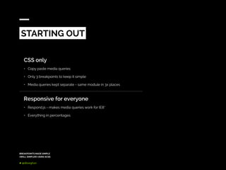


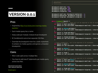

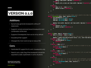


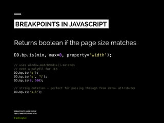


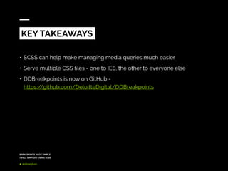


The document discusses a simplified approach to managing breakpoints in responsive web design using SCSS, aiming to create reusable code and maintain simplicity across projects. It highlights the evolution of a breakpoint mixin, detailing the pros and cons of different versions and how they support various devices, including older browsers like IE8. Key takeaways include the benefits of using SCSS for easier media query management and the availability of the ddbreakpoints library on GitHub.


![[SF HTML5] Responsive Cross-Device Development with Web Standards (2013)](https://cdn.slidesharecdn.com/ss_thumbnails/rwd-web-standards-sfhtml5-170412200009-thumbnail.jpg?width=640&height=640&fit=bounds)