1. We decided to use tracking shots and
panning close ups so the audience could feel
the atmosphere and the tension within the
scene. Furthermore, they can see the extent
of detail so that they can capture exactly
what is going on.
I decided to use black and white colours to
show how Kate’s life is really sad and boring.
The added effect of fading was used so the
audience could feel how Kate’s world was
closing in and how she felt isolated.
Establishing shot to show how this doesn’t actually look like a church to emphasise how she rushed
herself into getting married when she wasn’t ready hence the church looks more like a posh office.
I used a slow motion edit so the audience
feels the emotion and tense atmosphere.
This also adds to the dramatic effect of how
her life has slowed down and she will not be
able to recover from this horrific event.
The significance of the single rose is that she
is now one meaning alone; furthermore, the
colours due to the effect of being black and
white shows how inside she is dying and can
do nothing about it.
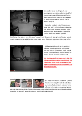
The use of slow motion head turns portrays
how the main story line is to do with these
characters. Furthermore it adds a striking
effect to it. I have seen many soap operas’
use this convention and therefore decided to use and develop this convention and the audience can
get a close up feel as to what the emotions are on the characters face.
2. I also realised that in all soap operas they
have an establishing point where the main
stories are set and where everyone meets
and usually it is either a cafe of some sort
or either a pub and so we used the idea of
having the outside of a pub for our main
stories. We got an establishing shot and a
P.O.V of the audience so they could see
the actual setting of the pub.
I used voice over so we could tell two
stories within a couple of seconds without
having to play two different stories.
In this scene as you can see the despair
and confusion on Mason’s face, there is a
voice over speaking ‘Mason, I don’t love
you anymore.’ By doing this we could see
how the stories are linked.
Another idea we wanted to put across was
drugs. So we used a BCU of two hands
exchanging the ‘drugs’ and then we used a
slow motion of the exchange again but this
time we used bleached colouring to show
how it is a cold world and you will get
involved with the wrong company.
3. We used the idea of someone getting
pregnant as it is such a gripping and
controversial subject. We used a high
angle shot to show how this character is
inferior as she is confu8sed with what to
do with her life.
In this story we have the two characters standing over Rav to show how not only in this scene but
perhaps together the two are stronger
and superior to Rav. The positioning was
important so you actually couldn’t see
how or if we were beating up Phil.
In this shot you can see I added a black
and white filter to create the dark and
ominous atmosphere. It also portrays
how there is no hope for Rav who is
obviously singled out in this fight which
leads to him losing.
4. Likewise with this picture you can see I
have also added the black and white filter.
However, in this shot we used a high
angle shot to emphasise how the two
were superior to Rav furthermore both
aggressive characters are dressed in
thuggish clothes to connote their attitude
and behaviour.
As you can see in this print screen I
removed the colour to show how there is
now hope in Rav’s life. Also notice how the
two aggressors are fleeing from the scene
to mirror they are no longer the dominant
and superior force. You can see that
Mason still has his hood up as he is trying
I utilised 1.5 second snapshots of all the
characters with their names so the audience could
really come to grips with who was who. Who plays
the protagonists and who plays the villains, the
reason being was I felt that it made me wanting
more so I thought this would help.
5. I used title cards to explore some of the main
conventions and themes so that the audience knew
exactly what was going on without giving away too much information. I also used the colours and
font of the E4 brand as we would like for the conventions to be met.