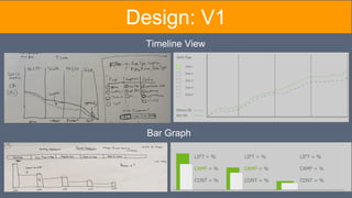
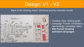
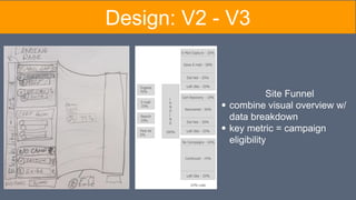
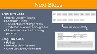
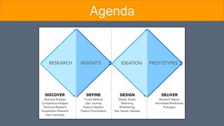
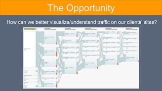
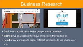
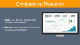
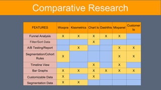
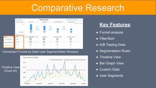
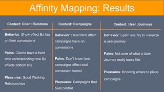
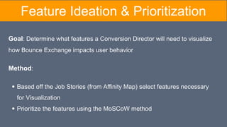
The document summarizes research conducted to understand how to better visualize user behavior and traffic on clients' websites for conversion directors. User interviews found it is difficult to explain the value of services and to see campaign impact. Comparative research on analytics tools showed popular features include funnel analysis, filters, and timelines. Job stories identified pain points such as a lack of visualizing lift over control and user journeys. Features like custom reports, funnels, and segmentation were prioritized. Prototypes of a dashboard with a site funnel and timeline views were created with the goal of giving a simple, informative way to visualize data.


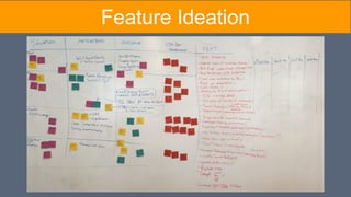
![Job Story Pain Points Key Quotes
When informing clients of our
progress, I want to use the data to
tell a story so I can demonstrate the
value of Bounce Exchange.
1. Clients & Conversion Directors look at
different metrics for success
2. Statistics alone don't tell the whole story
3. Bx campaigns interfering with client
campaigns
"It's all about the story the numbers are telling"
"I try to make my clients look as good as
possible to their bosses"
"The reality is, [the client] is sold on Bounce
Exchange itself as a product"
When measuring success, I want to
visualize lift over control so I can
better understand the effects of a
campaign at each stage in the
conversion funnel.
1. No easy way to visualize campaign lift
"The data I would be most interested to see is
the difference in pre-BX / control data versus
with post-BX / BX shown data at each defined
'goals'. "
"Google Analytics does a much better job of
showing campaign impact"
When targeting user segments, I
want to visualize their journeys so I
can place campaigns appropriately.
1. Current Dashboard doesn’t represent how
Conversion Director thinks about client sites
2. No way to visualize where they are losing
customers.
3. Google Analytics Funnel is overwhelming,
not actionable
“The dashboard… it's this stacked linear thing
and I don't think it matches the same way we
think about it”
"I want a funnel analysis so I can see where
the leaks are and target those areas with
campaigns"
Job Stories](https://image.slidesharecdn.com/bounceexchangedeckmodified-160114020111/85/BounceX-Client-Presentation-20-320.jpg)
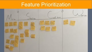
![Job Story Pain Points Key Quotes Features
When informing clients of our
progress, I want to use the data to
tell a story so I can demonstrate
the value of Bounce Exchange.
1. Clients & Conversion Directors look at
different metrics for success
2. Statistics alone don't tell the whole story
3. Bx campaigns interfering with client
campaigns
"It's all about the story the numbers are
telling"
"I try to make my clients look as good as
possible to their bosses"
"The reality is, [the client] is sold on Bounce
Exchange itself as a product"
● Custom Inputs
● Data Filtering
● Timeline View
● Goal Tracking
When measuring success, I want
to visualize lift over control so I
can better understand the effects
of a campaign at each stage in the
conversion funnel.
1. No easy way to visualize campaign lift
"The data I would be most interested to see
is the difference in pre-BX / control data
versus with post-BX / BX shown data at
each defined 'goals'. "
"Google Analytics does a much better job
of showing campaign impact"
● Campaign Lift
● KPI Reports
● Campaign Funnel
When targeting user segments, I
want to visualize their journeys so
I can place campaigns
appropriately.
1. Current Dashboard doesn’t represent
how Conversion Director thinks about client
sites
2. No way to visualize where they are
losing customers.
3. Google Analytics Funnel is
overwhelming, not actionable
“The dashboard… it's this stacked linear
thing and I don't think it matches the same
way we think about it”
"I want a funnel analysis so I can see
where the leaks are and target those areas
with campaigns"
● User Segmentation
● Site Funnel
Job Stories (w/ features)](https://image.slidesharecdn.com/bounceexchangedeckmodified-160114020111/85/BounceX-Client-Presentation-24-320.jpg)