Below the fold: Architecting a mission-critical department website
•Download as PPTX, PDF•
5 likes•4,977 views

A case study about making a departmental website better through user research, information architecture, content strategy, design and teamwork at Ithaca College. Presentation given at eduWEB11, 8/2/11, San Antonio, TX

Recommended
Recommended
More Related Content
What's hot
What's hot (11)
Viewers also liked
Viewers also liked (20)
Similar to Below the fold: Architecting a mission-critical department website
Similar to Below the fold: Architecting a mission-critical department website (20)
More from J. Todd Bennett
More from J. Todd Bennett (9)
Recently uploaded
Recently uploaded (20)
Below the fold: Architecting a mission-critical department website
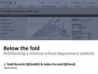
- 1. Below the fold Architecting a mission-critical department website J. Todd Bennett (@jtoddb) & Adam Forrand (@4and) decimal152
- 2. Architecting a helpful (yes, helpful) Student Financial Services experience
- 3. A case study about making a departmental website better through user research, information architecture, content strategy, design and teamwork …at Ithaca College
- 4. Ithaca College is a private college located on the South Hill of Ithaca, New York Founded in 1892 Just over 6,000 students (mostly undergraduate) with 5 schools and 2 divisions
- 5. This is Bonny She is not your presenter, but wanted to be. Say hello to her on Twitter @bggriffith
- 6. The right mix of people Benjamin Costello Web Applications Architect Eric Maguire VP for Enrollment Management Various Leaders Student Financial Services Bonny Georgia Griffith Director of Recruitment Marketing and us…
- 7. These people had a problem
- 8. Like most private colleges, IC is tuition-driven Ithaca’s total cost of attendance is $48,707 AND… They award $145 million in aid each year and 85% of students receive some financial aid
- 9. They have very helpful people in their financial aid and billing office… …but a not-so-helpful website
- 10. The background… Financial Aid and Bursar merged Each had separate sites, with different CMSs Tons of redundancies in content Content repurposed from print Sites were a maintenance nightmare Bad user experience for everyone
- 12. Minimize maintenance headaches for the staff
- 14. Financial aid is very complex and difficult to understand
- 15. Families are in search of better tools to understand the processStudy: “Cracking the Student Aid Code”, College Board
- 17. This was ONE page 1/8 of that page (Enlarged for your viewing enjoyment)
- 18. College Aid Programs Endowed scholarships Federal Programs NY State Programs FAQs
- 23. Discovery Flickr: David G Crawford
- 25. Admissions staff interviews
- 26. Conversations regarding content development and editorial workflows with key SFS staff
- 28. Usability tests of the current Student Financial Services sites performed by current undergraduates
- 29. A focus group with prospective students and their family members regarding concerns about valuing and financing a college education
- 30. Interviews with prospective students and parents discussing their needs and preferences for financial information from colleges and its impact on enrollment decisions
- 34. Directories
- 35. Index
- 36. Search
- 37. Letters
- 38. Publications
- 39. Telephone 24 references to “Bursar”
- 40. Student Financial Services? “I usually call the bursar’s office and have them transfer me to financial aid”
- 41. 2 content management systems… … each with benefits and limitations Required a hybrid solution
- 42. Architecture & Content Strategy Mark Bennett
- 48. Content Design
- 53. Then we added the REAL content
- 54. Content Workflow Working_Copy_ICContent_1.2.2.1_Ithaca_Grants Revision1_ICContent_ Revision2_ICContent_ FINAL_ICContent_
- 60. Putting it together Flickr: Comunidade 0937
- 65. Post Launch Testing & Feedback
- 67. J. Todd Bennett todd@decimal152.com http://www.linkedin.com/in/jtoddbennett @jtoddb on Twitter Adam P. Forrand adam@decimal152.com http://www.linkedin.com/in/adamforrand @4and on Twitter
Editor's Notes
- Adam
- Some of you may be looking for
- If you’re interested in any of these things, you’re in the right place
- And not just the fact that some of them were missing their heads
- Handoff to Todd
- This is MISSION-CRITICAL
- Talk about trickle-down redesign. How departments get left to fend for themselves.
- The result of that is pages like this
- It was obvious to everyone that this site needed a little work.
- So here’s what we set out to do. This was our process.
- All of these people will able to work together by using great tools.
- Handoff to Adam
- In addition we looked at letters, billing statements, brochures,phone tree messaging,call logs
- That presentation provided the outline for a major part of the IA
- Looking for any and all references to the site.
- One office, two websites. Nobody knows the name. Can’t find them. Catalog content. Print letters.
- Last slide in discovery, next is architecture
- Handoff to Todd
- That presentation provided the outline for a major part of the IA
- Notice the numbering system?
- This looks straightforward… but serious CMS constraints made planning very impt
- Content requirements tables- one of these for every page of the new IANote the consolidation of deadlines
- With all of the requirements, we could map out who does what, source content, SMEsNote it’s all still tied to the numbering systemThis is the last slide. Moving on to content design.
- Handoff to AdamWe call this content design, because the emphasis is on the content, design is used to support that.
- Then we wireframed every page of the IA, based on content requirements, before the contentThis was important because the CMS situation dictated the placement and layouts of some content
- Next we produced the content, delivered in wireframes. This was important to emphasize formattingDynamic content (FAQs, Deadlines, promos, documents) delivered in Word
- Sketches for financial aid 101This was going to be a series of videos, Larry left
- Slideshow graphics and addl graphics for the site
- We took inspiration from utility and credit card companies
- Benjamin and his team at Ithaca did all of the implementation in the CMSBonny populated the content
- Handoff to ToddNo major issues in usability testsReduced phone calls- staff able to use site as a resourceEasier maintenanceGreat feedback on tutorials– mentions from parents that it influenced their decision