Download to read offline

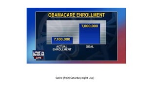
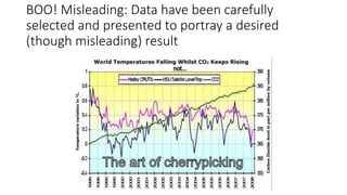


The document discusses various ways that data can be misleadingly presented in charts and graphs. It provides examples of pie charts that are difficult to interpret because the slices are too small, as well as bar graphs that deceive by manipulating the scale of the y-axis to exaggerate differences. The document advocates for using complete data sets and properly scaling graphs to accurately represent information without bias.


