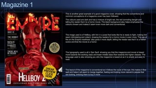
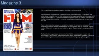
This document analyzes and compares magazine covers for horror movies. It discusses conventions for effective horror movie magazine covers, such as using dark colors, images of the main characters, and clear display of the movie title. It provides examples of both good and poor covers. The good covers follow conventions like prominent placement of the actor's image and movie title. Poor covers have issues like small or hard to find text, lack of structure, and images that don't clearly indicate the horror genre. Overall, the document examines what makes for a magazine cover that effectively promotes a horror movie.