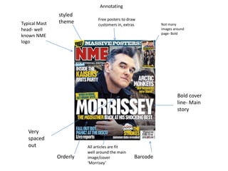
The document analyzes the cover page of a magazine called NME. It notes that the cover page has a spaced out, orderly design with the masthead in bold at the top and articles fitting around the main image in the center. While it includes some typical conventions like bright colors and taglines, the overall style targets an older audience compared to magazines like Kerrang that aim for younger readers.


![Coveranalysis[1]](https://cdn.slidesharecdn.com/ss_thumbnails/coveranalysis1-130516045034-phpapp02-thumbnail.jpg?width=640&height=640&fit=bounds)


