An example of DATA alteration for a presentation for 500+ audiences
•
0 likes•482 views

It shows how terrible the data treated before the presentation.

Recommended
Recommended
More Related Content
Recently uploaded
Recently uploaded (20)
Featured
Featured (20)
An example of DATA alteration for a presentation for 500+ audiences
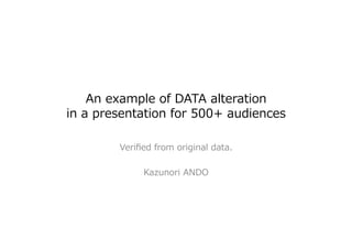
- 1. An example of DATA alteration in a presentation for 500+ audiences Verified from original data. Kazunori ANDO
- 2. Original data from Vade-‐‑‒Retro. The presenter have same data but didnʼ’t know another one had the same one. Date ISP name Sum of the rates=100% For each date, it shows spam sending rates for 15 Japanese ISPs.
- 3. A graph included in the original data from Vade-‐‑‒Retro(Excel file) 15 series (ISPs)
- 4. Change graph type to show sum of the rates (always 100% of course…)
- 5. Deleted a series(ISP) which have the biggest average rate. This graph is generated from original data which I have… (Note: The height of graph shows “100% -‐‑‒ a deleted ISP rate”) Only 14 series
- 6. The graph in actual presentation. Please compare this and the previous page.
- 7. Problems The Slide title didnʼ’t describe real meaning… -‐‑‒ The title is “How many spam send from Japanese ISPs?” -‐‑‒ The original data donʼ’t include any number of spam. -‐‑‒ The presenter change the meaning of graph! The deletion of data from original one. -‐‑‒ Why did he delete the series which have biggest sending rate? -‐‑‒ The sum of rates are not 100%... After this presentation, any correction or apology from presenter is not observed.