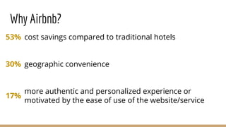
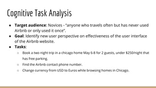
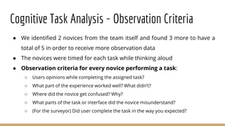
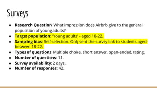
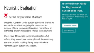
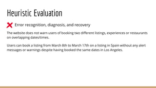
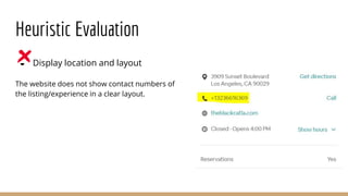
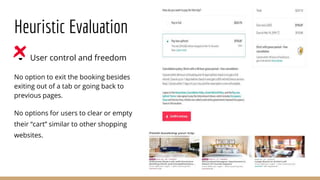
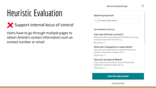
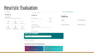
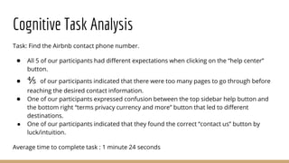
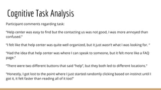
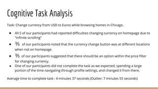
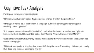
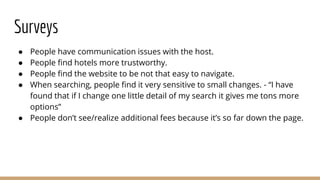
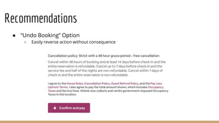
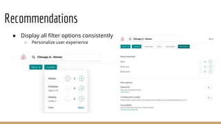
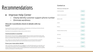
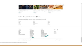
Airbnb User
Interface
Analysis
Can Ergelmis, Sarah Eger,
Shareena Paul, Mani Kumar,
Manopat Niyomthai, Chan Leong
Lee
Introduction
● Founded in 2008
● Mission: make a home anywhere in the world for people who live outside
their home and still want to feel like they are at home
● Mobile app launched in 2014
● New expanded market
○ Homes
○ Experiences
○ Restaurant reservations
○ Insurance
○ Cleaning services
Site Traffic & Users
● Users typically range from 25-34 years of age
● Annual income of $60k - $100k as well as the $100k+ groups are
overrepresented when compared to the general internet population
● Female user base is exceedingly high compared to the rest of the WWW
● Main markets: United States, China, Japan, Germany and France
● 84.7 million visits in the last 6 months
○ Average of 8.5 minutes per visit
Why Airbnb?
cost savings compared to traditional hotels
geographic convenience
more authentic and personalized experience or
motivated by the ease of use of the website/service
53%
30%
17%
Methods
Heuristic Evaluation
● Permit easy reversal of actions
● Error recognition, diagnosis,
and recovery
● Display location and layout
● User control and freedom
● Support internal locus of
control
Cognitive Task Analysis
● Target audience: Novices - “anyone who travels often but has never used
Airbnb or only used it once”.
● Goal: Identify new user perspective on effectiveness of the user interface
of the Airbnb website.
● Tasks:
○ Book a two night trip in a chicago home May 6-8 for 2 guests, under $250/night that
has free parking.
○ Find the Airbnb contact phone number.
○ Change currency from USD to Euros while browsing homes in Chicago.
Cognitive Task Analysis - Observation Criteria
● We identified 2 novices from the team itself and found 3 more to have a
total of 5 in order to receive more observation data
● The novices were timed for each task while thinking aloud
● Observation criteria for every novice performing a task:
○ Users opinions while completing the assigned task?
○ What part of the experience worked well? What didn’t?
○ Where did the novice get confused? Why?
○ What parts of the task or interface did the novice misunderstand?
○ (For the surveyor) Did user complete the task in the way you expected?
Surveys
● Research Question: What impression does Airbnb give to the general
population of young adults?
● Target population: “Young adults” - aged 18-22.
● Sampling bias: Self-selection. Only sent the survey link to students aged
between 18-22.
● Types of questions: Multiple choice, short answer, open-ended, rating.
● Number of questions: 11.
● Survey availability: 2 days.
● Number of responses: 42.
Problems Identified
Heuristic Evaluation
● Permit easy reversal of actions
Once the “Confirm & Pay” button is pressed, there is no
error tolerance feature giving the user a certain
amount of time to reverse this action, nor is there an
extra step or alert message to finalize their payment
Users have 48 hours to cancel a booking for a full
refund, they would have to complete all the necessary
steps to cancel a booking if they have clicked the
“confirm & pay” button on accident.
Heuristic Evaluation
● Error recognition, diagnosis, and recovery
The website does not warn users of booking two different listings, experiences or restaurants
on overlapping dates/times.
Users can book a listing from March 8th to March 17th on a listing in Spain without any alert
messages or warnings despite having booked the same dates in Los Angeles.
Heuristic Evaluation
● Display location and layout
The website does not show contact numbers of
the listing/experience in a clear layout.
Heuristic Evaluation
● User control and freedom
No option to exit the booking besides
exiting out of a tab or going back to
previous pages.
No options for users to clear or empty
their “cart” similar to other shopping
websites.
Heuristic Evaluation
● Support internal locus of control
Users have to go through multiple pages to
obtain Airbnb’s contact information such as
contact number or email.
Heuristic Evaluation
Cognitive Task Analysis
Task: Book a two night trip in a chicago home May 6-8 for 2 guests, under $250/night that has
free parking.
● ⅘ of our participants had difficulties said that the “more filters” button was hard to
locate.
● ⅗ of our participants felt that the options within the “more filters” section could be
organized better.
● ⅖ of our participants had some confusion while applying the price filter using the
scrollbar.
Average time to complete task : 4 minutes 32 seconds
Cognitive Task Analysis
Participant comments regarding task:
“More filters section were annoying, it was hard to find the “free parking” option.”
“Applying filters were fairly simple once you find them. “
“Easy to work with filters once found, but even so, it was difficult to the find parking option”
“The price filter can be more precise rather than scrolling, it was hard to find the $250 dollar
mark”
“I was confused using the price filter, I did 250 - 1000 instead of 0 - 250 the first time, why
can’t we just type the amount in?”
Cognitive Task Analysis
Task: Find the Airbnb contact phone number.
● All 5 of our participants had different expectations when clicking on the “help center”
button.
● ⅘ of our participants indicated that there were too many pages to go through before
reaching the desired contact information.
● One of our participants expressed confusion between the top sidebar help button and
the bottom right “terms privacy currency and more” button that led to different
destinations.
● One of our participants indicated that they found the correct “contact us” button by
luck/intuition.
Average time to complete task : 1 minute 24 seconds
Cognitive Task Analysis
Participant comments regarding task:
“Help center was easy to find but the contacting us was not good, I was more annoyed than
confused.”
“I felt like that help center was quite well organized, but it just wasn’t what I was looking for. “
“Had the idea that help center was where I can speak to someone, but it felt more like a FAQ
page.”
“There were two different buttons that said “help”, but they both led to different locations.”
“Honestly, I got lost to the point where I just started randomly clicking based on instinct until I
got it, it felt faster than reading all of it too!”
Cognitive Task Analysis
Task: Change currency from USD to Euros while browsing homes in Chicago.
● All 5 of our participants had reported difficulties changing currency on homepage due to
“infinite scrolling”
● ⅗ of our participants noted that the currency change button was at different locations
when not on homepage.
● ⅗ of our participants suggested that there should be an option within the price filter
for changing currency.
● One of our participants did not complete the task as we expected, spending a large
portion of the time navigating through profile settings, and changed it from there.
Average time to complete task : 4 minutes 37 seconds (Outlier: 7 minutes 55 seconds)
Cognitive Task Analysis
Participant comments regarding task:
“I think it would’ve been better if we could just change it within the price filter.”
“I thought it would be at the bottom at the page, but I kept scrolling and scrolling and
scrolling… until I gave up.“
“It is easy to use once I found it, but I didn’t read what the button at the bottom right said
before, maybe it could be worded better than “Terms, Privacy, Currency and More”. ”
“Was it me? Or was that (currency option) inconsistent, they were in different spots when not
on the homepage?”
“This task sounded the simplest, but it was definitely the most frustrating, I didn’t expect to dig
that deep into the user settings to find it.”
Surveys
● People have communication issues with the host.
● People find hotels more trustworthy.
● People find the website to be not that easy to navigate.
● When searching, people find it very sensitive to small changes. - “I have
found that if I change one little detail of my search it gives me tons more
options”
● People don’t see/realize additional fees because it’s so far down the page.
Proposal of Solutions
Recommendations
● “Undo Booking” Option
○ Easily reverse action without consequence
Recommendations
● Display all filter options consistently
○ Personalize user experience
Recommendations
● Improve Help Center
○ Clearly identify customer support phone number
○ Eliminate wordiness
Recommendations
● Keep footer at bottom of all pages
○ Improve consistency
○ Ease of access to information
● Changing Currency
○ Make option more intuitive
Recommendations
•Messaging for easy communication
Recommendations
•Comparing homes list
•No need to go back and forth between home pages to compare
Recommendations
Conclusion & Implications
● Changes are necessary to better support users
● Changes not only in design, but functionality as well
● New design should adhere to principles and be efficient while still being
functional
● Changes will not only help the user but can also help grow the user base
● Seemingly great websites can always improve if you dig a little deeper---
not sure about keeping this in
questions?

Airbnb User Interface Analysis Presentation

  • 1.
    Airbnb User Interface Analysis Can Ergelmis,Sarah Eger, Shareena Paul, Mani Kumar, Manopat Niyomthai, Chan Leong Lee
  • 2.
    Introduction ● Founded in2008 ● Mission: make a home anywhere in the world for people who live outside their home and still want to feel like they are at home ● Mobile app launched in 2014 ● New expanded market ○ Homes ○ Experiences ○ Restaurant reservations ○ Insurance ○ Cleaning services
  • 3.
    Site Traffic &Users ● Users typically range from 25-34 years of age ● Annual income of $60k - $100k as well as the $100k+ groups are overrepresented when compared to the general internet population ● Female user base is exceedingly high compared to the rest of the WWW ● Main markets: United States, China, Japan, Germany and France ● 84.7 million visits in the last 6 months ○ Average of 8.5 minutes per visit
  • 4.
    Why Airbnb? cost savingscompared to traditional hotels geographic convenience more authentic and personalized experience or motivated by the ease of use of the website/service 53% 30% 17%
  • 5.
  • 6.
    Heuristic Evaluation ● Permiteasy reversal of actions ● Error recognition, diagnosis, and recovery ● Display location and layout ● User control and freedom ● Support internal locus of control
  • 7.
    Cognitive Task Analysis ●Target audience: Novices - “anyone who travels often but has never used Airbnb or only used it once”. ● Goal: Identify new user perspective on effectiveness of the user interface of the Airbnb website. ● Tasks: ○ Book a two night trip in a chicago home May 6-8 for 2 guests, under $250/night that has free parking. ○ Find the Airbnb contact phone number. ○ Change currency from USD to Euros while browsing homes in Chicago.
  • 8.
    Cognitive Task Analysis- Observation Criteria ● We identified 2 novices from the team itself and found 3 more to have a total of 5 in order to receive more observation data ● The novices were timed for each task while thinking aloud ● Observation criteria for every novice performing a task: ○ Users opinions while completing the assigned task? ○ What part of the experience worked well? What didn’t? ○ Where did the novice get confused? Why? ○ What parts of the task or interface did the novice misunderstand? ○ (For the surveyor) Did user complete the task in the way you expected?
  • 9.
    Surveys ● Research Question:What impression does Airbnb give to the general population of young adults? ● Target population: “Young adults” - aged 18-22. ● Sampling bias: Self-selection. Only sent the survey link to students aged between 18-22. ● Types of questions: Multiple choice, short answer, open-ended, rating. ● Number of questions: 11. ● Survey availability: 2 days. ● Number of responses: 42.
  • 10.
  • 11.
    Heuristic Evaluation ● Permiteasy reversal of actions Once the “Confirm & Pay” button is pressed, there is no error tolerance feature giving the user a certain amount of time to reverse this action, nor is there an extra step or alert message to finalize their payment Users have 48 hours to cancel a booking for a full refund, they would have to complete all the necessary steps to cancel a booking if they have clicked the “confirm & pay” button on accident.
  • 12.
    Heuristic Evaluation ● Errorrecognition, diagnosis, and recovery The website does not warn users of booking two different listings, experiences or restaurants on overlapping dates/times. Users can book a listing from March 8th to March 17th on a listing in Spain without any alert messages or warnings despite having booked the same dates in Los Angeles.
  • 13.
    Heuristic Evaluation ● Displaylocation and layout The website does not show contact numbers of the listing/experience in a clear layout.
  • 14.
    Heuristic Evaluation ● Usercontrol and freedom No option to exit the booking besides exiting out of a tab or going back to previous pages. No options for users to clear or empty their “cart” similar to other shopping websites.
  • 15.
    Heuristic Evaluation ● Supportinternal locus of control Users have to go through multiple pages to obtain Airbnb’s contact information such as contact number or email.
  • 16.
  • 17.
    Cognitive Task Analysis Task:Book a two night trip in a chicago home May 6-8 for 2 guests, under $250/night that has free parking. ● ⅘ of our participants had difficulties said that the “more filters” button was hard to locate. ● ⅗ of our participants felt that the options within the “more filters” section could be organized better. ● ⅖ of our participants had some confusion while applying the price filter using the scrollbar. Average time to complete task : 4 minutes 32 seconds
  • 18.
    Cognitive Task Analysis Participantcomments regarding task: “More filters section were annoying, it was hard to find the “free parking” option.” “Applying filters were fairly simple once you find them. “ “Easy to work with filters once found, but even so, it was difficult to the find parking option” “The price filter can be more precise rather than scrolling, it was hard to find the $250 dollar mark” “I was confused using the price filter, I did 250 - 1000 instead of 0 - 250 the first time, why can’t we just type the amount in?”
  • 19.
    Cognitive Task Analysis Task:Find the Airbnb contact phone number. ● All 5 of our participants had different expectations when clicking on the “help center” button. ● ⅘ of our participants indicated that there were too many pages to go through before reaching the desired contact information. ● One of our participants expressed confusion between the top sidebar help button and the bottom right “terms privacy currency and more” button that led to different destinations. ● One of our participants indicated that they found the correct “contact us” button by luck/intuition. Average time to complete task : 1 minute 24 seconds
  • 20.
    Cognitive Task Analysis Participantcomments regarding task: “Help center was easy to find but the contacting us was not good, I was more annoyed than confused.” “I felt like that help center was quite well organized, but it just wasn’t what I was looking for. “ “Had the idea that help center was where I can speak to someone, but it felt more like a FAQ page.” “There were two different buttons that said “help”, but they both led to different locations.” “Honestly, I got lost to the point where I just started randomly clicking based on instinct until I got it, it felt faster than reading all of it too!”
  • 21.
    Cognitive Task Analysis Task:Change currency from USD to Euros while browsing homes in Chicago. ● All 5 of our participants had reported difficulties changing currency on homepage due to “infinite scrolling” ● ⅗ of our participants noted that the currency change button was at different locations when not on homepage. ● ⅗ of our participants suggested that there should be an option within the price filter for changing currency. ● One of our participants did not complete the task as we expected, spending a large portion of the time navigating through profile settings, and changed it from there. Average time to complete task : 4 minutes 37 seconds (Outlier: 7 minutes 55 seconds)
  • 22.
    Cognitive Task Analysis Participantcomments regarding task: “I think it would’ve been better if we could just change it within the price filter.” “I thought it would be at the bottom at the page, but I kept scrolling and scrolling and scrolling… until I gave up.“ “It is easy to use once I found it, but I didn’t read what the button at the bottom right said before, maybe it could be worded better than “Terms, Privacy, Currency and More”. ” “Was it me? Or was that (currency option) inconsistent, they were in different spots when not on the homepage?” “This task sounded the simplest, but it was definitely the most frustrating, I didn’t expect to dig that deep into the user settings to find it.”
  • 23.
    Surveys ● People havecommunication issues with the host. ● People find hotels more trustworthy. ● People find the website to be not that easy to navigate. ● When searching, people find it very sensitive to small changes. - “I have found that if I change one little detail of my search it gives me tons more options” ● People don’t see/realize additional fees because it’s so far down the page.
  • 24.
  • 25.
    Recommendations ● “Undo Booking”Option ○ Easily reverse action without consequence
  • 26.
    Recommendations ● Display allfilter options consistently ○ Personalize user experience
  • 27.
    Recommendations ● Improve HelpCenter ○ Clearly identify customer support phone number ○ Eliminate wordiness
  • 28.
    Recommendations ● Keep footerat bottom of all pages ○ Improve consistency ○ Ease of access to information
  • 31.
    ● Changing Currency ○Make option more intuitive Recommendations
  • 32.
    •Messaging for easycommunication Recommendations
  • 33.
    •Comparing homes list •Noneed to go back and forth between home pages to compare Recommendations
  • 34.
    Conclusion & Implications ●Changes are necessary to better support users ● Changes not only in design, but functionality as well ● New design should adhere to principles and be efficient while still being functional ● Changes will not only help the user but can also help grow the user base ● Seemingly great websites can always improve if you dig a little deeper--- not sure about keeping this in
  • 35.

Editor's Notes

  • #3 Video? Something interactive? Goals and purpose of your system Discuss any data on site traffic, history of site, evolutions, etc. Define Users any other interesting, unique information about your interface
  • #4 18 to 24 year old age range seems to be underrepresented compared to the general internet population
  • #8 In addition to a heuristic evaluation, we also performed a cognitive task analysis in the form a cognitive walkthrough. The first step was identifying the target audience, the novices, and we defined them as anyone who travels often but has used Airbnb less than or equal to one time. Step 2 involved defining a goal for the cognitive walkthrough and it was “Identify new user perspective on effectiveness of the user interface of the Airbnb website”. Step 3 was to design tasks for the novices to perform. We devised basic functions like make a booking, find Airbnb support and change currency but made it a little more sophisticated because the novices are individuals who have a decently sufficient amount of experience with computers and internet browsing. Our final tasks ended up being: (read out from slide)
  • #9 Out of the 5 novices, we identified 2 from the team itself and found 3 more so we could get a sufficient amount of observation data. Step 4 was the observation part of the cognitive walkthrough. The novices were timed for each task while they were thinking out loud. The team devised an observation criteria, a set of questions the observer, which is us, would answer by observing and conversing while the task is being performed. In order to make the entire observation process a cyclic one, we decided to add a reflective question at the end. This serves the purpose to get the opinion of a regular user of Airbnb, which is the observer, on the entire task the novice has performed. This explains whether or not the way the novice performed the task was reasonable for a first timer, in the eyes of a regular user.
  • #10 We also performed a survey with the research question: “What impression does Airbnb give to the general population of young adults?”. And as the slide says, we defined our target population of young adults to be aged between 18 and 22. The reason we picked young adults are they are one group that is defined to be tech-savvy and we wanted a purer sample, with a more detailed opinion on Airbnb. (if they ask, this is the reason we filtered out older people) AND you can say we targeted airbnb’s massive potential customer base of the near future, since most users are 24 to 35, most of our respondents are only 2 or 3 years away from hitting that age range, soon to be graduates who will soon step in to the workforce, get a job/stable income, therefore begin to travel more often. (and this is reportedly the year Airbnb goes public). Our sampling bias was mainly self-selection, where we only sent out the survey link to students falling between that age. During the formation of the survey, we decided to have various question types in order to collect different types of quantitative and qualitative data. The survey consists of multiple choice, short answer, open-ended and rating questions. The survey consists of 11 questions and it was open for 2 days before we stopped accepting responses. At this point, we had received 42 responses.
  • #12 Heuristics - Quick, informal, and intuitive algorithm our brain uses to generate an approximate answer to a reasoning question. Allows us to quickly make sense of a complex environment.
  • #13 Heuristics - Quick, informal, and intuitive algorithm our brain uses to generate an approximate answer to a reasoning question. Allows us to quickly make sense of a complex environment.
  • #14 Heuristics - Quick, informal, and intuitive algorithm our brain uses to generate an approximate answer to a reasoning question. Allows us to quickly make sense of a complex environment.
  • #15 Heuristics - Quick, informal, and intuitive algorithm our brain uses to generate an approximate answer to a reasoning question. Allows us to quickly make sense of a complex environment.
  • #16 Heuristics - Quick, informal, and intuitive algorithm our brain uses to generate an approximate answer to a reasoning question. Allows us to quickly make sense of a complex environment.
  • #17 Heuristics - Quick, informal, and intuitive algorithm our brain uses to generate an approximate answer to a reasoning question. Allows us to quickly make sense of a complex environment.