6 BIG UI DESIGN
Mistakes
you’re
making
Settings
Volume
Data tracking
Privacy
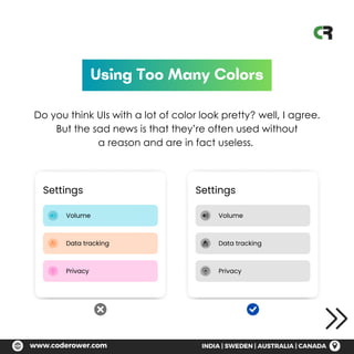
Using Too Many Colors
Do you think UIs with a lot of color look pretty? well, I agree.
But the sad news is that they’re often used without
a reason and are in fact useless.
Settings
Volume
Data tracking
Privacy
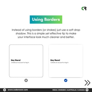
Using Borders
Instead of using borders (or strokes) just use a soft drop
shadow. This is a simple yet effective tip to make
your interface look much cleaner and better.
Hey there!
Create an account or log in
Hey there!
Create an account or log in
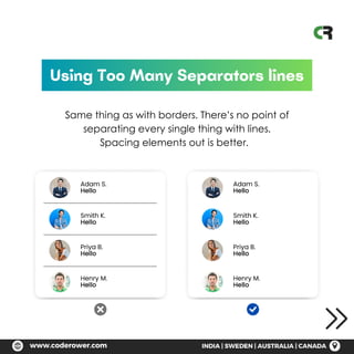
Using Too Many Separators lines
Same thing as with borders. There’s no point of
separating every single thing with lines.
Spacing elements out is better.
Adam S.
Hello
Adam S.
Hello
Smith K.
Hello
Smith K.
Hello
Priya B.
Hello
Priya B.
Hello
Henry M.
Hello
Henry M.
Hello
Log in
Email Address
Password
Log in
Using elements that are very round
While rounded elements are user friendly, making
them overly rounded might make the
interface feel somewhat cheap.
Log in
Email Address
Password
Log in
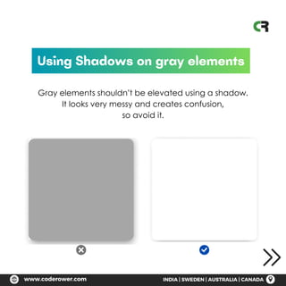
Using Shadows on gray elements
Gray elements shouldn’t be elevated using a shadow.
It looks very messy and creates confusion,
so avoid it.
Need UI Services?
We Build Delightful Experience,
Understanding User Needs
www.coderower.com
India | Sweden | Australia | Canada
CONTACT US TODAY

6 Big UI Design Errors That Are Hurting Your User Experience

  • 1.
    6 BIG UIDESIGN Mistakes you’re making
  • 2.
    Settings Volume Data tracking Privacy Using TooMany Colors Do you think UIs with a lot of color look pretty? well, I agree. But the sad news is that they’re often used without a reason and are in fact useless. Settings Volume Data tracking Privacy
  • 3.
    Using Borders Instead ofusing borders (or strokes) just use a soft drop shadow. This is a simple yet effective tip to make your interface look much cleaner and better. Hey there! Create an account or log in Hey there! Create an account or log in
  • 4.
    Using Too ManySeparators lines Same thing as with borders. There’s no point of separating every single thing with lines. Spacing elements out is better. Adam S. Hello Adam S. Hello Smith K. Hello Smith K. Hello Priya B. Hello Priya B. Hello Henry M. Hello Henry M. Hello
  • 5.
    Log in Email Address Password Login Using elements that are very round While rounded elements are user friendly, making them overly rounded might make the interface feel somewhat cheap. Log in Email Address Password Log in
  • 6.
    Using Shadows ongray elements Gray elements shouldn’t be elevated using a shadow. It looks very messy and creates confusion, so avoid it.
  • 7.
    Need UI Services? WeBuild Delightful Experience, Understanding User Needs www.coderower.com India | Sweden | Australia | Canada CONTACT US TODAY