Downloaded 23 times


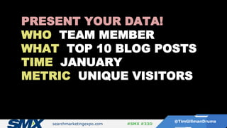
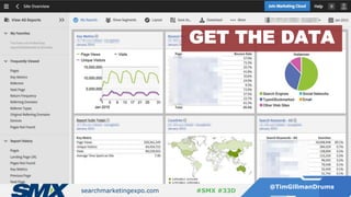
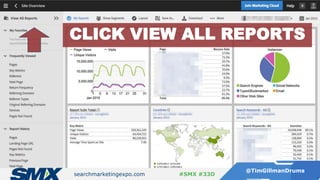

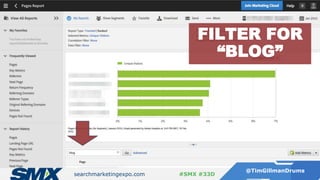
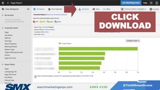
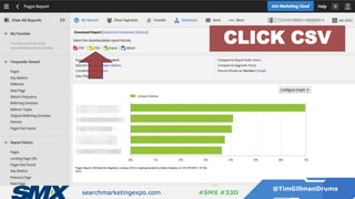
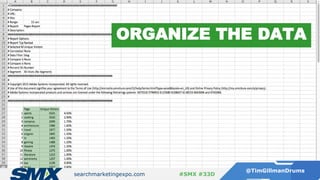
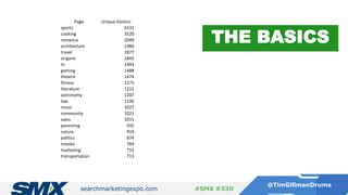

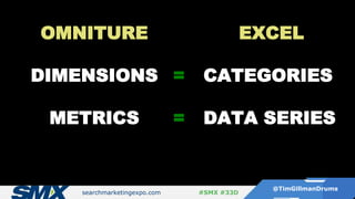
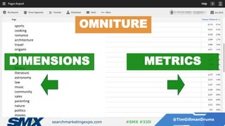
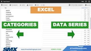
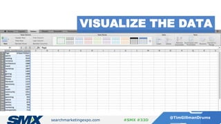
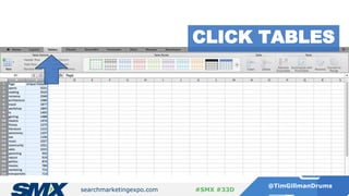
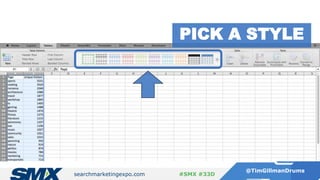
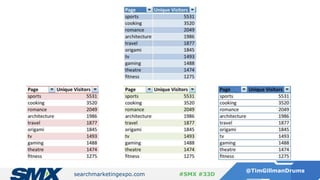
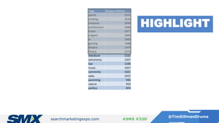
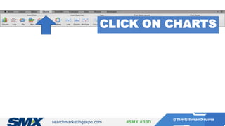
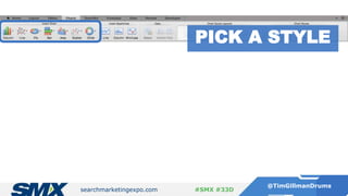
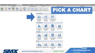
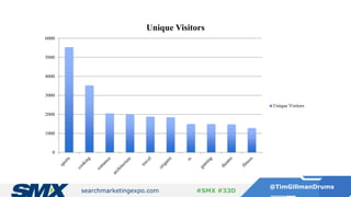
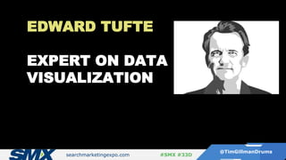
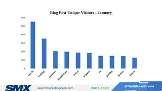
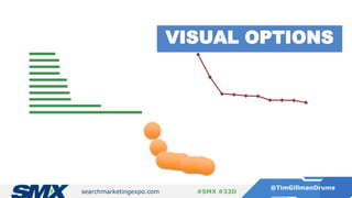
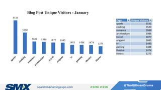

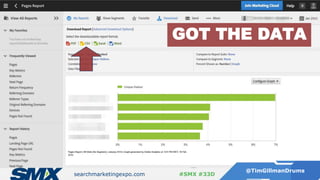
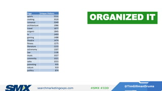
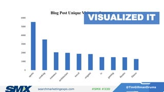

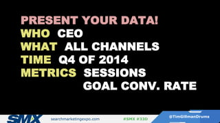
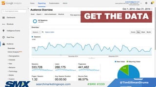
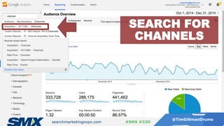
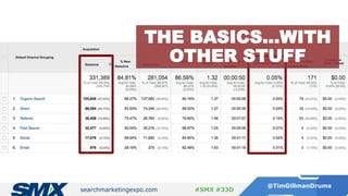
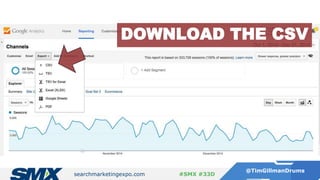
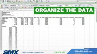
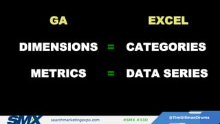
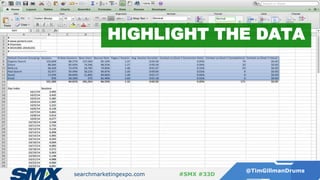
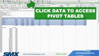
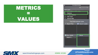
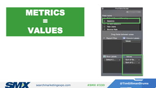
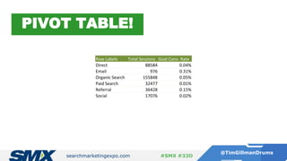
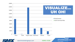
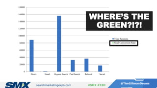

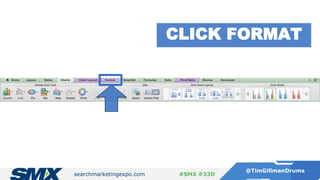
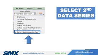
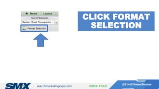
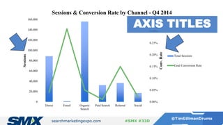


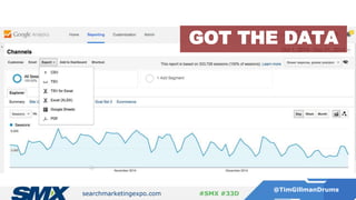
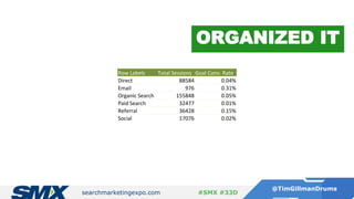
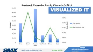
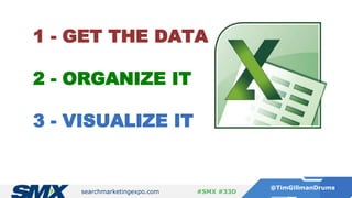

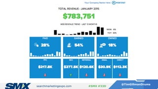


The document outlines a presentation by Timothy Gillman on how to effectively visualize analytics using Excel, emphasizing three key steps: getting the data, organizing it, and visualizing it. It provides examples of data organization and visualization techniques, and discusses platforms like Adobe Analytics and Google Analytics. Additionally, the presentation highlights resources for learning Excel and enhancing data visualization skills.


