2. Q1. In what ways does your
media product use, develop
or challenge forms and
conventions of real media
products?
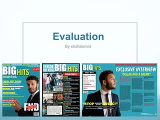
3. MAGAZING FRONT COVER
FORMS AND CONVENTIONS
image of my finished front
magazine cover.
Key convention which is used in all magazines is the
masthead which I have decided not to break as it is very
important to have. The masthead is really important
because it is the title of the magazine and a lead in. I have
decided to make my masthead which is ‘BIG HITS’ the
biggest font and text so it is visual to the target market as it
allows them to identify the magazine. It also allows it to tie
in with the cover image as they are both very big and visual
and take up most of the front cover. The masthead also
relates to the cover image because the artist on the
magazine is a music artist and the masthead ‘BIG HITS’
signifies music which are in the top of the list in the charts.
Another key convention which most
music magazines have is cover lines.
It is usually positioned and aligned on
the left or right hand side of the cover
page and can usually be in different
font, sizes and colours. The cover lines
on my magazine are positioned and
aligned on the left hand side of the
magazine. The come indifferent font
sizes and text and also come in white
and yellow only so it allows me to
stick with my colour scheme. The
cover lines also has the name of the
artists and stories and information
about what's inside the magazine.
I have also used a selling line in my front cover
as this allows to grab my audiences attention.
“first mag to have R&B and POP in one.” I
have chosen to use this as my selling line as it
focuses on the feature of the magazine and
something which is different.
another key form and convention
is the cover image. Every
magazine needs a cover image
as it allows the reader to know
who the main attraction of the
magazine is. I have included a
cover image and made sure it is
big and takes up the whole of the
cover of the magazine so its clear
to the reader. I have also made
sure eye contact is included as I
made sure the photo of the artist
is making direct contact with the
camera. This is a key convention
as it allows the reader to feel a
connection when they are
reading.
the colour scheme of my
magazine is consistent
and goes in a specific
colour regime. 4 colours
have been used
throughout this magazine
and has been used for
the text, cover lines,
masthead, selling line,
heading and so on.
In my front magazine
cover I have a couple of
graphics which I have
used in places where
there is so much empty
space. I have also used
graphics to separate my
cover lines and I have
also used them to
highlight specific texts
and quotes.
4. MAGAZINE CONTENTS PAGE
FORMS AND CONVENTIONS
image of my finished
magazine contents page.
Important convention which is
used in most magazines is page
numbers. In my media product I
have used pager numbers which
are placed underneath each
picture and text . This will
therefore allow easy navigation
for the reader. It also has a small
description about the nature of
the article so that the reader can
get a taste of what is in the article
and decide weather they want
turn to the page to read it.
Contents pages always include
columns and in my contents page I
have used 2 separate columns. They
are split into sections. For example
news, features, and reviews are in
one section which include text about
what’s inside the magazine. The
others section which includes pictures
of the main star of the magazine with
numbers and subheadings below. This
is good as it makes it clear for the
reader and directs you to what you are
looking for. I've also made sure to stick
with the colour scheme of
my front cover by using the
colours blue, white, red and
yellow as my 4 main
colours. This is a important
form and convention as it
keeps the colour scheme
consistently throughout and
also keeping the house style
format.
At the top of this contents page is
the title of the page. I've included
the masthead as the title blending
it with “inside this weeks big hits.”
I've included this as it represents
the magazine company big hits.
This also allows the reader to
know what they are reading.
Another key forms and convention which is important and are used in
most contents pages is a editors letter. In my media product I have used
a editors letter at the bottom of my contents page. I have made sure it
is very noticeable because it has a rectangular white box with black
text which makes it look very effective. It is very effective having the
editors letter as it engagers the reader with the editor and make it
seem as if he is speaking to them . Also it is signed so therefore makes it
more personalized. I have also included a picture of the editor which is
me as it allows the reader to personally know who he is.
Most music magazines include a a context. In my media product I have used a context as you can already see
because of the red box with white writing “contest.” They are split into 3 sections with the subheadings news,
features and reviews. It is important to have a context as it allows the reader to find what they are looking for, it
also works as a easy navigation system for the reader. To make it more clear I've also put a little description with
page number. Below “contents” I've also included a issue number and a date .they blend with the format of
’contents’ title with the red background . I have positioned this here as it is in a position where they are both visual.
Another
convention
which I have
followed is to
have images in
my context page.
I have used a
couple of images
in my context
page which are
all of the cover
star.
5. MAGAZINE ARTICLE PAGE
FORMS AND CONVENTIONS
One key convention in a double spread magazine article which is vital, is to include a image which
takes up one side or most of the page. As you can see in the article page that I have created the
image of my artist who placed taking up half of the side of the double sided article page. This
therefore makes it the main focus of double page spread article. Therefore it is important to be
eye catching and appealing to the readers. It is a medium close up image of the artist, this is good
as this allows the audience to see who the artist clearly is. Although I have not made my artist
make eye contact which is a very important convention because it is effective as it allows the
reader to feel some type of connection and feel more engaged when reading it. The reason why I
have done this is to show that my artist is thankful and grateful for his success as he is looking up
in the sky which portrays that he is thanking god. My artist in the image is wearing a suit making it
feel smart and sophisticated which is simplistic but effective and still appeals to the eye because
of the vintage look. Because he is dressed smart which may portray that he is ready and down to
get to business and that he is successful which women tend to like so therefore you could say it is
aimed to attract the female eye. Also it could attract the male eye in terms of looking up to him as
a role model and wanting to be like him.
Another key conventions that all music magazines articles have for text is columns. In
music magazines there are 3 types of articles which are question and answer,
biography and a generalist interview. In my article I have decided to go with question
and answer as it is the most simplistic and makes sense as my artist newly introduced
to the music world, it also gives an insight of the artists life and who he is. My article
article text is separated into 3 organized columns which also makes it look professional
and controlled. It also makes it easier to read for the reader.
I have also included a drop cap in my double spread page article. This is a normal convention
which is always used in big text articles. It is also very effective as it engages the reader to a
specific part because of its big bold font, which therefore makes that specific area eye-catching.
I have included a lead in and a pull
quote which is a normal
convention that most article pages
do have to engage the reader to
carry on reading. In my article o
have included both pull quite
which is “stop which, start doing”
and lead in “his magical voice
breaking hearts and takes over
charts, what's the secret of
FAHAD’S sudden success?” i have
done this to engage the reader by
making it very simplistic but Also
effective by making them want to
find out more. This also gives a
little teaser of what's install in the
article so therefore allows the
reader the choice weather they
want to or not.
image of my finished
article page.
I've also made sure to stick
with the colour scheme of
my front cover article page
by using my 4 mains colours
which are the colours blue,
white, red and yellow. This is
a important form and
convention as it keeps the
color scheme consistently
throughout and also keeping
the house style format. I
have also included graphics
in my article page where
there are empty spaced in
the article page so there are
no empty gap such as
including a fact box. This also
fills in the gaps and also
makes it look effective.
I've included quotes in my article page which I have got from
my front cover and article page “dollar in a dream.”
6. DEVELOPMENTS AND IDEAS
FROM EXSISTING MAGAZINES
For my magazine front cover I have got
many of my inspiration and ideas from this
billboard music magazine staring Justin
bieber. One of conventions which I liked
most about this billboard magazine is the
overall colour scheme so therefore I decided
to develop this into my own magazine front
cover. I have decided to stick with the
colours white, red and yellow but change
the blue slightly into more of a turquoise
colour.
Another inspiration which I have got from the
Justin bieber billboards magazine is the over all
design and layout of the quote. I have also got
ideas from some of the graphics and developed it
into my magazine which I have used to separate
my cover lines.
For my contents page have got
my inspiration from a
completely different genre to
my own magazine which is
from keerang (rock). I have also
developed ideas from a news
paper contents. I have
developed the subheadings of
the contents which are News,
Feature and Reviews. The text I
used is in one column same as
both the news paper and
keerang magazine.
For what style my model should have I decided to get
inspiration from jay z the man himself which got ideas
from another R&B magazine. This enables me to dress
my model up in a suit and make him look smart. One of
the reasons why I have decided to do this is because it
shows that my cover star is successful in the music
industry and also jay z is a big artist and massive in the
music industry.
In my article page I got inspiration from an Ed Sheeran
magazine. I liked the way the quote was displayed so
therefore I implemented it into my own magazine and
made it my own by changing the colours to stick to my
colour scheme and use my over stars quote..
I decided to use the style of
keerangs article image layout
and how they have presented it
in to two columns. This way I
feel it makes it look more
appealing and also more easier
to understand because of how
they are presented.
7. MEDIA PRODUCT WHICH CHALLENGES THE
FORMS AND CONVENTIONS
My overall music media product doesn’t break any of the conventions or forms. To show my understanding
of forms and conventions that have been challenged I have looked at a couple of existing ones which I have
displayed below here.
In this magazine MOGO you can
clearly see that there are no cover
lines. Now this is a form that this
magazine has broken, cover lines
are put in front covers to give an
insight to the target audience what
is going to be in the magazine and
what it consists of. This maybe
because the artist himself is very
popular and there are no need of
cover lines because of how popular
he is.
The mast head on this magazine is placed on
the left hand side and positioned sideways.
This here breaks a music magazine
convention as you can tell because majority
of magazines have there masthead at the
top of the front cover. But how ever i
believe personality it works as it is unique
and most magazines don't have this which
makes it more recognisable to the target
audience.
As you can see the cover star here is not
making eye contact with the camera which
is an important convention. The reason it
is a important convention is because it
created s a connection with the reader
when they are reading. However this has
not been used here but it works because
of the genre of the magazine which is rock.
As you can see here the front cover
size is very different to all
magazines. This here breaks the
form of what a magazine should look
like. This looks more of a CD player
front cover than a magazine front
cover and i believe that this doesn't
work as some of the audience may
get confused of what this actually is.