Web design has come a long way since the early days of the World Wide Web. From basic HTML pages to the dynamic and visually stunning websites we see today, the evolution of web design has been a journey of innovation and creativity. With the introduction of CSS, web designers were able to create more complex layouts and styles. It leads revolution in web designing and development. But the evolution didn't stop there. As technology continued to advance, so did web design, with the introduction of responsive design, parallax scrolling, and other cutting-edge techniques. Today, web design is more important than ever, with businesses relying on their online presence to connect with customers and drive sales. Here we'll take a look at the evolution of web design and how it has changed the way we interact with the internet.
Digital Computer Classes
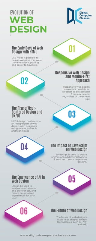
The Early Days of Web Design with HTML
In the early days of the internet, web design was limited to basic HTML pages. These pages were simple and plain, with little to no styling or design elements. The focus was on delivering content rather than aesthetics. Designers had to rely on tables and inline styles to create any kind of layout or styling, which was a tedious and time-consuming process.
However, as the internet began to grow in popularity, the need for more dynamic and visually appealing websites became apparent. This led to the introduction of CSS, which allowed designers to separate content from presentation and create more complex layouts and styles.
CSS made it possible to design websites that were more visually appealing and easier to navigate. It also made it easier to maintain and update the design of a website.
Responsive Web Design and Mobile-First Approach
As the use of mobile devices became more prevalent, web designers faced a new challenge: how to create websites that were optimized for mobile devices. This led to the development of responsive web design, which allows websites to adapt to the screen size of the device they are viewed on.
Responsive web design has become the norm for web design, with most websites being designed with a mobile-first approach. This means that the design is optimized for mobile devices first, and then scaled up for larger screens.
Responsive web design has made it possible for websites to be accessed from any device, regardless of the screen size, without sacrificing the user experience. It has also made it easier for web designers to create websites that are optimized for all devices.
The Rise of User-Centered Design and UX/UI
With the increasing importance of user experience (UX) and user interface (UI) design, web designers have shifted their focus to creating websites that are user-centered. User-centered design puts the user at the centre of the design process, with the goal of creating websites that are easy to use and navigate.
UX/UI design has become an integral part of web design, with designers using a variety of tools and techniques to
This PowerPoint helps students to consider the concept of infinity.
The Evolution of Web Design.pdf
1. 01
03
05
02
04
06
The Early Days of Web
Design with HTML
The Rise of User-
Centered Design and
UX/UI
The Emergence of AI in
Web Design
Responsive Web Design
and Mobile-First
Approach
The Impact of JavaScript
on Web Design
The Future of Web Design
CSS made it possible to
design websites that were
more visually appealing
and easier to navigate.
UX/UI design has become
an integral part of web
design, with designers
using a variety of tools
and techniques
AI can be used to
analyze user behavior
and preferences, and
create personalized
experiences for each
user.
Responsive web design
has made it possible for
websites to be accessed
from any device,
regardless of the screen
size
JavaScript is used to create
animations, add interactivity to
forms, and create responsive
designs.
The future of web design is
likely to be shaped by new
technologies, such as (VR)
and (AR)
EVOLUTION OF
WEB
DESIGN
w w w . d i g i t a l c o m p u t e r c l a s s e s . c o m