80 ĐỀ THI THỬ TUYỂN SINH TIẾNG ANH VÀO 10 SỞ GD – ĐT THÀNH PHỐ HỒ CHÍ MINH NĂ...
Contents Page Feedback
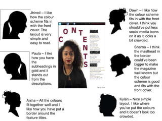
1. Jhineil – I like
how the colour
scheme fits in
with the front
cover. The
layout is very
simple and
easy to read.
Paula – I like
how you have
the
subheadings in
gold and it
stands out
from the
descriptions.
Aisha – All the colours
fit together well and I
like how you have put a
border around the
feature titles.
Dawn – I like how
the colour scheme
fits in with the front
cover. I think you
should’ve put less
social media icons
on it as it looks a
bit crowded.
Sharna – I think
the masthead in
the border
could’ve been
bigger to make
the magazine
well known but
the colour
scheme is good
and fits with the
front cover.
Kylan – Nice simple
layout. I like where
you’ve put the colours
and it doesn’t look too
crowded,