NO1 WorldWide Amil baba in pakistan Amil Baba in Karachi Black Magic Islamaba...
Billy elliot analysis
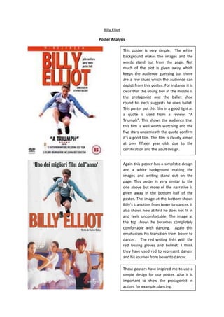
1. Billy Elliot<br />Poster Analysis <br />This poster is very simple. The white background makes the images and the words stand out from the page. Not much of the plot is given away which keeps the audience guessing but there are a few clues which the audience can depict from this poster. For instance it is clear that the young boy in the middle is the protagonist and the ballet shoe round his neck suggests he does ballet. This poster put this film in a good light as a quote is used from a review, “A Triumph”. This shows the audience that this film is well worth watching and the five stars underneath the quote confirm it’s a good film. This film is clearly aimed at over fifteen year olds due to the certification and the adult design. <br />These posters have inspired me to use a simple design for our poster. Also it is important to show the protagonist in action; for example, dancing.Again this poster has a simplistic design and a white background making the images and writing stand out on the page. This poster is very similar to the one above but more of the narrative is given away in the bottom half of the poster. The image at the bottom shows Billy’s transition from boxer to dancer. It also shows how at first he does not fit in and feels uncomfortable. The image at the top shows he becomes completely comfortable with dancing. Again this emphasises his transition from boxer to dancer. The red writing links with the red boxing gloves and helmet. I think they have used red to represent danger and his journey from boxer to dancer.<br />