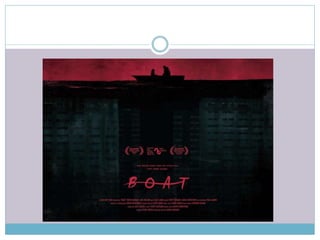
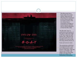
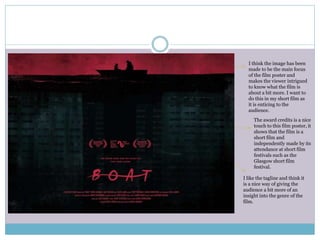
B O A T
Short Film Poster Style Model
This film poster has a
house style of two main
colours: black and red.
This keeps the consistency
for the viewers and isn’t
too much to look at. The
two colours have a
connotation of danger or
mysteriousness and this
can be a direct indication
of what the film is like.
The film title “boat” is
positioned at the bottom of
the page to allow the image
at the top to take the main
feature role. I like how the
font used makes the word
look like it is a wave as this
fits along with the theme of
boats and waves in water.
The production credit lines
are positioned where most
are on film posters, at the
bottom of the page. I like this
feature and I think I will
adapt it into my short film
poster as it adds to the
authenticity of the poster.
The award credits is a nice
touch to this film poster, it
shows that the film is a
short film and
independently made by its
attendance at short film
festivals such as the
Glasgow short film
festival.
I think the image has been
made to be the main focus
of the film poster and
makes the viewer intrigued
to know what the film is
about a bit more. I want to
do this in my short film as
it is enticing to the
audience.
I like the tagline and think it
is a nice way of giving the
audience a bit more of an
insight into the genre of the
film.

Film poster style model

  • 1.
    B O AT Short Film Poster Style Model
  • 3.
    This film posterhas a house style of two main colours: black and red. This keeps the consistency for the viewers and isn’t too much to look at. The two colours have a connotation of danger or mysteriousness and this can be a direct indication of what the film is like. The film title “boat” is positioned at the bottom of the page to allow the image at the top to take the main feature role. I like how the font used makes the word look like it is a wave as this fits along with the theme of boats and waves in water. The production credit lines are positioned where most are on film posters, at the bottom of the page. I like this feature and I think I will adapt it into my short film poster as it adds to the authenticity of the poster.
  • 4.
    The award creditsis a nice touch to this film poster, it shows that the film is a short film and independently made by its attendance at short film festivals such as the Glasgow short film festival. I think the image has been made to be the main focus of the film poster and makes the viewer intrigued to know what the film is about a bit more. I want to do this in my short film as it is enticing to the audience. I like the tagline and think it is a nice way of giving the audience a bit more of an insight into the genre of the film.