1. Identify the strengths and weaknesses of
your front cover- what looks particularly
effective? And what doesn’t work as well/
you’d change for the main task?
2. WEAKNESS (1):
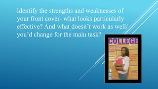
Overall I am very pleased with my college magazine front cover. I
think I could have made the blocks at the background look straight
or use a different background such as library. Also, I could use
different colours such as blue and green for the texts on the page to
make it associated to every college students than only college girls
because of the use of purple and pink.
3. WEAKNESS (2):
Moreover, I could use an image of a boy and a girl to
represents how young people behaviour both in the
society and college. This would attract both gender to
the magazine not only girls. This as a result, could
increase the amount of students buying the magazine.
4. STRENGTHS (3):
I believe using the statement; ‘the secret to achieving A*…’ will attract more students
to the magazine because students will want to know the easy route to university. I used
the red colour to make it easy to read from any angle and symbolise energetic.
Moreover, the way the girl has posed help balanced the texts to make it easy and
quicker to read from any point of view. Some of my texts include alliteration such as
‘bright breezy’ creates a sound of calm, relaxed and informal.
5. STRENGTHS (4):
Lastly, the use of social media sites like Facebook and the school
website helps the target audience to keep in touch with the
college and keep up to date information