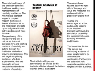
1. Textual Analysis of
poster
The conventional
reviews down the right
side of the page add
value and reassures the
audience that the
production targets them
The formal text for the
Title targets our
secondary audience of
older people looking for
an intellectual
gratification. Furthermore
the bold black font
suggests precision which
targets an older audience.
The institutional logos are
conventional as well as all the
institutional information at the bottom
in small print at the bottom
The main focal image of
the chainsaw connotes
traditional working class
representations of
creativity and labour. The
minimalistic approach
supports our post
modern themes as it
leaves a leaves a lot to
the imagination and sets
up an enigma which an
active audience will want
to solve
The positioning of the
image over the font is
unique as it almost
suggests new and exciting
methods of creativity are
cutting through the
traditional methods of
drawing and precision. This
will target our primary
audience, VAL type –
Experiencers, who are
looking to achieve
innovation and find new
methods of creativity.
The tag line
encourages an active
audience to become
more creative
themselves through the
stimulation caused by
the biological reference
to bodily movement
and thought.