Dashboards can contain an a lot of critical data. How much is too much? Evaluate your business needs and goals to determine what is the right data and what is too much content.
Horngren’s Cost Accounting A Managerial Emphasis, Canadian 9th edition soluti...
Dashboards Too Much Information
1. Dashboards:Too Much Information? January 2017
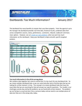
The dashboard has many benefits to anyone that uses them properly. From the agent on up to
the manager the dashboard provides real time data, historical results, combined data from
across competitive sources, status, performance, summaries, inbound, outbound and many
more options. However, we can create our own problems when we want too much
information on the dashboard. Keep your dashboard simple and with specific targeted
purpose.
Too much information in the all the wrong places
We combine data together but come to realize that it is too much for one dashboard tab. So
we create multiple dashboard tabs so we can select tab after tab to find the data that we are
looking for at that moment in time. The concept is to create dashboard tabs that have the
exact data that we are searching for that will answer our specific questions. The trouble is our
challenges vary by day and by the problems we are faced with at that moment. The problem
we are facing is a usual one but it has a variance today and we need to see multiple pieces of
data but they are in the wrong tabs, today.
2. So we migrate from tab to tab scrolling up and down left and right, searching. A quick answer is
needed but time is wasted because of our need to have as much possible information. Too
much data can also occur due to excessive details. How deep do you need to go to understand
the results of the data?
A persons vision (eye site) can require the need to use a larger font. The larger font can directly
affect the amount of data that can be included in the dashboard or the dashboard will exceed
the boundaries of your screen.
Tip: The question is often asked: How much is too much? If you cannot find it in in your multiple
tabs dashboard in less than one minute you have too much information or your data is not
structured properly. If you do not need this data everyday then do not include in your
dashboard.
Have a clear purpose for each KPI and the goal of the dashboard.
Cannot be organized
Sometimes we organize things based on the visual appearances. We want what looks good to
us and forget about the need to be organized. Our rational is “We will get used to finding what
we need with time.” Having graphs and gauges next to each other because they look good is
3. not a resolution. We color code the dashboard because it is our corporate colors or because
we like it. Sure making the dashboard look good is appealing but does it help us find the data
we need or does it slow us down?
Too much information can be difficult to organize hard to find what you are looking for and
must be made a certain size to fit in the dashboard and not exceed the screen. The bar charts
have multiple colors requiring a key to define the numbers, which take up more space on the
dashboard.
Tip: Metrics need be organized by the level of importance and relevance to one another. If it is
singular metrics (Service Level, Abandon Rate, etc.) they can be in a gauge. A group of related
data (Staffed, Available, InAux, etc.) should be in a chart or spreadsheet that holds that data
together. The color coding should not affect the visibility or your ability to read the data quickly,
if it does, change the colors.
Organize the data because of its importance and relevance. Select your top active data topics
for the dashboard and then have someone else to few the data to see how quickly they
understand all of the data.
Audience
Dashboards need to provide the correct data based on the audience. Simple and easy to do,
correct? The dashboard needs to be “structured to match your management structure.”
Details are needed at the agent, supervisor and manager levels. But the details are very
4. targeted for agents and become fully group level for the manager. When the dashboard target
is senior level details are removed and summary high level data is solely required.
Understand there is different types of data. The audience needs to see the correct type of
data. Immediately actionable data such as Calls InQueue need to go to those that can take
immediate action. Including actionable data on a dashboard for an audience that cannot do
anything about it is a waste of space.
Data that shows trends are ideal for managers and senior managers. Trends can have the wrong
influence to the wrong audience. If the focus is on tracking changes or making directional
decisions then trending information is being sent to the correct people.
Historical totals such as for the day/week/month are included on dashboards for those that are
making the business decisions. However, this data can also be separated by business trends
versus agent or group performance. Definition of the data beyond historical trending is crucial
to the success of the dashboard.
Tip: Each audience has a different level of data required on their dashboards. Active agents
need very little data. A few key indicators to alert them to the action then need to take. Too
much data and they are unable to react immediately. The dashboard is not required to fill the
screen. Key actionable data is all the agent needs to be aware of to do their jobs.
Know your audience and target the data for the business structure surrounding that audience.
Information affecting performance
Trending data can affect the long term performance. There are multiple dangers of trending
data given to the wrong person or to a person that is decision affected by the data. For
example, giving trending data to an agent and the agent sees their performance is trending
down they can be negatively affected and could leave the business because of fear for their job.
Or a manager that focuses on the trend but is not aware of other metrics that can be affecting
some of the agent trends.
5. Not enough of the appropriate data can affect decision making when status and performance
are not investigated. Guilty until information is provided is the wrong approach with the
dashboard. Complete information is required when reviewing directional performance data.
Tip: All data on the dashboard must have a clear purpose and be able to provide a complete
answer. If the data requires other information so decisions can be made then it needs to be
included in the dashboard. Avoiding data because it is too much for the dashboard is just as bad
if not worse than overloading the dashboard with data that has little daily purpose.
The right data for the right people or the data is worthless.
There are many challenges to designing the right dashboard. The need to go beyond how nice it
looks and get to the purpose of the dashboard: providing the right data in the most appropriate
layout. Do not overpower the dashboard keep it direct, simple and structured for the audience.
Spectrum is a leading provider of Unified Contact Center Reporting. Contact Spectrum today to
discuss building the right dashboards. For more examples of reporting visit our website and the
products page. http://www.specorp.com/products
Follow Spectrum Corporation:
6. SlideShare
LinkedIn
Blog
Dan Boehm
VP Sales and Marketing
Spectrum
dboehm@specorp.com
+1 713 986 8839