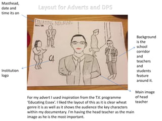
1. Institution
logo
Masthead,
date and
time its on
For my advert I used inspiration from the T.V. programme
‘Educating Essex’. I liked the layout of this as it is clear wheat
genre it is as well as it shows the audience the key characters
within my documentary. I'm having the head teacher as the main
image as he is the most important.
Background
is the
school
corridor
and
teachers
and
students
feature
around it.
Main image
of head
teacher
2. C4Institution
logo
Masthead
For my advert I kept the theme of the head teacher
being in the middle as he is the most significant out of all
of them with the two teachers behind him, for the
background I used the school as that's where its set.
The colour palette I will
be using is neutral, I
want it to be realistic as
it follows codes and
conventions of reality
T.V. including some
entertainment for
viewers.
Main image
using long
shot
3. For the double page spread I used the background of the
school as I think this keeps the audience informed what the
genre is. I also used text on the left hand third as when the
viewers look at it that’s the first thing they see, on the right
hand third I did an extract of the head teacher which gives an
insight of the school.
Institution
logo
masthead
Left
hand
third
column
Extract of
teacher
Main image
using wide shot.