
Recommended
More Related Content
What's hot
What's hot (20)
Viewers also liked
Viewers also liked (20)
Similar to Question 1
Similar to Question 1 (20)
Question 1
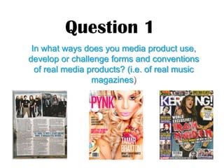
- 1. Question 1 In what ways does you media product use, develop or challenge forms and conventions of real media products? (i.e. of real music magazines)
- 2. Cover Page Here is the front cover of my magazine • Image of the artist takes up 90% of the cover, The reason why my artist is taking up majority of the cover is because she is a new artist, and when new artists come out onto the music scene the way they look has a big impact on their future in music. • Font on the front cover is used throughout the whole magazine like a theme. I have used three or four different fonts so that the magazine was not all one font because that would make the magazine look boring and unattractive whereas a variety of different texts suggests different types of information being included in the magazine. • Colours which have been used. Blues and greys suggest the city – urban theme. Red looks quite bright and is really highlighted out which makes it attractive and eye catching and seems energetic – brightens up the dull city colours. • Straplines and text introduce the new artist ‘ Hani Waya’ but on the front cover I have also mentioned ‘ Stars of the past’ because people that listen to R’n’B music love old school music , therefore using this strapline will attract them because the magazine would include their favourite childhood artist.
- 3. Contents Page Here is the contents page of my magazine. • Pictures The pictures on my cover page are range from a long shot, medium shot and close shot. I have purposely used different shot types and angles to add interest and variety. • Layout I have put the contents of what is in the magazine at the bottom half of the page and the title in the middle to help readers quickly find their way around the magazine. The photos illustrate the range of artists in the magazine. • Folios I have included folios beside the features so when people scan through the contents page and know what is going to be on the page and then they can first read the article that attracts them the most. • Captions I have included captions on my images so people are aware of who this artist is. This makes them feel more knowledgeable about the content of the magazine before they read it. • Focus on a range of artists My contents page focuses on a range of different of artists as people do not have one particular favourite, they have many favourites. It gives lots of artists the opportunity to promote themselves via my magazine.
- 4. Layout The layout of my Straplines and texts The straplines Photographs The magazine is quite organised it I have used the colours link with the photographs I have included has a few pictures surrounded by magazine, and I short but filled with are just of the artist this article text and has a strapline and a information and they tempt the is about. This is because she heading, it also includes a picture reader to read more of the article. is a new artist therefore the which I created myself. The article is solely about her. I layout of my magazine is quite have used two close-up shots simple yet effective because it is and a Long shot because I organised and all the colours mix wanted to show different sides well and it seems like a laidback to the artist and different article to read. I think the colours details about her. I wanted work well with my genres people to read the article to because the urban genre is quite relate to the artist. dark therefore these colours link well. Fonts In my double page spread I have used 3 • Expanded Quotations The expanded quotation different fonts which consists through the whole which I have used are to highlight were the best magazine as a trend. I included the same 3 fonts on parts of the interview are which will draw in the the magazine because different fonts and colour viewer to read the article, it will excite them. fonts separate pieces of writing. Double Page Spread