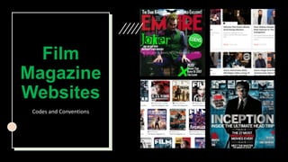
2. Codes and
Conventions
Masthead of the magazine/company title
Largest images at the top of the page displaying the top
stories
Different sections – typically including Movies, TV,
Reviews, Podcasts
Sometimes there are sub-sections within one sections
Writer of the article is usually shown underneath
the displayed stories
Colour schemes – there are usually matching colours for
all the headings
Images used for every preview to the articles shown to
make it more engaging for readers
Mainly colloquial language is used to engage readers
Simple fonts, headings in bold to stand out
A link or section to buy or subscribe to publication
Related ads – catered to the target audience. Ads
sometimes border the page or are just pop-up ads along
the side.
3. Analysis - Empire
Magazine
Masthead
sections
Largest image
spotlight for the
most
popular/most
interesting story
Pictures linking
with articles
Headings in
bold with engaging
language to get
readers to click
Search bar
Pop-up
adverts and
ads down the
side next to
articles
Sub-sections
within one
section
4. Analysis – Sight and Sound Magazine
Large masthead
of company
name
Links to
subscribe and
to shop the
magazine
Images
corresponding with
articles
Purple colour
scheme
sections
Largest image
spotlight for the most
interesting story
Authors name under
every shown article